Toggle chips
Stay organized with collections
Save and categorize content based on your preferences.
A ToggleChip
is a specialized chip that allows users to select various options.
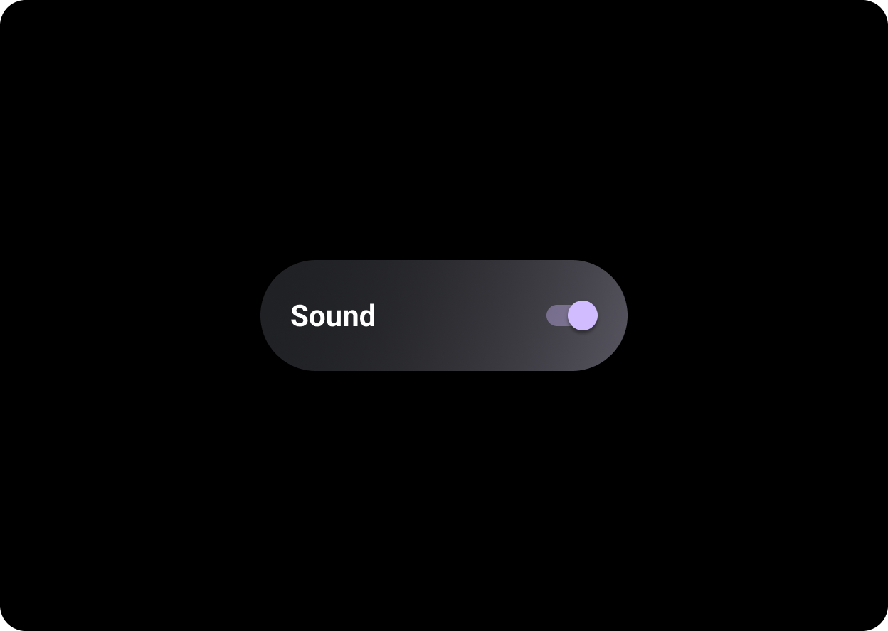
Toggle chip
Toggle chips include a bi-state toggle control. Some examples
of a bi-state toggle control include a switch, radio button, or
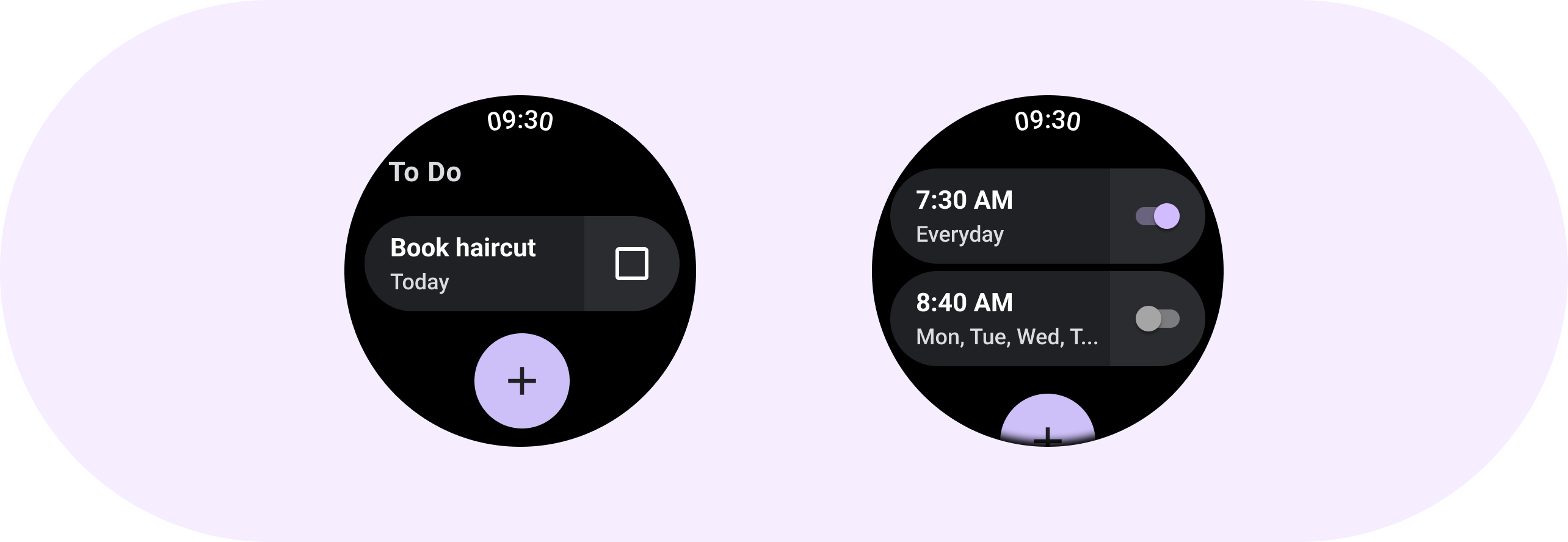
checkbox. Use toggle chips for situations in which many options may
need to be quickly and easily set, such as in Settings.
Anatomy
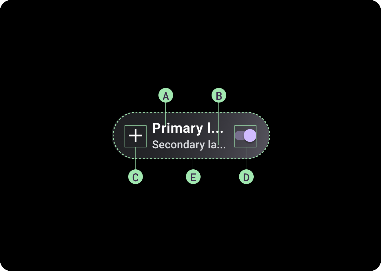
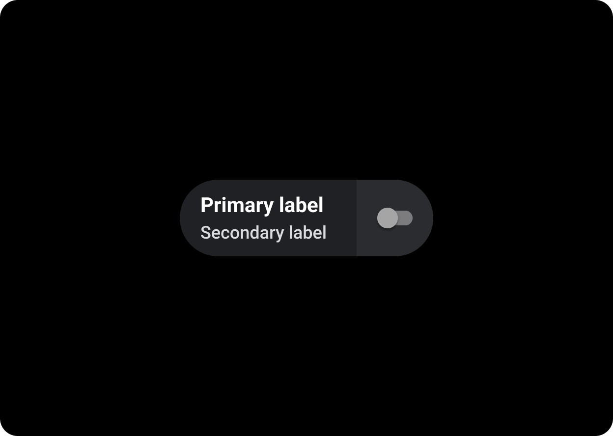
Toggle chips have four slots that accommodate two text labels, one
selection control and one application icon. The icon and secondary
label are optional.
A. Label
B. Secondary label
C. Icon
D. Selection control
E. Container
Selection controls
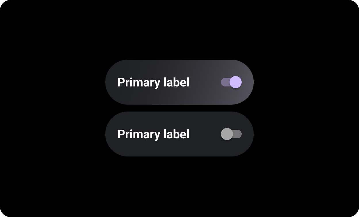
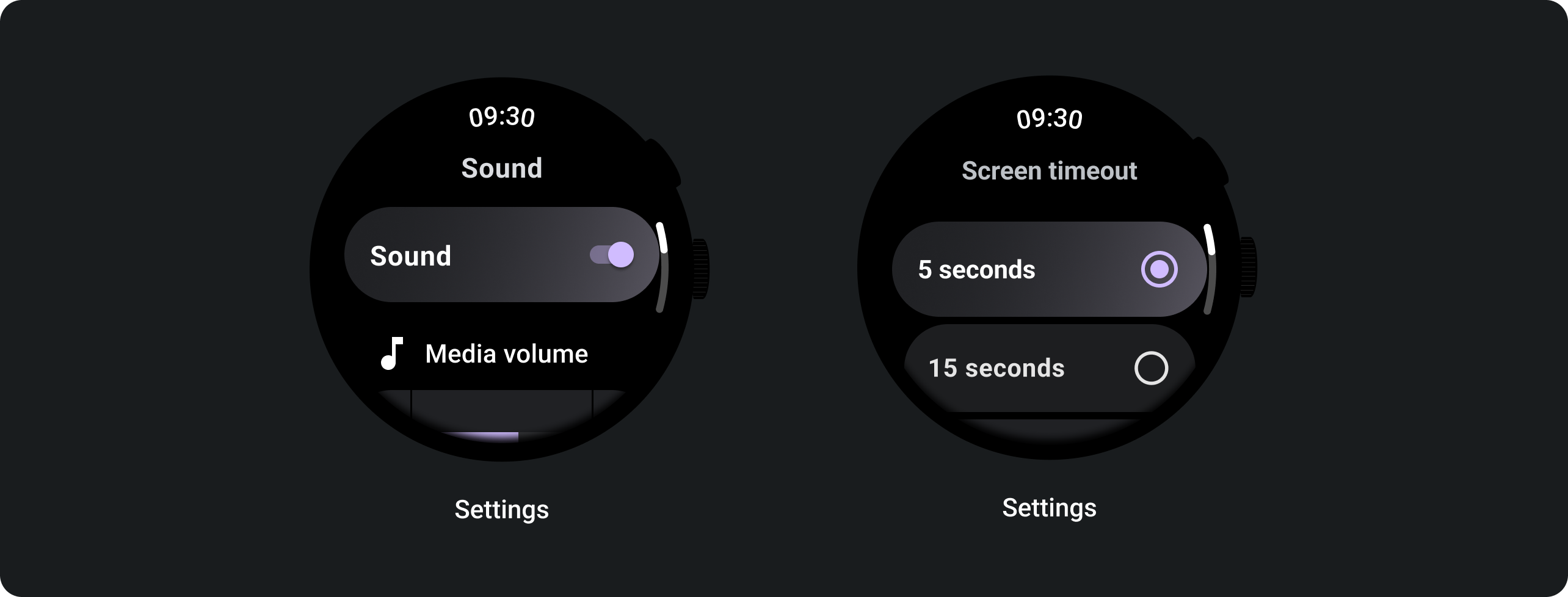
Switch
Use a switch to turn a selection on or off.
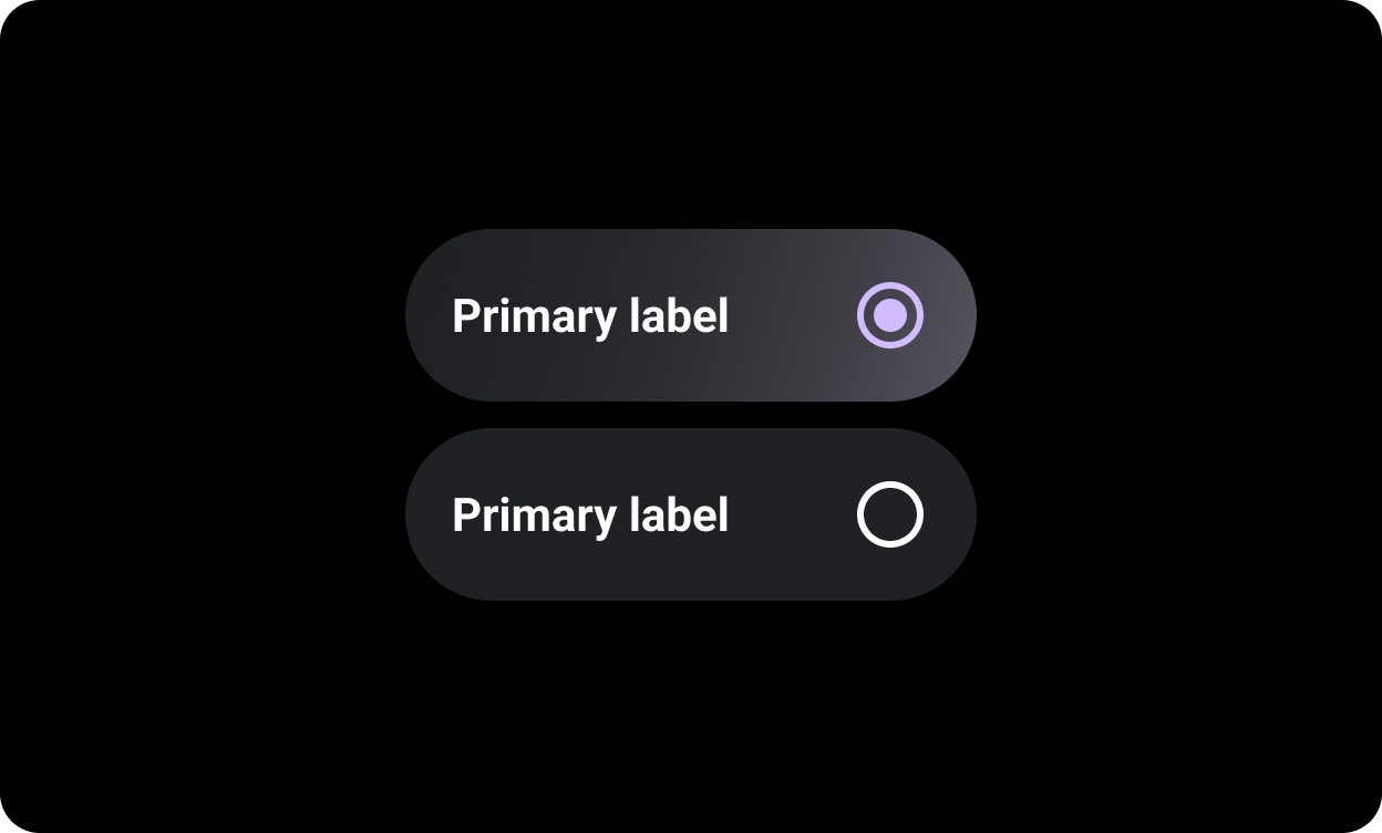
Radio button
Use radio buttons in lists where the user can select only one option.
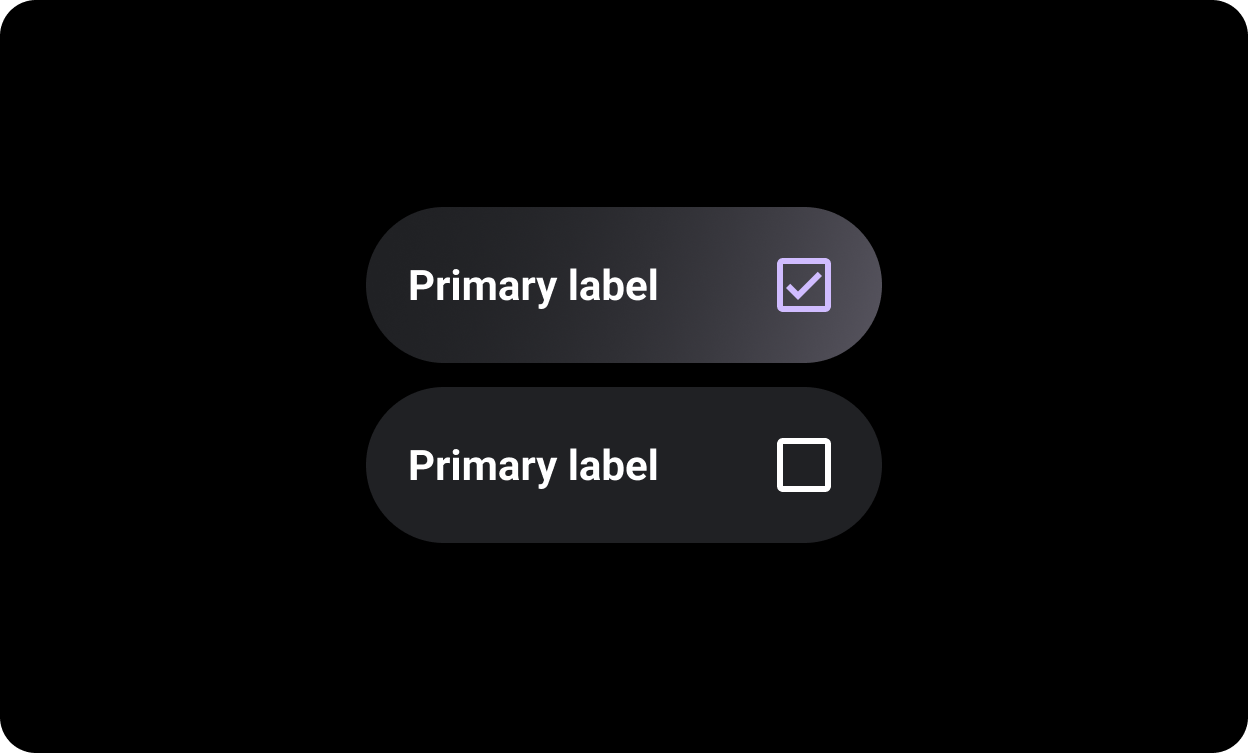
Checkbox
Use checkboxes in lists where the user can select multiple options.
Split toggle chips
The
SplitToggleChip differs from the ToggleChip by having
two tappable areas, one clickable text area and one with a toggle.
On split toggle chips, differentiate between the tappable background
area and the toggle control by making each section a different color.
Usage
Use toggle chips as shown in the following examples.
Content and code samples on this page are subject to the licenses described in the Content License. Java and OpenJDK are trademarks or registered trademarks of Oracle and/or its affiliates.
Last updated 2023-05-08 UTC.
[{
"type": "thumb-down",
"id": "missingTheInformationINeed",
"label":"Missing the information I need"
},{
"type": "thumb-down",
"id": "tooComplicatedTooManySteps",
"label":"Too complicated / too many steps"
},{
"type": "thumb-down",
"id": "outOfDate",
"label":"Out of date"
},{
"type": "thumb-down",
"id": "samplesCodeIssue",
"label":"Samples / code issue"
},{
"type": "thumb-down",
"id": "otherDown",
"label":"Other"
}]
[{
"type": "thumb-up",
"id": "easyToUnderstand",
"label":"Easy to understand"
},{
"type": "thumb-up",
"id": "solvedMyProblem",
"label":"Solved my problem"
},{
"type": "thumb-up",
"id": "otherUp",
"label":"Other"
}]
