
When using a pointer device, users rely on the cursor to track where they are pointing, infer what kind of actions they can perform, and get feedback during certain interactions.
Cursor icons
Cursor icons provide specific visual cues that indicate to users which elements are interactive and what actions they can perform.
The system provides a set of cursor icons, such as the following:
General
| Icon | Type | Description |
|---|---|---|
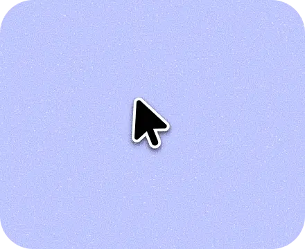
|
Pointer | Indicates where the mouse is pointing on the screen. |
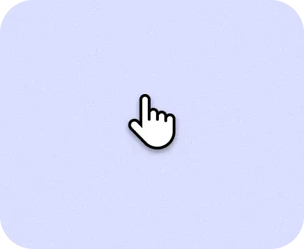
|
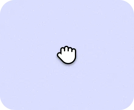
Hand pointer | Indicates that an object can be clicked or interacted with. |
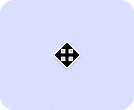
|
All scroll | Indicates that the user can scroll in any direction. |
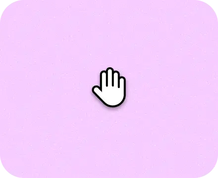
|
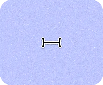
Grab | Indicates that the user can drag an object. |
|
Grabbing | Indicates that the element is being dragged. |
|
Copy | Indicates that the user can copy text or other content by clicking and dragging. |
|
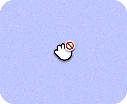
No drop | Indicates that the user can't drop the item that they are dragging. |
|
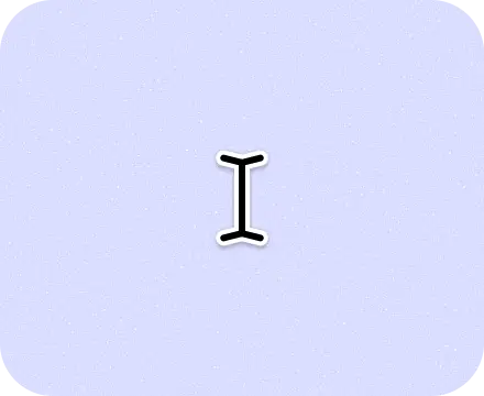
Text | Indicates that the user can insert, edit, or copy text. |
|
Text vertical | Indicates that the user can insert, edit, or copy vertical text. |

|
Alias | Indicates that the user can create an alias for a file or directory. |
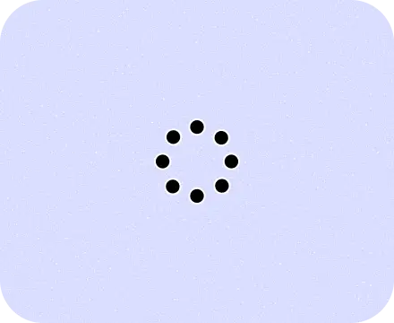
|
Process spinner | Indicates that a process is underway and the user can't interact with the UI until the process is finished. |
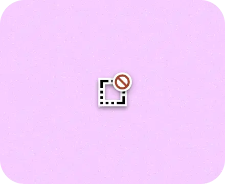
Services
| Icon | Type | Description |
|---|---|---|
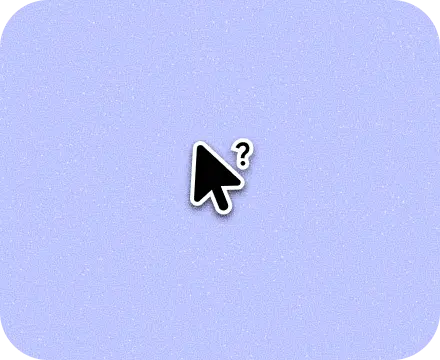
|
Help | Indicates that help is available as a help window for the current context. |
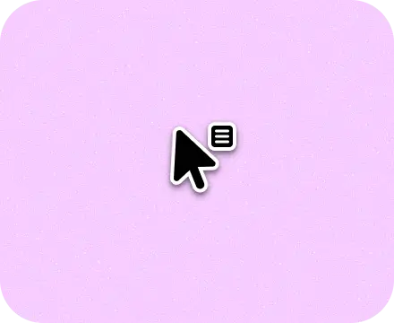
|
Context menu | Indicates that the user can right-click to open a context menu. |
|
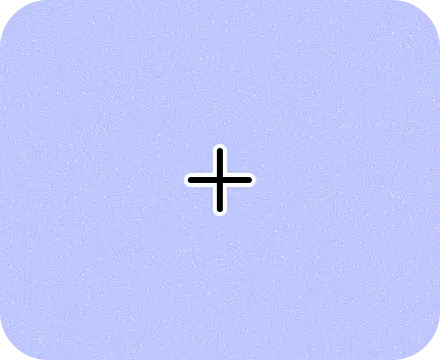
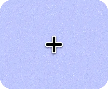
Crosshair | Indicates that the user can precisely select an object or location. |
|
Cell | Shows the active cell in a spreadsheet. |
|
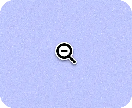
Zoom out | Indicates that the user can zoom out on an object or area of the screen. |
|
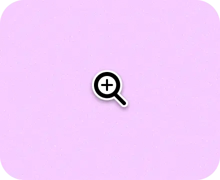
Zoom in | Indicates that the user can zoom in on an object or area of the screen. |

|
Spot hover | Indicates that the mouse is hovering, similar to the default pointer. Used mostly for testing and screen recording. |

|
Spot touch | Indicates that the cursor has tapped. |
Resize
| Icon | Type | Description |
|---|---|---|
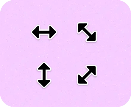
|
Resize arrows | Indicates that the element can be resized in the direction shown. |
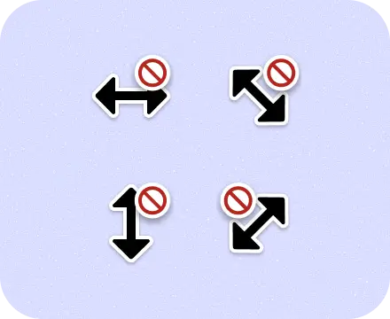
|
No resize directional arrows | Indicates that the user can't resize the object in the shown direction. |
|
No resize all directions | Indicates that the user can't resize an object in any direction. |
Stylus
| Icon | Type | Description |
|---|---|---|

|
Scribe hover | With a stylus, indicates that the input field is writable. |
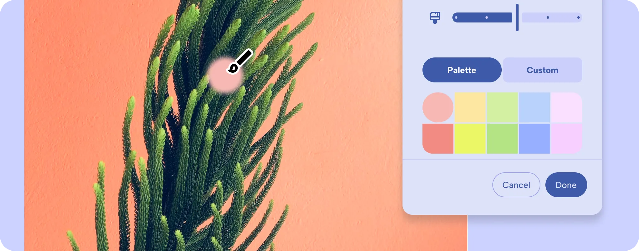
Use cursor icons
Use and set the system cursors to communicate interaction to users. For example, use a magnifying glass when hovering over zoomable content.
Create a custom cursor icon for more specialized actions that are not provided
by Android.
For design guidance, cursor icons. For implementation details and how to set different cursor types, custom cursors.