A desktop experience is adaptive from the start, supporting a variety of sizes on connected displays or within windows. Support the full range of Android devices by creating an adaptive UI. Adaptive layouts are essential for desktop experiences, letting users seamlessly resize their app windows.
To prepare your app for a desktop experience, start by adapting your app's UI, and then proceed to density and input interaction design. For more information, see Adaptive layouts. To practice with a design lab, see the Adaptive design lab.
Think in panes
Adopt a pane-based approach to layout by using grouping and containment. Content can be organized using visual containers or through implicit grouping with whitespace. These panes offer flexibility, as they can be expanded, constrained, hidden, moved, or displayed as pop-ups. Designing with panes simplifies the process of creating cohesive experiences across various mobile devices and can be integrated with current grids to streamline complex layout alignments.

Do
Scale
While expansive screens provide more room for content, the additional space and ergonomic factors such as viewing distance must be taken into account. Typography should be scaled up slightly for comfort for users who may be further away or typing on a keyboard.
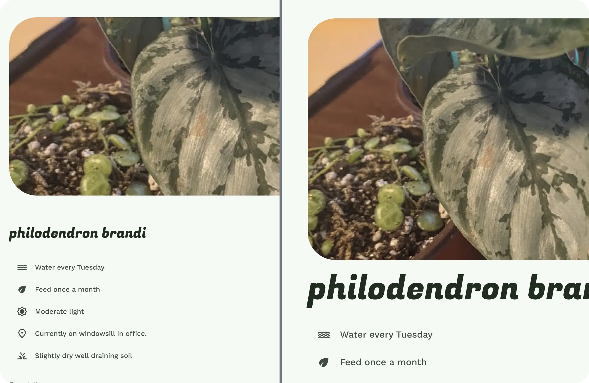
UI elements and type are scaled on extended and connected displays, and may have different scales due to screen resolutions.
Use a step or two up in your existing type scale designs, or consider implementing a specialized type scale designed for desktop and expanded displays. Opinionated adjustments can be made in your designs for more editorial quality.
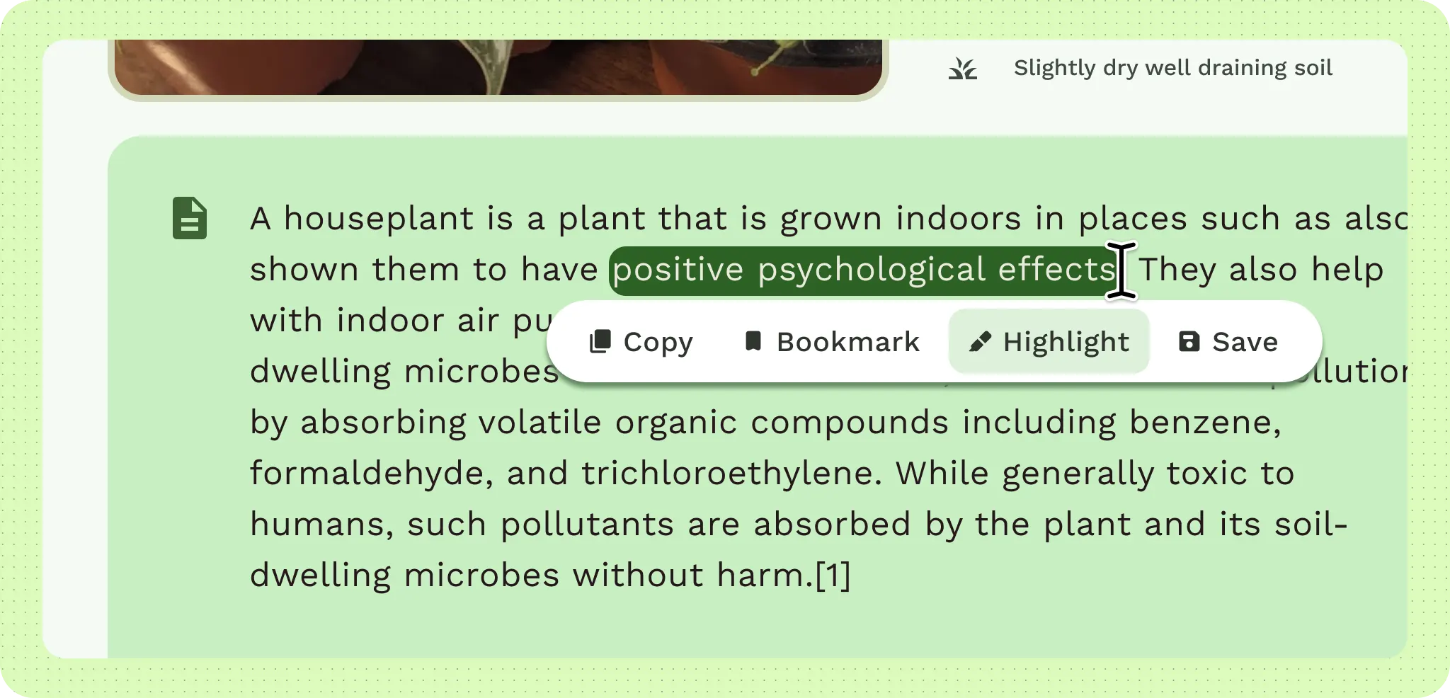
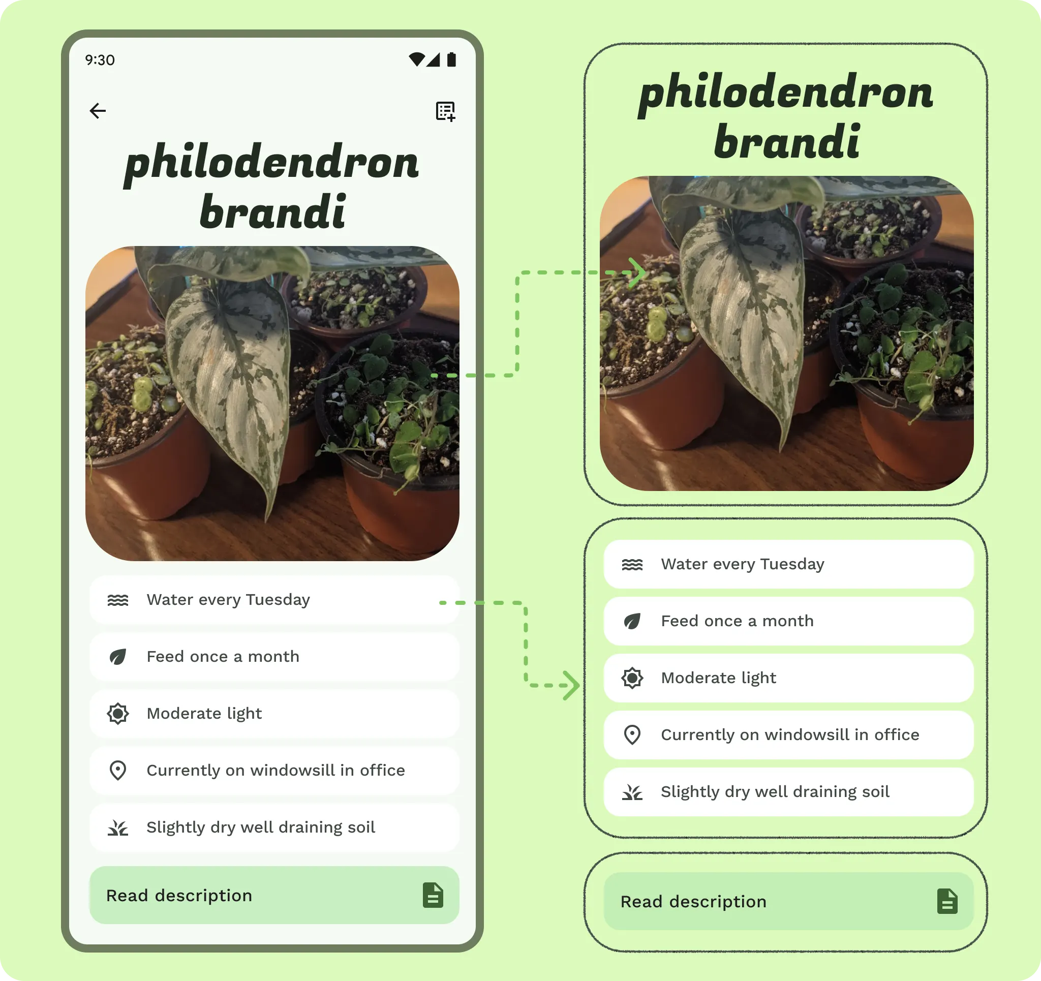
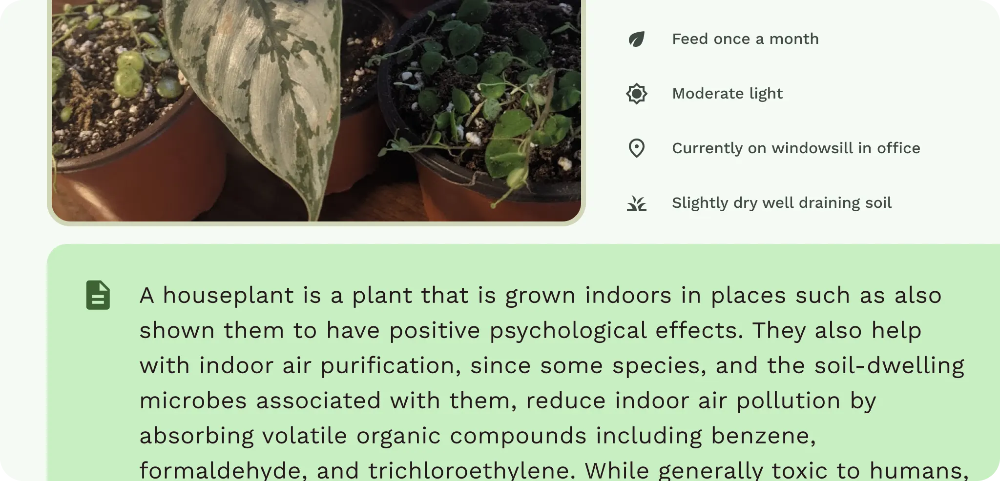
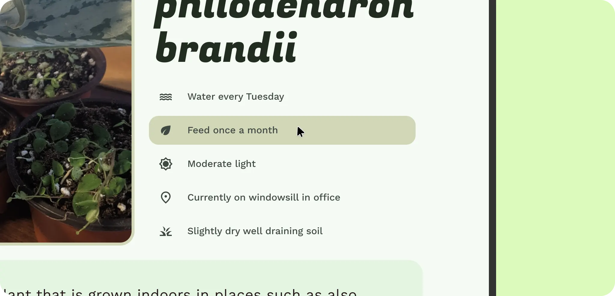
The image also scales up and spans across the screen. This lets the user see the plant in more detail, but it's not using the space efficiently. Keep this in mind when structuring the UI elements.
Content and UI elements
Now that content is grouped and scaled, some of the content UI can also shift or update to better fit the breakpoints.
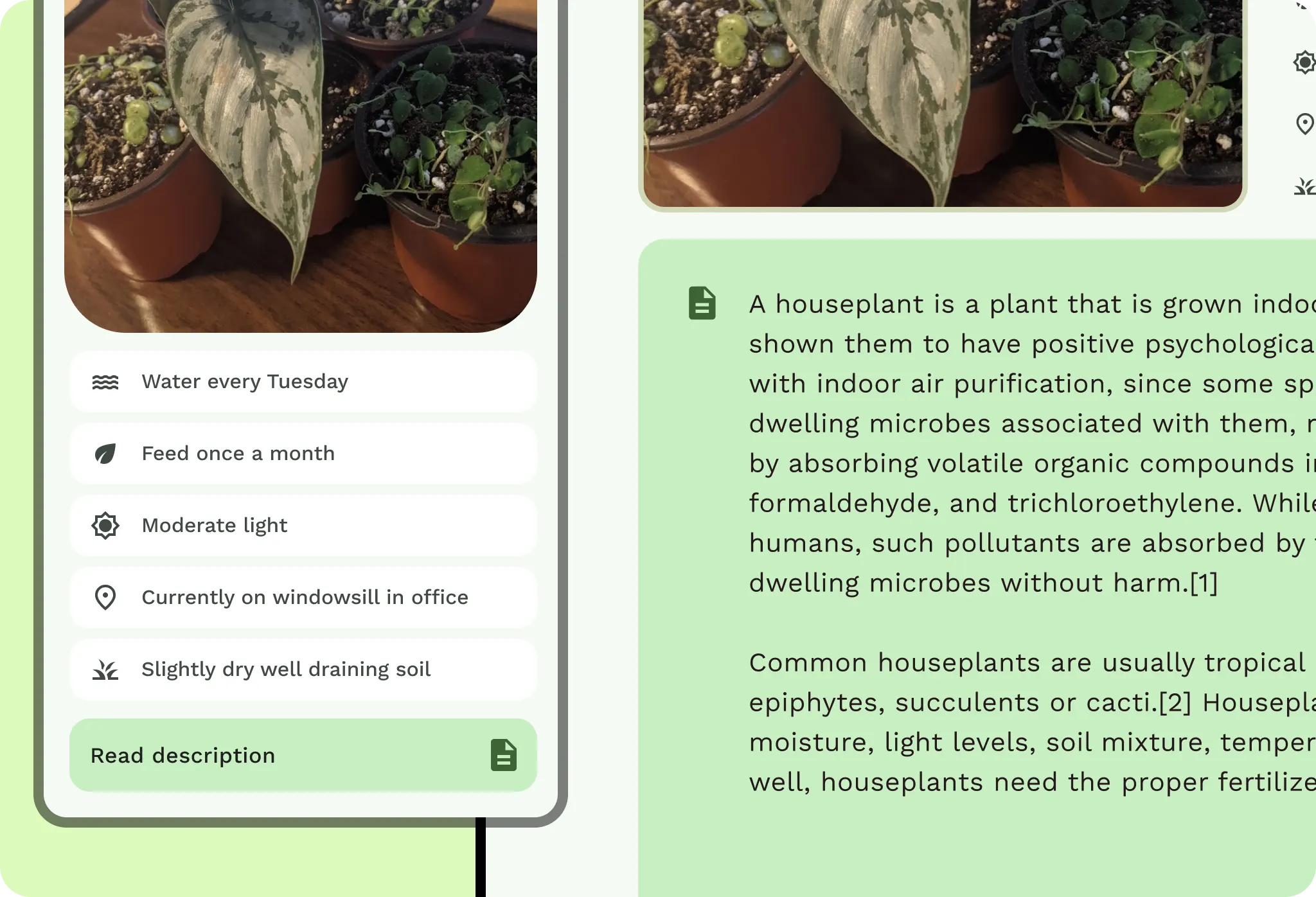
Within each pane of content, decide if and how it will adapt. Look at the content itself. If a list row changes to a card, does the content lose interaction efficiency and scannability? Components can behave differently at various breakpoints. You can adapt their width or visibility, or even switch components.
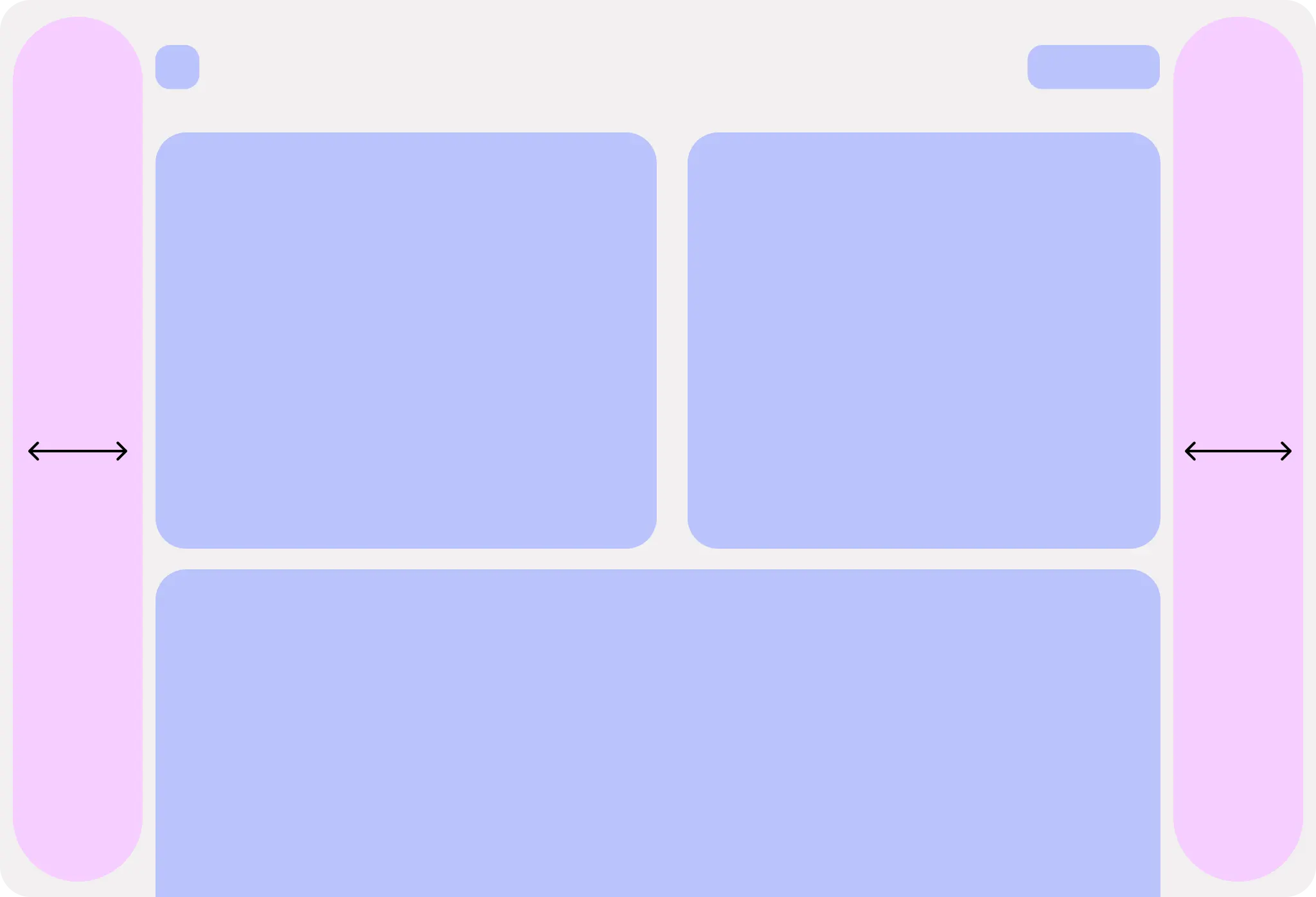
Decide on the maximum width for each UI element and copy within a pane. UI elements shouldn't stretch to the full width or distort. Set maximum paddings and margins within panes. Copy should allow for comfortable reading by limiting line lengths. Limit short-form copy to around 60 characters, while long-form content can run longer.

Do
Use graceful progressive disclosure. Can more content appear when the user increases the window size? Consider whether the additional content increases productivity with fewer clicks or creates confusion.
Content within each pane can change layout, again depending on the content, by reflowing to different columns and grid structures. For example, a vertical grid with a carousel can update to a masonry grid with a feature carousel. Consider vertical change for elements and combine with constraints and presentation changes. You might not want to shift components like this, depending on content consumption.
Consider letting the user adjust the layout to their preference for maximum readability and productivity.
Navigation
After you adapt content and UI elements, decide how content panes interact with each other and the navigation hierarchy. Instead of tapping to navigate to the detail content, you can use the additional screen space to show details and supporting content next to each other.
- If a navigation bar is in use, the bottom bar should update to a navigation rail to the side of the screen for increased ergonomics. Don't stretch out a bottom navigation bar.
- For secondary navigation, like tabs, consider fixing them to a max width so they are easier to navigate with precision.
- App bars can also be fixed to their corresponding pane of content, but make sure not to confuse the navigation hierarchy.
Density
A desktop experience can shift both its interaction density and visual density due to input precision and screen size.
- You can increase the density of visual elements, such as table data, without overwhelming the user compared to a compact phone layout. Consider any content density optional and always allow for text scaling within the layout, don't hard set type sizes.
- Components should have a more exact click target. Intrinsic click targets around components can lead to misclicks.
Inputs
Additional inputs mean additional interaction patterns for your users.
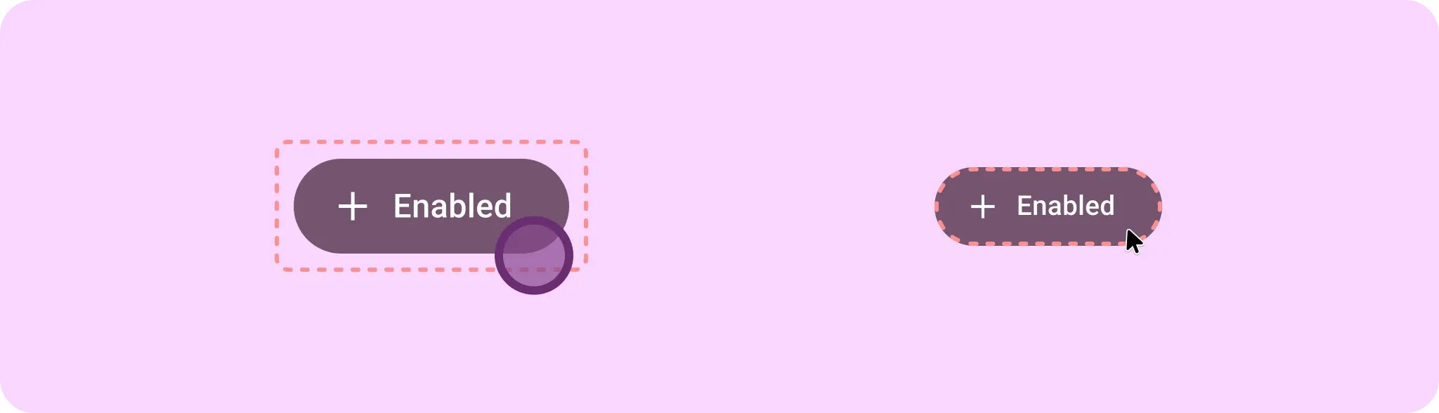
When a user has a mouse and keyboard, your app needs to account for hover state and focus.
- Add hover states for pointer inputs, such as a mouse and stylus.
- Capture focus states for elements when users navigate using the Tab key for accessibility.
- Account for cursor states, as the cursor can also help communicate interaction and app state to the user.
Additional states can add increased efficiency.
- Right-click functionality can include context menus for quick feature access.
- Hover tooltips can help onboard users.
- Keyboard shortcuts help power users increase productivity.