
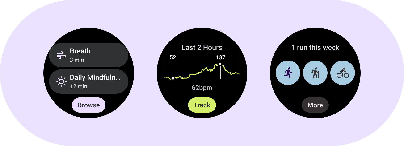
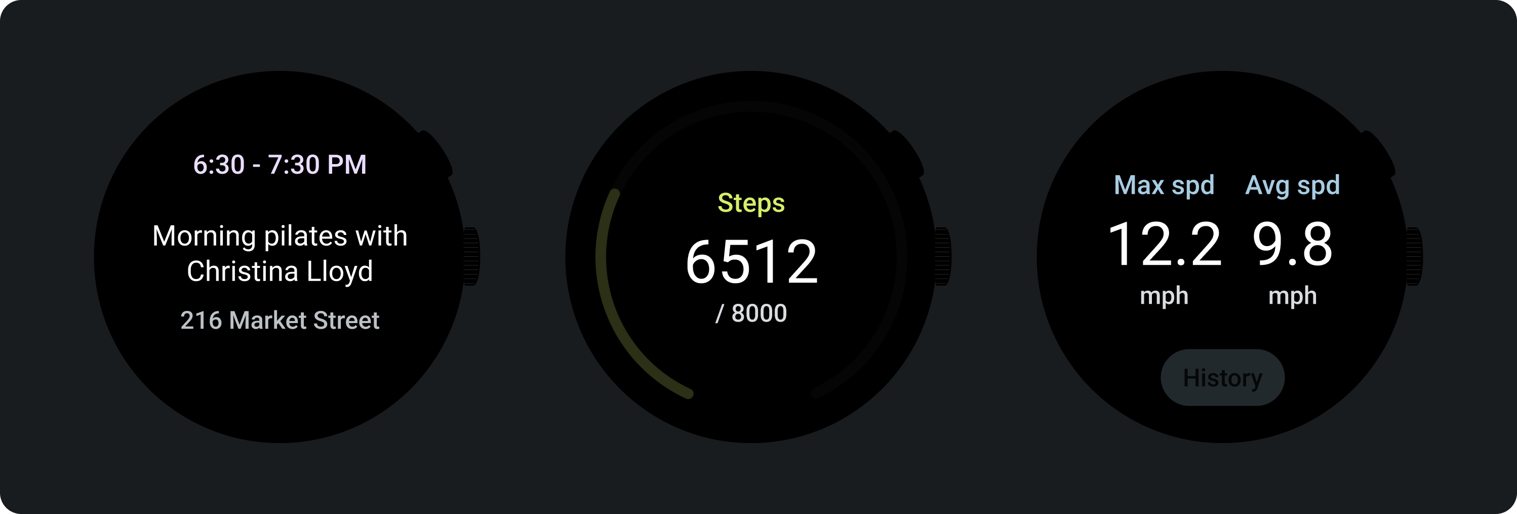
Understand tile fundamental elements. Use tile templates, layouts, and components to design and build unique tiles for your apps.
Fundamental elements
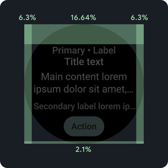
Percentage padding
Top, bottom, and side margins all use percentages, rather than fixed margin amounts, to achieve proportional scaling.
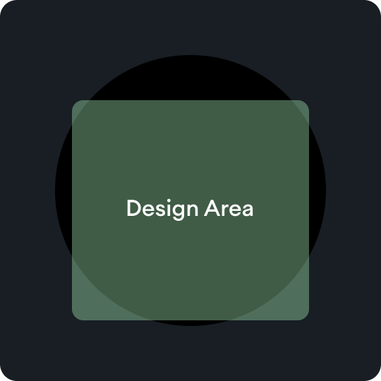
Design areas
Each type of tile template has its own rules within the primary content area. Refer to the layout guidance for more information.
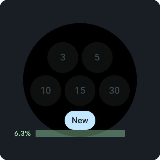
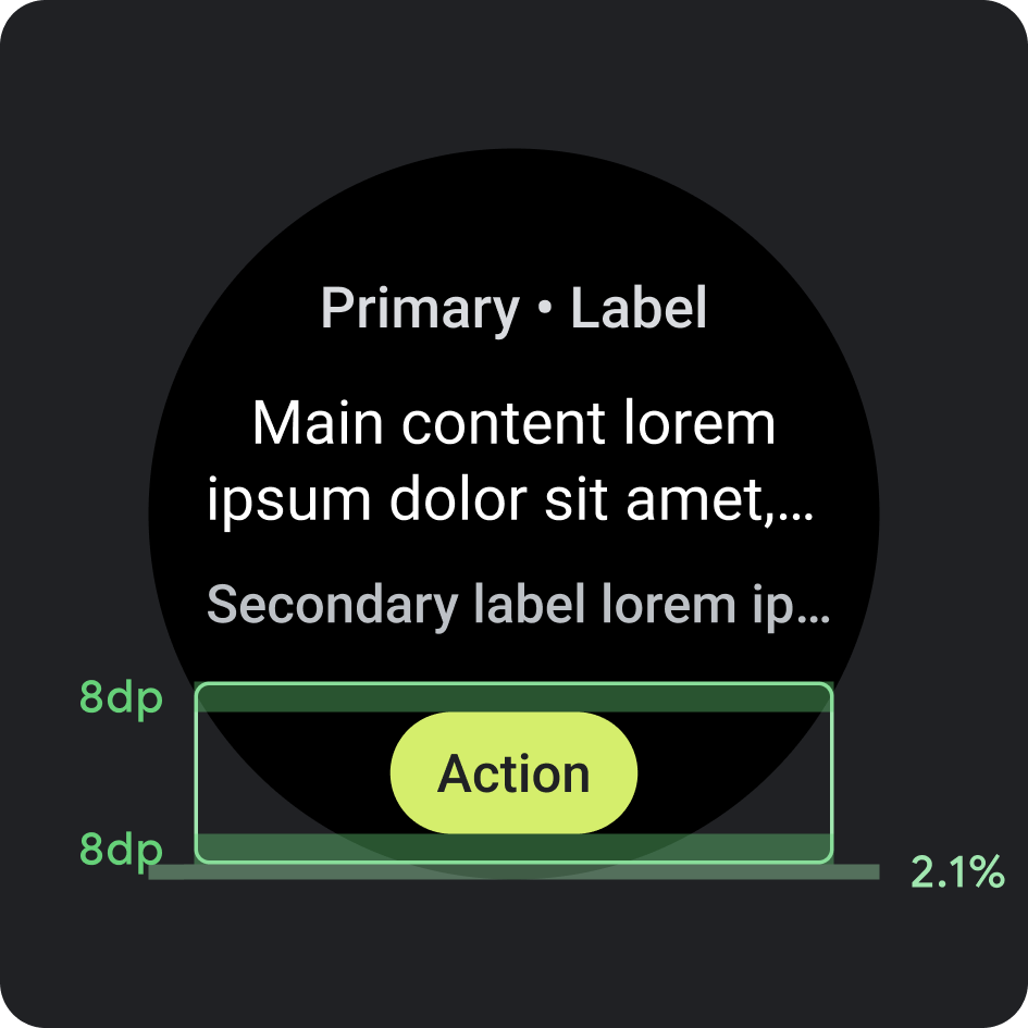
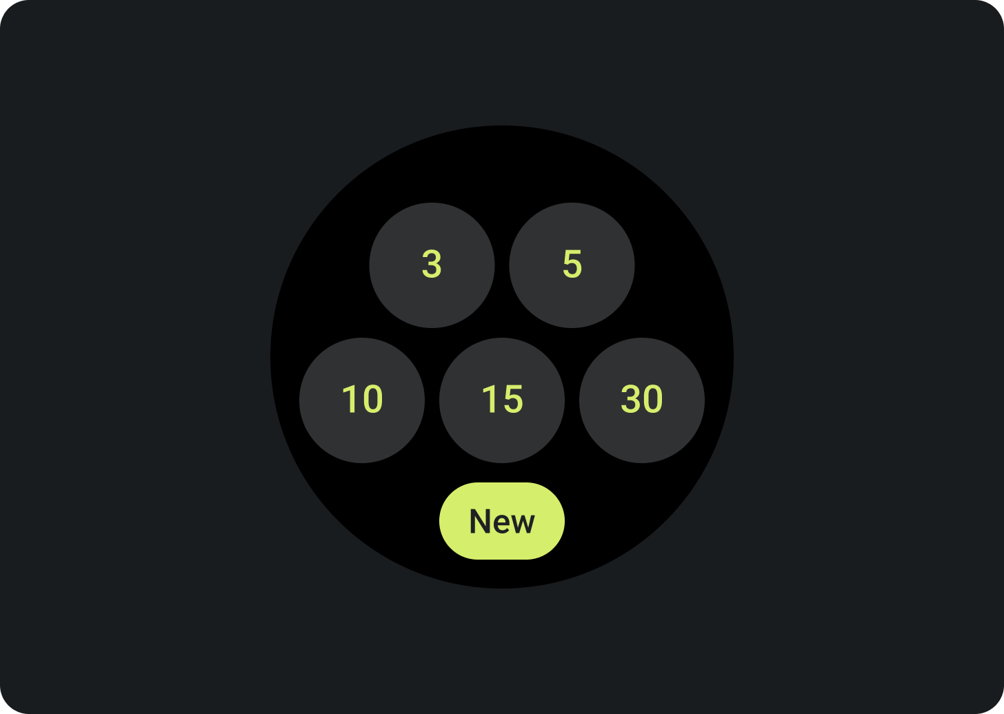
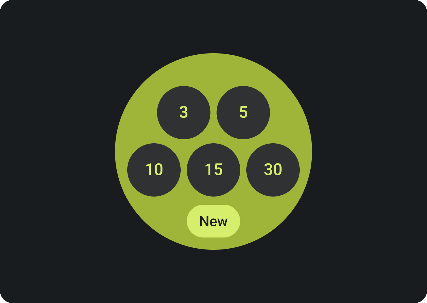
Bottom compact chip
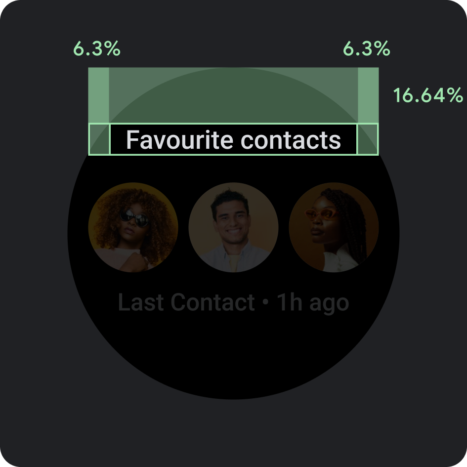
Important for enabling secondary actions on the tile. Consistently placed 6.3% above the bottom.
Bottom compact chip
Within the button, use a word that's short but specific to a particular action or destination. The translation of this call-to-action text must accommodate the character count limits. As a default or fallback value, you can use "More" as the call-to-action text.
Placement
- Margin: 2.1% from the bottom
- Internal padding: 8 dp above and below
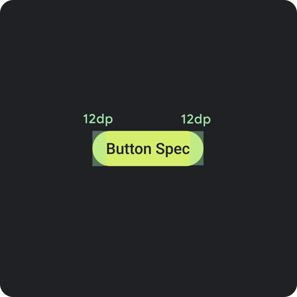
Button spec
- Internal padding: 12 dp on both sides
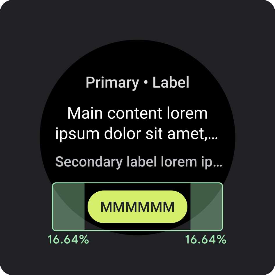
Side internal padding/margins
- 16.64%
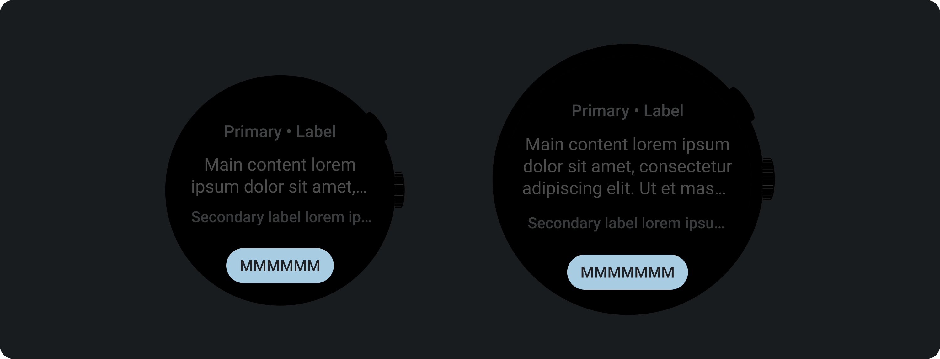
Recommended character limit < 225 dp
- Max lines: 1
- Max character limit: 8
- Recommended character limit: 6
- Truncation: No
Recommended character limits > 225 dp
- Max lines: 1
- Max character limit: 9
- Recommended character limit: 7
- Truncation: No
Color
Apply your brand's theme
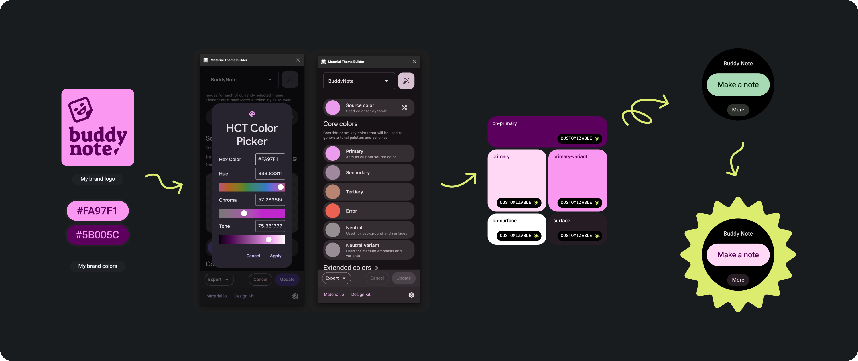
There are several brand colors to choose from. They can also be customized and changed to fit your app's look and feel.
Use the Material theme tools and guidance to generate colors that have adequate color contrast levels, using your primary color as a source color Use the generated palette to replace the primary, primary-variant, on-primary, surface, and on-surface colors in your palette in Figma to theme your tile correctly. All other colors are not customizable to create consistency across tiles.
Other Material theme building tools:
Color application
Always set the background color to black.
Do
Don't set the background as a full bleed image or block color.
Don't
Typography
Roboto is the primary font used in Wear OS. Body 2 is recommended as the default and the smallest font size, while Display 2 is the largest type style that's available for tiles.
Primary label
Primary label text is always 16.64% from the top edge and have an internal padding of 6.3%. Color and font also remain consistent throughout.
Internal padding
Top margins: 16.64%
Side margin: 6.3%
Color
On-Background-Variant (Gray 300)
Type
Tiles3P (Roboto) / Button - 15S Bold
For more information about font, weight, and sizing, see Typography.
Components
There are several components available to build your app's tiles. These components are aligned with Material Design.
Icon button
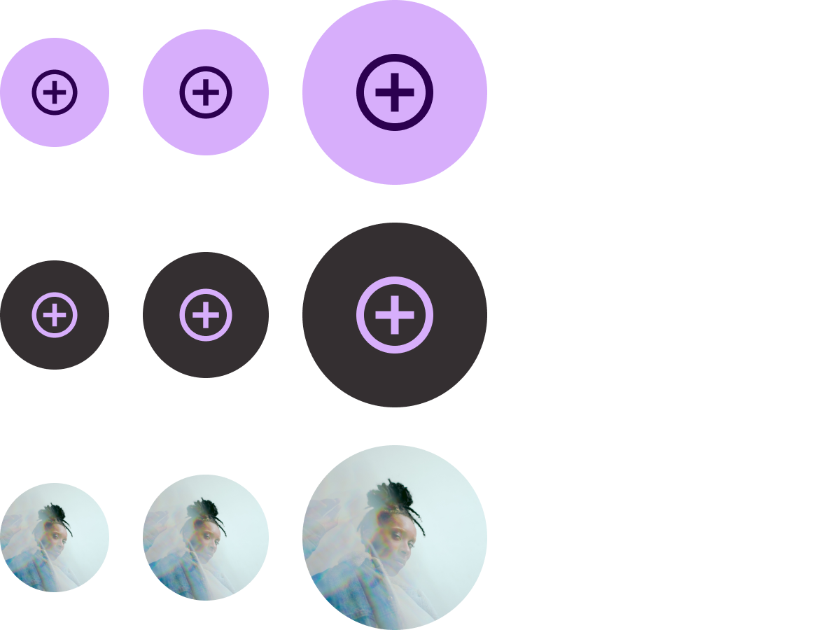
Options: Button or Toggle Button
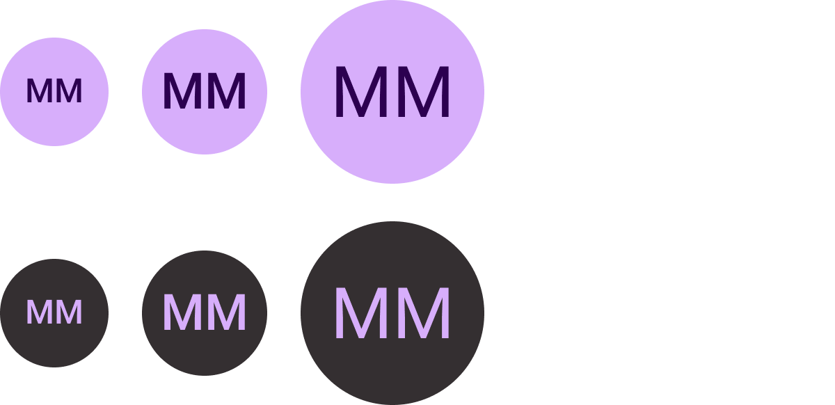
Sizes: Standard, XS, S, L
Types: Filled, tonal-filled, and image
List up to 7 options.
Text button
Options: Button or Toggle Button
Sizes: Standard, XS, S, L
Types: Filled and tonal-filled
List up to 7 options.
Standard chip
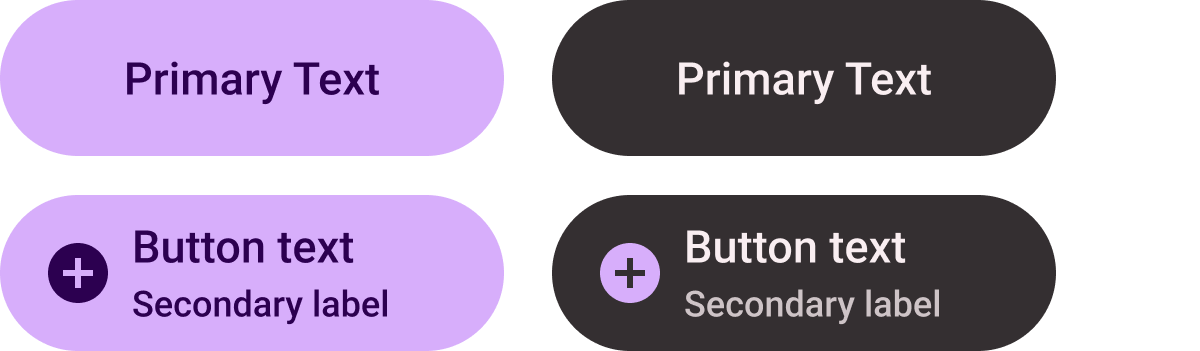
Options: Icon, secondary label, and text alignment
List up to 2 options.
Title chip (primary-fill only)

Center-aligned text
Create a single, prominent CTA.
Compact chip

Types: Filled and tonal-filled
Options: Icon or no icon
Use in the bottom button slot.
Progress indicator
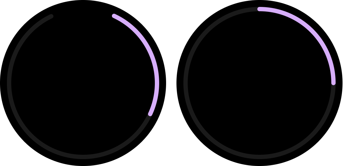
Types: Customizable stroke width
(Default sizes: 8 dp and 5 dp)
Options: Gap at the bottom or full
Indicate progress and task completion.
Figma design kit
Download the Tiles on Wear OS design kit to start using the tile design layouts with built-in components, options, and recommendations to create different layouts that suit your needs, while following the guidelines in the ProtoLayout templates.