


Jetpack Compose Glimmer에서 서피스는 모양을 사용하여 시각적
경계와 둥글기를 정의합니다. Shapes 클래스는 다양한 유형의 구성요소에 적합한 여러 수준의
둥글기를 제공합니다.
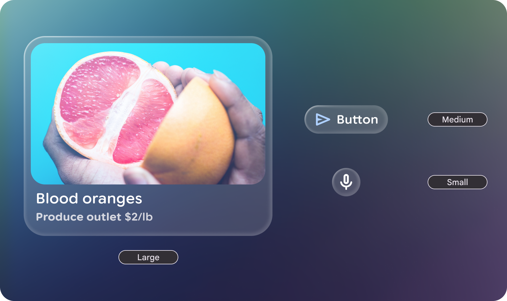
도형 카테고리
GlimmerTheme 클래스는 세 가지 표준 도형 크기를 정의합니다.
- 작음: 크기가 동일한 4개의 모서리가 있는 도형입니다. 카드와 같은 구성요소에 사용됩니다. 기본적으로 24.dp 의
RoundedCornerShape입니다. - 중간: 크기가 동일한 4개의 모서리가 있는 모양으로, 크기는 작음과
큼 사이입니다. 가장 일반적으로 사용되는 모양이며 서피스에서 기본적으로 사용됩니다. 기본적으로 36.dp 의
RoundedCornerShape입니다. - 큼: 4개의 둥근 모서리가 있는 도형입니다. 이 모양은 버튼과 같은 구성요소에 사용됩니다. 기본적으로
CircleShape입니다.
예: GlimmerTheme에서 모양 가져와 구성요소에 적용
먼저 GlimmerTheme.shapes에서 정의된 모양을 가져온 다음
이러한 모양을 일부 구성요소에 적용합니다.
@Composable fun ShapesSample() { val shapes = GlimmerTheme.shapes GlimmerLazyColumn { item { ShapeItem("small", shape = shapes.small) } item { ShapeItem("medium", shape = shapes.medium) } item { ShapeItem("large", shape = shapes.large) } } } @Composable private fun ShapeItem(name: String, shape: Shape, modifier: Modifier = Modifier) { val interactionSource = remember { MutableInteractionSource() } Box( modifier .aspectRatio(2.5f) .fillMaxWidth() .surface(interactionSource = interactionSource, shape = shape), contentAlignment = Alignment.Center, ) { Text(name) } }
모양 맞춤설정
Shapes 클래스는 @Immutable입니다. 기존 테마 모양의 사본을 만들고 copy 함수를 사용하여 특정 값을 재정의할 수 있습니다. 이렇게 하면 앱 브랜드의 특정 반지름을 조정하면서 테마의 구조를 유지할 수 있습니다.
예: 특정 모양 값 재정의
다음 코드는 특정 도형 값을 재정의합니다.
@Composable fun CustomShapesSample() { val customShapes = GlimmerTheme.shapes.copy( small = RoundedCornerShape(12.dp), medium = RoundedCornerShape(20.dp) ) val interactionSource = remember { MutableInteractionSource() } Box( Modifier .aspectRatio(2.5f) .fillMaxWidth() .surface(interactionSource = interactionSource, shape = customShapes.small), contentAlignment = Alignment.Center, ) { Text("custom small") } }
기본값
GlimmerTheme에서 달리 지정하지 않으면 시스템은 기본적으로 다음 값을 사용합니다.
| 토큰 | 기본 모양 | 크기 또는 반지름 |
|---|---|---|
|
|
24.dp |
|
|
36.dp |
|
|
완전히 둥근 모양 |