
The Card component contains content and actions about a single subject.
Anatomy
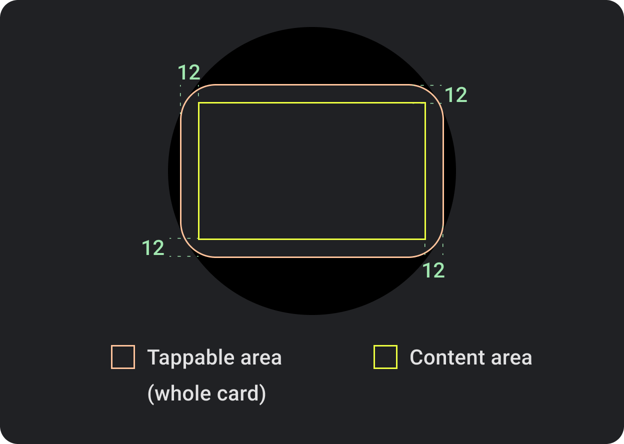
By default, cards are rectangular with rounded corners and a gradient background. Set the maximum height of your card to 60% to ensure that it's fully displayed on the screen because circular displays can clip up to 20% of the top and bottom of the screen.
Related components

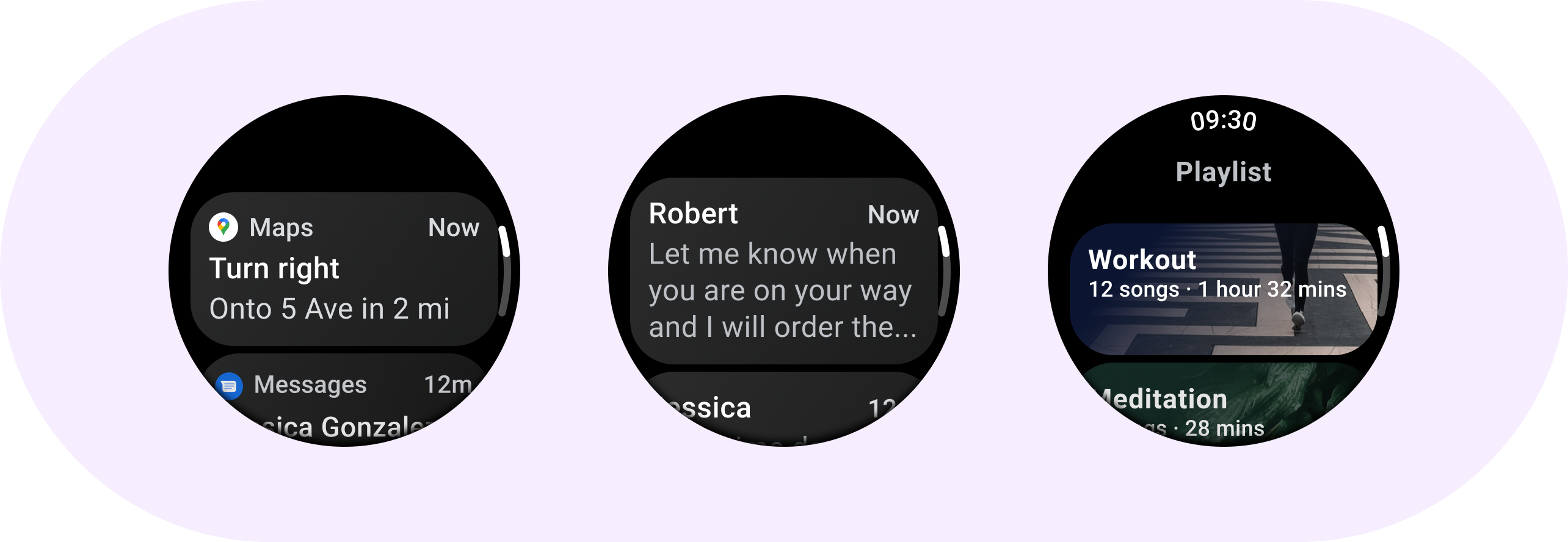
Title Card
Use Title cards to show information within an application, such as a message. Title cards have a three slot layout which includes a title, an optional time field, and the relevant content, which is either an image or text.
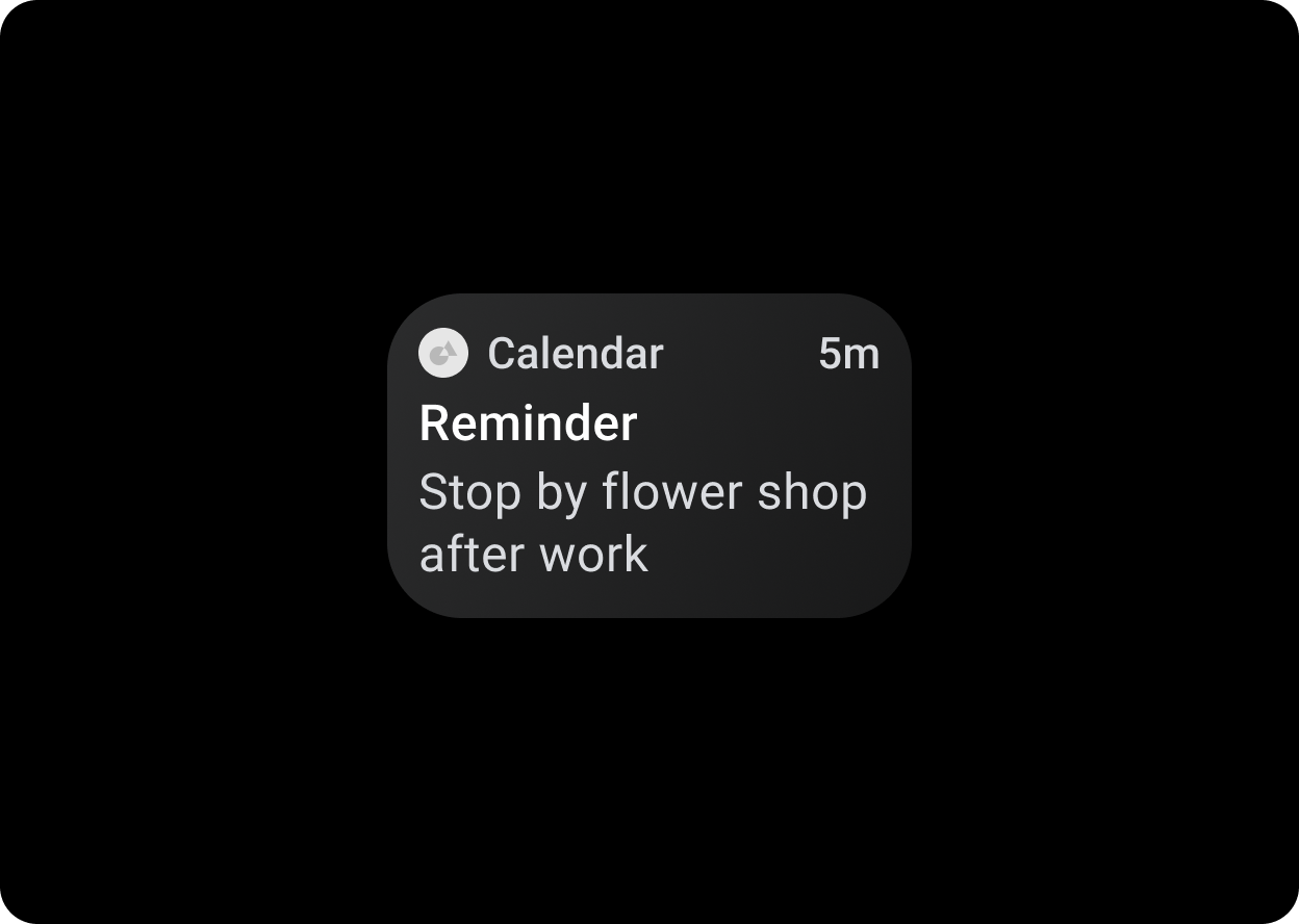
App Card
Use App cards to show interactive elements from multiple applications. App cards have a five slot layout that includes an application icon, the application name, the time that the activity occurred, a Title of some sort and the relevant content, which is either an image or text.
Design recommendations
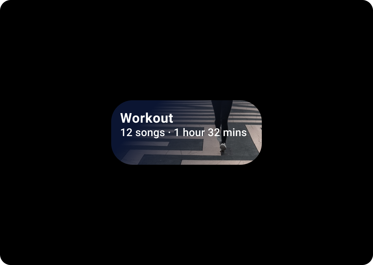
Image cards display content relating to a single topic with a background image. Image cards can also display standalone images.
TitleCard(
    onClick = { ... },
    title = { Text("Workout") },
    backgroundPainter = CardDefaults.imageWithScrimBackgroundPainter(
        backgroundImagePainter = painterResource(id = R.drawable.backgroundimage)
    ),
    contentColor = MaterialTheme.colors.onSurface,
    titleColor = MaterialTheme.colors.onSurface
) {
    Text("12 songs · 1 Hour 32 mins")
}
Sizes
Cards default to the maximum width of the container.
Card height
Card height is flexible. It is determined by the components’ content.
On round watch faces, cards that are taller than 60% of the height of the screens are clipped.