
Use a Dialog to focus users' attention on a timely action or piece of
information.
Anatomy
Dialogs should appear in response to a user task or an action, with relevant or contextual information. Unlike their mobile counterparts, Dialogs in Wear OS occupy the whole screen and are layered over other content.
Dialogs support a swipe-to-dismiss gesture. When the user performs this swipe gesture, the system reveals the parent content in the background.
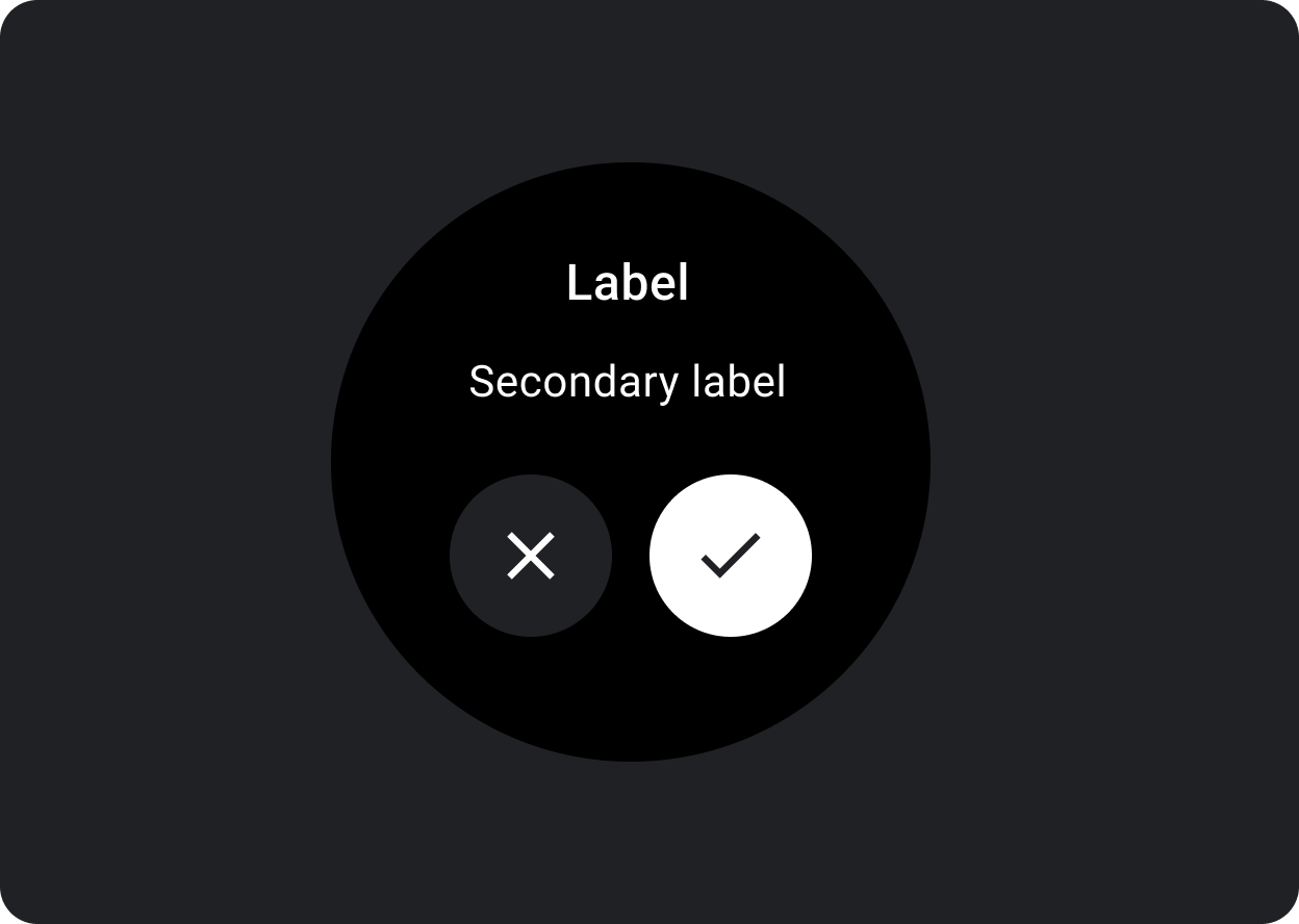
Dialogs have a single slot for opinionated dialog content, such as an Alert or Confirmation.
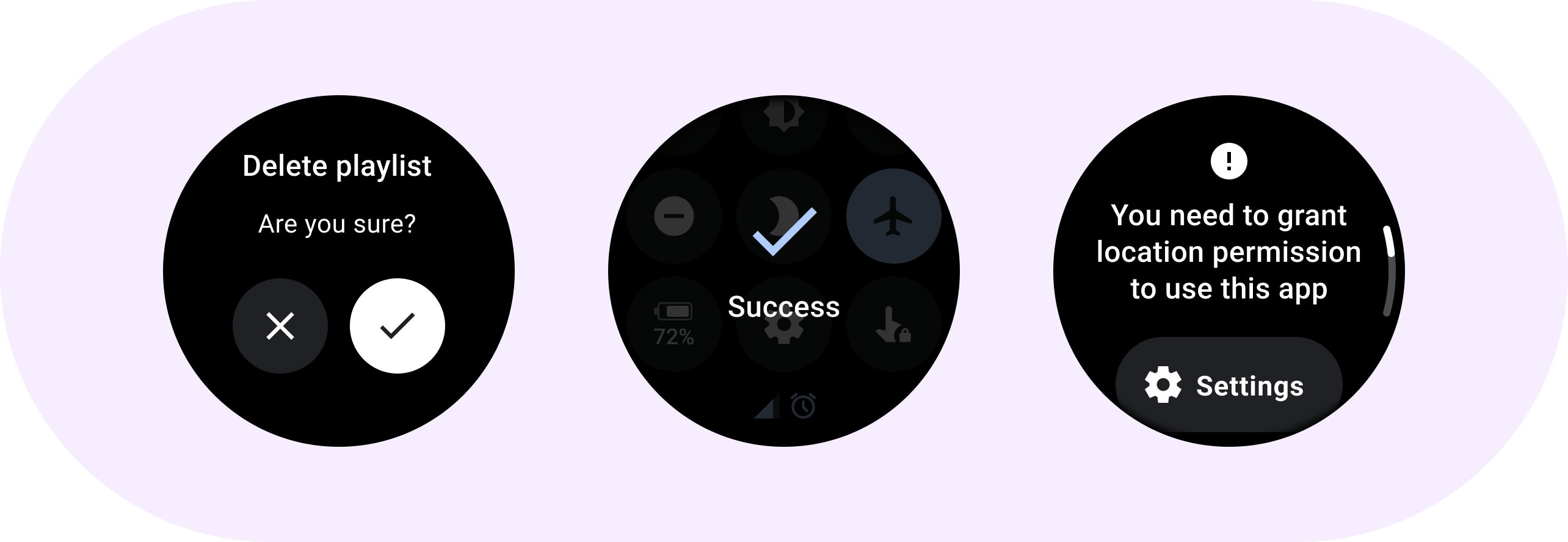
Use an alert component to get the user's response for important tasks.
Alerts disable all app functionality when they appear, and remain on screen until an action has been taken. Alerts are purposefully interruptive, so use them sparingly.
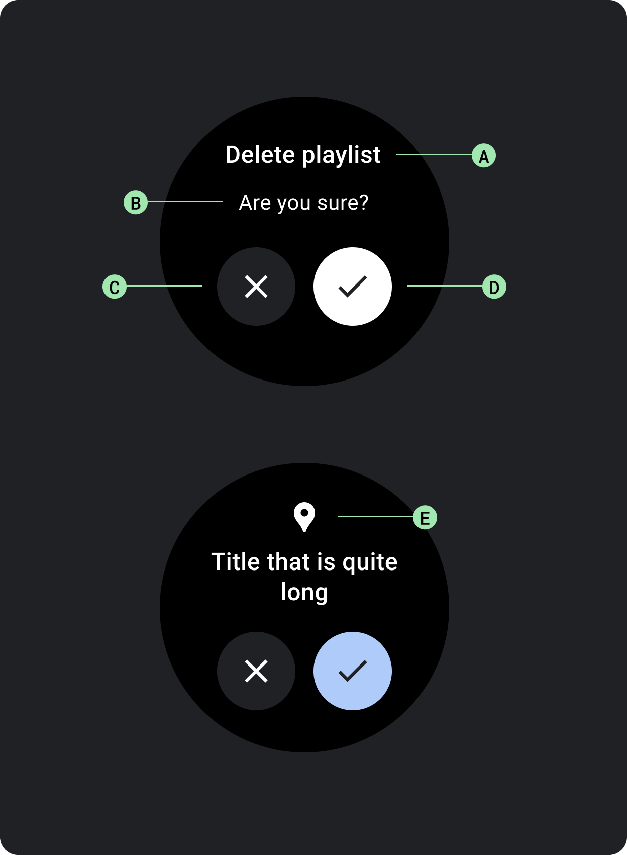
If the content of the alert is longer than three lines of text, consider left aligning the content to improve its readability. Otherwise the text is center aligned by default.
A. Title
B. Content (optional)
C. Negative button
D. Positive button
E. Icon (optional)
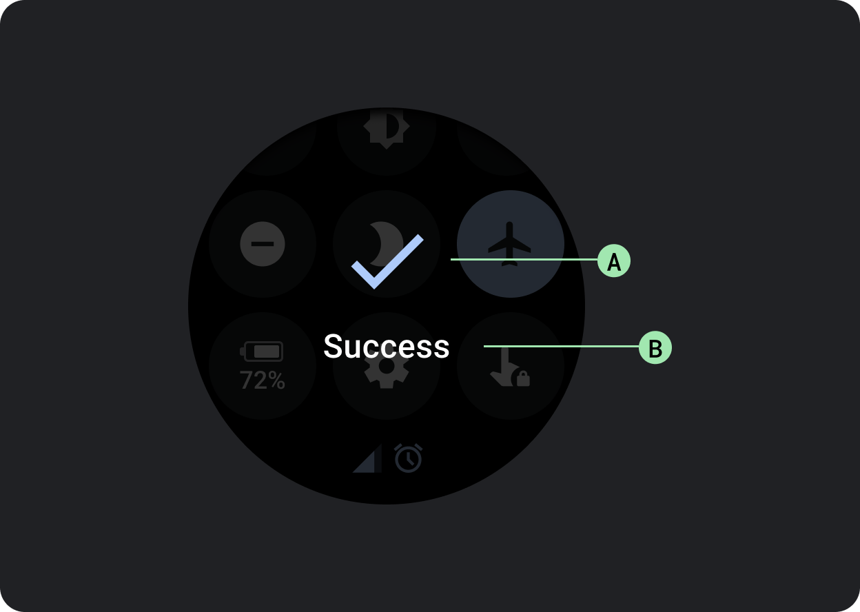
The confirmation component displays a confirmation message to the user for a short period of time. Unlike its Material counterpart, the confirmation component in Wear OS doesn’t allow users to provide final confirmation of a choice.
Use this component to capture a user’s attention after an action has been executed.
A. Icon
B. Label