Wear Material Theming is the ability to systematically customize Wear Material Design to reflect your brand. When you begin changing aspects of your UI such as color and typography, Wear Material Theming tools apply your design vision throughout your user experience. The tools allow easy switching between design and code workflows by providing specific values for all customizable attributes. Customizing the attribute values creates a Wear Material Theme for your product.
Use Wear Material Theming
Wear Material Theming consists of three main actions: customizing your theme, applying it across your design mocks, and using it in code.
Wear Material Design comes with a built-in theme that can be used as is. Customize the built-in theme to make Material work for your product.
Theming in practice
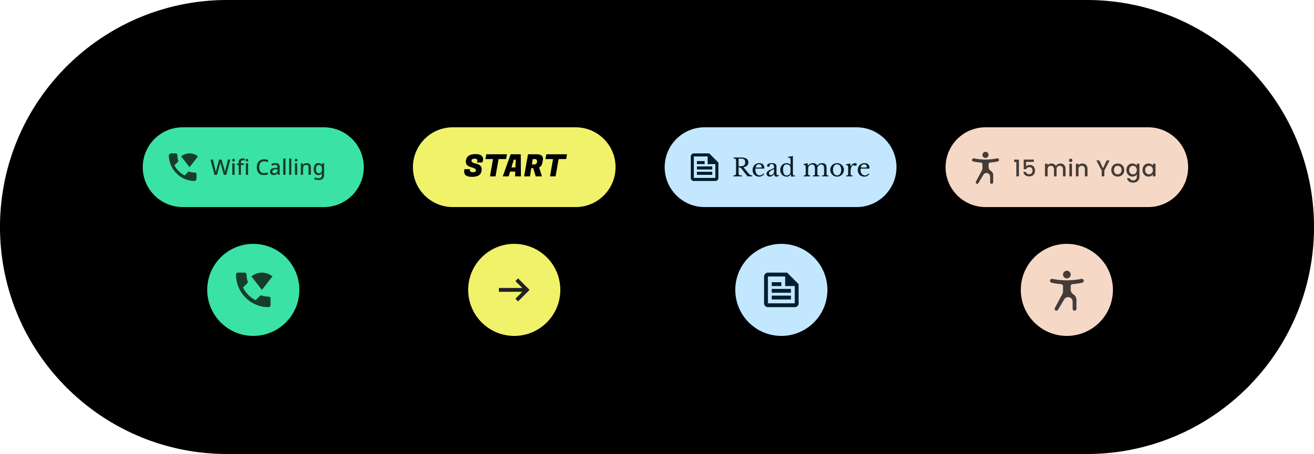
Theming affects your entire UI, including individual components such as chips. The following example shows how to customize a chip component’s default values.
A contained chip is assigned values for a specific color, shape, and type family. Adjust the default values to suit your app’s style.
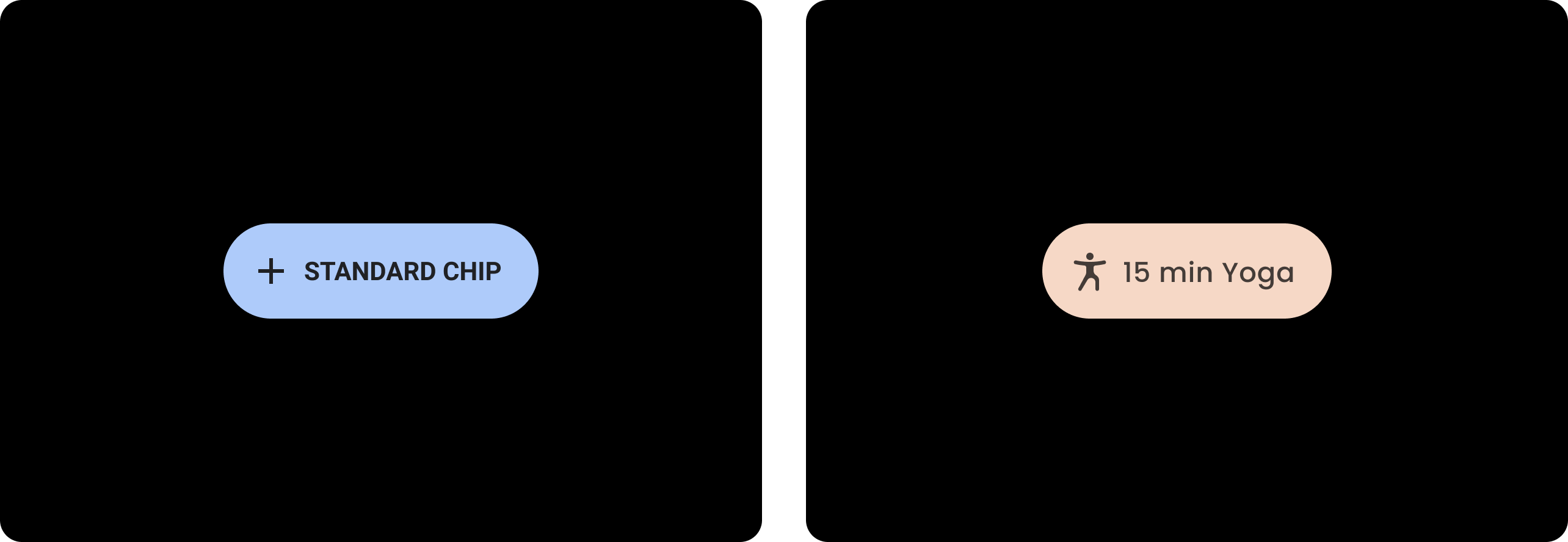
| Before
A baseline Wear Material chip with default styles. |
After
A customized Wear Material chip. |
Color
The color system supports setting custom colors for components, text, icons, and surfaces. Set your theme colors for the 13 following categories:
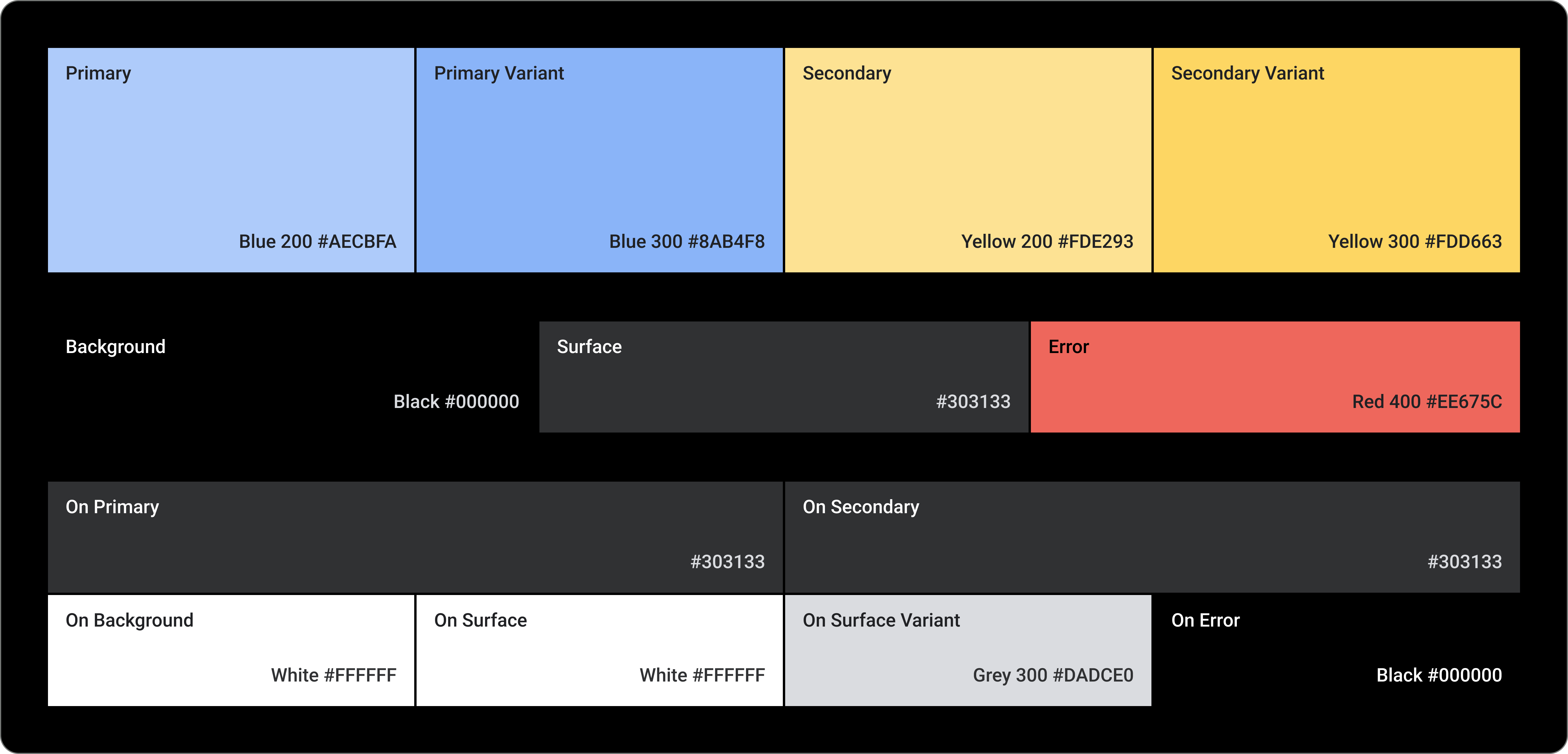
Primary
Primary Variant
Secondary
Secondary Variant
Background
Surface
Error
On Primary
On Secondary
On Background
On Surface
On Surface Variant
On Error
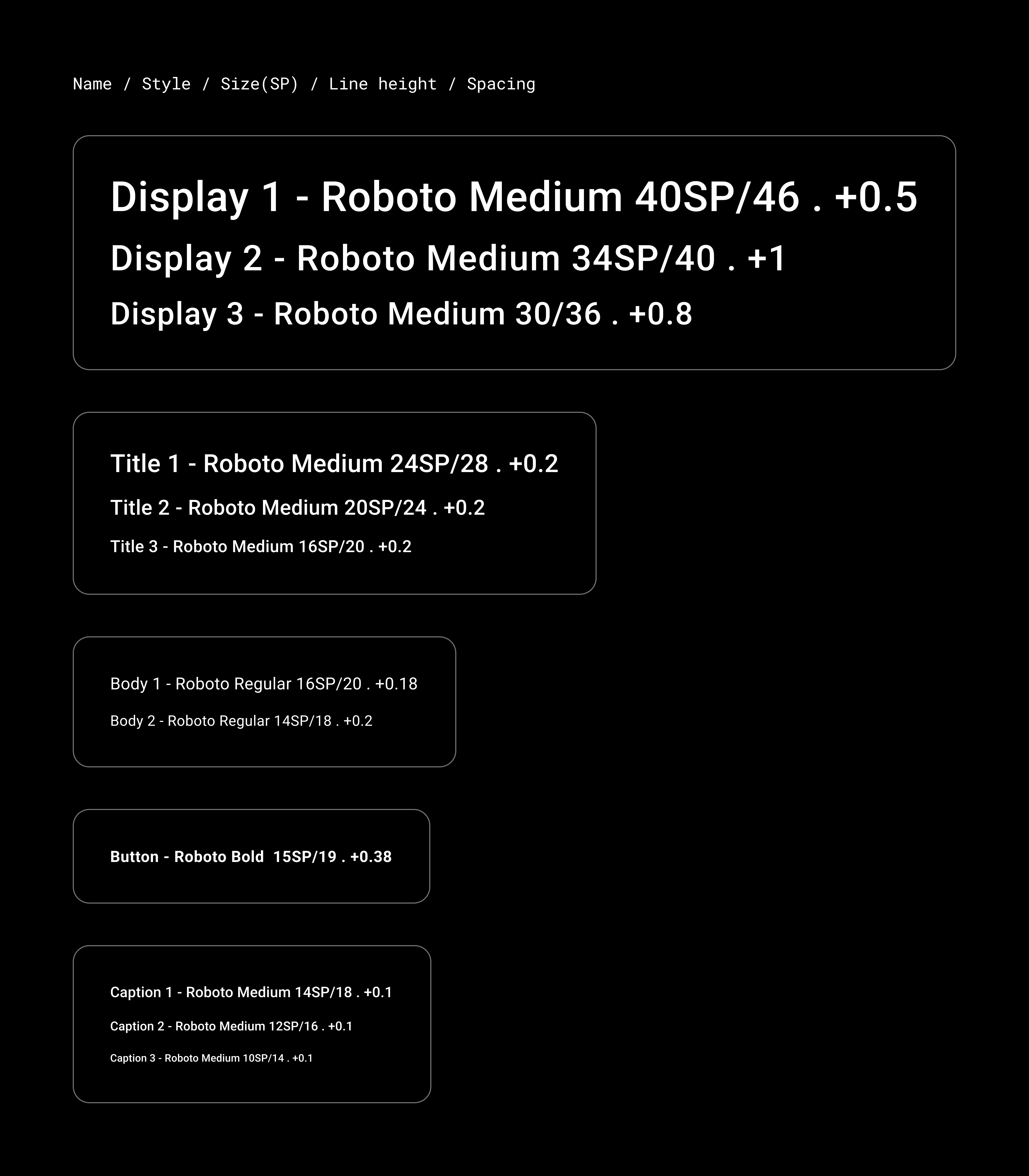
Typography
The typography system supports 11 categories that together form the type scale. This type scale determines the various type styles and sizes that appear on-screen, ranging from body copy to button text.
Typography attributes are controlled by values that can be customized for the type family, font, case, size, and tracking.