Widgets are a critical component for customizing a user's homescreen. They can often help users achieve a critical user journey for an app with a single tap, or provide a quick summary of an app's most important pieces of data. They can also be customized to fit the needs of the user and tailored to individual preferences.
The quality of a widget can impact user engagement with your app content and features. There are three main tiers of widget quality:
- Tier 3: Low Quality - don't meet the minimum quality bar and don't provide a great user experience.
- Tier 2: Quality Standard - is helpful, usable, and provides a quality experience.
- Tier 1: Differentiated - are exemplary widgets offering hero experiences that are personalized, and help users create unique and productive homescreens.
Tier 3: Low Quality
A widget is deemed low quality if it does not meet standard layout, color, discovery, and content criteria. For more information on building a best practice, high-quality widget, refer to the following guidelines.
Tier 2 - Quality Standard
To be considered good quality, the widget meets all of the following Layout, Color, Discovery, and Content criteria:
Layout
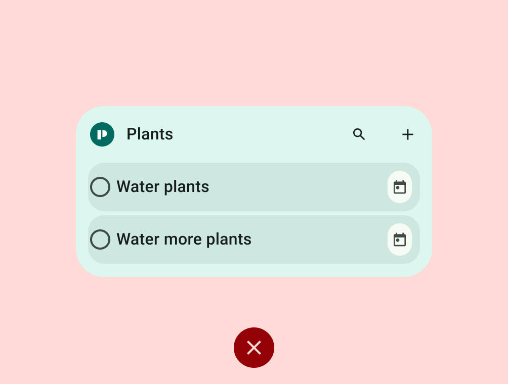
- Widget must fill the bounds
set by the launcher grid when dropped on the homescreen. Widget can be resized
to at least one of the following sizes : 2x2, 4x2 (launcher grid cells).
For more information, see
Sizing guidelines.
- Widget must align properly to other home screen elements on the vertical or horizontal axis, and does not occupy unnecessary space.
- Widget must touch at least two opposing edges of the grid. In other words, widgets don't need to be rectangular. They can have custom shapes, as long as the edges of the shape touch at least two edges of the grid.
- If resizable, widgets must have an appropriate min or max size, which can be
set with
minWidth,minHeight,maxResizeWidth, andmaxResizeHeightin the AppWidgetProviderInfo XML- Max size should be set if resizing the widget only adds blank space.
- Min size should be set based on the minimum size your widget still offers value and meets touch target requirements (48x48).

Do
Don't
Color
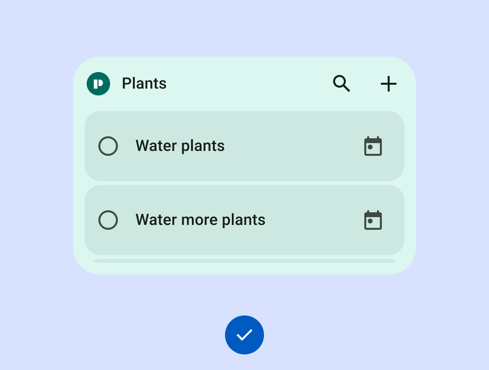
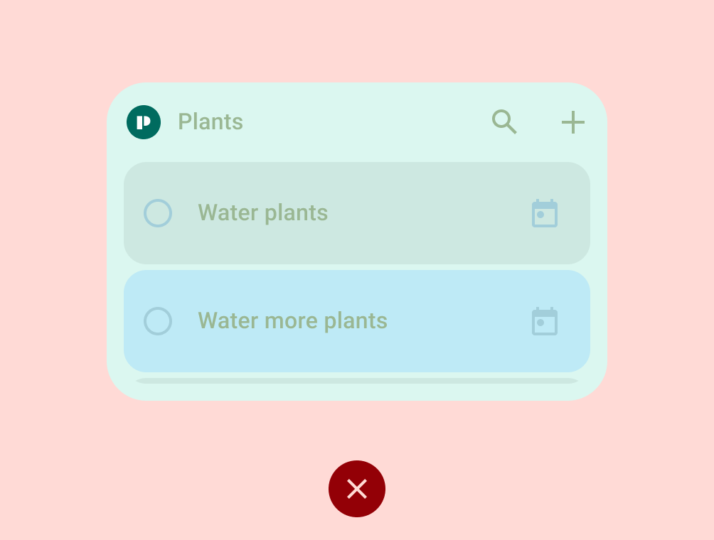
- Widget text and icon buttons must have sufficient contrast ratios to meet accessibility requirements (excludes thumbnails and images).
Do
Don't
Discovery
Widget must have accurate previews in the Widget picker. This can be set with
previewImageandpreviewLayoutin the AppWidgetProviderInfo XML, or with Generated Previews.- Widget preview looks consistent with functionality that is offered when added to the homescreen.
Video 1: Widget with inaccurate preview.
Content
- Widget content must not be consistently stale or untimely.
- Widget must update after user completes an action from the widget.
- Widget must update after user completes a related action from within the app
- Widget must let users manually refresh content, if there is an expectation the data refreshes more frequently than the UI.
- Widget UI must be functional or content is cropped.
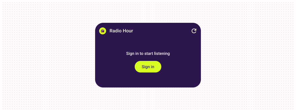
- Widget zero and empty states must be intentional and must show the value of the widget or provide a call to action, when the widget is installed but the user is not yet logged in.
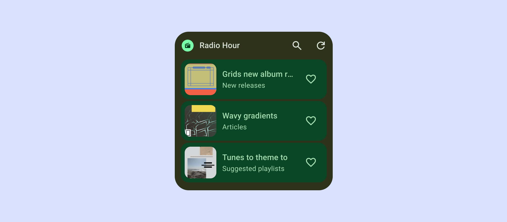
Tier 1 - Differentiated
The best widgets meet all of the Tier 2 criteria and all of the following Layout, Color, Discovery and System Coherence criteria.
Layout
- Widget fills the bounds and aligns properly to other home screen elements on
the vertical or horizontal axis, and does not occupy unnecessary space
- All shapes MUST hit all four edges of the bounds of the grid
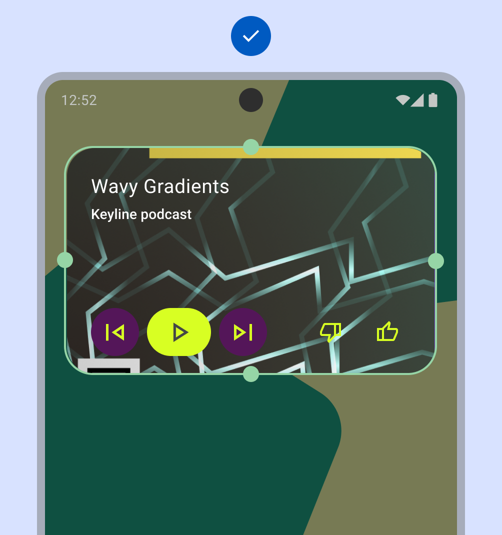
Do
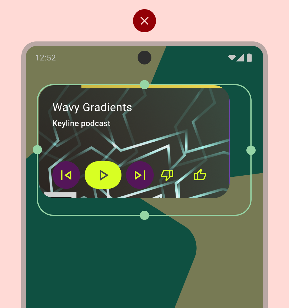
Don't
Widget supports a preferred size
- Widget can be resized to at least one of the following sizes : 2x2, 4x2
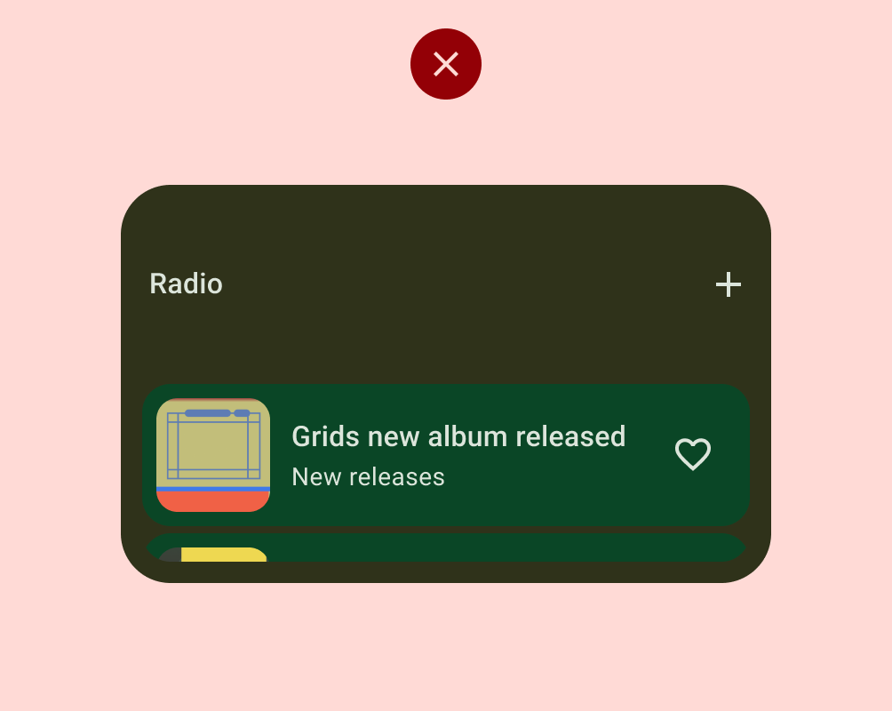
Widget header is used and applied consistently
- Recommend use of header if:
- You want to provide deep links to certain app functions like search.
- You want to apply an app branding icon which doubles as a consistent link back to the app on tap.
- Widget contains scrolling content (list, grid, etc)
- Header content provides helpful context (name of to-do list)
- Header is optional when:
- Widget is a full bleed image (Photos)
- Space is limited (< 2 rows tall)
- When header content is redundant.
- If using a header, meet our spec:
- Icon, Title, Actions.
- Icon is always present
- Title appears when there is sufficient space
- Actions based on widget context.
- Height 48dp, Padding, 14dp
- Icon, Title, Actions.
- Recommend use of header if:
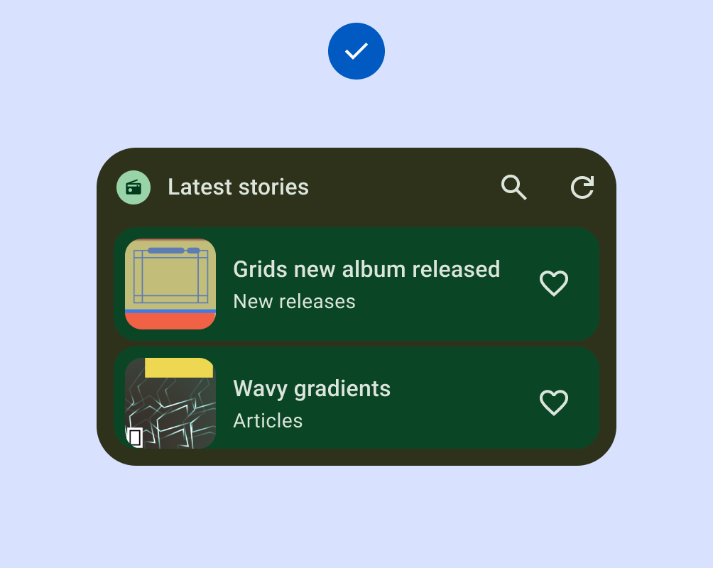
Do
Don't
Color
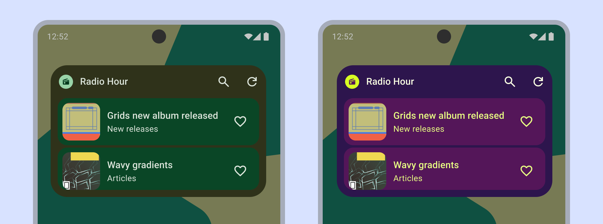
- Widget supports color palette based on system theming, content color, or
brand color.
- Widget supports Light and Dark mode palettes.
- Dynamic color is an example of device context theming.
- Local color extraction is an example of app content based theming.
- Semantic color is an example of app content based theming.
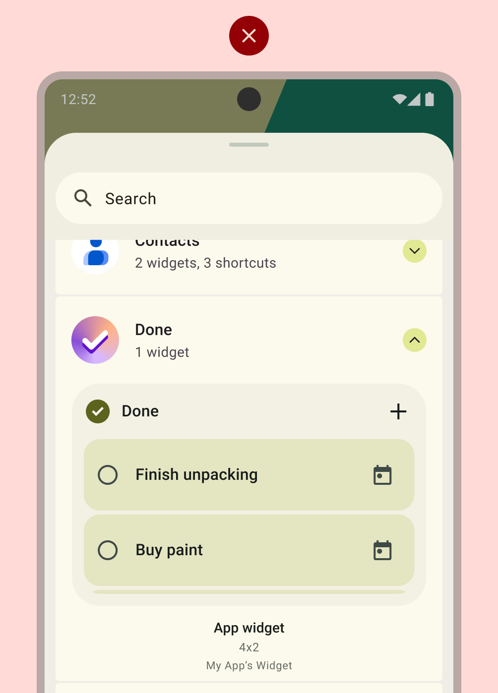
Discovery
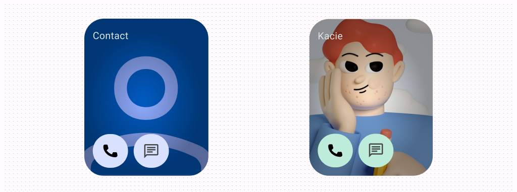
- Preview includes user-content or applies system theme (Generated
Previews api or
previewLayoutin the AppWidgetProviderInfo XML).
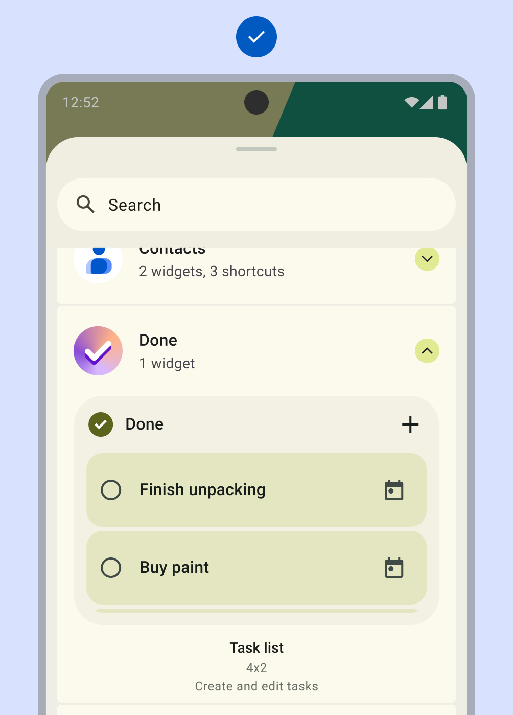
- Widget has a name or description that helps users understand the value
of the widget.
- The name is less than 50 characters long.
- The name and description are unique within the app. For example, the app can't have multiple widgets named the same thing.
Do
Don't
System Coherence
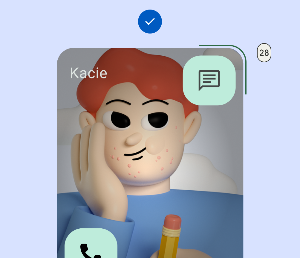
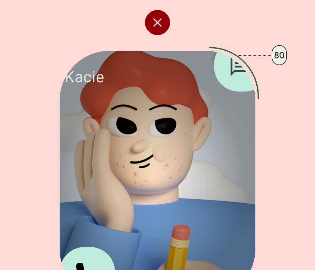
- Rectangular widgets must use the corner radius provided by system (OEM specific)
Do
Don't
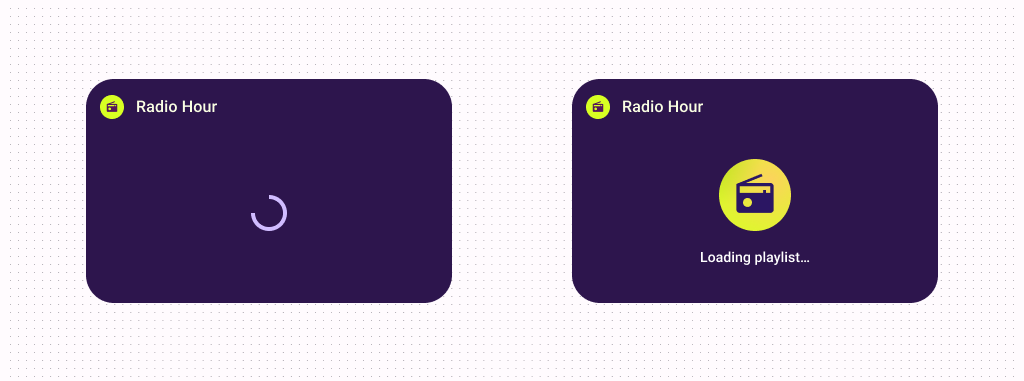
- Shows a loading state with a progress
indicator
(within an
initialLayoutwith themed color or branded equivalent).
- Uses system configuration instead of a custom widget settings entrypoint
- Uses system launch transition when entering/exiting app to widget
Remember the tips offered in this guide when creating your widget. You want to provide the best quality and a great user experience. Many quality bars can be met with Canonical Layouts. To learn more about quality bars, designers refer to the Android Widget Templates, and developers refer to Layout code samples in our Platform Samples & the Layouts developer guide.
