Color considers display, environment, and cognition. Color on glasses uses a highly-refined palette to support the behavior of additive displays and to optimize for visual comfort. The use of color on glasses should be used judiciously to harmonize with the real world, to indicate important actions, display imagery or provide semantic meaning.
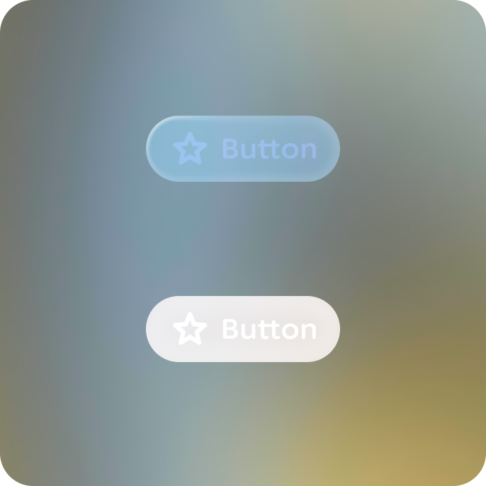
Black is transparent on optical-see-through display. Keep this in mind when designing as darker color will appear dull or transparent, but this can also be used to create depth.
Color scheme
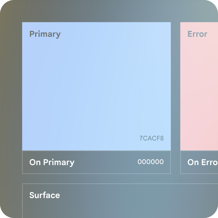
The glasses color scheme (collection of color tokens or roles to theme the color of your app) consists of 3 accent roles, 6 surface (or neutral roles), and their on-color counterparts. The color roles are similar to their mobile scheme roles and should be used in the same manner.
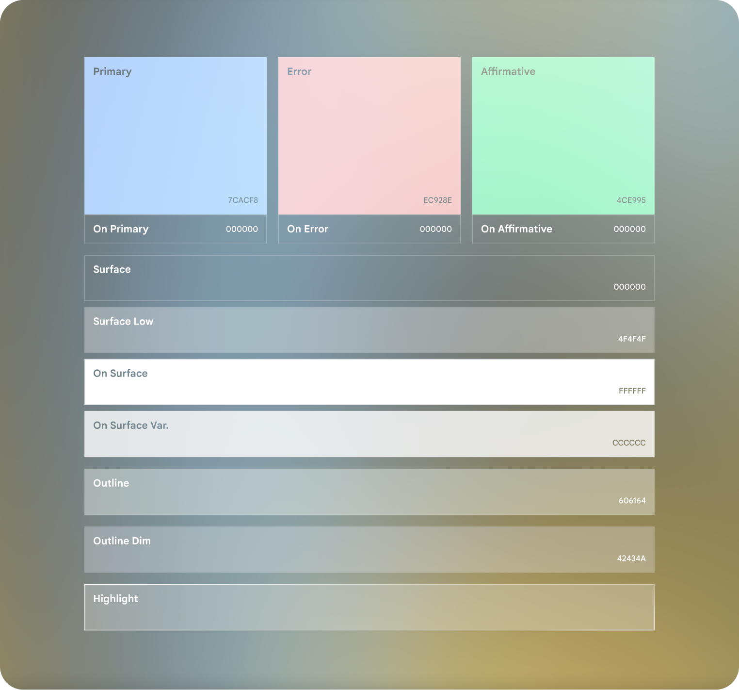
Accent colors can be used for on color as limited emphasis.
Do
Don't
Customize color
When customizing colors for glasses, minimal visual obstruction and harmonization with the real world is crucial, prioritize legibility across varying lighting conditions. Carefully calibrate colors to balance brightness against saturation to be instantly discernible.
Primary color can be customized to use your brand or primary interaction color. Consider the contrast, saturation, and power usage of the chosen color.
Optimized brand and semantic colors
Colors that represent brand, actions, or system alerts must be:
- Bright enough to be legible
- Saturated enough to be discernible as a color
- Ensure at least a 66% tone difference between foreground and background using the HCT color space.
Learn more on Jetpack Compose Glimmer theme.
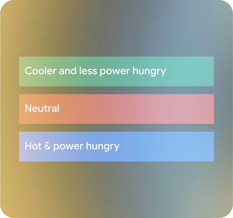
Power usage
Some colors use more power and generate more heat than others. Green is the least power hungry, blue is the most, when comparing colors of equal tone as seen on the right. Minimize the number of pixels you light up. The brighter the screen, the hotter the display gets. Don't fill the screen with all white, as this can cause thermal mitigation.
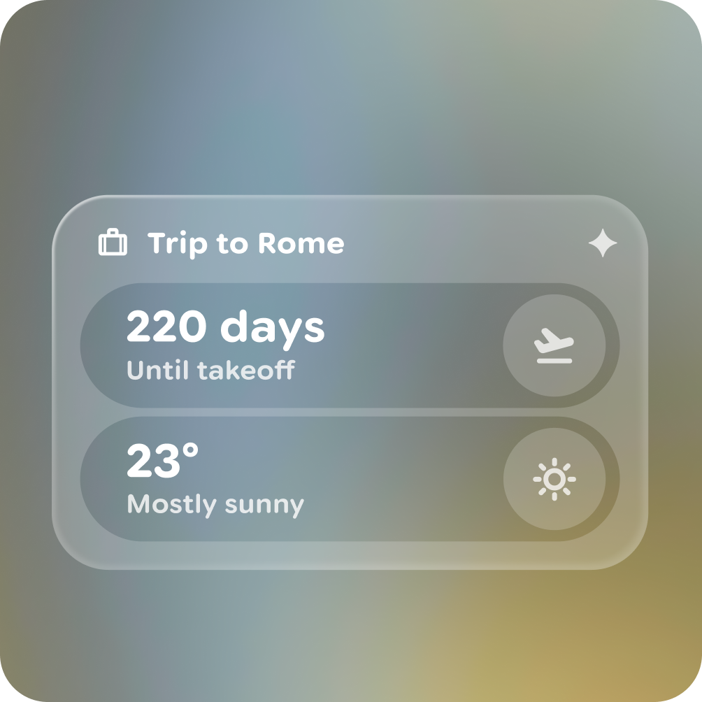
Do
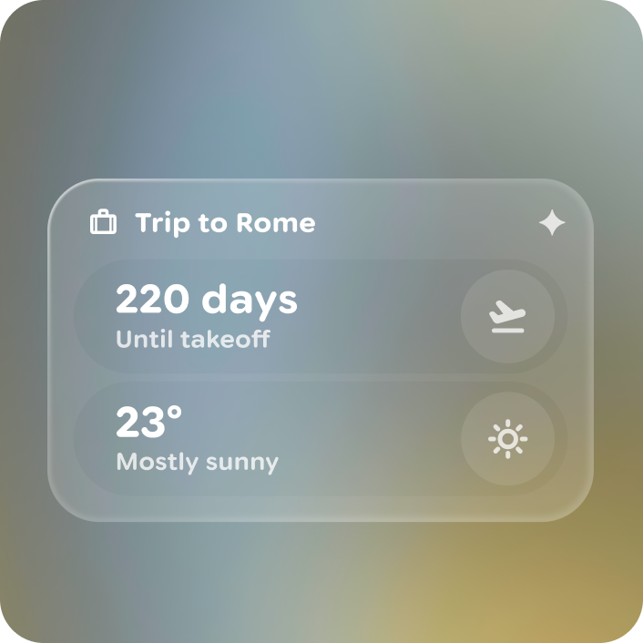
Don't

Do
Don't
Customized surfaces should be avoided.
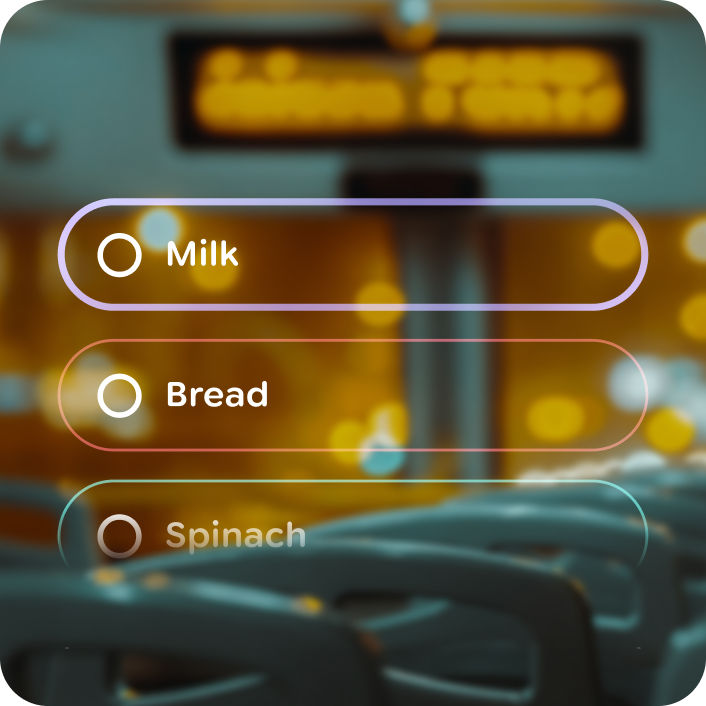
Dark container colors
Containers generally must focus on displaying content that is within them, without being distracting:
- Surfaces must be black for highest contrast.
- Surfaces should be no lighter than 34% tone in their focused state to maintain legibility for foreground elements.
- Outlines should be visible but subtle.
Do

Don't
Do
Don't
Do
Don't
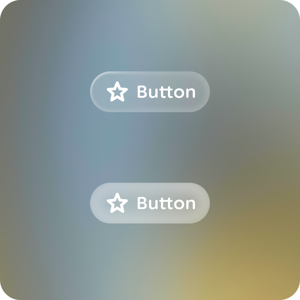
Outline customization is possible to add branding or expressive UI.
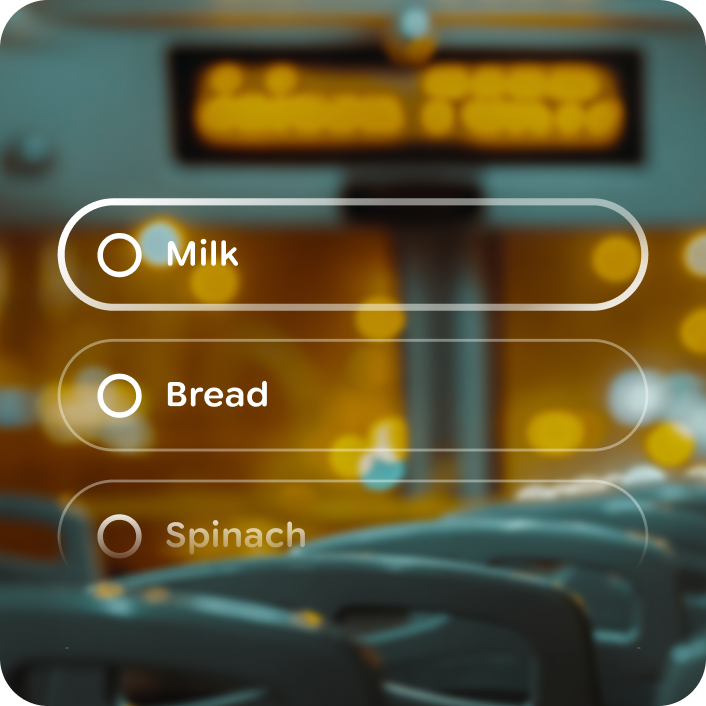
Do
Don't

Warning
 Customizing the outline focus with blue: the focus state highlight is made of 2
outlines, color is applied to layer 2 to tint the focus state.
Customizing the outline focus with blue: the focus state highlight is made of 2
outlines, color is applied to layer 2 to tint the focus state.
Do