Type is optimized for comfort and glanceability for AI glasses this includes an optimized typescale and font family characteristics.
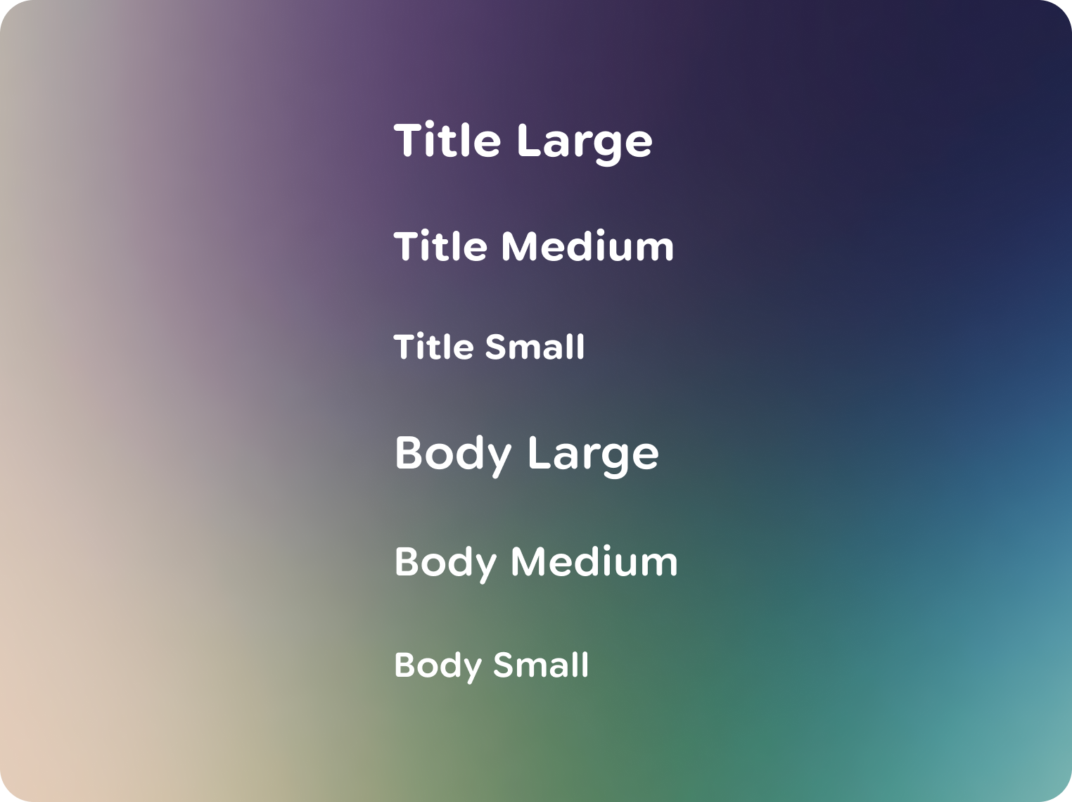
Jetpack Compose Glimmer has an optimized default typescale. Composed of two roles with 3 styles each, type roles are based on their purpose and hierarchy.
You can find the typescale roles and values in the Jetpack Compose Glimmer Figma kit, along with type role use in the components.
Measured in degrees
Interfaces, including text, on glasses are measured in angular degrees, not pixels or points. This unit of measurement corresponds to how much space UI takes up in the user's field of view. The size of type changes based on how far away it appears.

The minimum size for text is 0.6°
Most text should be between 0.7° - 0.9° Based on legibility research, the minimum size for readable body text is around 0.6° at any given depth. To meet the minimum legibility metric, text must be at least 18px in size. 30 PPD × 0.6° minimum = 18px text size.
Customize fonts
Fonts like Google Sans Flex can be optimized for glasses display. If using Google Sans Flex, you can optimize your font through variable font axes to make adjustments that create a more comfortable reading experience:
- Optical size, optimizes letterforms for each point size
- Roundness axis to adjust formality
- Wide range of weights and widths
Halation and chromatic aberration in glasses displays spreads light in all directions, causing the boundaries of the letters to disappear. Rounded letterforms can mitigate halation and chromatic aberration in glasses displays due their simplified letterforms geometry. Consider letter spacing, letterform shape and glanceable sizing improves readability and comfort.
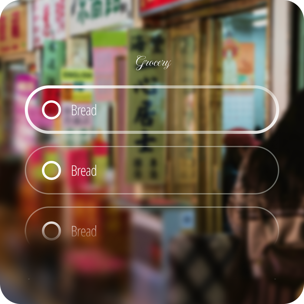
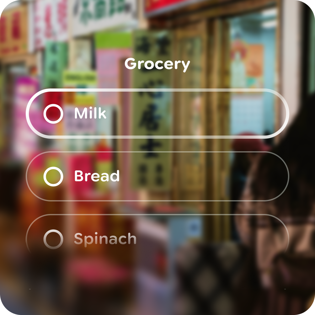
 Here Google Sans Flex has been replaced with Nunito, a rounded font at an
increased weight axes.
Here Google Sans Flex has been replaced with Nunito, a rounded font at an
increased weight axes.
These principles are based on optical science for this specific display form-factor, and adhering to them is key to creating a comfortable and legible user experience.
Do