
Components are purpose-built building blocks for building your UI. Your app should utilize Jetpack Compose Glimmer for components as they are optimized for the unique use cases of displays on AI glasses.
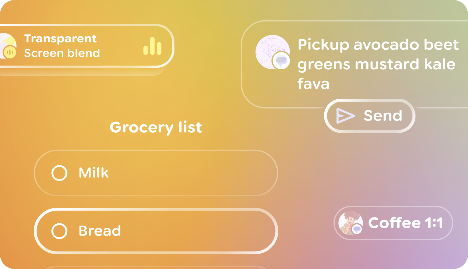
Optimized components
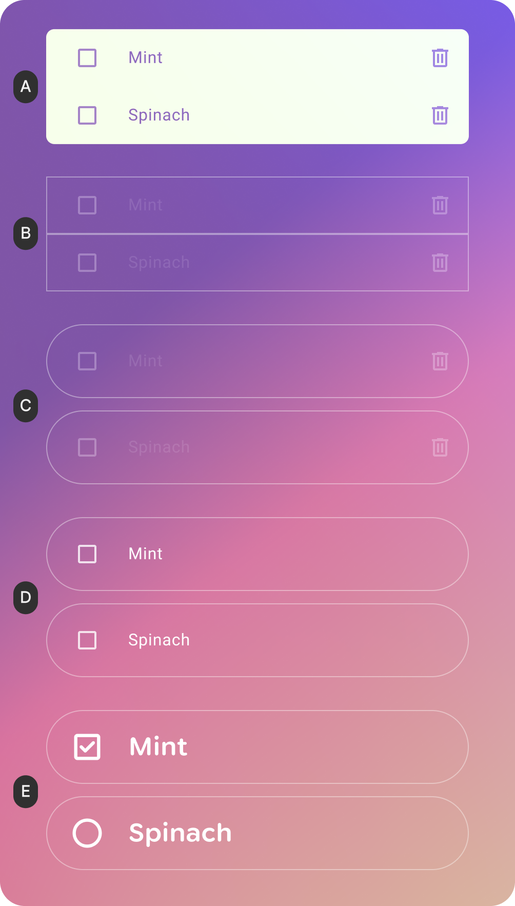
A. Surface color: Surfaces need to have transparency, so the opaque surface color here would be changed to black to make it transparent.
B. Outline & Highlight: The Outline color is optimized for contrast. The use of a highlight provides visual expression and might be used to indicate some types of input.
C. Shape: A softer shape system is used to improve glanceability by reducing the sharpness of corners and improving comfort. On Surface color: The On Surface color of content is white to maximize contrast against the world.
D. Typography: Glimmer's typography scale uses a small set of refined Body and Title styles that optimize kerning, size and weight for optimal readability & legibility.
E. Iconography: The use of rounded Material Symbols coheres with the rounded typography scale.
Get started
Ready to implement components? Check out the Jetpack Compose Glimmer documentation.