
Jetpack Compose Glimmer is built on Jetpack Compose and includes composables, components, behaviors, and a theme that are designed for AI glasses with a display. With Glimmer, you can build native UI for display glasses using Compose, bringing your app experiences to life with less code, powerful tools, and intuitive Kotlin APIs.
Jetpack Compose Glimmer composables
Jetpack Compose Glimmer provides @Composable functions tailored for AI
glasses displays, such as Text, Button, and ListItem. Here
are some unique characteristics of Jetpack Compose Glimmer composables:
- Simplified styling: The
Surfacecomponents, for example, default to black or transparent backgrounds for optical display optimization. - Optimized color defaults: Jetpack Compose Glimmer calculates content color based on background color by default, so developers rarely need to manually set text colors, enhancing legibility without any additional work.
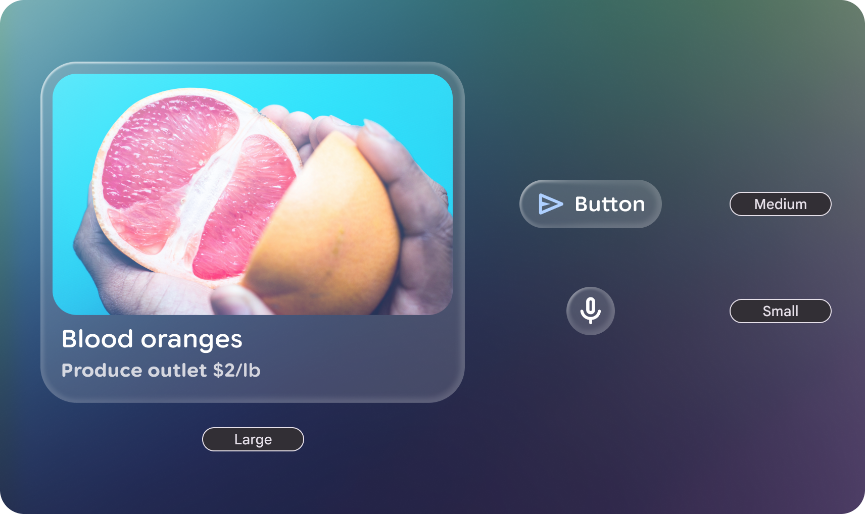
Differentiated focus: Focus is indicated using outline-based visual feedback instead of the ripple effect, which promotes clear visibility.
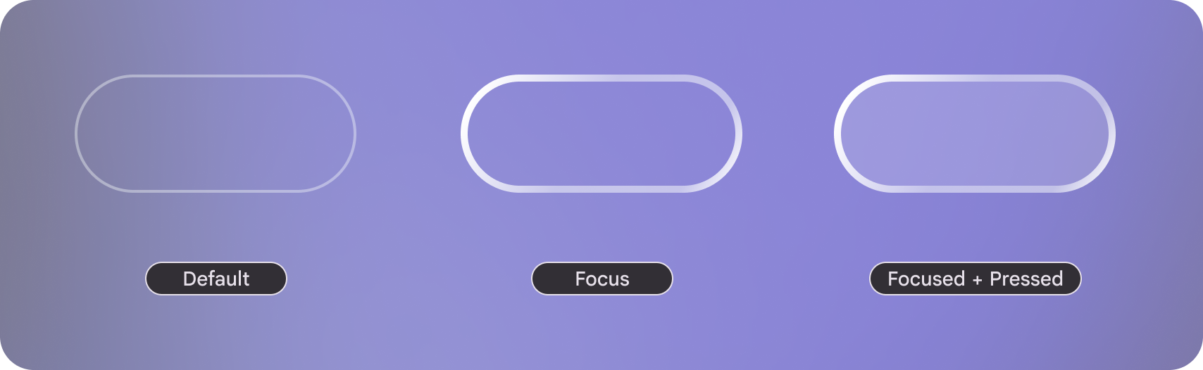
Figure 1. Three focus states in Jetpack Compose Glimmer, which are differentiated using outline-based visual feedback. Optimized Elevation: Jetpack Compose Glimmer uses limited box-shadows for visual separation
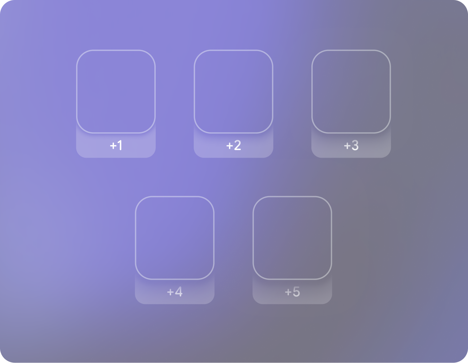
Figure 2. Five levels of elevation in Jetpack Compose Glimmer, which are differentiated using limited box-shadows.
Jetpack Compose Glimmer components
Jetpack Compose Glimmer features its own set of custom-designed components, similar to the components in Jetpack Compose, but specifically optimized for the unique visual and interactive demands of display glasses. Jetpack Compose Glimmer components are customizable with Jetpack Compose Glimmer's theme and build on lower-level Compose features to support user input methods like tap and swipe by default.
To learn more about using a specific component, see the following guides:
- Buttons
- Cards
- Icons
- Icon buttons
- Lists
- List items
- Surfaces
- Text
- Toggle buttons
- Title Chips
- Vertical stacks
If one of these high-level components doesn't work for your use case, you can
use a surface to build a custom component. Surfaces are the most-basic
building block in Jetpack Compose Glimmer—a blank canvas for any specific,
custom designs or interactions that you want to build.
Jetpack Compose Glimmer modifiers
Modifiers in Jetpack Compose Glimmer function identically to Compose modifiers, which let you augment composables by customizing their layout, appearance, and behavior. Jetpack Compose Glimmer includes modifiers and unique defaults for glasses-specific visual feedback and performance.
Jetpack Compose Glimmer's theme
Jetpack Compose Glimmer features a dedicated theming system for display glasses.
Jetpack Compose Glimmer's theme implements a simplified and optimized palette of
colors, typography, and shapes. This promotes maximum visibility and conciseness
for display glasses. All Jetpack Compose Glimmer components are designed for
automatic integration with glasses-specific input methods. Jetpack Compose
Glimmer's theme is exposed using the GlimmerTheme class.
Like other themes in Jetpack Compose, GlimmerTheme includes several
subsystems which are briefly outlined in the following sections along with their
customizable attributes:
- Colors
- Typography
- Component spacing values
- Shapes
- Depth effect levels
- Icon sizes
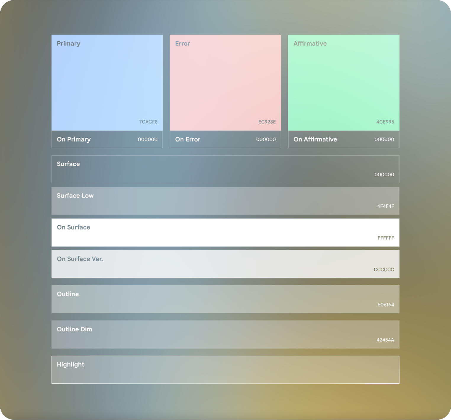
Colors
Jetpack Compose Glimmer's color system is designed for additive displays
and real environments. Unlike standard Android themes, the GlimmerTheme
Colors prioritize dark backgrounds with semi-transparency and vibrant
accents to ensure content is legible against unpredictable real-world lighting.
The system uses a three-part palette with primary, secondary, and neutral colors. Neutral colors often serve as the physical surfaces of the spatial UI, while the primary and secondary colors provide clear visual cues for interaction and branding.
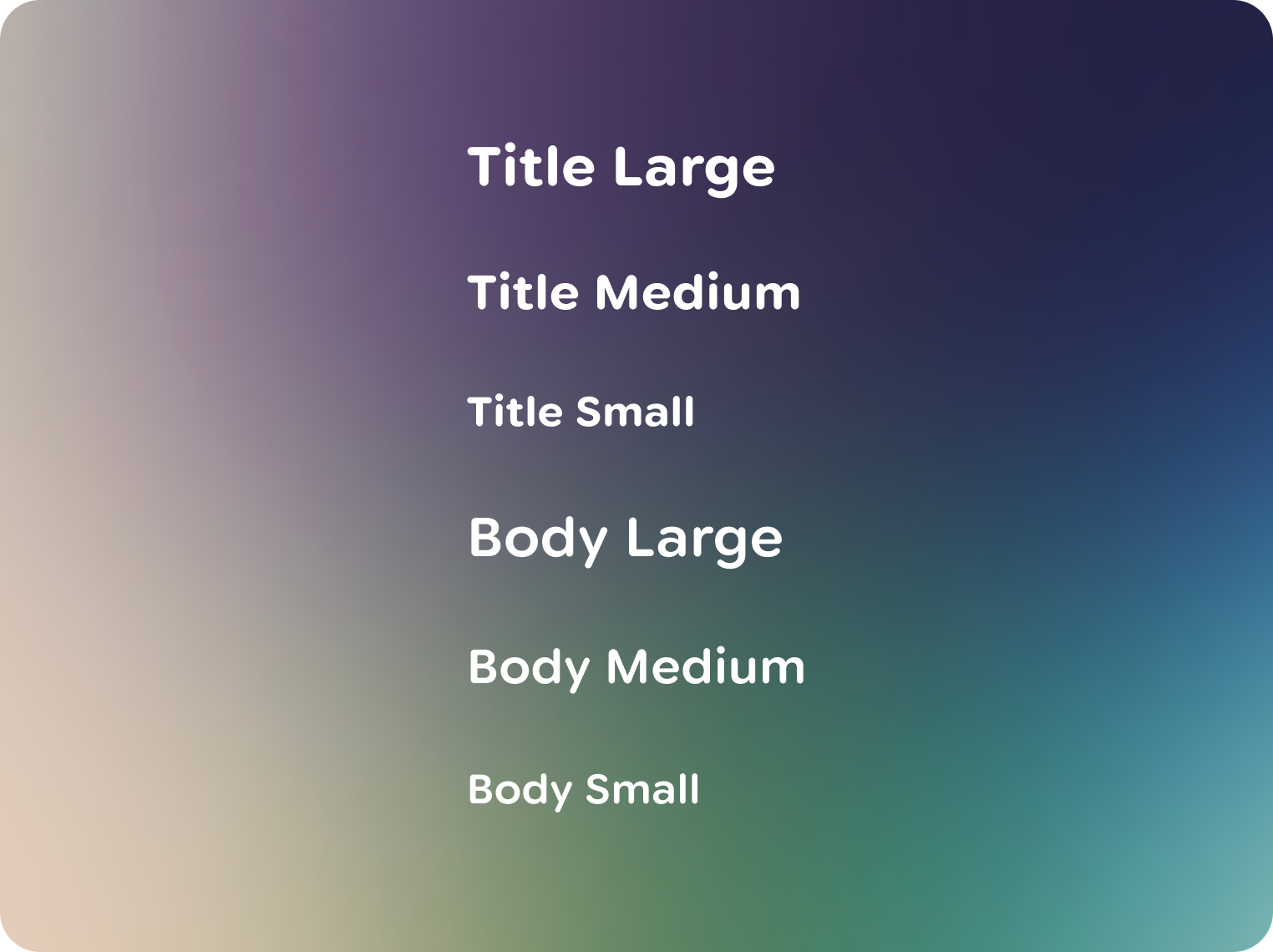
GlimmerTheme.Typography
Jetpack Compose Glimmer's typography system includes various typography styles
for legibility and conciseness on display glasses. These styles are designed to
maximize contrast and improve text readability through bolder weights, wider
letter spacing, and appropriate line heights. These styles are exposed through
GlimmerTheme.typography.
Component spacing values
These values are used to ensure consistent spacing across Jetpack Compose Glimmer components. This includes component paddings, spacing between components, and other spacing elements. Note that changing these values affects the default sizing of most components.
Shapes
Jetpack Compose Glimmer's shape system defines a set of standard corner
treatments and geometric forms for components, designed to create a consistent
and minimalist visual language on display glasses UIs, with all shapes exposed
through GlimmerTheme.shapes.
Depth effect levels
Jetpack Compose Glimmer components use depth to represent hierarchy, which
helps to visually distinguish elements that display above (on top of) other
cards. Depth on display glasses is the combination of placement in z-space and
shadows. For most high-level components, such as list items, depth is
automatically applied based on focus state. When a component is focused, it
gains depth; when it loses focus, it returns to its normal state. However for
working with custom components, you can use the depthEffect parameter on
Modifier.surface, or depthEffect.
Icon sizes
Jetpack Compose Glimmer's icon system is designed to coherently integrate with the simplified visual language of display glasses UIs, often leveraging rounded forms like Material Symbols Rounded for optimal readability.