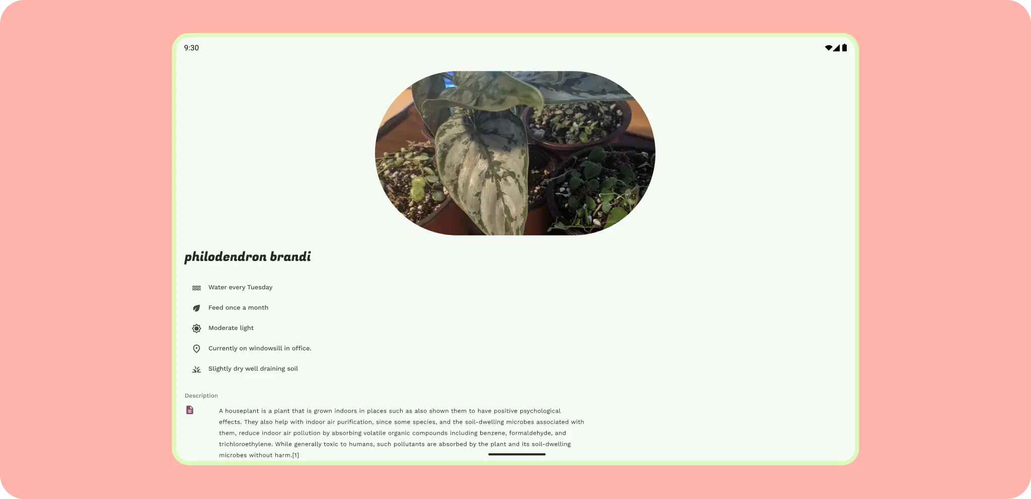
Adaptive design is the practice of designing layouts that adapt to specific breakpoints and devices.
To implement adaptive layouts effectively:
First, consider the device's window class width to determine layout changes, then adjust for height. Support different screen sizes.
Android leverages responsive design concepts, similar to web development, employing flexible grids and images to create layouts that respond effectively to their context.
Allow layouts to respond to a variety of sizes with adaptive methods: reflow, reveal, presentation change.
Avoid locking your app to portrait only. This causes letterboxing when your app is resized.
Don't
For design guidelines about adapting layouts to expanded screen sizes, read the Support different screen sizes developers guide in Compose and the M3 Applying Layout page. You can also check out the Android large screen canonical gallery for inspiration and implementation of large screen layouts.
Think adaptive
Adaptive should be be the default when designing your app. The Android mobile market is constantly evolving, so you can't only think of mobile as handset phones. Instead it should include everything from handset phones, foldables, tablets, and everything in between.
While certain features and use cases may not make sense on every screen size or form factor. Adaptive design allows your users more freedom regarding ergonomics, usability, and app quality.
Methods and quality
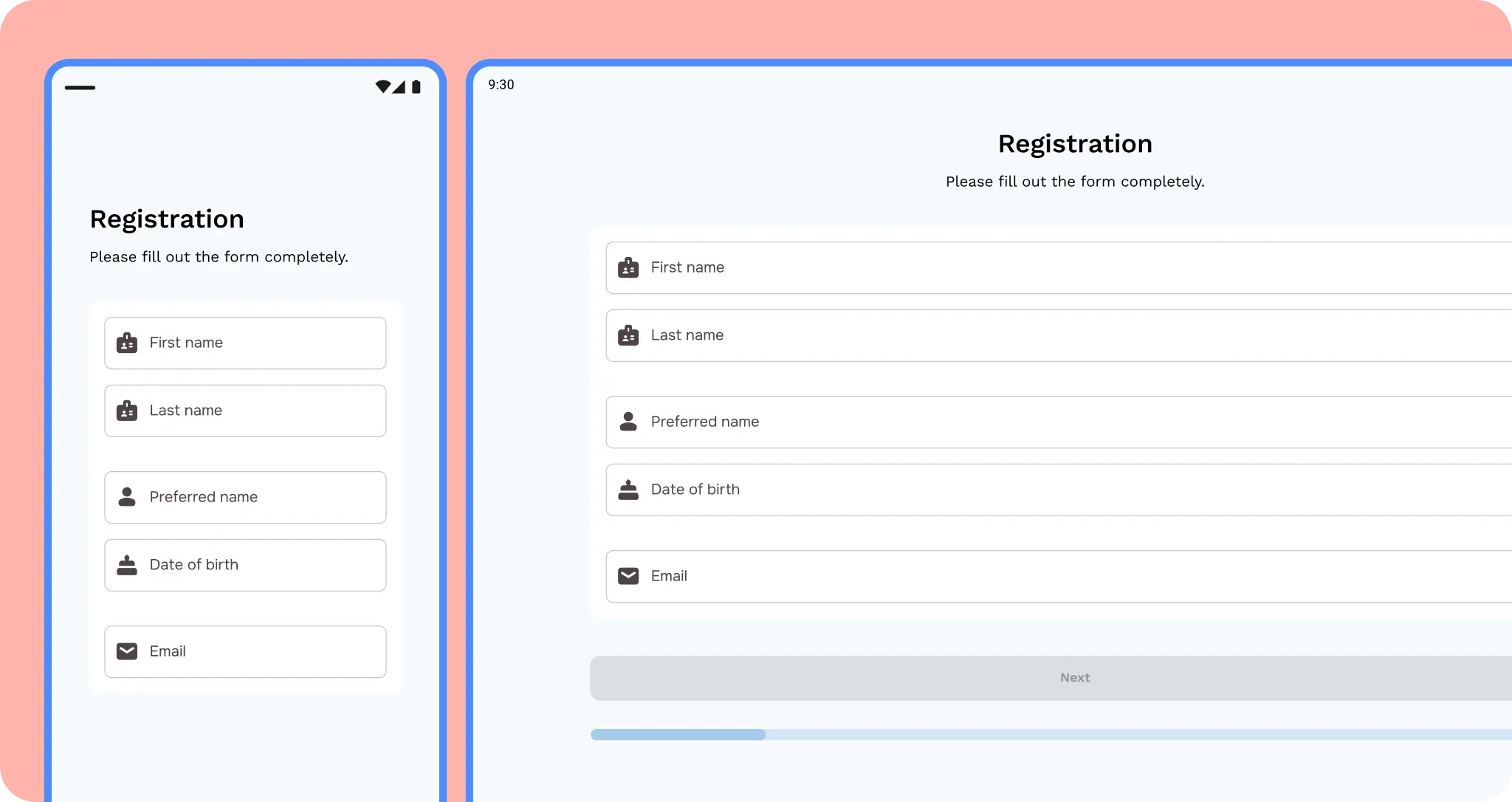
You can start by designing key screens (communicate the essential concepts or your app) with class sizes as breakpoints to act as guidelines for the rest of your app. These hero experiences can highlight differentiated adaptive and form factor qualities. Or design content to be responsive at a foundational level by notating how content should be constrained, expand, or reflow.
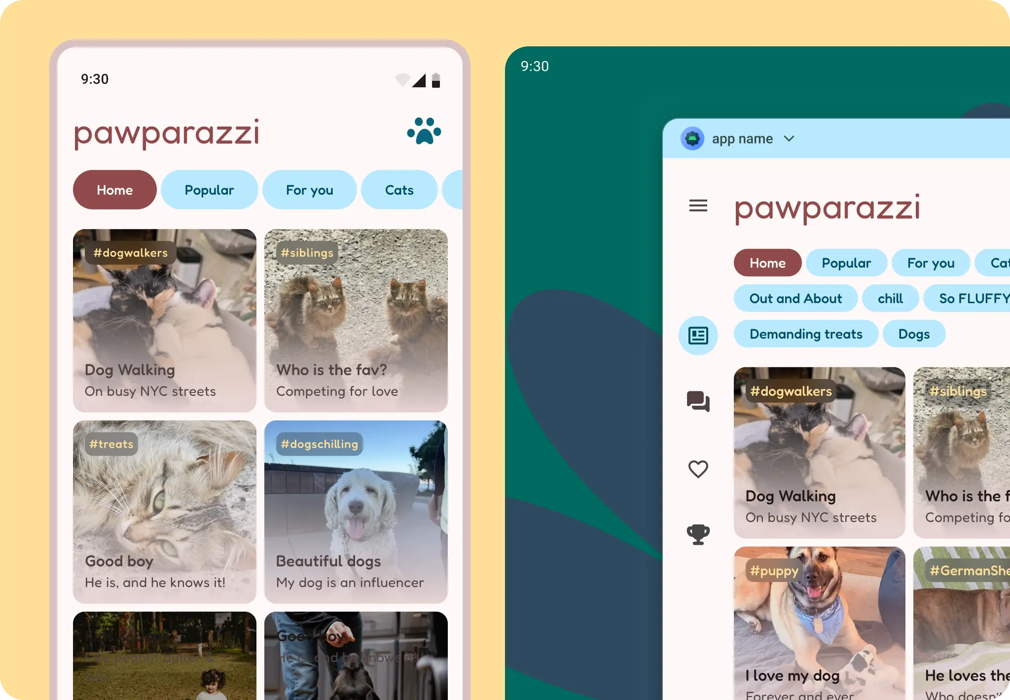
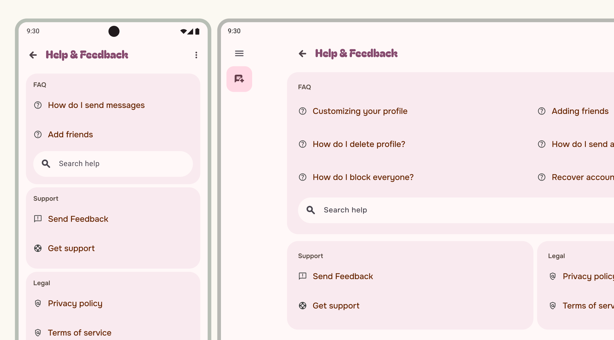
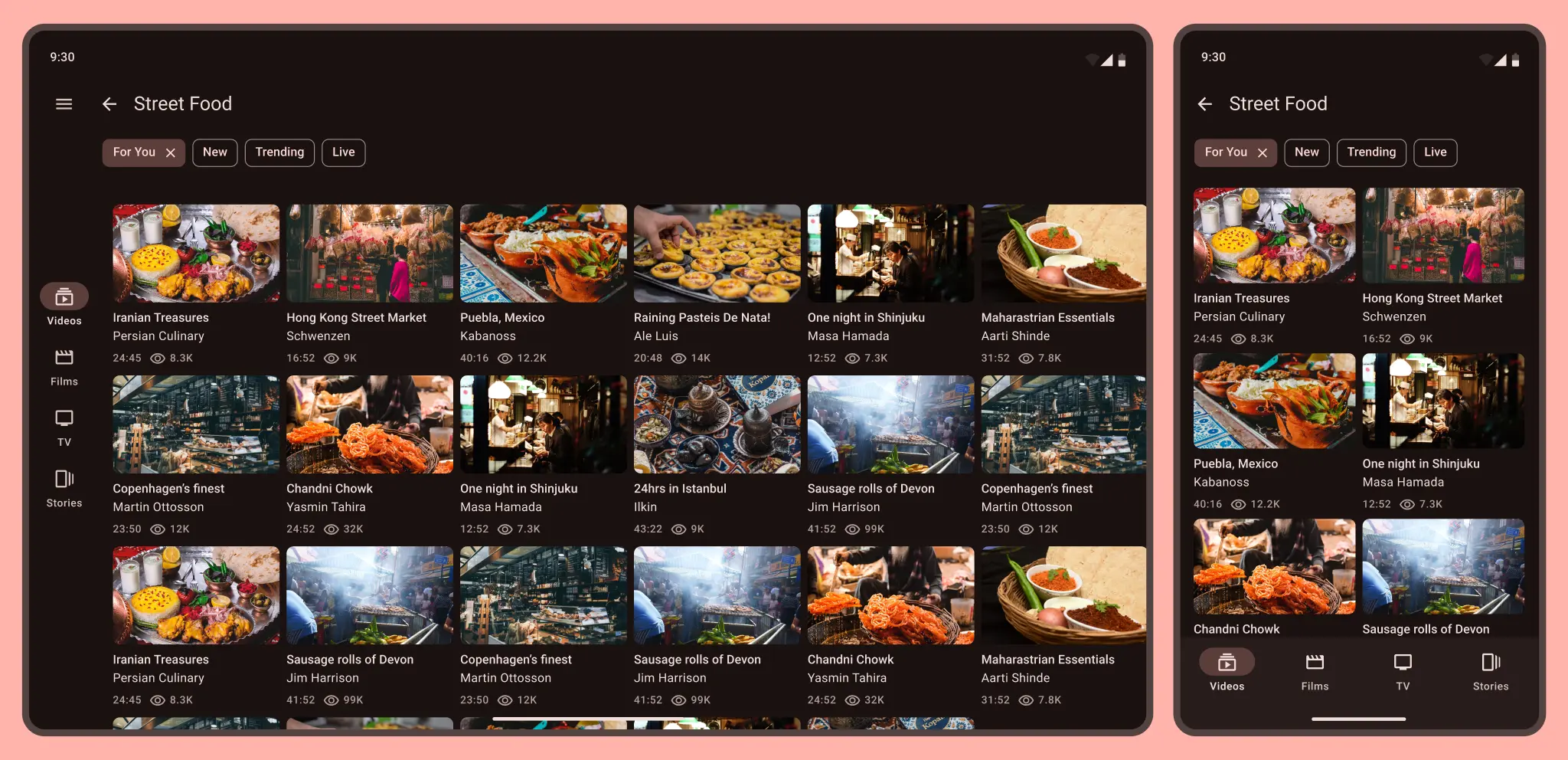
In this example, the navigation and content reflows, flexes, and scales for better ergonomic navigation. The layout grid expands from vertically oriented to multi-column. The address in the app bar and filters reflow and flex to fit the layout grid.
Do
Don't
Do
Do
Don't
 Make sure inputs and buttons are not stretched.
Think in terms of containment and panes.
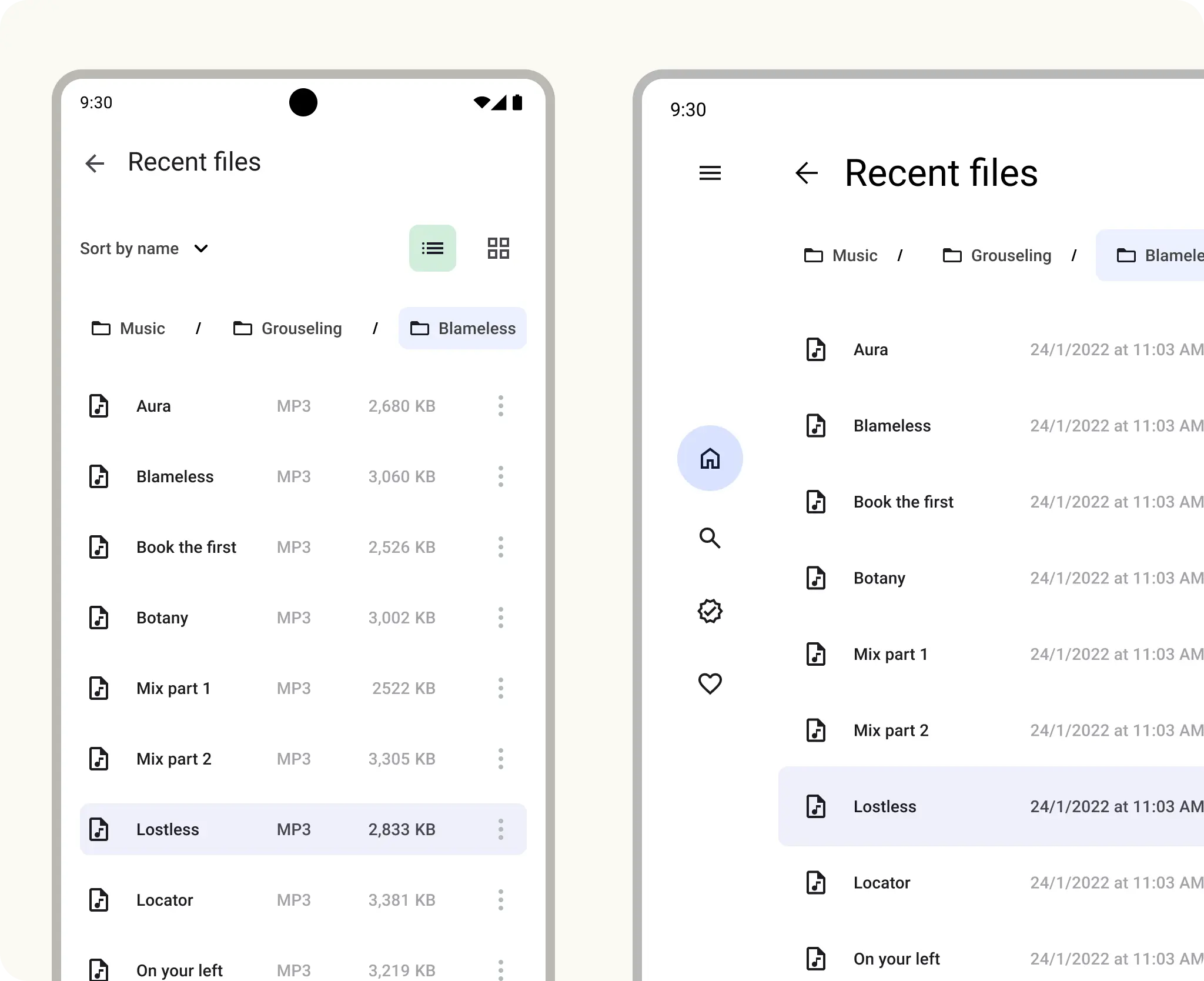
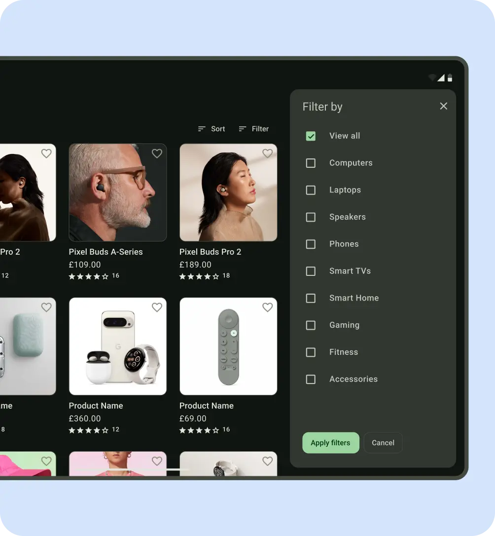
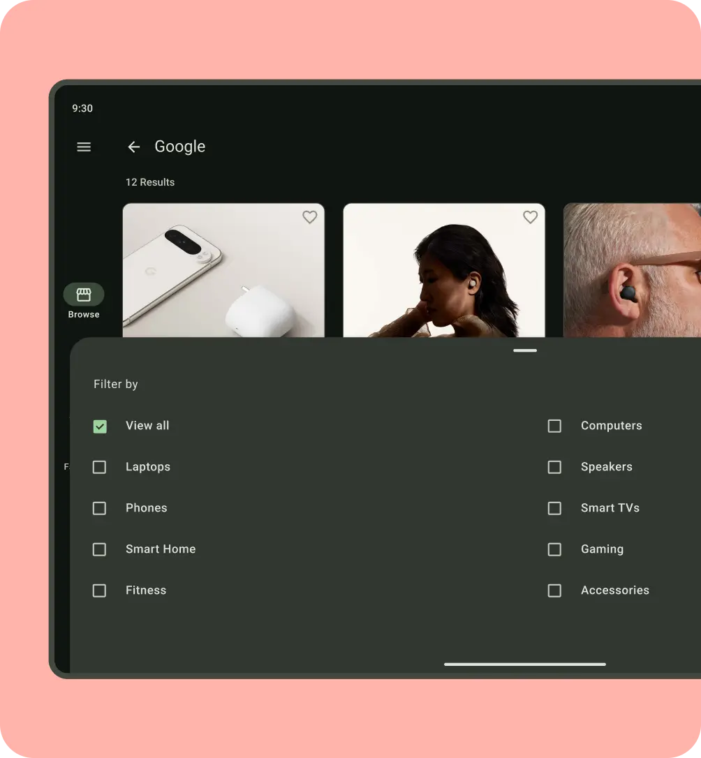
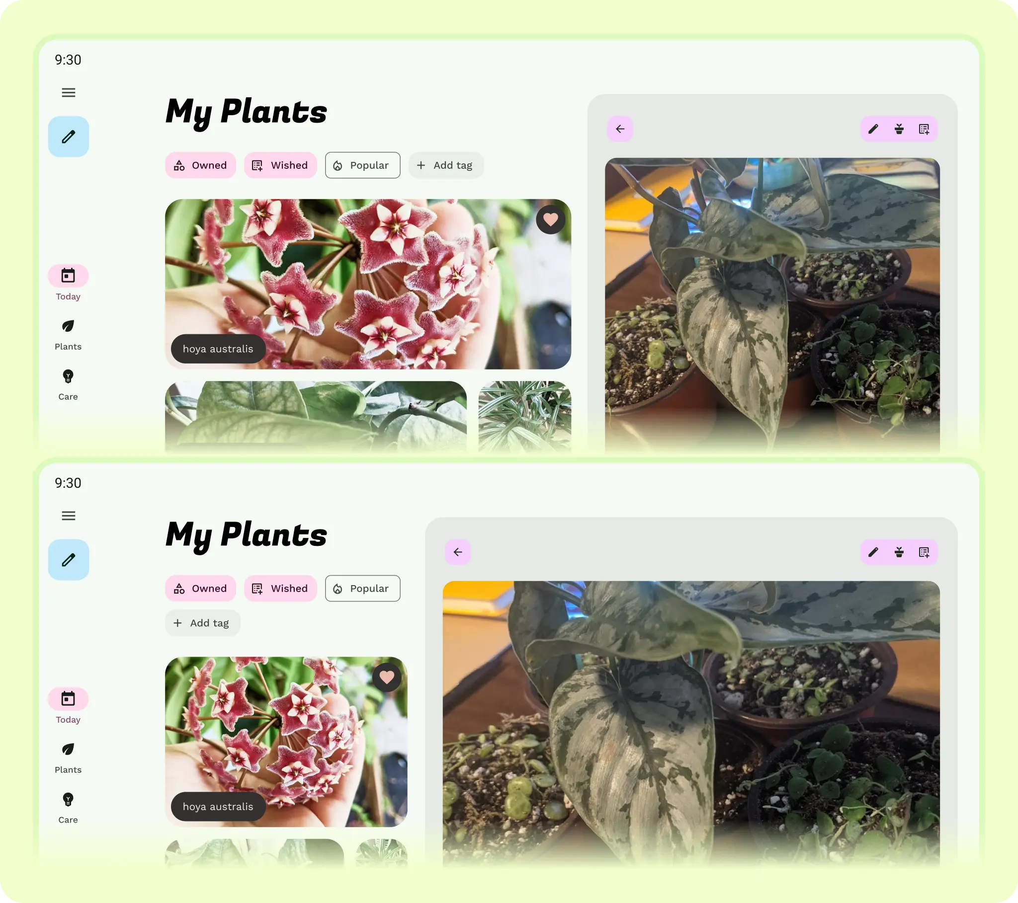
Use the containment concept of panes to group content for adaptive layouts. For example, the example used is a detail screen, one pane that could be shown in a list-detail layout.
Compact sizes should stick to a one pane layout.
Medium can use 1–2 pane layouts.
Large and extra-large can use multiple pane layouts.
Use intrinsic and visual containers to group elements together. Panes can move in, hide, expand, be constrained, or pop up. Thinking with panes makes designing across all mobile devices easier.
While panes are not essential on large screens, you should still think of content in containment groupings for flexibility.
Allow elements to shift and rearrange by focusing on how elements adapt to the grid. Consider vertical change for elements and combine with constraints and presentation changes.
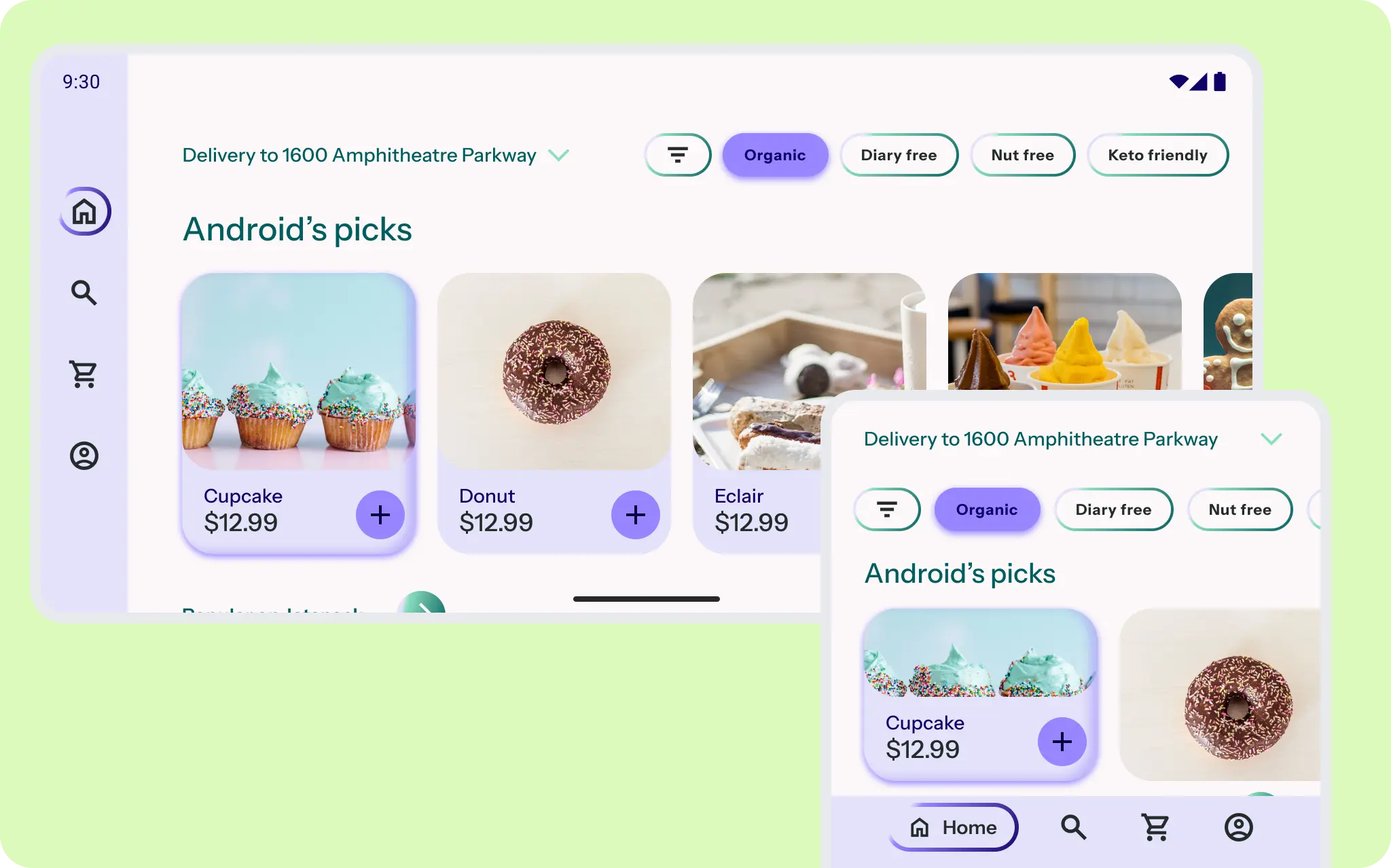
Consider the scale and amount of content shown.
A small grid of videos on a phone becomes tight and overwhelming on a tablet. Update UI element's scale based on screen size, density, and input.
A high quality app should meet the differentiated tier in core app and large screen quality guidelines.
For more on layouts, check out the Material Design 3 (M3) Understanding layout page.
Take advantage of unique form factor sizes.
Don't forget smaller screen sizes as well and different aspect ratios, as Android phones have a range of sizes and foldables can include a small cover screen that can display your app.
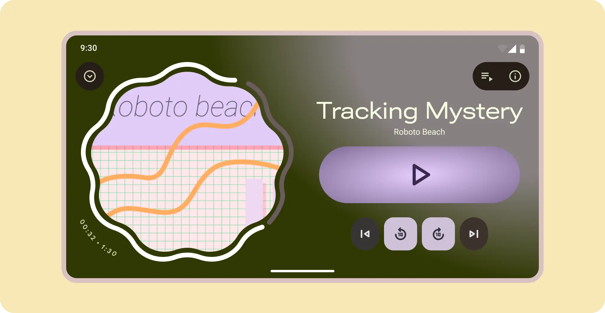
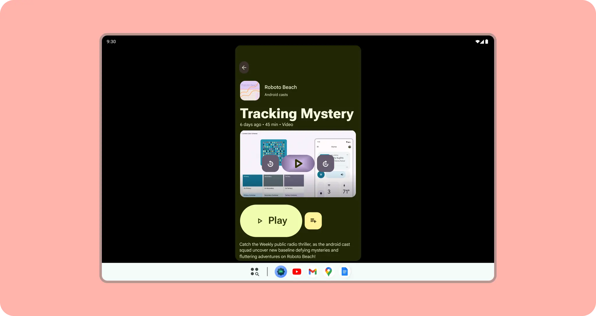
For control based layouts, like media players, allow the controls to reflow and content to reveal.
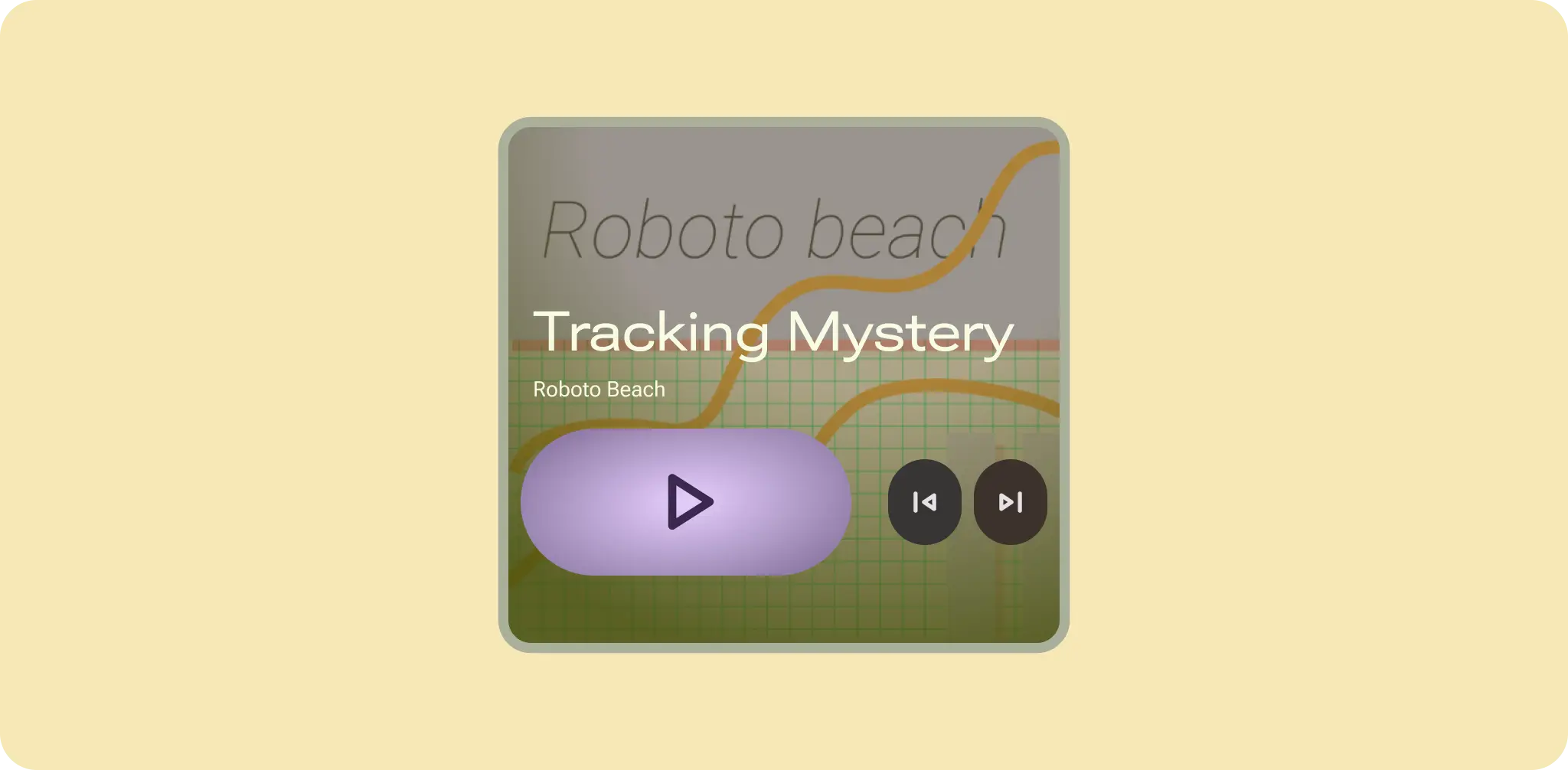
To help user's adjust, use an anchor element, like a large play button, to adapt the content around and the hero art becomes the background on the cover screen.
Beyond size classes
Although window size is a common factor for adaptive design, your app must also
be ready for users to plug in monitors and input devices, view at various
distances, and change their device's posture. It's possible to check for these
changes using the mediaQuery API, which lets you add nuance when you
design how your app adapts specific UI elements to certain use cases.
Adapt your app's design at the component or pane level, rather than designing
entire screens per size, input, form factor, and posture.
For more on input interaction, read more in the desktop experience interaction guides.
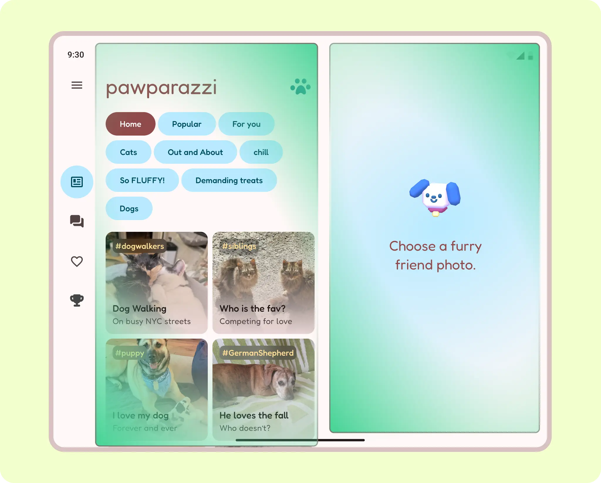
Check out a sample case study, Pawparrazzi, built and designed with the latest adaptive apis and design guidance.