Android design covers a wide range of unique aspects and devices; only looking at breakpoints isn't enough. Users can adjust and reorient app windows on their devices. With foldable devices, a single device can cover all of these use cases. It's essential to think in panes for content adaptability.
Orientation changes
Don't lock apps to portrait. Doing so can look like a bug and creates undesirable letterboxing when multitasking.
Users often reorient their devices for ergonomics and content viewing. Your app must support these orientation changes.
On larger devices, portrait and landscape can have more subtle effects as they go from a medium to large size, but landscape provides a medium window size with a compact vertical view.
Consider the following design practices for landscape orientation:
Support edge-to-edge system bars.
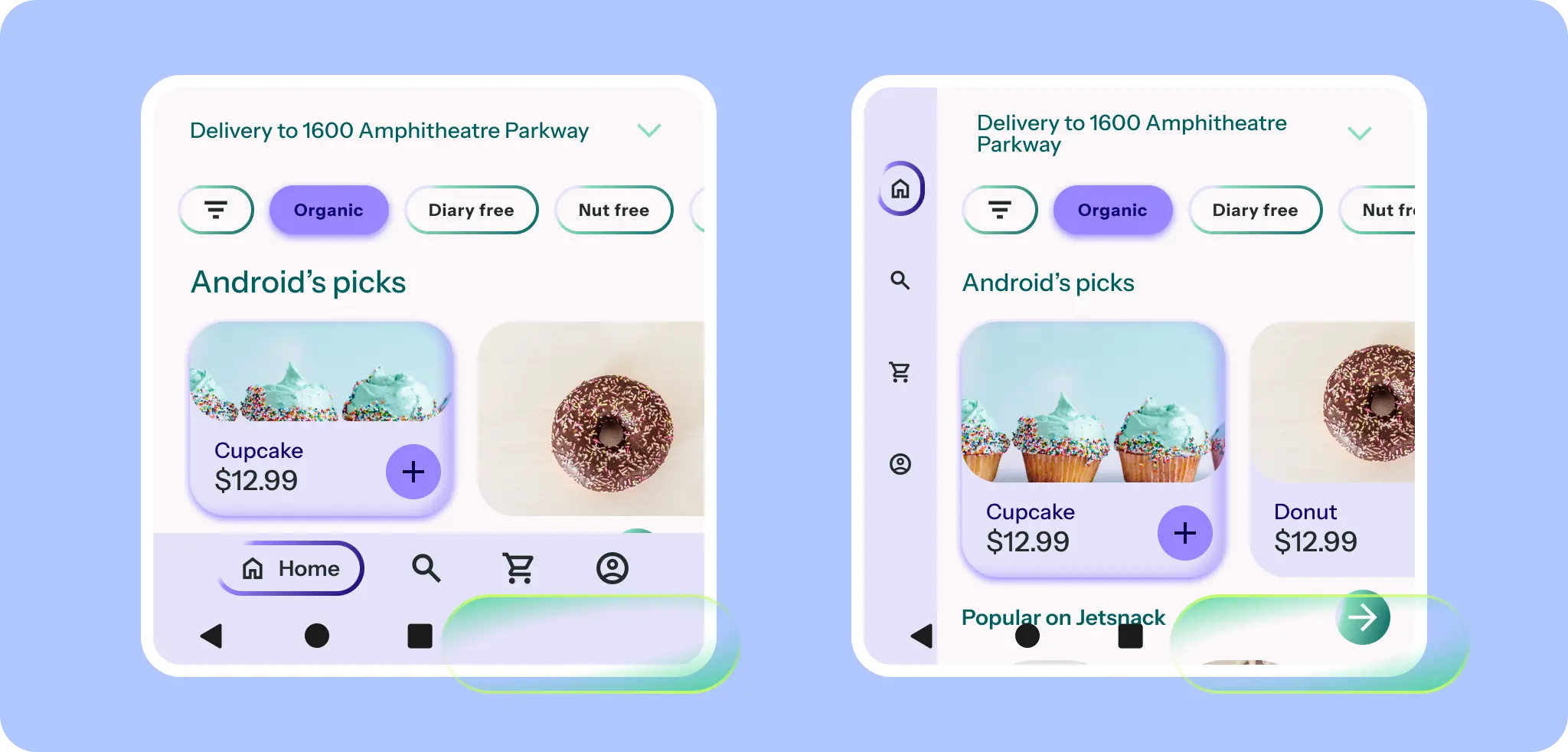
Decide on the navigation component that best supports your content, such as a horizontal navigation bar or a navigation rail.
Consider reflowing content or changing density.
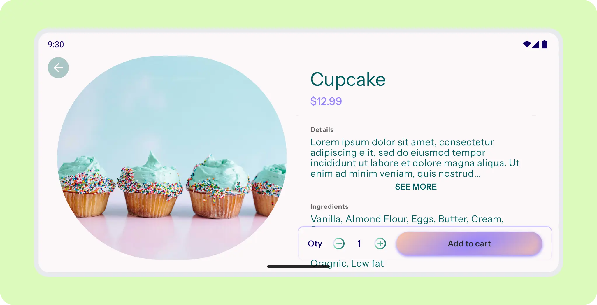
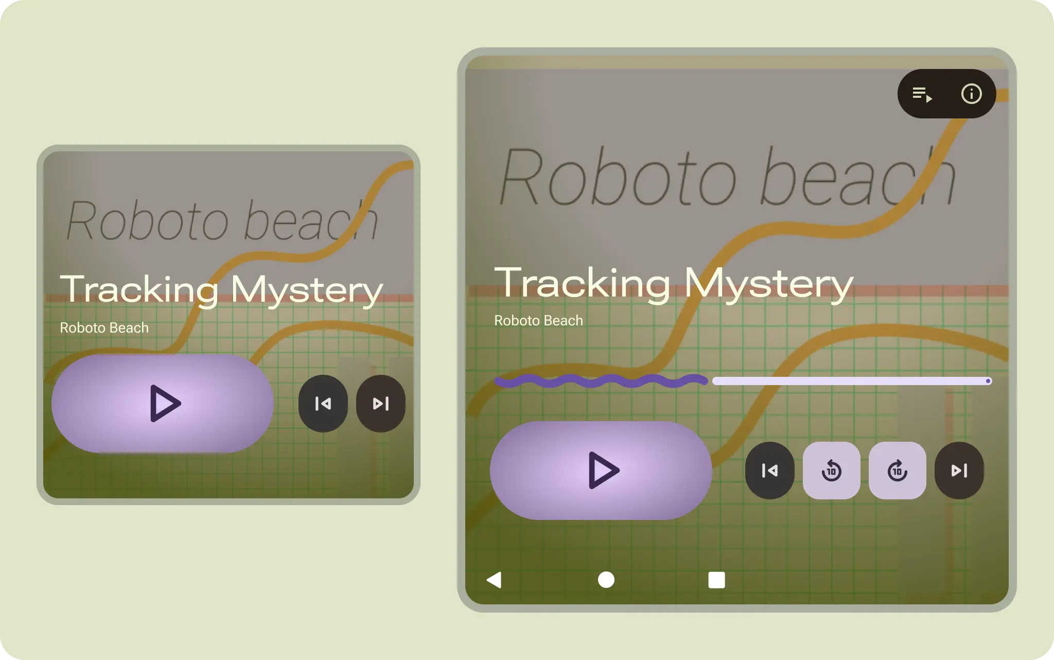
Landscape layouts can use medium-width UI.
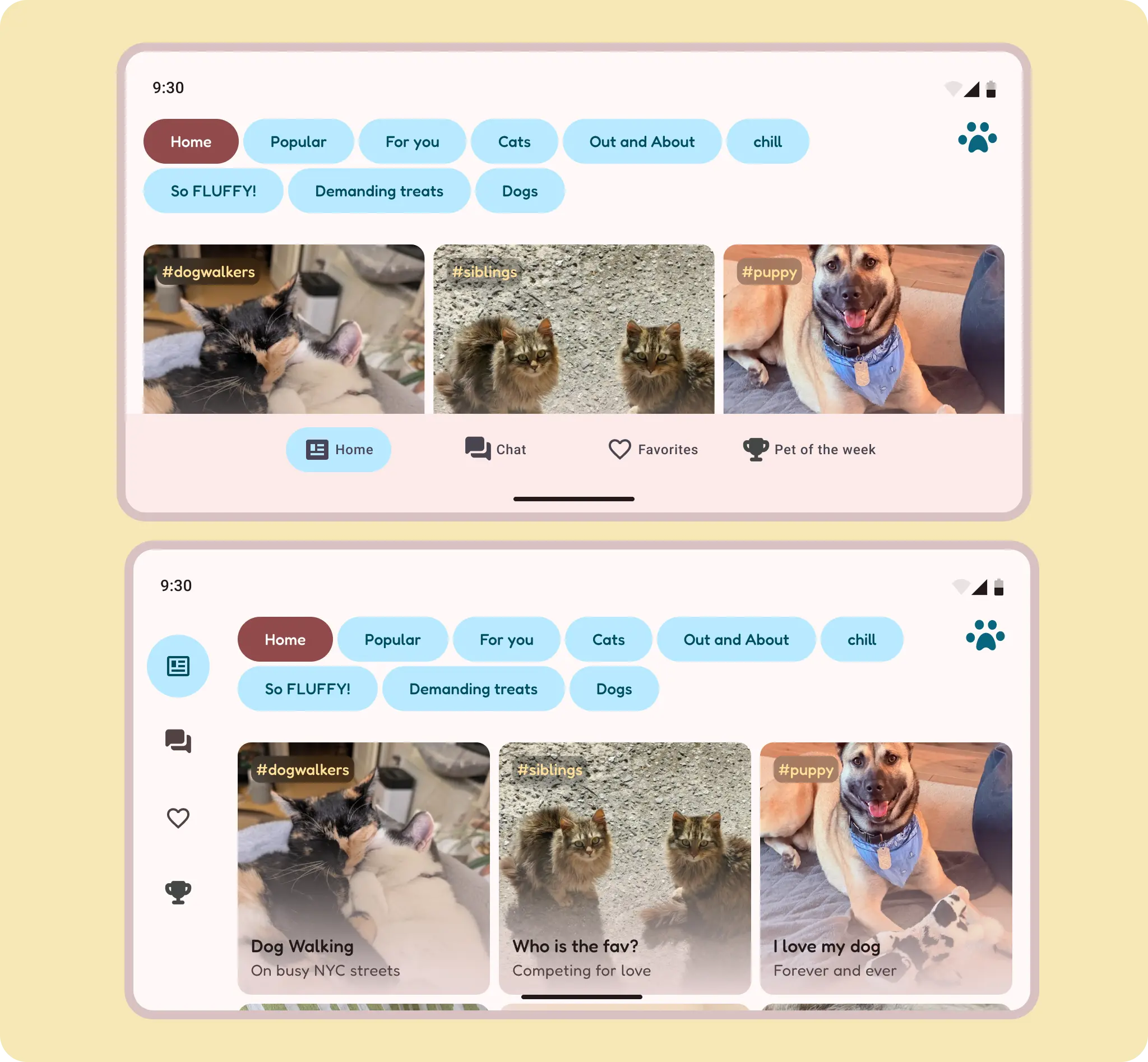
Landscape orientation can take advantage of the reduced height of a horizontally oriented bottom navigation bar.
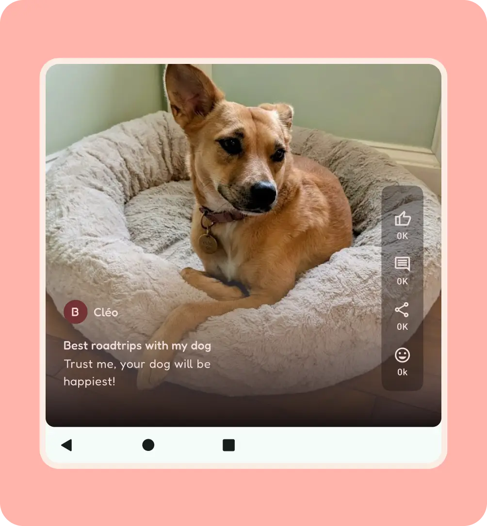
For content, try to use a container to letterbox the content, or use a different content orientation when available, such as vertical instead of landscape video. Full-width content on a compact portrait takes up most of the screen in a large landscape layout. If the content didn't scroll in portrait, don't make it scroll in landscape, because this can confuse users.
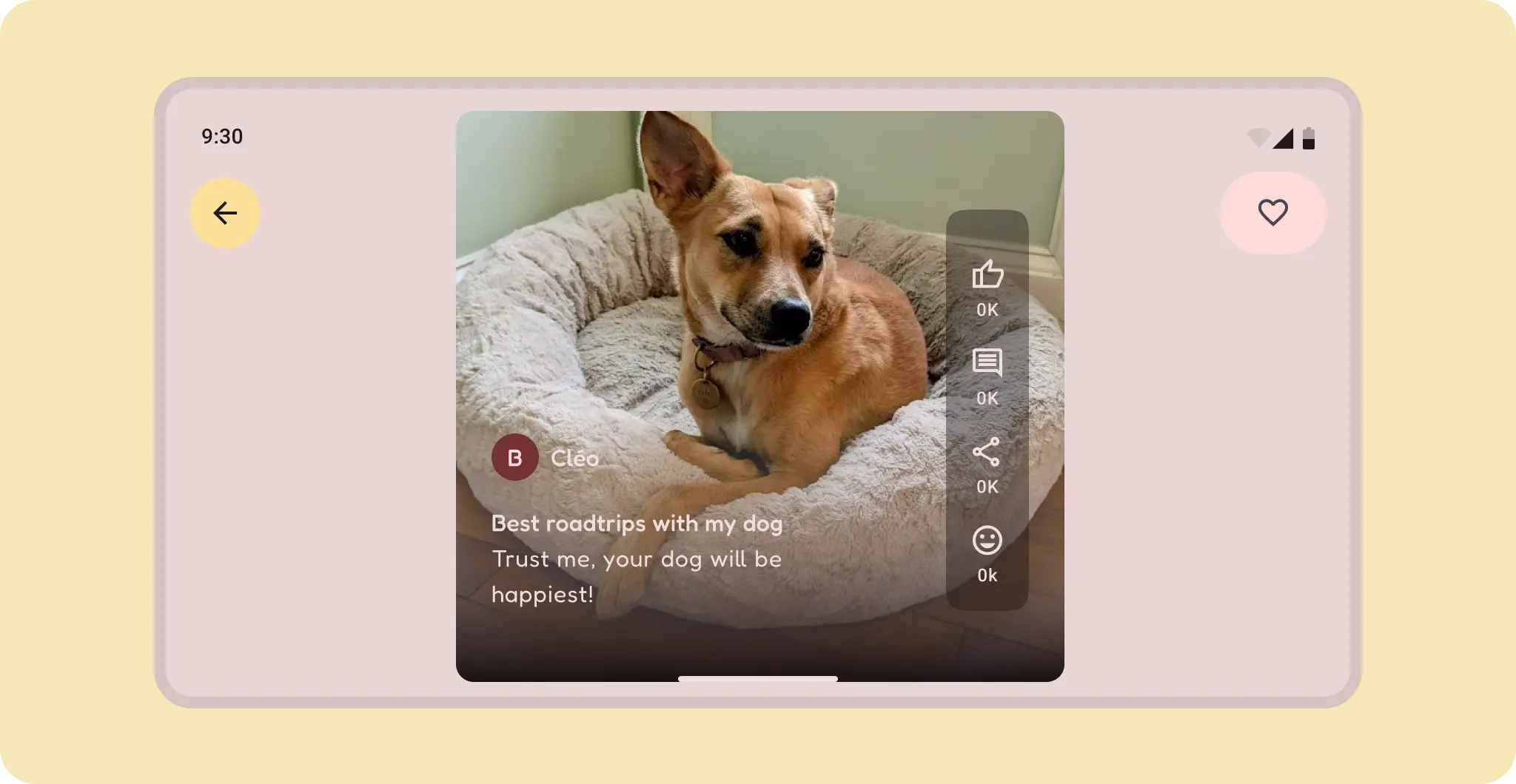
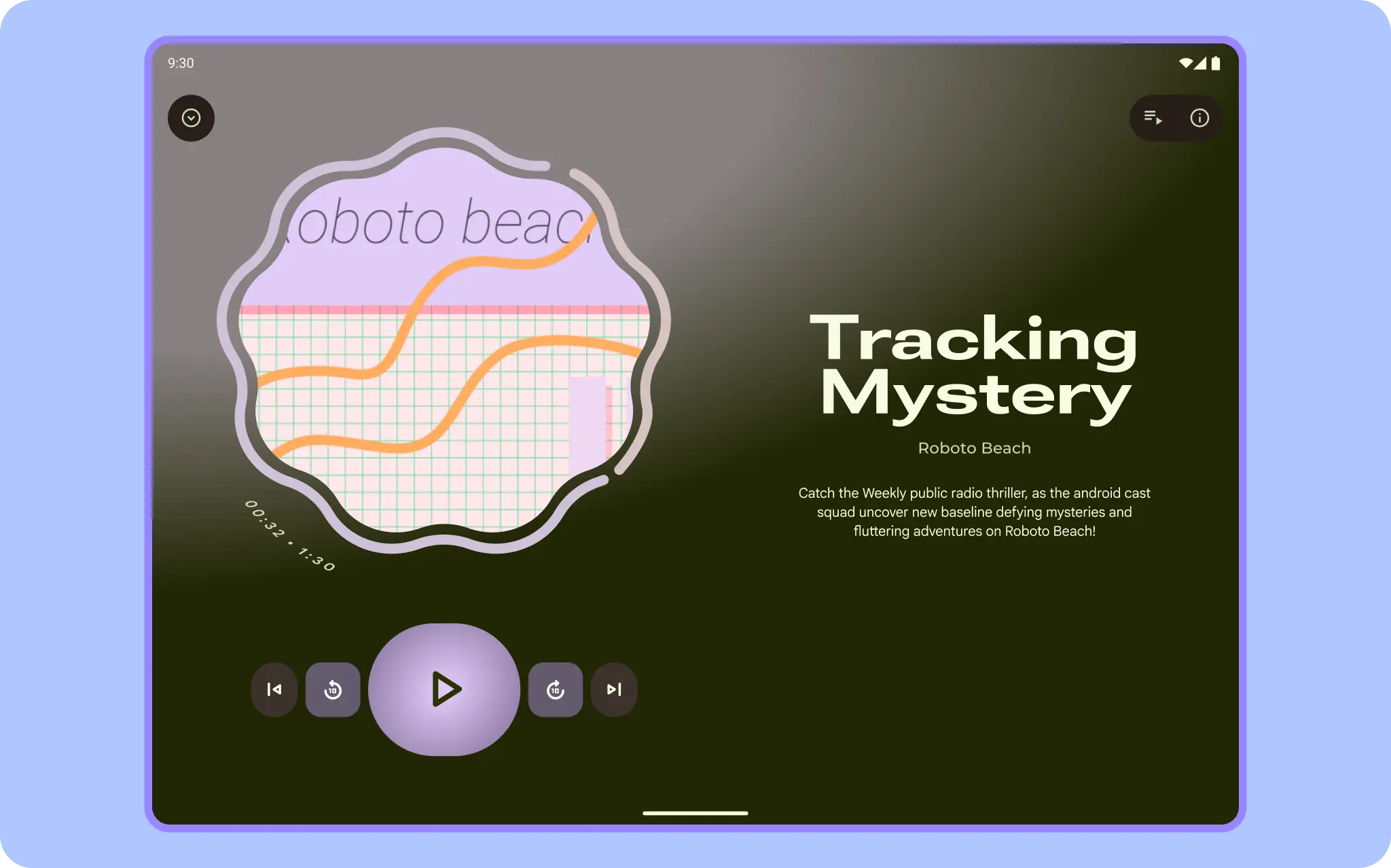
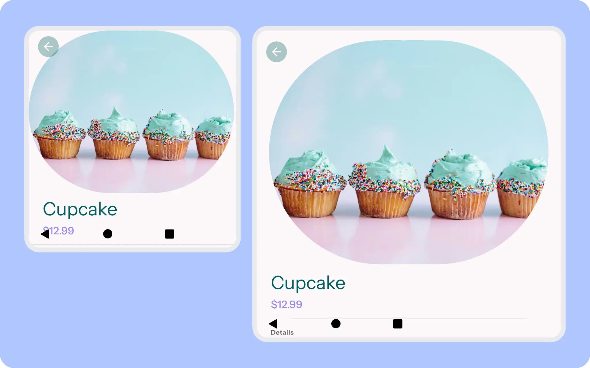
The hero image takes the prominent space and sticks. The bottom app bar undocks.
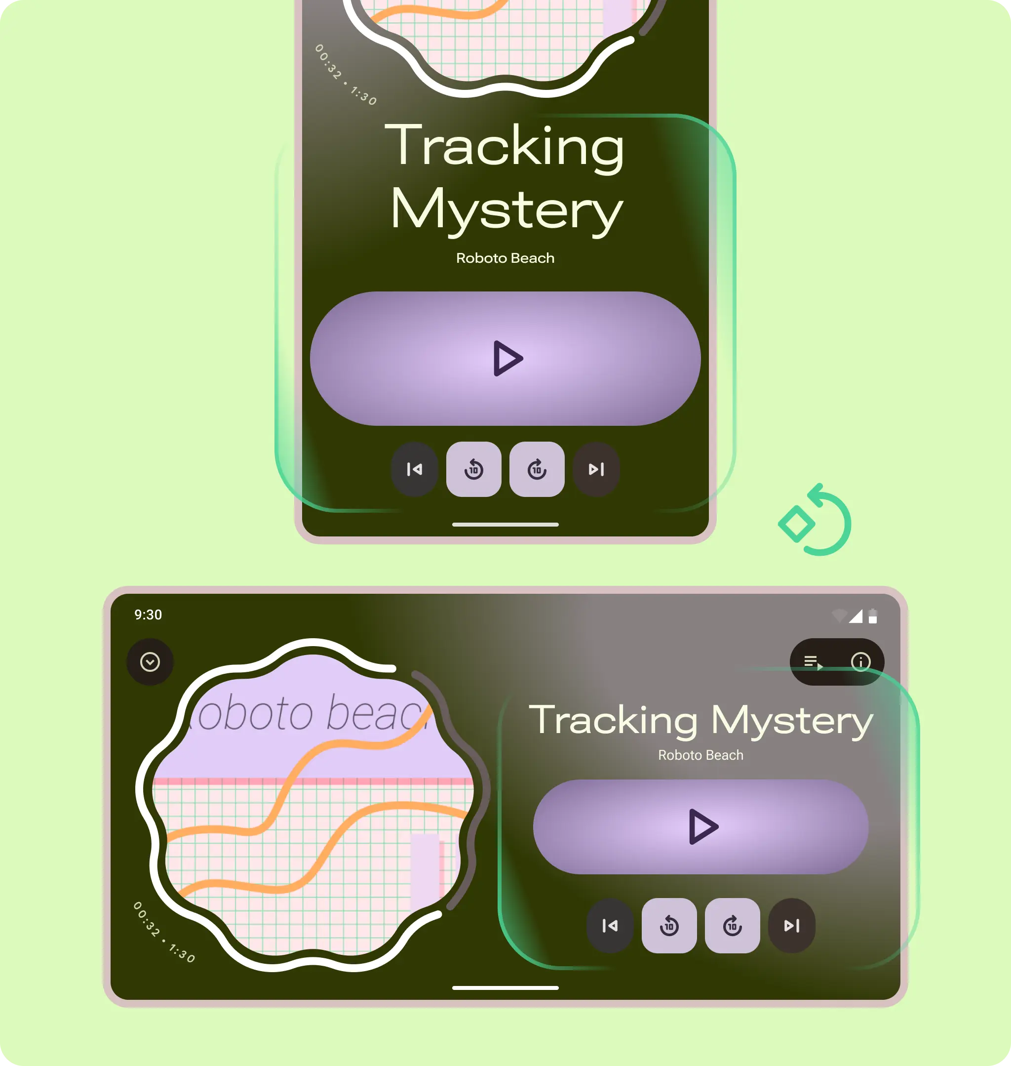
From portrait to landscape: both container groupings rotate in place.
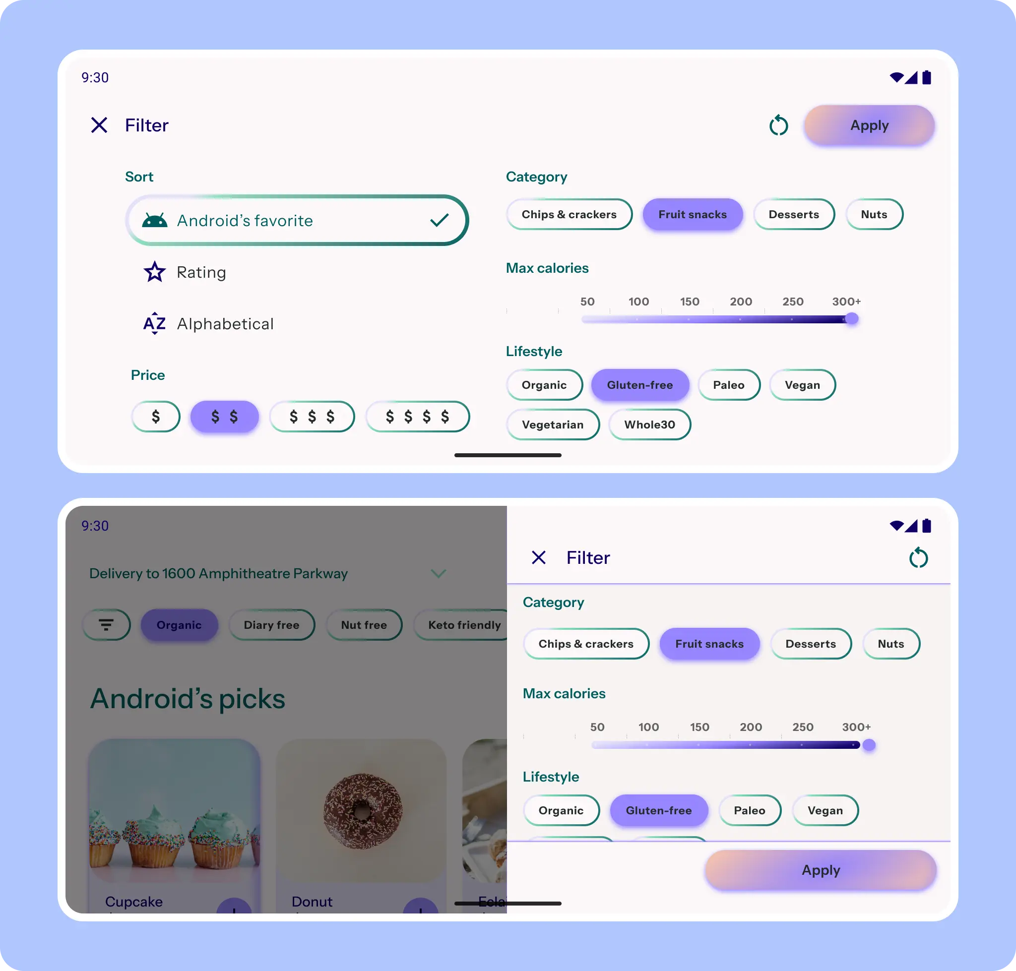
For a filter sheet, the sheet component can change to a side sheet. If more attention is needed, the sheet remains full-screen but adapts to a two-column layout.
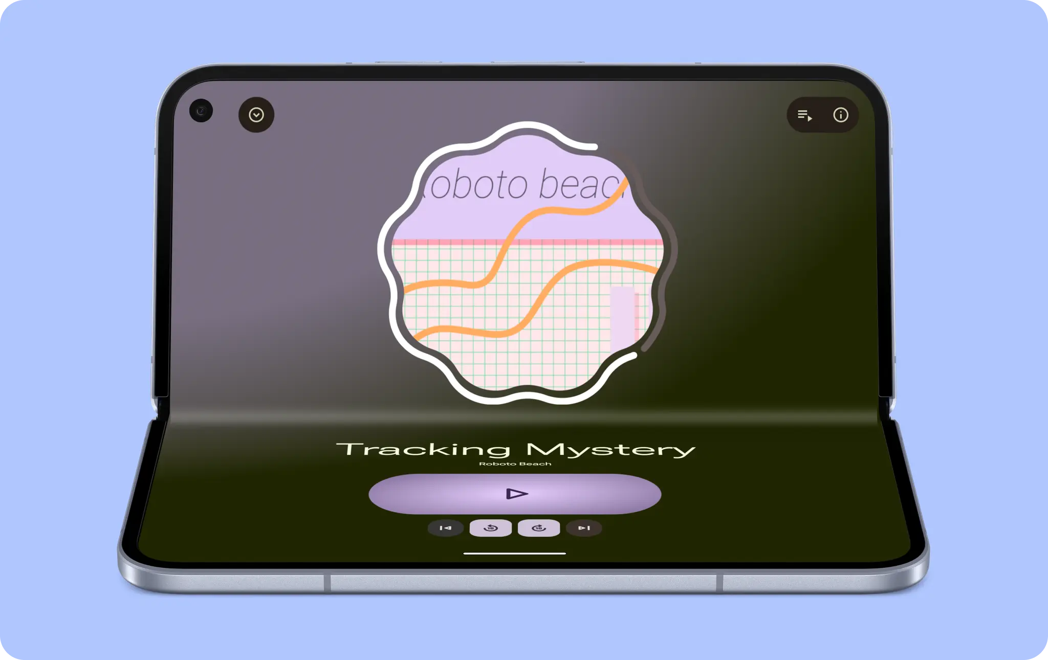
Postures
Account for unique form factor use cases, like fold postures (folded, flat, and tabletop).
Your app doesn't have to specifically account for every posture, but consider taking advantage of one for your app. For example, a media player can show a unique tabletop and cover UI.
Flat
A foldable is in a flat posture when unfolded. The screen is usually a medium or large class size.
Folded
When a foldable device is closed, it's in a folded posture. In this posture, you interact with the outer screen, which is typically compact.
Tabletop
A tabletop posture is partially folded in a horizontal position. This posture lets you use unique layouts, such as large controls and landscape video.
Hinge
Make your app hinge-aware, so content flows smoothly with continuity and doesn't get lost in the hinge. This might not be necessary on single-pane layouts. However, consider whether controls and text should avoid the hinge space.
If you're designing with a layout grid and panes, allow for a wider gutter to accommodate the hinge, such as in a two-pane list-detail layout.
Some foldables, like trifolds, have multiple hinges.
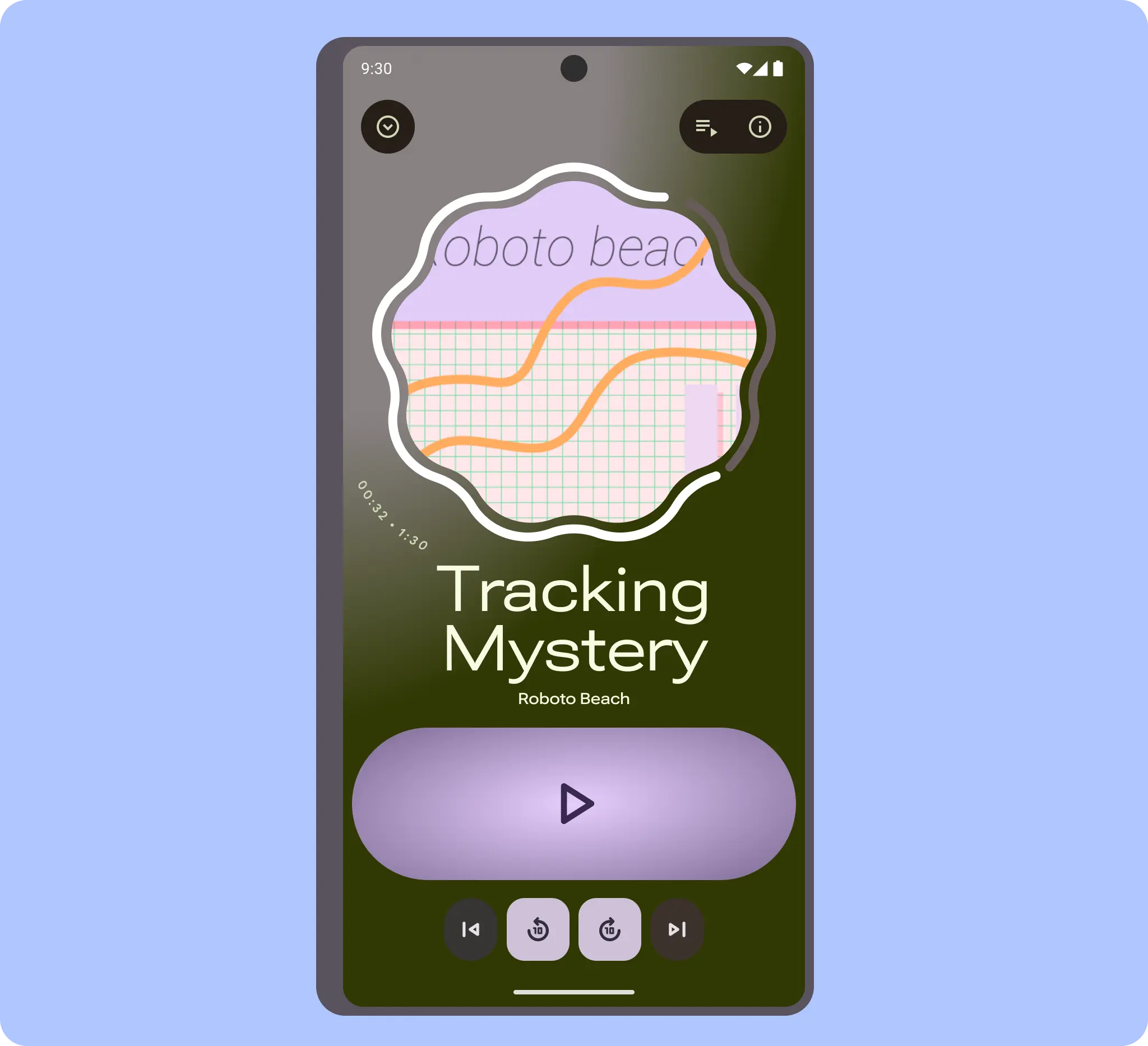
Cover
Some foldable phones can have an outer cover screen in a square aspect ratio, like a flip phone.
When designing for cover screens, follow these guidelines:
- Ensure apps are edge-to-edge.
- Make sure UI elements aren't covered by camera cutouts.
- Keep use cases and UI focused.
For example, when a device is used only as a media player, the cover art can become the background to reveal a quick view that requires less information.
On smaller screens and aspect ratios, consider the experience of focused content. The hero image takes up most of the cover for visual appeal, with a peek at the title and content for ease of scrolling and legibility.
The cover should remain highly focused on input. For example, when the keyboard appears, the message is the primary focus.
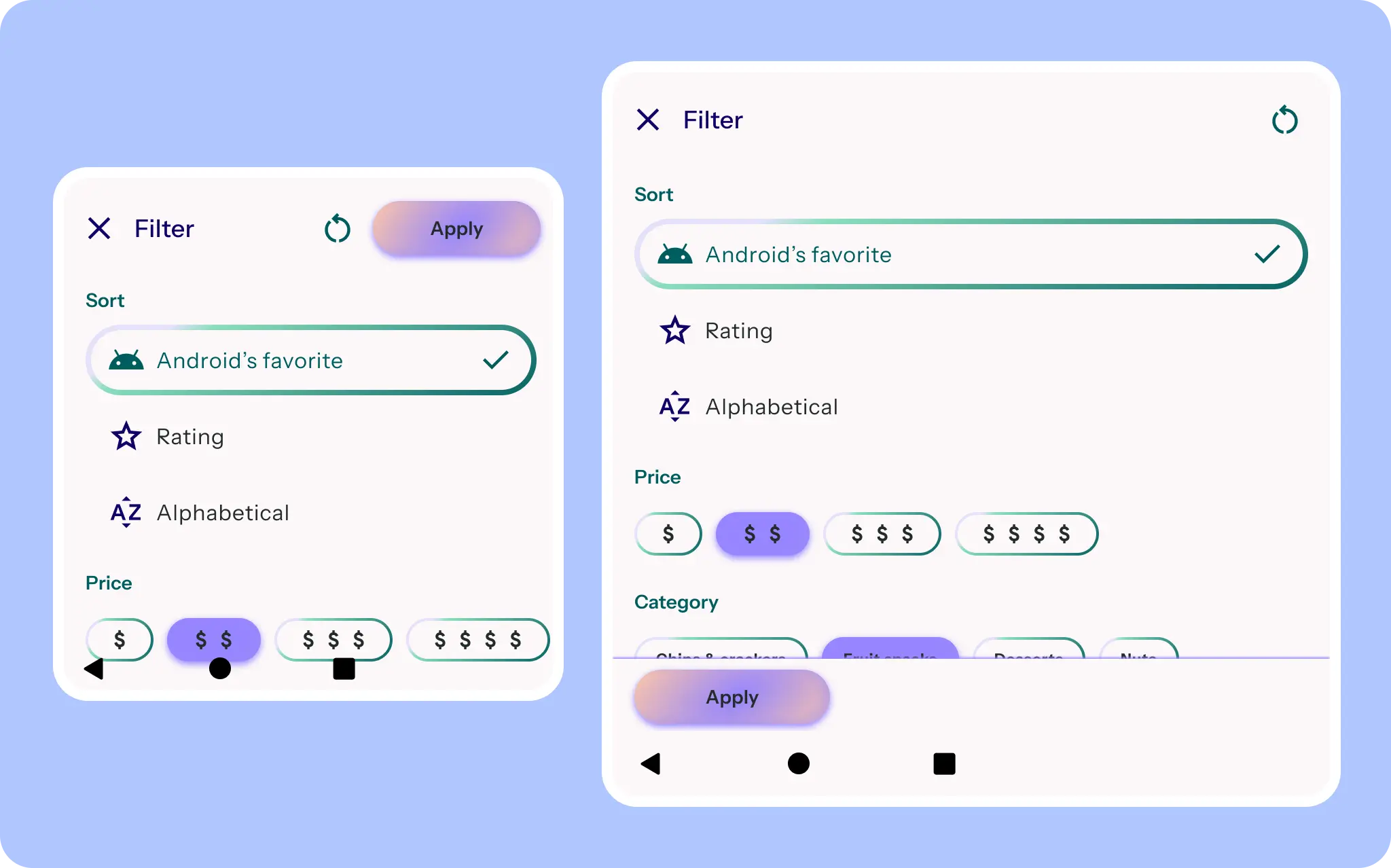
In smaller screens, like covers, the filter sheet is full-screen, but the button placement and scaling adapt.
Although compact, a navigation rail might be more ergonomic on a cover screen.
Larger covers can take advantage of either navigation orientation. Consider how users might interact with the content.
A small navigation rail can avoid system UI and camera cutouts while respecting the condensed height.
Do