
Use common layouts to help lay out your app for common use cases and screen sizes. These ready-to-use compositions are good starting points.
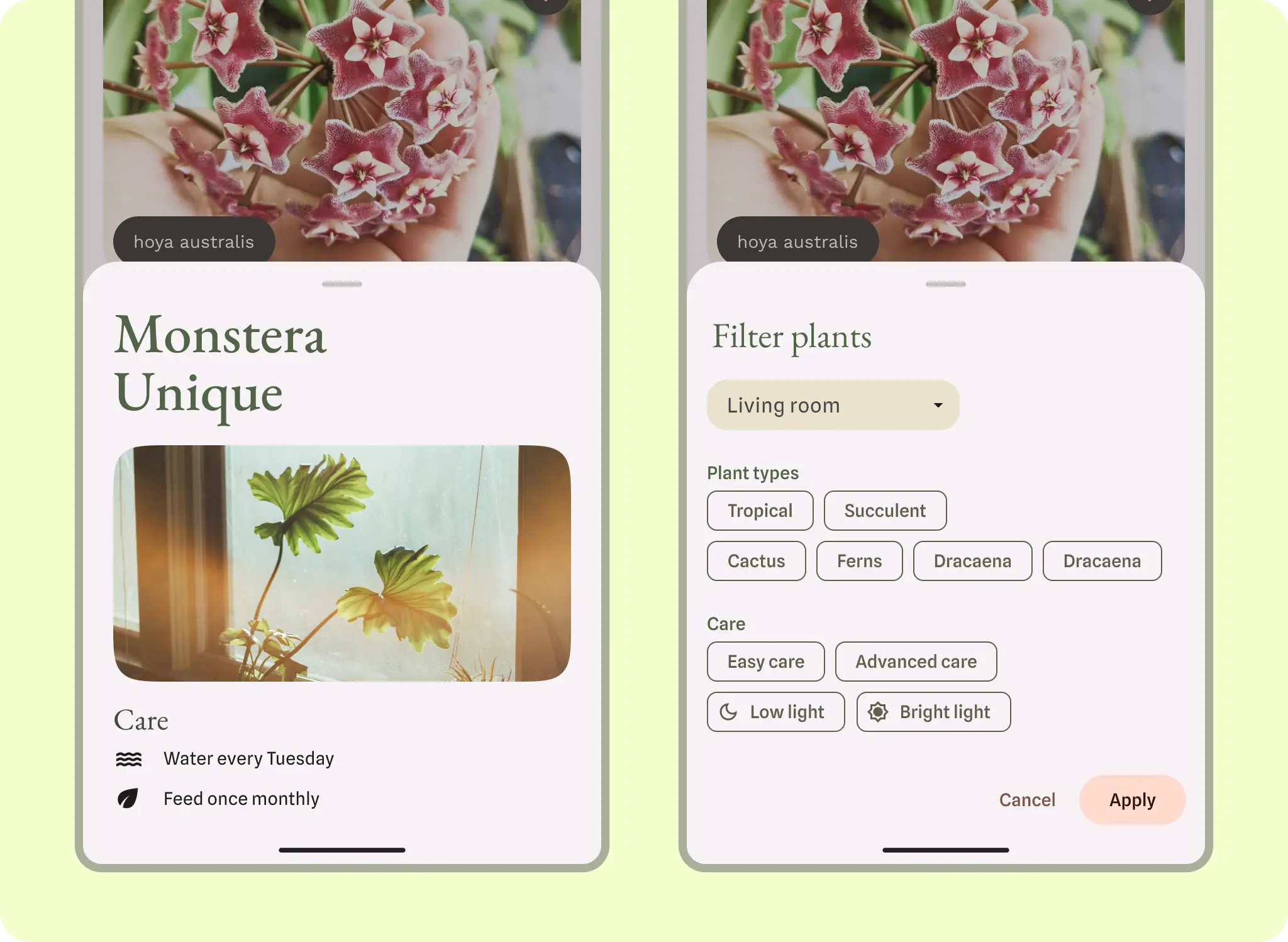
List-detail layout
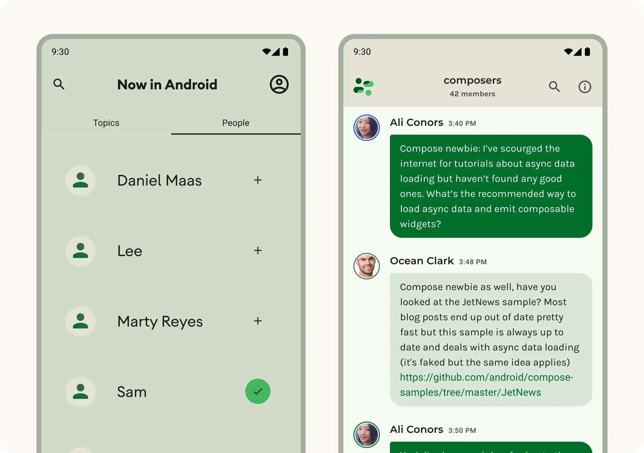
A list-detail layout enables users to explore lists of items that have descriptive, explanatory, or other supplementary information—the item detail. For compact screen sizes, only the list or detail view are visible. Displaying a collection of content in a row-based layout, lists make up the most common form of layouts for apps. List-detail is ideal for messaging apps, contact managers, file browsers, or any app where the content can be organized as a list of items that reveal additional information.
Content can be static or dynamic.
- Dynamic content is content that your app serves on-the-fly and is ideal for showing user-generated content or reflecting the user's preference or actions. For example, imagine a photo app with a scrollable list of user-generated photos, which is unique for each user and changes as the user uploads more images. These images are dynamic content.
- Static content represents hard-coded content, which is modifiable only by making changes directly to your app's code. Examples of static content are images and text that every user might see.
The Now in Android Figma file provides multiple layout examples. The following example shows a one-dimensional collection of content.
Explore Material 3 Lists for more design guidance on list components and specs.
Feed layout
A feed layout arranges equivalent content elements in a configurable grid for quick, convenient viewing of a large amount of content. Learn more about Material 3 guidelines for using cards in a collection. Feeds can be list- or grid-based configuration on compact displays, typically in cards or tiles. Content can be dynamic, meaning it is "fed in" from a dynamic external source such as an API.
A grid layout is composed of both rows and columns made up by implied or explicit containment principles. A grid layout can be more rigidly applied or staggered to vary the rows and columns. Both should have consistent application of spacing and logic to avoid confusing users.
You can implement a feed layout with Lazy lists or lazy grids.
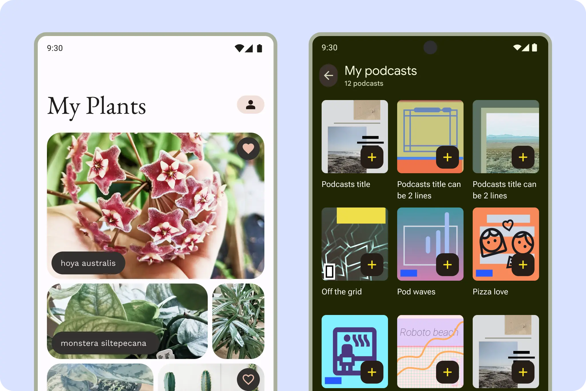
For example, here a photo gallery and podcasts in a grid layout are common feed formats.
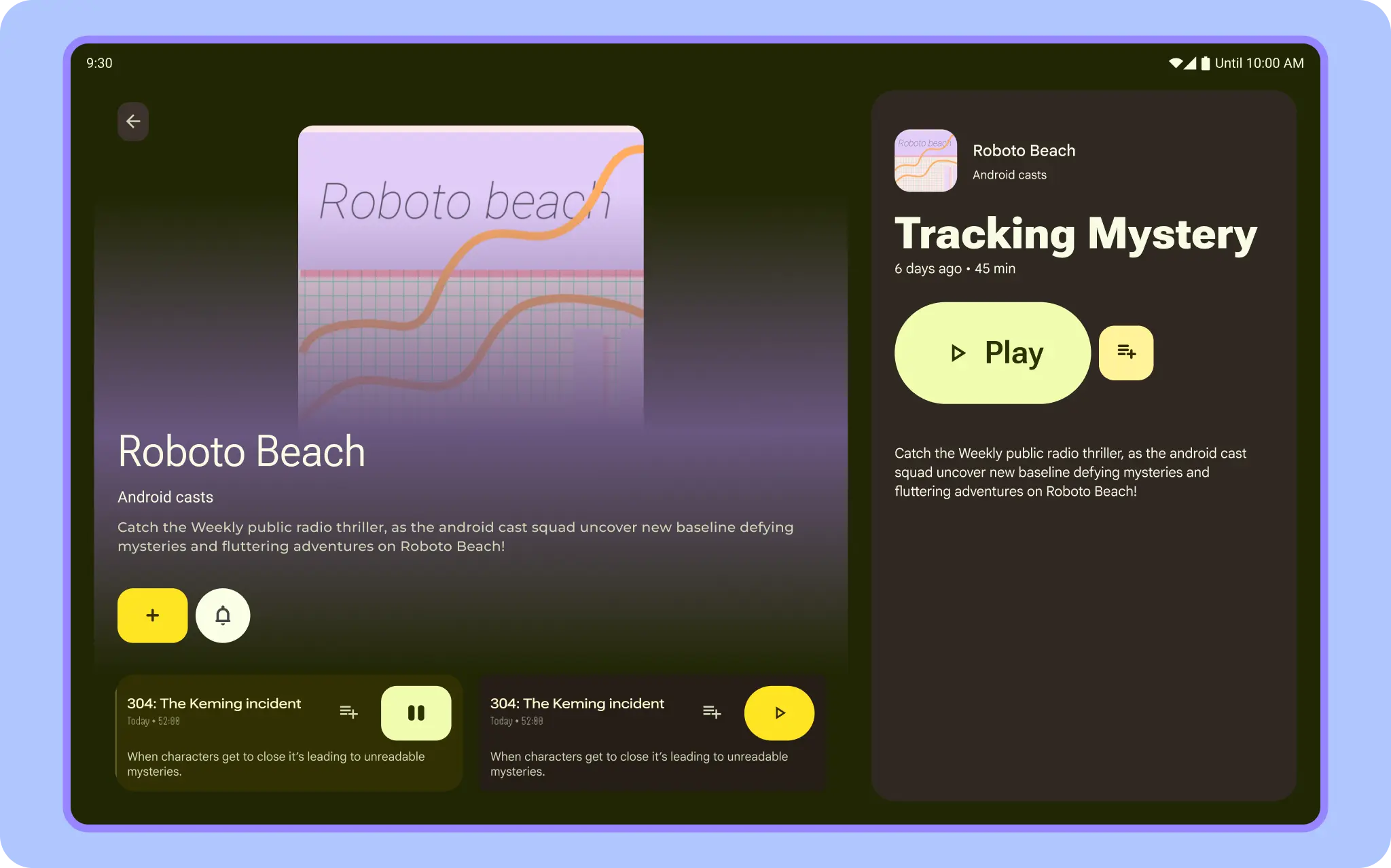
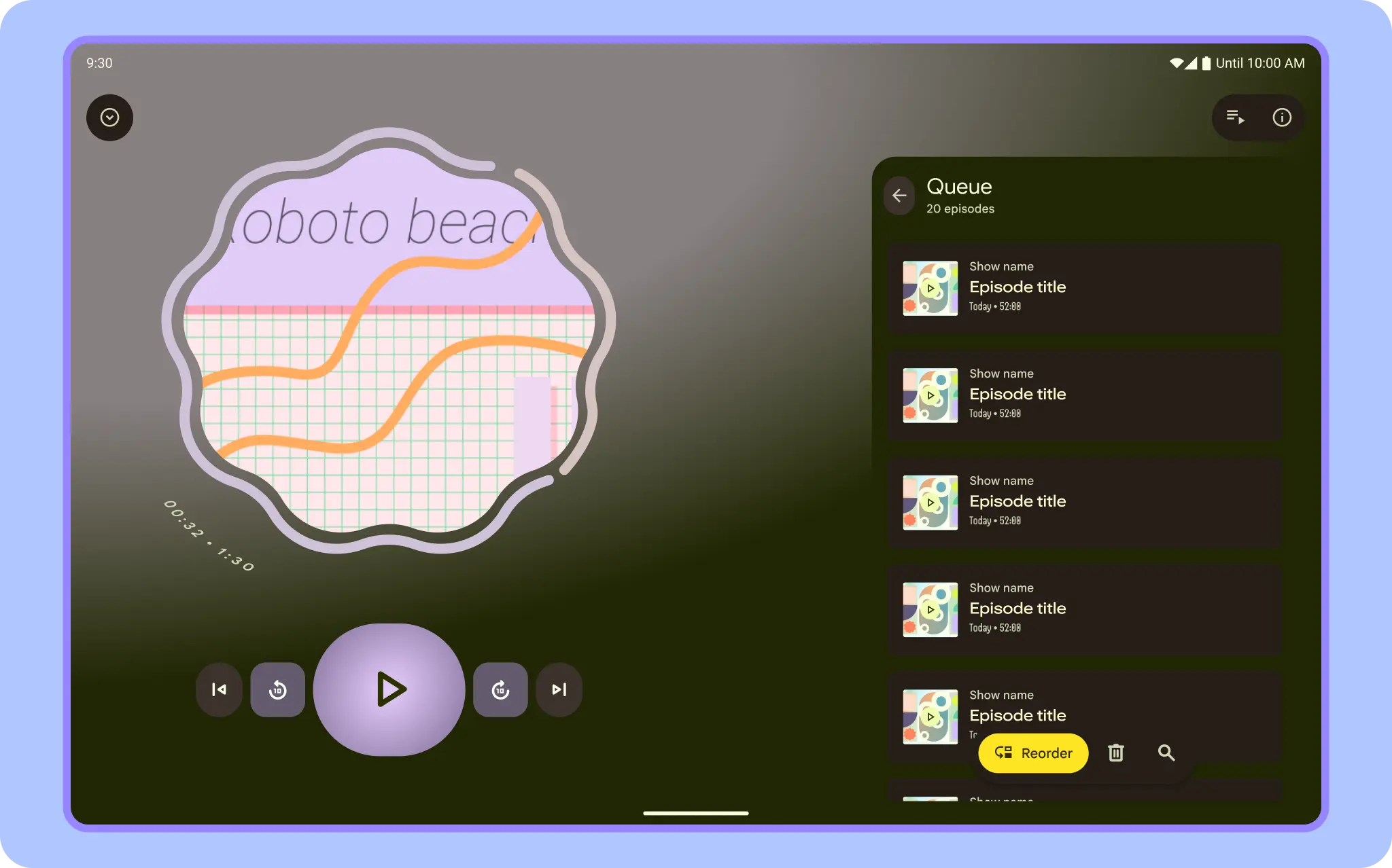
Support pane layout
A mobile view might require supporting content or controls, such as sheets or dialogs. They help the primary view stay focused and uncluttered.
Learn about M3 guidance for bottom sheets.
WebViews
A WebView displays in-app web pages. In most cases, we recommend using a standard web browser, like Chrome, to deliver content to the user. To learn more about web browsers, read the guide for invoking a browser with an intent.