
Use a Button component for actions that are well understood by users and don't need a text label. Buttons are distinguished from chips by their circular shape.
Anatomy
A. Content
Buttons have a single slot reserved for an icon or text. Choose an icon that is relevant to the action the button performs. You can use text with a maximum of three characters if an icon is unable to describe the relevant action. Consider the use of a Chip component if an icon cannot clearly describe the action
B. Container
Button containers are limited to a single solid color fill.
Button types
Compact buttons
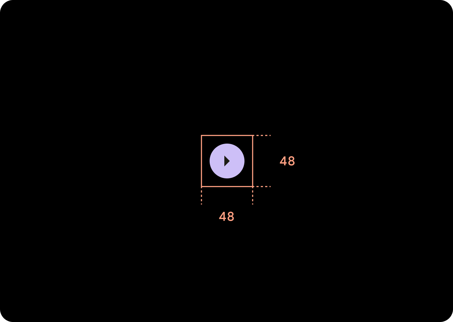
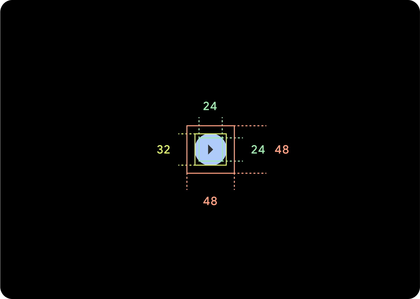
Compact buttons appear smaller but have a larger tappable area. The default tappable area is 48x48 dp.
Hierarchy
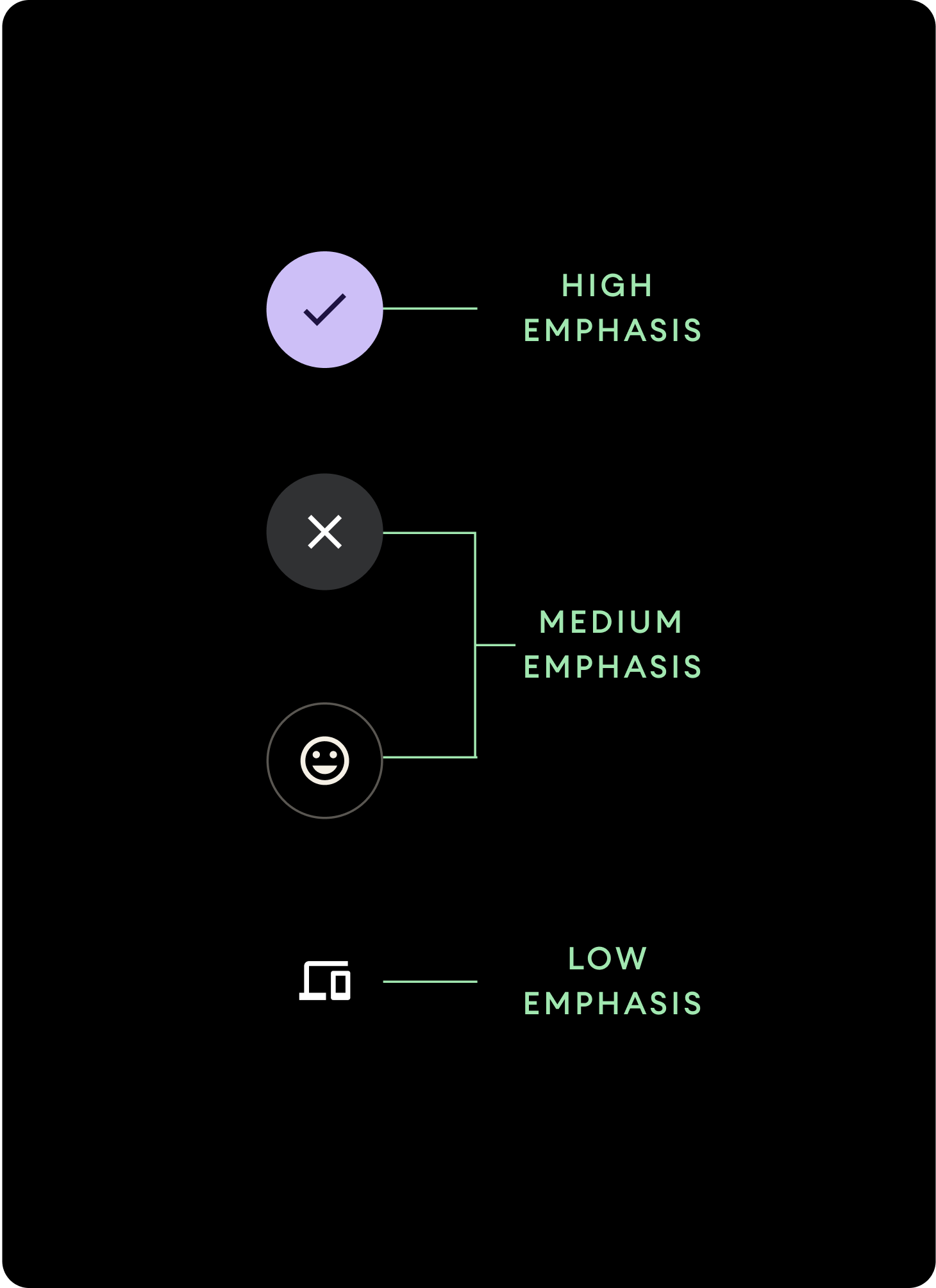
Use different color fills to denote button hierarchy.
High emphasis
High emphasis buttons contain actions that are primary to the app. For high emphasis buttons use Primary or Secondary colors for the container and On Primary and On Secondary colors for the content. For more information see Wear Material Theming.
Medium emphasis
Medium emphasis buttons are distinguished by a less contrasting color fill. They contain actions that are less important than the primary actions. Use the Surface color for the container and the On Surface color for the content.
Alternatively, use the custom OutlinedButton component for a medium emphasis button. This has a transparent background, a primary variant colored stroke of 60% opacity, and primary colored content.
Low emphasis (icon only)Low emphasis buttons are distinguished by having no fill. They are best suited for smaller areas on the watch face where a compact arrangement is needed. Use the On Surface colour for the content.
Sizes
Use buttons of different sizes to emphasize or de-emphasize actions.
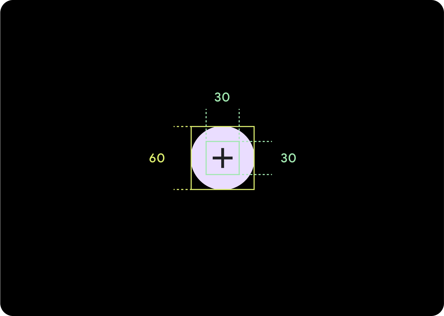
Large
Icon (30 x 30 dp)
Container (60 x 60 dp)
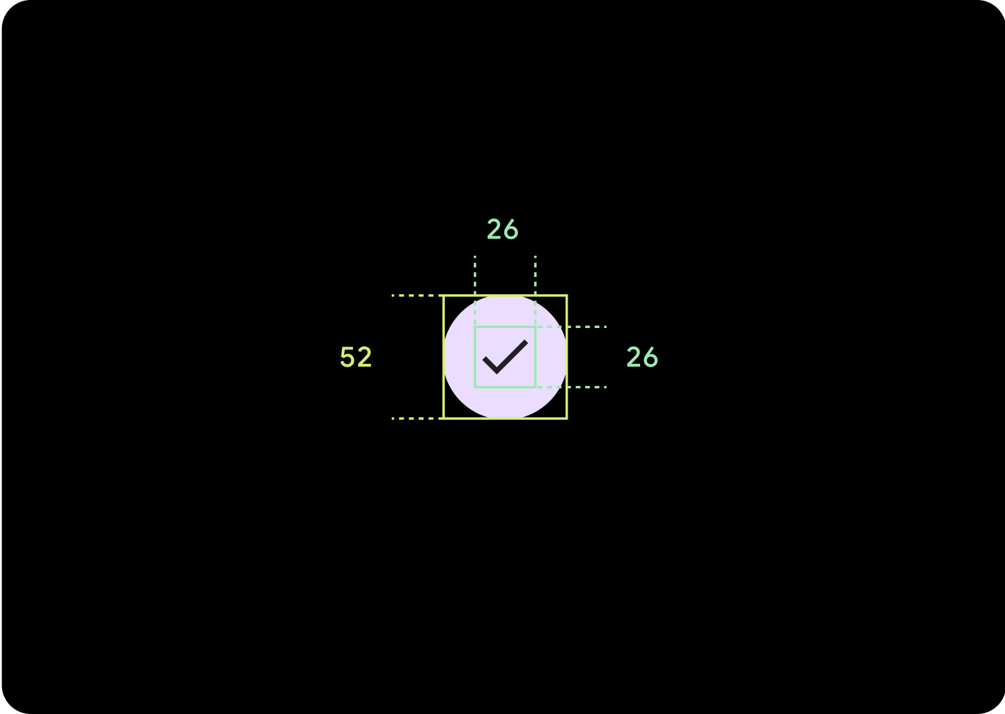
Default
Icon (26 x 26 dp)
Container (52 x 52 dp)
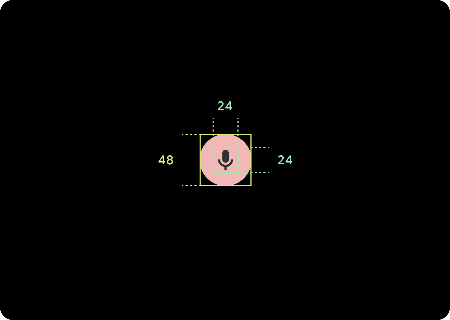
Small
Icon (24 x 24 dp)
Container (48 x 48 dp)
Extra Small
Icon (24 x 24 dp)
Container (32 x 32 dp)
It's recommended to add additional padding around this button to create a tap target of at least 48 dp. This is our minimum tap target size for accessibility.
Usage
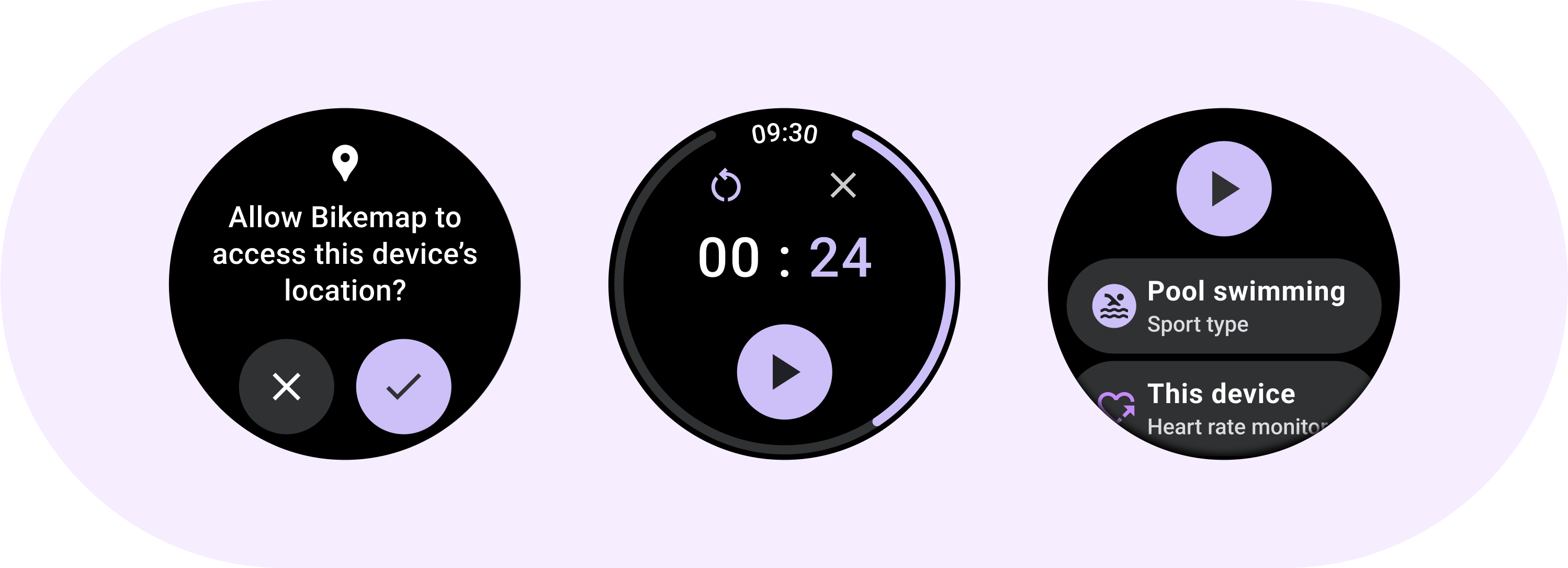
Use standard buttons to enable the user to take a single action such as accepting or declining a call, or starting a timer.
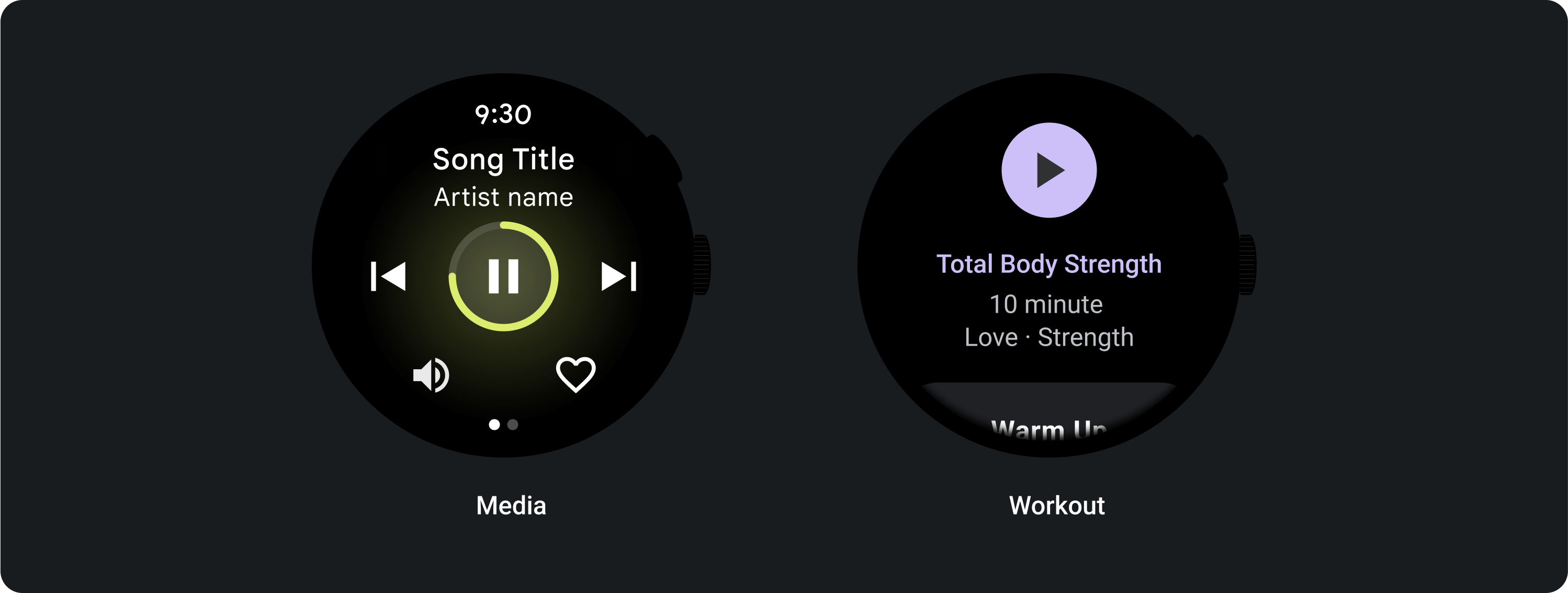
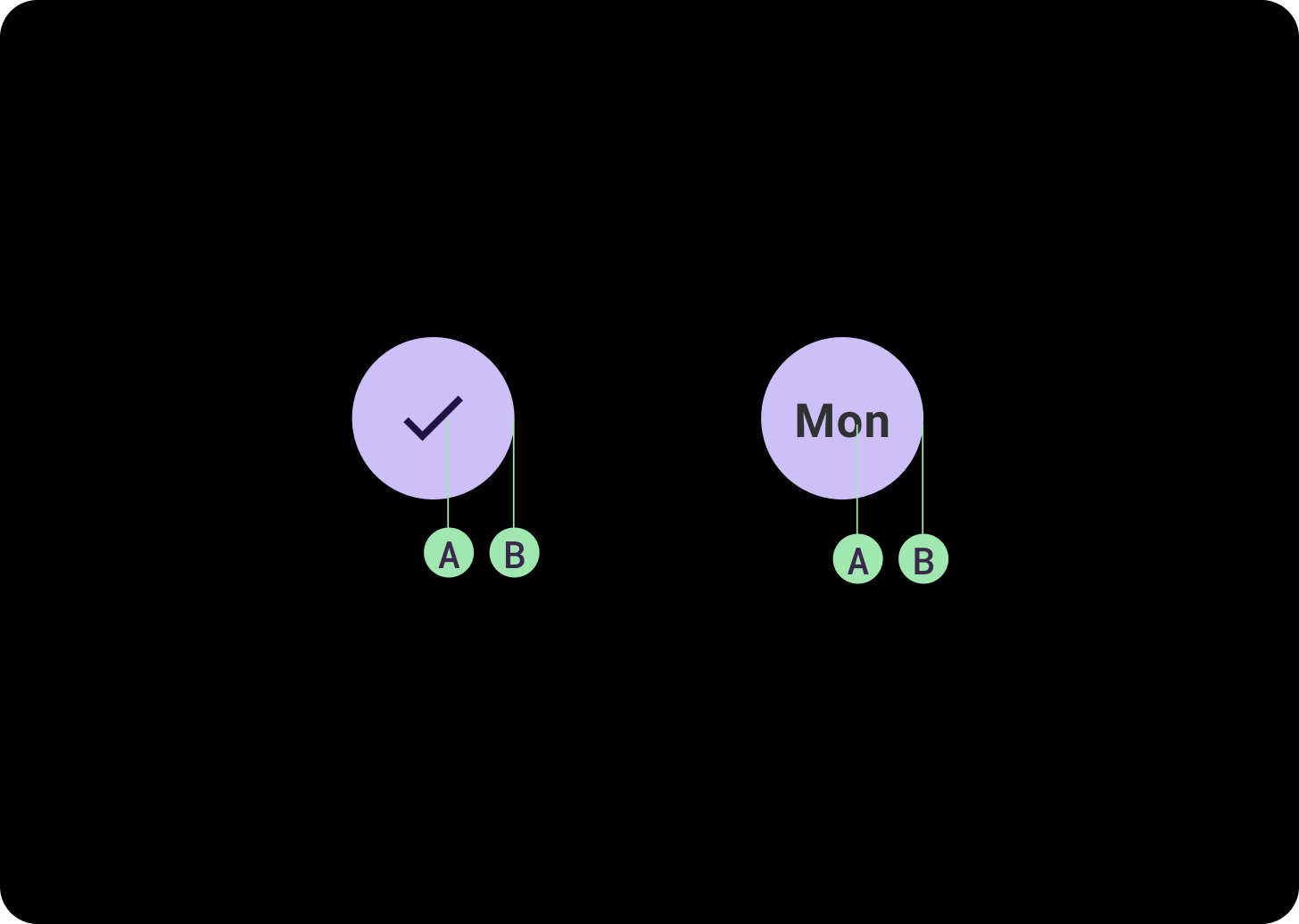
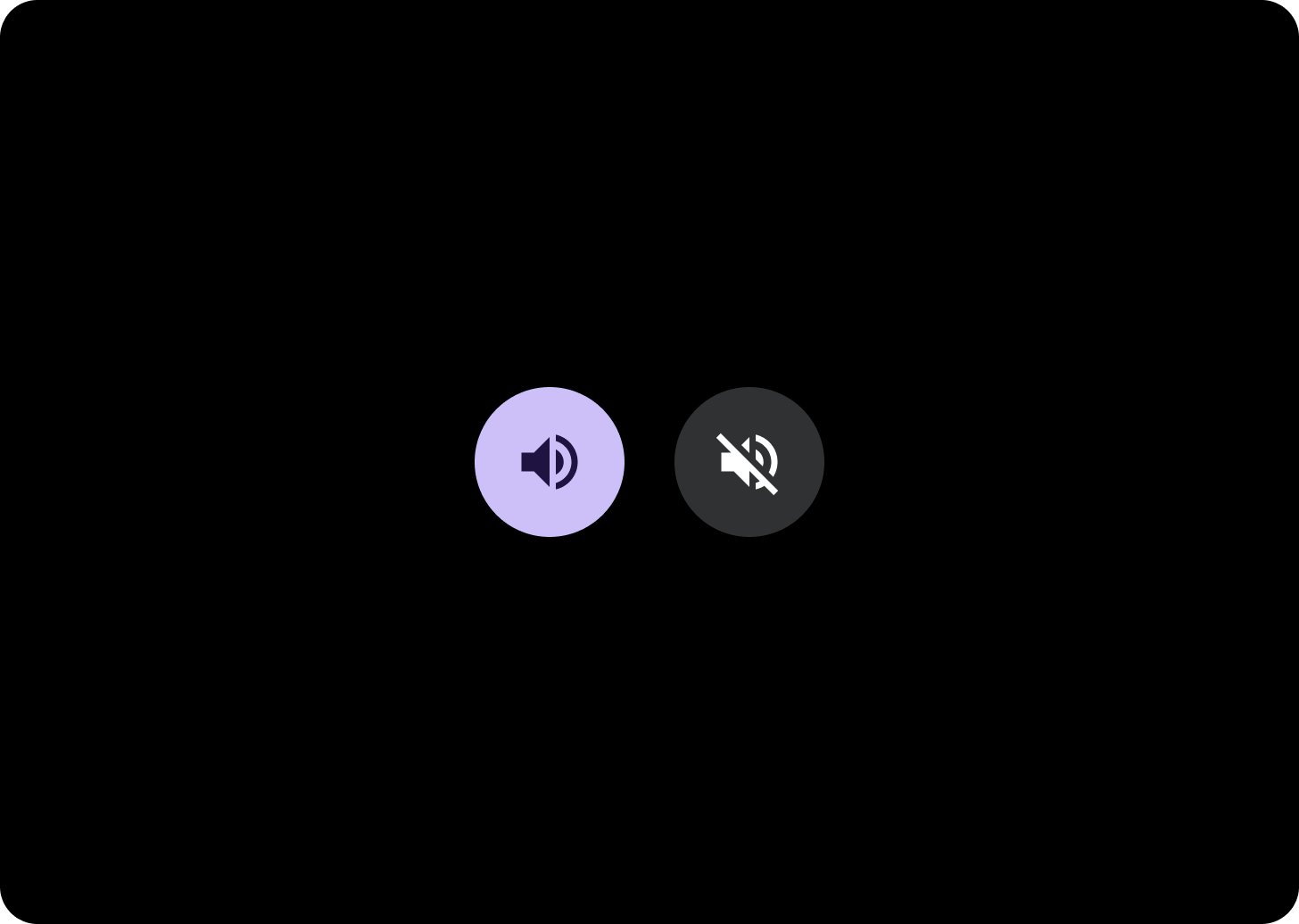
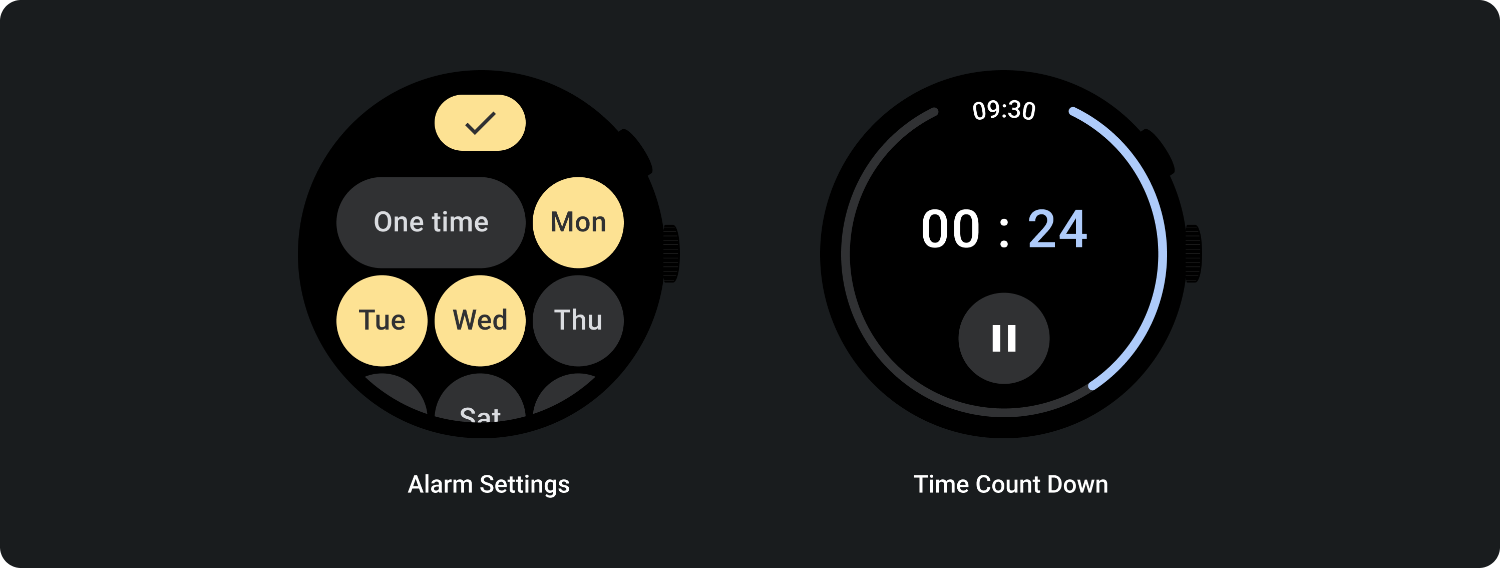
Use toggle buttons to allow the user to turn an option on or off, such as selecting and deselecting days of the week or pausing and restarting a timer.
Adaptive layouts
Responsive behavior

1 button
The internal padding will remain the same, and the margins should be percentages in order to stop the buttons from stretching too far, and keeping a relative size.
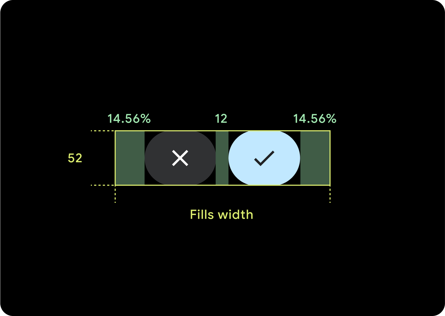
2 buttons
When there are 2 buttons, percentage internal margins are added in order to stop the buttons from stretching too far, and keeping a relative size.
IMEs
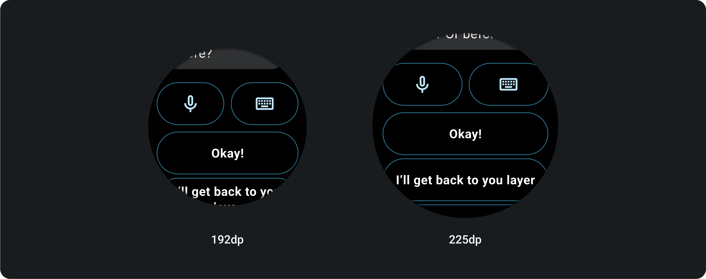
1 or 2 Buttons
IMEs with 2 or a single button lockup always stretch all the way to the side margins regardless of screen size.
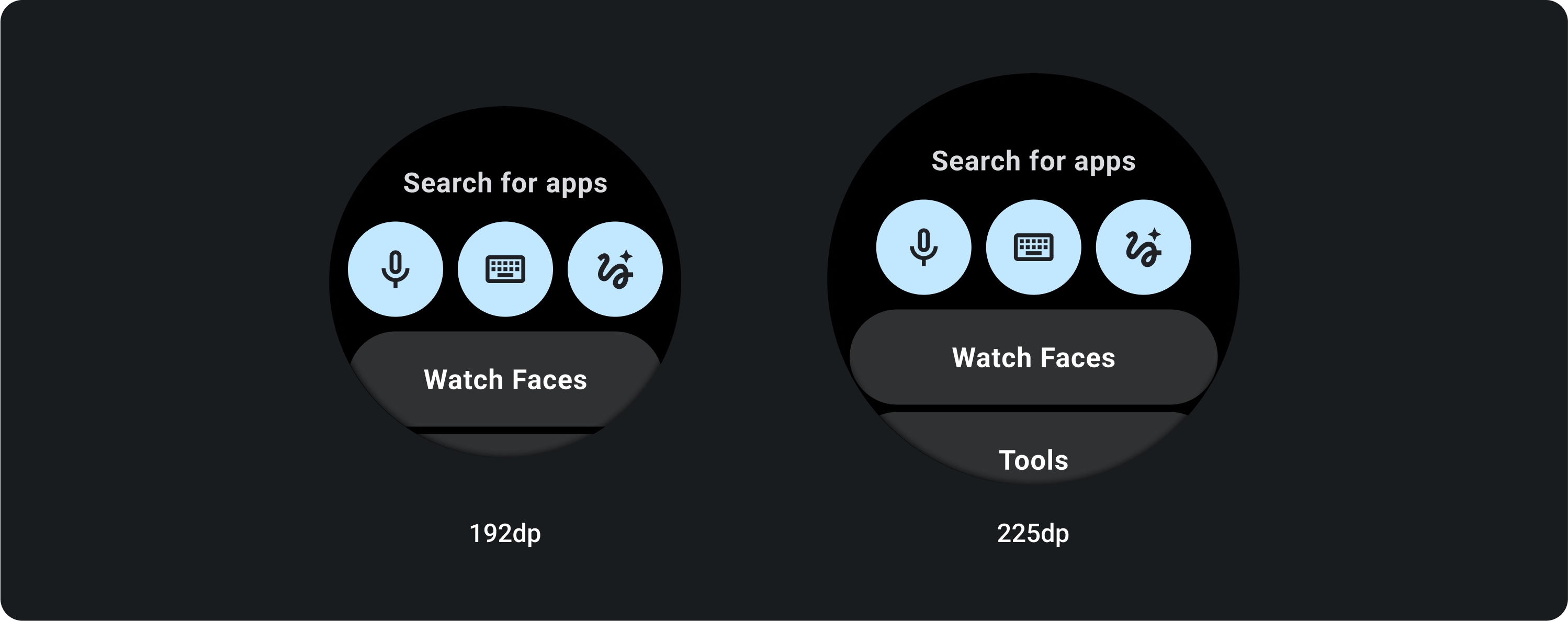
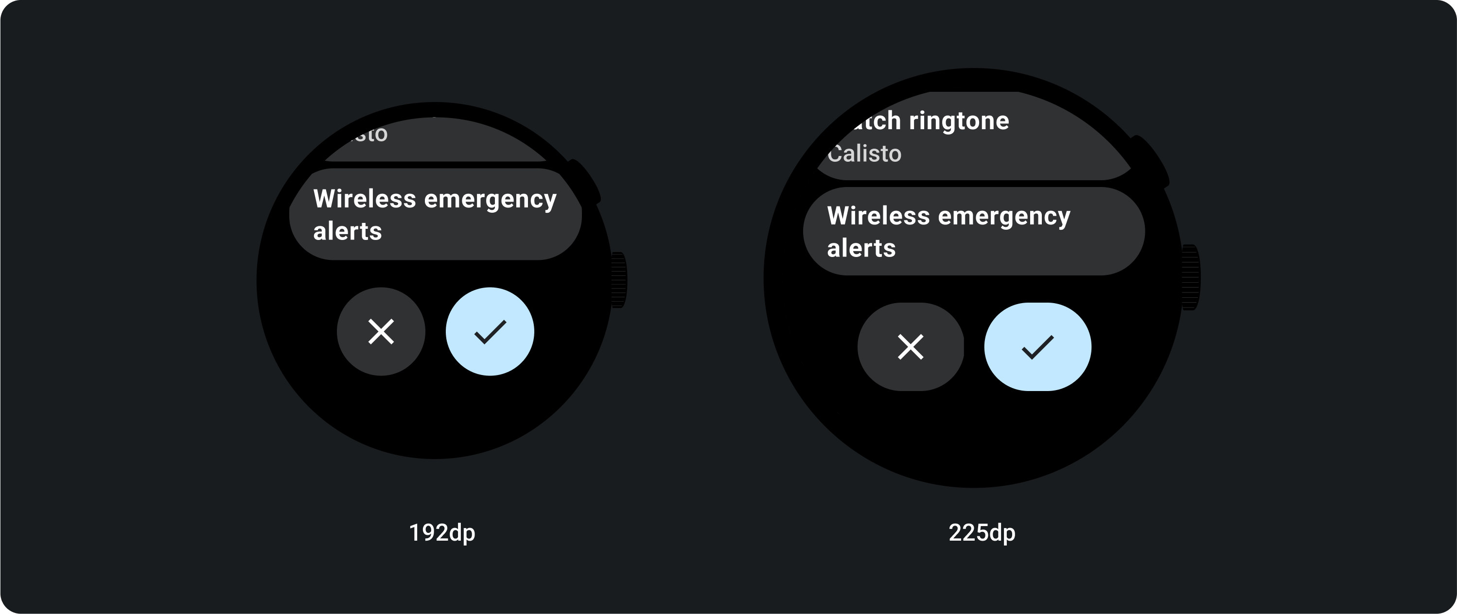
3 Buttons
On screens smaller than 225 dp, the buttons remain circular and do not stretch. On larger screens, 225 dp or larger, the buttons stretch all the way to the side margins.