
Android users engage with different media types, such as music, podcasts, audiobooks, and radio. Design apps that allow users to quickly access media on their watch. On the watch, prioritize ease and speed of interactions, because users spend much less time interacting with their watch than their phone or tablet.
Media app architecture
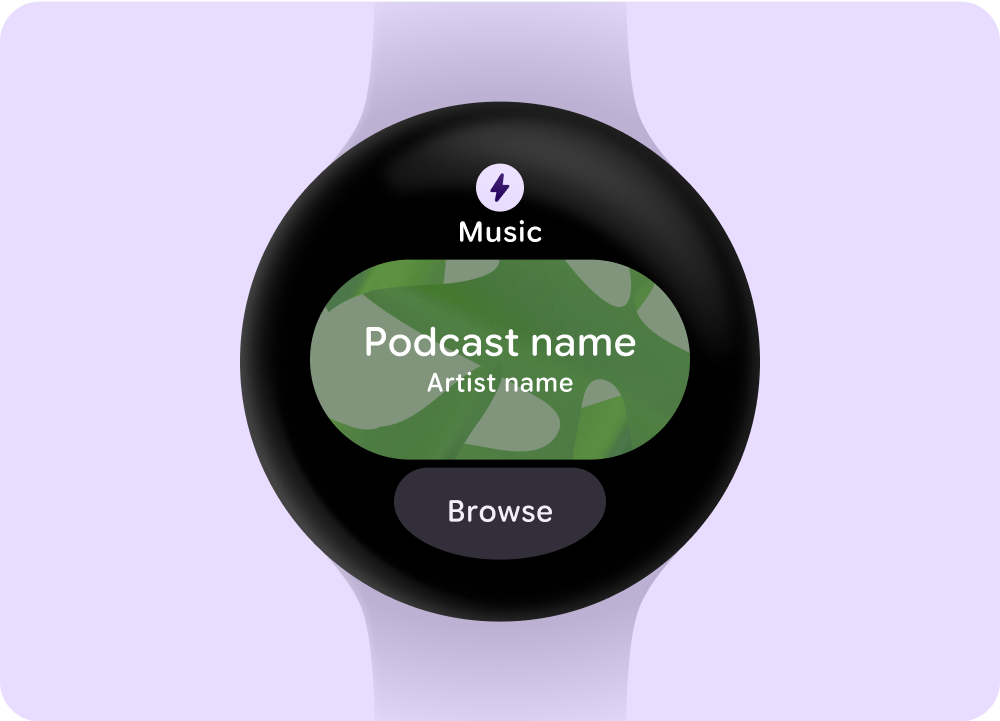
Media apps have specific constraints and requirements, so focus on key use cases like browsing available media or viewing details of a specific media entity.
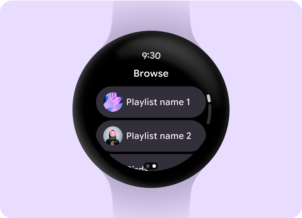
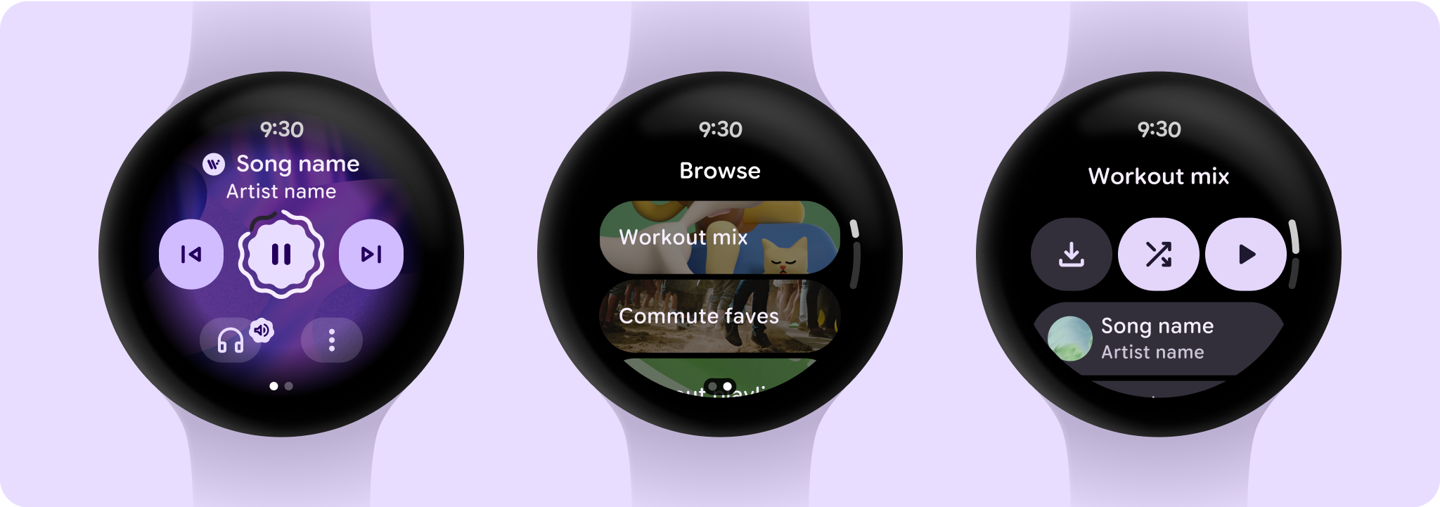
Browse
Helps users find media and content by prioritizing downloaded items.
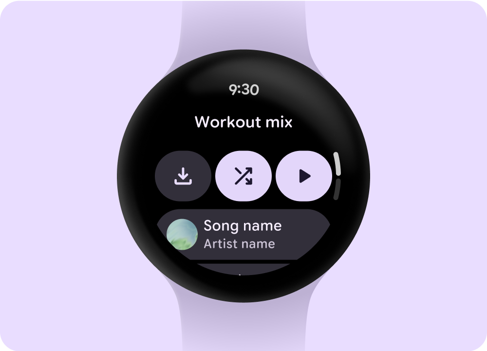
Entity page
Give users more information about what a media item contains. Provide important context and actions—such as manual download, play, or shuffle—readily.
Reduce your app hierarchy and expose media for the user. Design with a flat information architecture that allows users to quickly access lists and showcase thumbnails. Consider using custom design components for Wear OS.
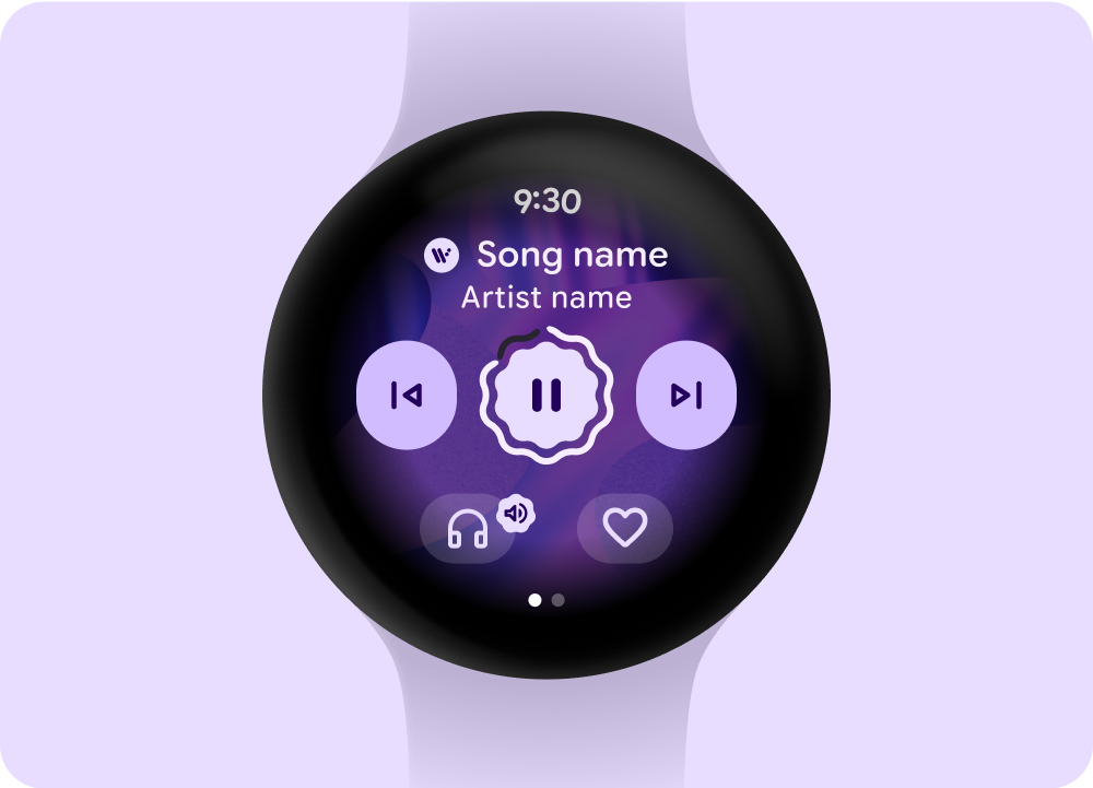
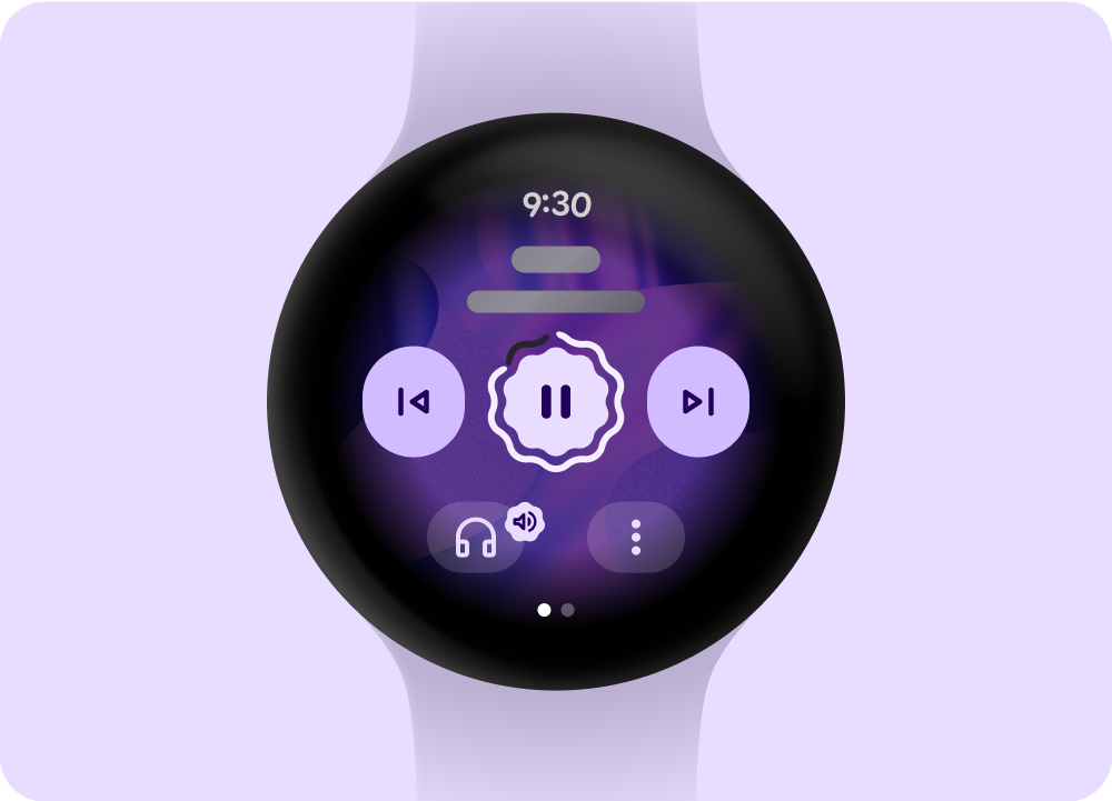
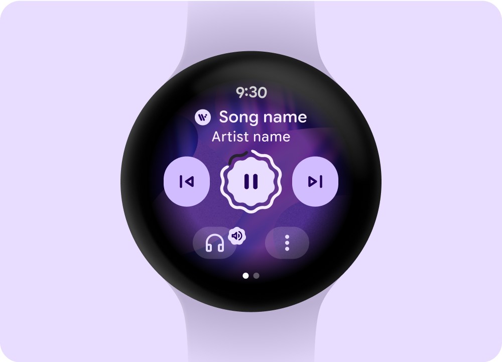
Media controls screen
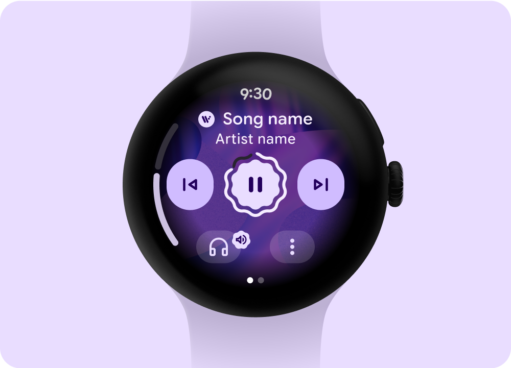
Media apps include media controls screens. Create media controls using a 5-button layout. The 5-button layout helps meet minimum tap targets. The following are examples of media controls for a music app and a podcast or audiobook app.
 Music
Music
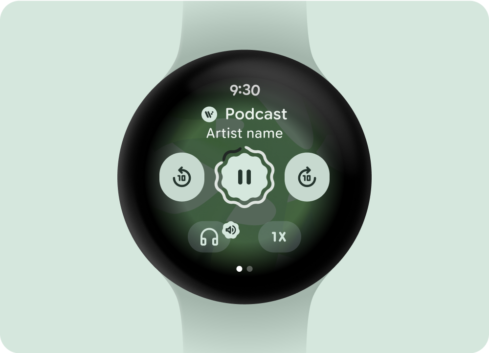 Podcasts or audiobooks
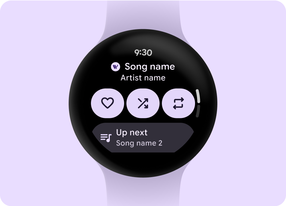
If you include more than 5 actions, use a three-dot overflow icon to take users to an additional page. Adapt the media controls that you display, depending on the type of content. You can use custom icons and fonts for your app.
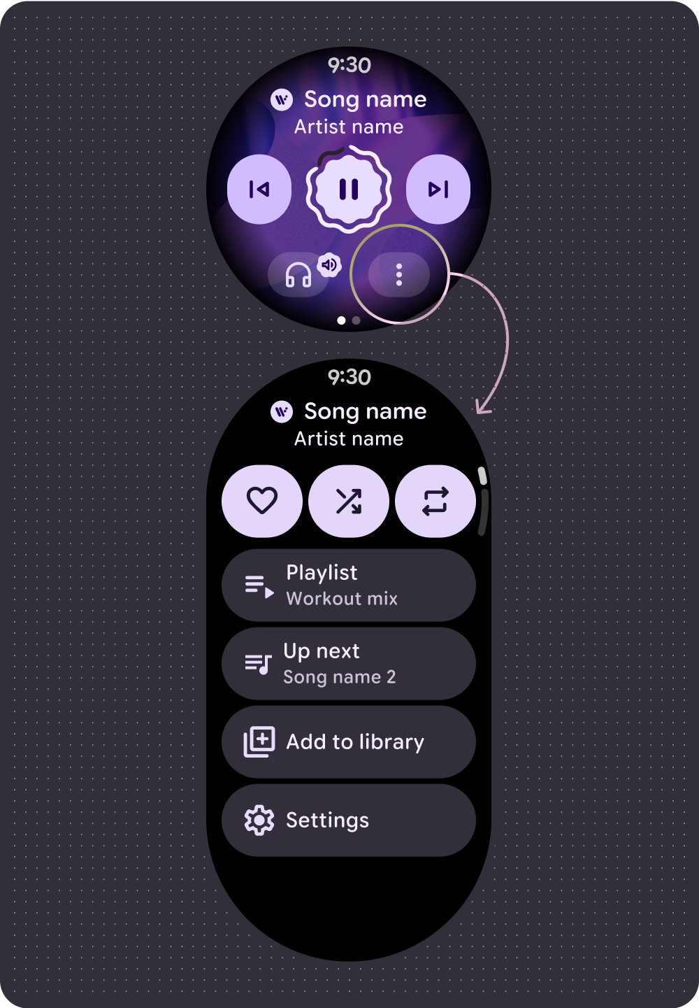 Music
Music
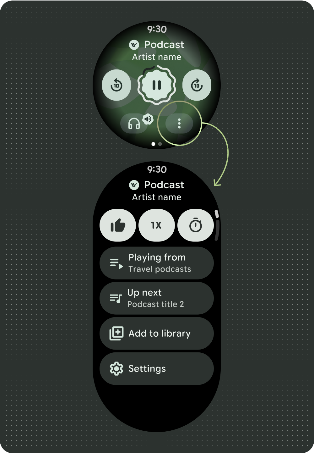 Podcasts or audiobooks
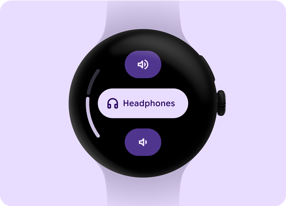
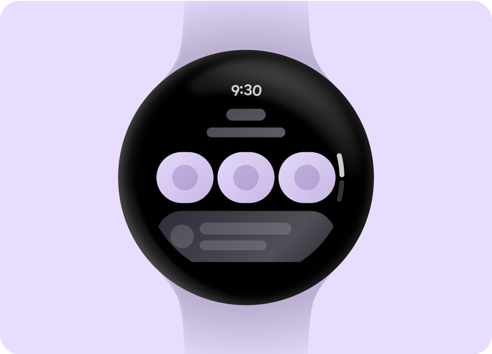
Control the volume
Volume controls are a key media control for users on the watch. Media controls include a device volume button to enter the volume controls screen and indicate the output device in use, such as headphones.
Most Wear OS devices have a rotating side button (RSB) or a bezel. Certain Wear devices can also have additional hardware buttons to control volume. Use the RSB, bezel, or the additional button to control the volume. On the media controls screen, show the volume indicator only when the RSB or bezel is rotated, as shown in the example.
Show the indicator only when the RSB or bezel is rotated
Stepper component: Volume and output controls
Manage playback queue
Playback queues have two types:
- Playback queue without previous songs.
- Playback queue with previous songs.
To help users interact effectively with the playback queue, use the consistent pattern shown in the following example.
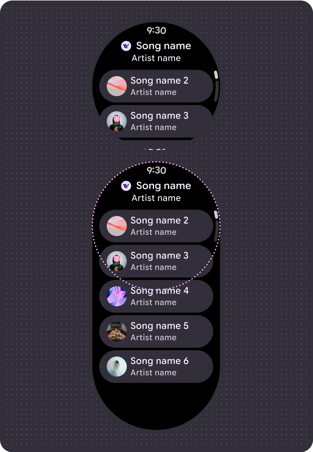 Playback queue without previous songs
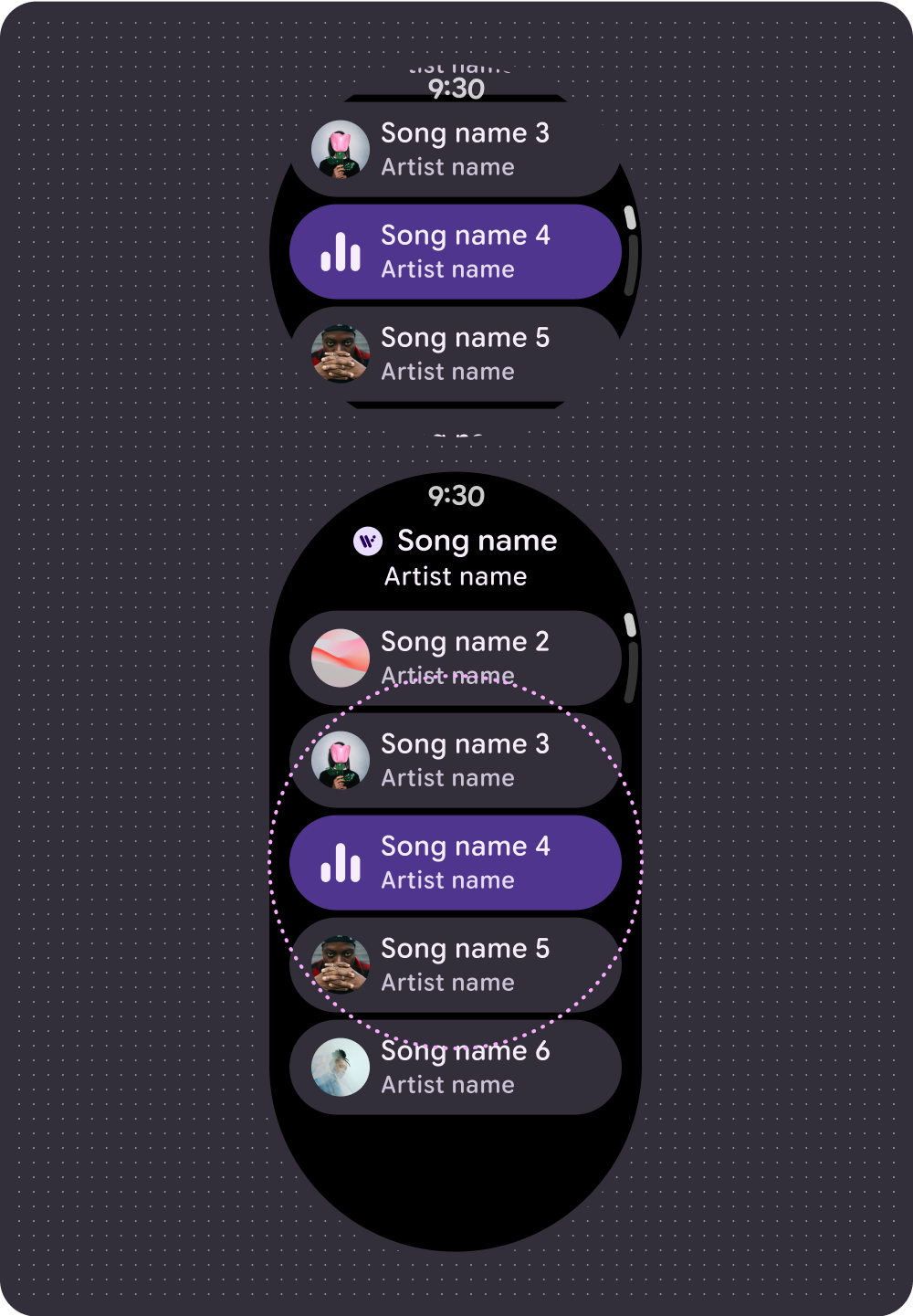 Playback queue with previous songs
Always on Display (AOD)
Developers can also create a custom ambient mode layout. This supports ongoing experiences, such as media controls. Because these layouts remain on the screen for long time periods, limit the number of pixels that are illuminated.
Media player
 Ambiactive AOD mode (handled by developers)
To make content power efficient while also meeting user needs, remove progress indicators that update frequently for media sessions.
If a progress indicator needs to update several times a minute to provide value to the user, remove it. For example, a progress ring for a short 3-minute audio track would update too infrequently to be helpful in always-on mode.
Handle loading states
To reduce perceived latency, the system supports placeholder and loading states that hint at where content appears once it loads. This animated treatment overlays the loading content and follows the same structure of the layout and components that are loading. The transition between loading and loaded states creates a natural transition.
 Loading or Placeholder state
 Loaded state
 Loading or Placeholder state
 Loaded state
Design tiles
For media tiles, show selectable media and include an effective way to quickly access the app experience. Device latency for media data updates on tiles can last up to 20 seconds. Therefore, avoid direct action buttons, such as pause or play, that control in-app functions.
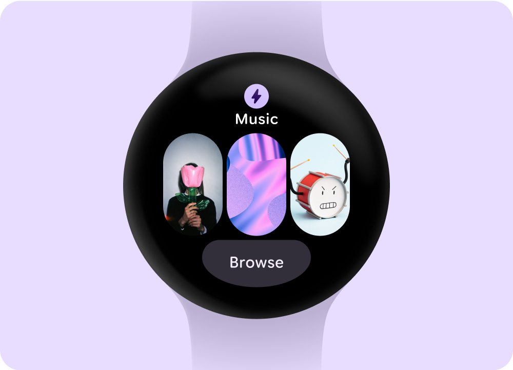 Selectable media options
 Media playing