
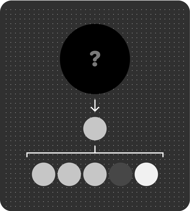
The system creates a theme for your app's media controls by sourcing a seed color from the current media entity's artwork. The Material 3 Expressive dynamic theme algorithm generates a secondary, tertiary and neutral palette. This theme reflects across the rest of the app screens.
Examples of color themes
The following sections show examples of color themes.
Example 1
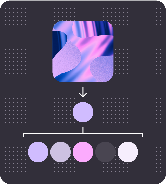
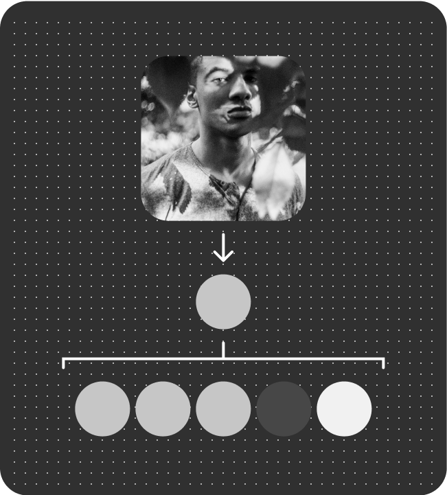
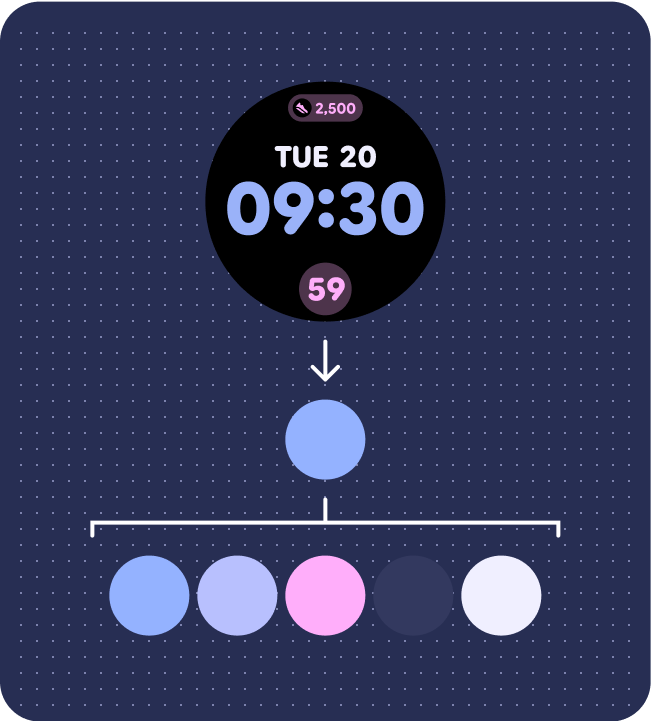
Color palette (from artwork seed color)
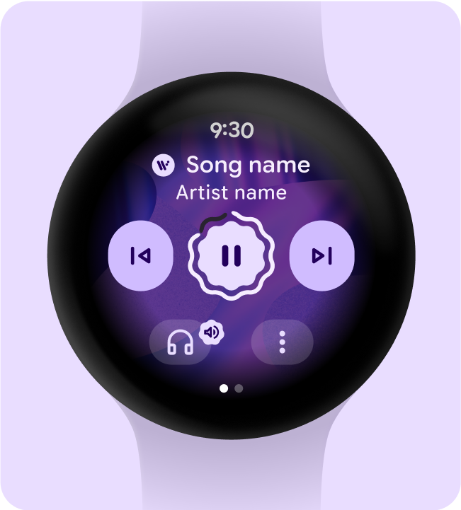
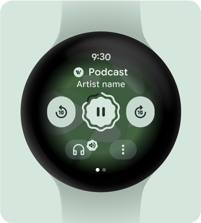
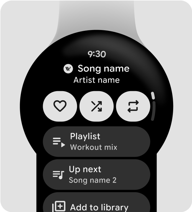
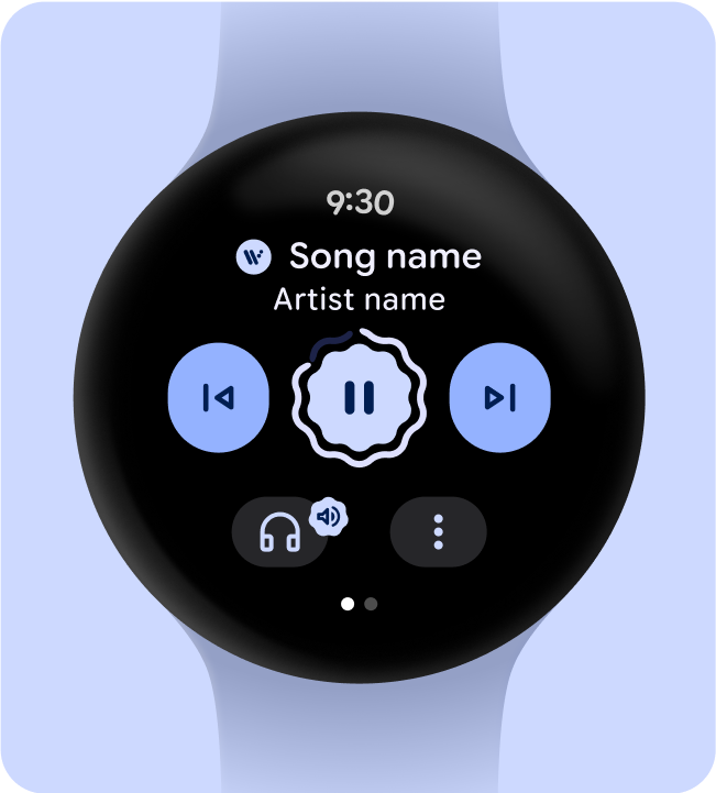
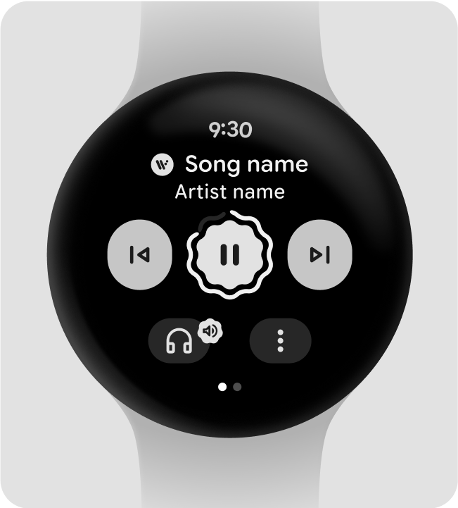
Media controls
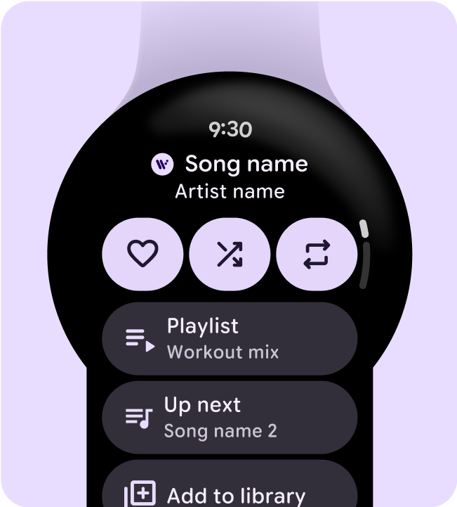
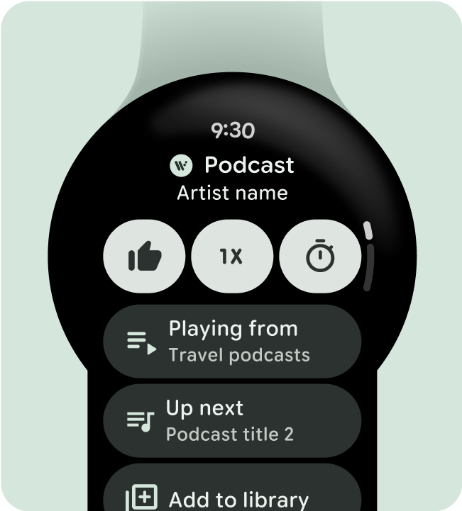
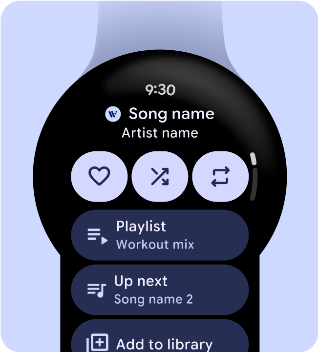
Overflow app screen
Example 2
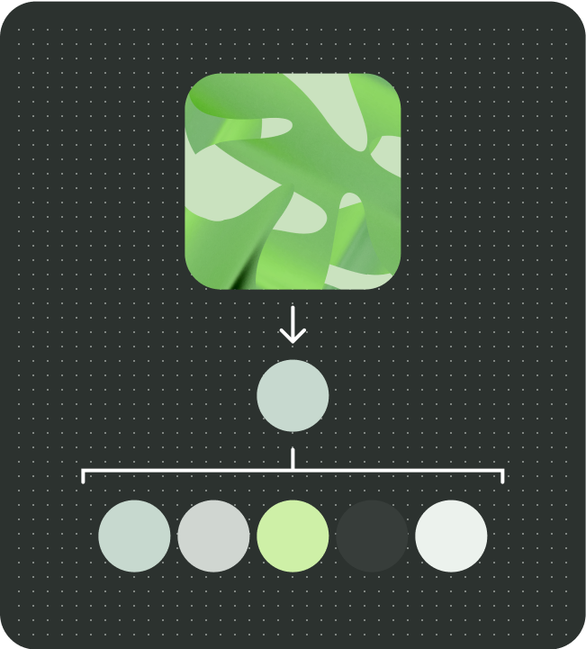
Color palette (from artwork seed color)
Media controls
Overflow app screen
Example 3
Color palette (from artwork seed color)
Media controls
Overflow app screen
Fallback theme
To prepare for an instance where there is no artwork, or seed color available, the system uses a fallback theme based on the user's current watch face.
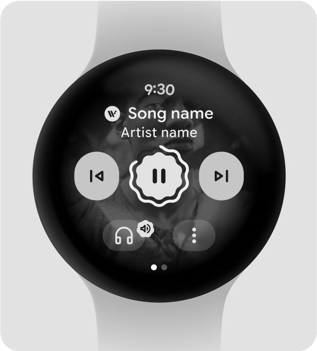
You can also choose to use a monochrome palette and seed color in your media app. In this case, the media entity's artwork doesn't appear on the media controls screen.
System media controls (fallback)
Color palette (from Watchface/SysUI color)
Media controls
Overflow app screen
Media app controls (fallback) - mono
Color palette (monochrome color palette)
Media controls

Overflow app screen