
1. 事前準備
如要瞭解如何使用各種 Android 平台 API,實作社群網路應用程式中的常見功能,SociaLite 是絕佳的參考範例。這款應用程式運用各式 Jetpack API 實現複雜功能,不僅可在更多裝置上穩定運作,也能減少編寫程式碼的需求。
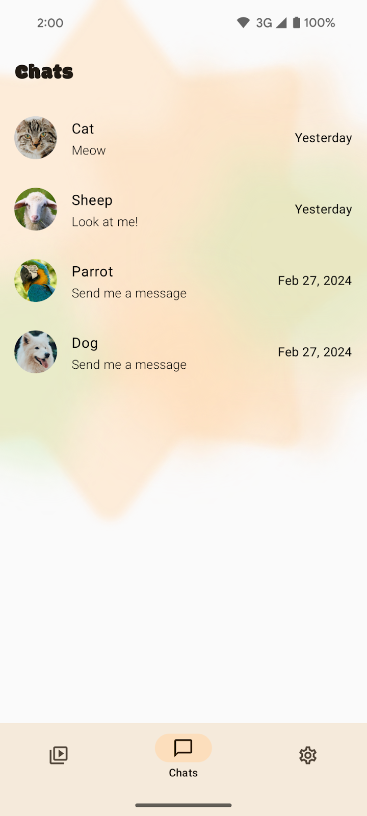
本程式碼研究室會逐步引導您製作與 Android 15 無邊框強制措施相容的 SociaLite 應用程式,並確保這款無邊框應用程式能回溯相容。採用無邊框設計後,SociaLite 會如下圖所示,具體情形因裝置和操作模式而異:
|
|
三按鈕操作模式下的 SociaLite | 手勢操作模式下的 SociaLite |

|
大螢幕裝置上的 SociaLite |

必要條件
- 具備 Kotlin 基本知識。
- 完成「設定 Android Studio」程式碼研究室,或熟悉 Android Studio 使用方式,且能在搭載 Android 15 的模擬器或實體裝置上測試應用程式。
課程內容
- 如何因應 Android 15 的無邊框措施更動。
- 如何讓無邊框應用程式回溯相容。
軟硬體需求
- 最新版 Android Studio。
- 搭載 Android 15 Beta 1 以上版本的測試裝置或模擬器。
- Android 15 Beta 1 以上版本的 SDK。
2. 取得範例程式碼
- 前往 GitHub 下載範例程式碼。
您也可以複製整個存放區,然後查看 codelab_improve_android_experience_2024 分支。
$ git clone git@github.com:android/socialite.git
$ cd socialite
$ git checkout codelab_improve_android_experience_2024
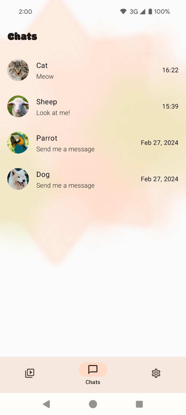
- 在 Android Studio 中開啟 SociaLite,然後在 Android 15 裝置或模擬器上執行該應用程式。您會看到類似下方的畫面:
|
|
三按鈕操作 | 手勢操作 |


|
大螢幕 |

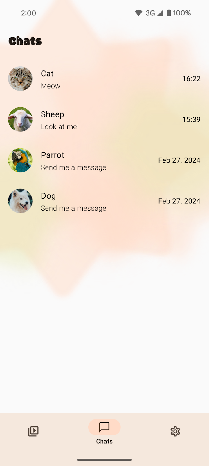
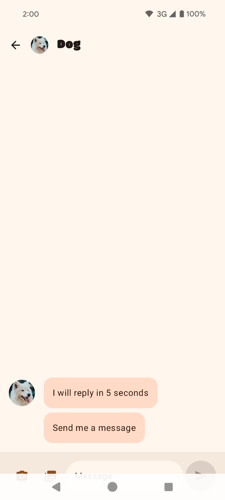
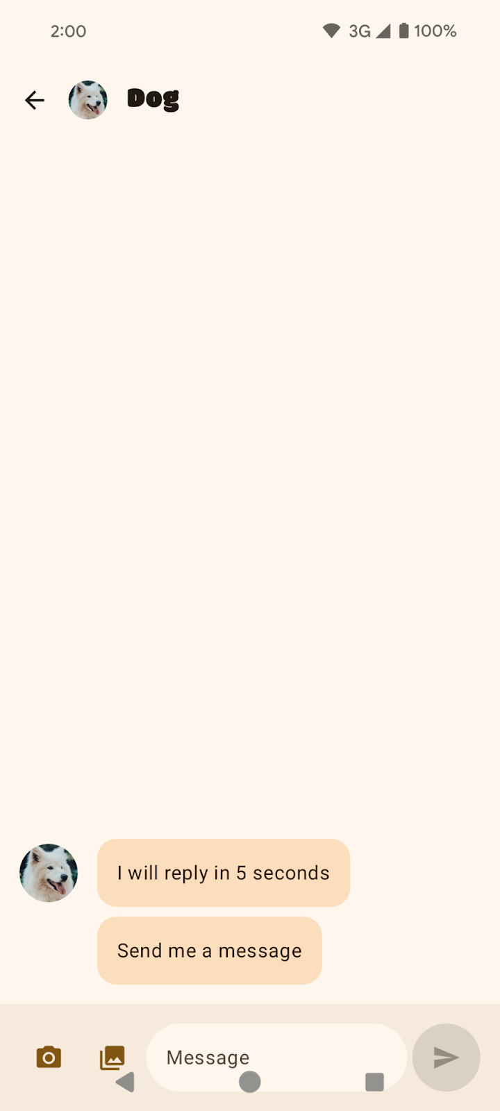
- 在「Chats」頁面上選取任一對話,例如談論狗狗的對話。
|
|
談論狗狗的聊天訊息 (三按鈕操作模式) | 談論狗狗的聊天訊息 (手勢操作模式) |


3. 讓應用程式採用 Android 15 的無邊框設計
什麼是無邊框設計?
採用「無邊框」設計,是指應用程式能在系統資訊列後方繪製,帶來更優質的使用者體驗,並充分運用螢幕空間。

如何因應 Android 15 的無邊框措施更動
在 Android 15 之前,應用程式的 UI 預設會受到限制,即使處於展開狀態,也不會延伸到狀態列和導覽列這類系統資訊列區塊。雖然您可以選擇採用無邊框設計,但因應用程式各不相同,這項操作可能既瑣碎又麻煩。
所幸,從 Android 15 開始,應用程式都會預設採用「無邊框」設計。您會看到以下預設設定:
- 三按鈕導覽列呈現透明狀態。
- 手勢導覽列呈現透明狀態。
- 狀態列呈現透明狀態。
- 除非是套用了插邊或邊框間距,否則內容會在系統資訊列後方繪製,例如在導覽列、狀態列和說明文字列之後。
這可確保在提升應用程式品質時,一定會採用無邊框設計,並讓打造無邊框應用程式的過程更輕鬆。不過,此更動對應用程式可能不是全然有益。我們之後會舉例說明您將目標 SDK 升級為 Android 15 後,對 SociaLite 造成的兩項負面影響。
將目標 SDK 值改為 Android 15
- 在 SociaLite 應用程式的 build.gradle 檔案中,將目標和編譯 SDK 版本更改為 Android 15 或
VanillaIceCream。
如果您學習這個程式碼研究室課程時,Android 15 還未推出穩定版,程式碼會如下所示:
android {
    namespace = "com.google.android.samples.socialite"
    compileSdkPreview = "VanillaIceCream"

    defaultConfig {
        applicationId = "com.google.android.samples.socialite"
        minSdk = 21
        targetSdkPreview = "VanillaIceCream"
        ...
    }
...
}
如果您學習這個程式碼研究室課程時,Android 15 已推出穩定版,程式碼會如下所示:
android {
    namespace = "com.google.android.samples.socialite"
    compileSdk = 35

    defaultConfig {
        applicationId = "com.google.android.samples.socialite"
        minSdk = 21
        targetSdk = 35
        ...
    }
...
}
- 重新建構 SociaLite,留意下列問題:
- 三按鈕操作模式下的背景保護措施與導覽列不符。在手勢操作模式下,「Chats」畫面會自動採用無邊框設計,您不必執行任何操作。但在三按鈕操作模式下,您應移除畫面的背景保護措施。
|
|
三按鈕操作模式下的「Chats」畫面 | 手勢操作模式下的「Chats」畫面 |
- UI 遭遮蔽。對話底部的 UI 元素被導覽列遮住。此問題在三按鈕操作模式下最為明顯。
|
|
談論狗狗的聊天訊息 (三按鈕操作模式) | 談論狗狗的聊天訊息 (手勢操作模式) |
修正 SociaLite
如要移除三按鈕操作模式預設的背景保護措施,請執行下列步驟:
- 在
MainActivity.kt檔案中移除預設的背景保護措施,方法是將 window.isNavigationBarContrastEnforced 屬性設為 false。
class MainActivity : ComponentActivity() {
    override fun onCreate(savedInstanceState: Bundle?) {
        installSplashScreen()
        super.onCreate(savedInstanceState)
        setContent {
            // Add this block:
            if (Build.VERSION.SDK_INT >= Build.VERSION_CODES.Q) {
                window.isNavigationBarContrastEnforced = false
            }
        }
    }
    ...
}
window.isNavigationBarContrastEnforced 屬性可確保導覽列的對比度夠強,能因應全透明背景的要求。您只要將這個屬性設為 false,就能有效將三按鈕操作模式的背景設為透明。window.isNavigationBarContrastEnforced 只會在三按鈕操作模式下發揮效果,不會影響手勢操作模式。
- 在 Android 15 裝置上重新執行應用程式,查看任一對話。「Timeline」、「Chats」和「Settings」畫面現在都會顯示為無邊框。而應用程式的
NavigationBar(含有「Timeline」、「Chats」和「Settings」按鈕) 會在系統透明的三按鈕導覽列後方繪製。
|
|
「Chats」畫面上的帶狀長條已移除。 | 手勢操作模式不受影響 |
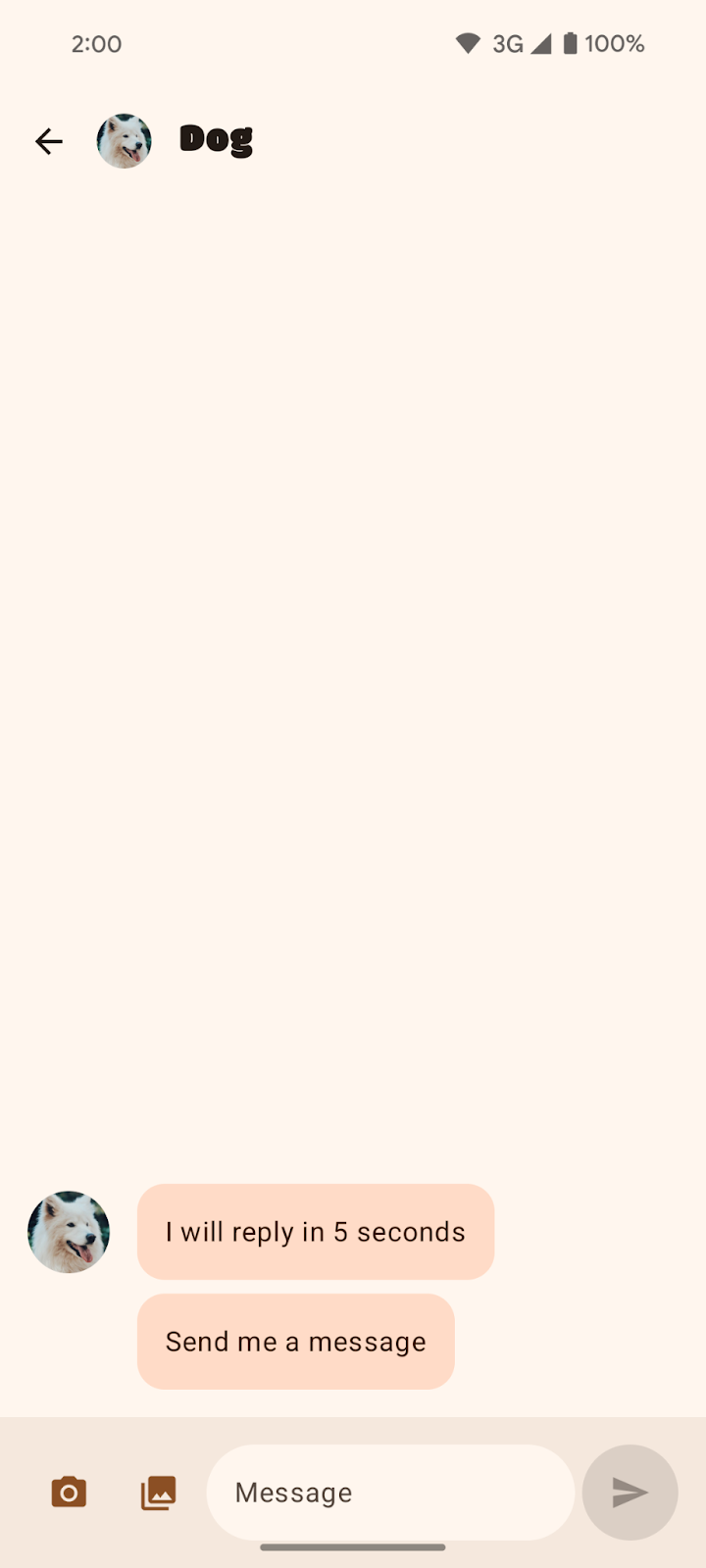
但請注意,對話的 InputBar 仍遭到系統資訊列遮蔽。您需要妥善處理插邊,才能修正這個問題。
|
|
談論狗狗的對話 (三按鈕操作模式)。底部的輸入欄位被系統導覽列遮住。 | 談論狗狗的對話 (手勢操作模式)。底部的輸入欄位被系統導覽列遮住。 |

在 SociaLite 中,InputBar 會被遮住。實際上,如果您將裝置旋轉到橫向模式,或使用大螢幕裝置,可能會發現畫面四周的元素都遭到遮蓋。因此,請針對上述所有使用情況,考量如何處理插邊。就 SociaLite 而言,您可以套用邊框間距,將 InputBar 中可輕觸的內容調到上方位置。
如要套用插邊以修正 UI 遭遮蔽的問題,請採取以下步驟:
- 前往
ui/chat/ChatScreen.kt檔案,在第 178 行左右找出ChatContent可組合函式,其中含有對話畫面的 UI。ChatContent會利用Scaffold輕鬆建構 UI。根據預設,Scaffold可提供系統 UI 相關資訊 (例如系統資訊列的深度) 做為插邊,供您搭配使用Scaffold的邊框間距值 (innerPadding參數)。請使用Scaffold的innerPadding,將邊框間距新增到InputBar中。 - 在第 214 行左右找出
ChatContent中的InputBar。這個自訂的可組合函式可建立 UI,供使用者撰寫訊息。以下是輸入列的預覽畫面:

InputBar 採用了 contentPadding,並將其當做邊框間距,套用到含有其餘 UI 的 Row 可組合函式中。這個邊框間距會套用到 Row 可組合函式的每個邊。您可以在第 432 行左右發現這點。以下是供您參考的 InputBar 可組合函式 (請不要新增這段程式碼):
// Don't add this code because it's only for reference.
@Composable
private fun InputBar(
    contentPadding: PaddingValues,
    ...,
) {
    Surface(...) {
        Row(
            modifier = Modifier
                .padding(contentPadding)
            ...
        ) {
            IconButton(...) { ... } // take picture
            IconButton(...) { ... } // attach picture
            TextField(...) // write message
            FilledIconButton(...){ ... } // send message
            }
        }
    }
}
- 返回
ChatContent中的InputBar,然後變更contentPadding,以便使用系統資訊列插邊。您可以在第 220 行左右查看此操作。
InputBar(
    ...
    contentPadding = innerPadding, //Add this line.
    // contentPadding = PaddingValues(0.dp), // Remove this line.
    ...
 )
- 在 Android 15 裝置上重新執行應用程式。
|
|
談論狗狗的對話 (三按鈕操作模式);其中插邊套用方式有誤。 | 談論狗狗的對話 (手勢操作模式);其中插邊套用方式有誤。 |


套用底部邊框間距後,按鈕就不會再被系統資訊列遮住,但是這也同時套用了頂部邊框間距,其中涵蓋 TopAppBar 和系統資訊列的深度。Scaffold 會將邊框間距值傳遞給自身內容,以便避開頂部應用程式列和系統資訊列。
- 如要修正頂部邊框間距,請建立
innerPaddingPaddingValues副本,將頂部邊框間距設為0.dp,然後將修改的副本傳遞到contentPadding中。
InputBar(
    ...
    contentPadding = innerPadding.copy(layoutDirection, top = 0.dp), //Add this line.
    // contentPadding = innerPadding, // Remove this line.
    ...
 )
- 在 Android 15 裝置上重新執行應用程式。
|
|
談論狗狗的對話 (三按鈕操作模式);已正確套用插邊。 | 談論狗狗的對話 (手勢操作模式);已正確套用插邊。 |


恭喜!您已針對 Android 15 平台的無邊框相關更動,製作相容的 SociaLite 應用程式。接著,我們來瞭解如何確保採用無邊框設計的 SociaLite 能夠回溯相容。
4. 讓採用無邊框設計的 SociaLite 回溯相容
現在,SociaLite 在 Android 15 上已採用無邊框設計,但在較舊的 Android 裝置上卻非如此。如要讓 SociaLite 在舊版 Android 裝置上顯示無邊框效果,請呼叫 enableEdgeToEdge,然後在 MainActivity.kt 檔案中設定內容。
class MainActivity : ComponentActivity() {
    override fun onCreate(savedInstanceState: Bundle?) {
        installSplashScreen()
        enableEdgeToEdge() // Add this line.
        window.isNavigationBarContrastEnforced = false
        super.onCreate(savedInstanceState)
        setContent {... }
    }
}
enableEdgeToEdge 的匯入內容是 import androidx.activity.enableEdgeToEdge。依附元件為 AndroidX Activity 1.8.0 以上版本。
如要深入瞭解如何讓無邊框應用程式回溯相容,以及如何處理插邊,請參閱以下指南:
本課程中關於無邊框設計的部分到此結束。下一節內容屬於選用性質,會討論無邊框設計的其他注意事項,或許也適用於您的應用程式。
5. 選用:無邊框設計的其他注意事項
處理架構周遭的插邊
元件
您可能已注意到,當我們變更目標 SDK 值後,SociaLite 中的許多元件「並未」更動。SociaLite 的架構採用最佳做法,因此處理這項平台變更並不困難。最佳做法包括:
- 使用 Material Design 3 元件 (
androidx.compose.material3),例如TopAppBar、BottomAppBar和NavigationBar,因為這類元件會自動套用插邊。 - 如果應用程式使用 Compose 的 Material 2 元件 (
androidx.compose.material),這類元件本身不會自動處理插邊。不過,您可以存取插邊,然後手動套用。在androidx.compose.material 1.6.0以上版本,則請使用windowInsets參數,為BottomAppBar、TopAppBar、BottomNavigation和NavigationRail手動套用插邊。同樣地,對Scaffold也是使用contentWindowInsets參數。否則,請手動將插邊套用為邊框間距。 - 如果應用程式使用 Views 和 Material 元件 (
com.google.android.material),您可能不需採取額外行動,因為大多數以 Views 為基礎的 Material 元件 (例如BottomNavigationView、BottomAppBar、NavigationRailView和NavigationView) 都會處理插邊。不過,如果您使用AppBarLayout,就需要新增android:fitsSystemWindows="true"。 - 如果應用程式使用 Views 和
BottomSheet、SideSheet或自訂的容器,請使用ViewCompat.setOnApplyWindowInsetsListener套用邊框間距。對於RecyclerView,也請使用這個事件監聽器套用邊框間距,同時新增clipToPadding="false"。 - 如果是複雜的 UI,請使用
Scaffold(或NavigationSuiteScaffold/ListDetailPaneScaffold),而非Surface。Scaffold可讓您輕鬆放置TopAppBar、BottomAppBar、NavigationBar和NavigationRail。
捲動內容
您的應用程式可能含有清單;受到 Android 15 異動影響,清單中最後一個項目或許會被系統的導覽列遮住。

上圖顯示三按鈕操作模式遮住清單中最後一個項目。
使用 Compose 捲動內容
在 Compose 中,請使用 LazyColumn 的 contentPadding 為最後一個項目增加空間,但如果您使用 TextField 則例外:
Scaffold { innerPadding ->
    LazyColumn(
        contentPadding = innerPadding
    ) {
        // Content that does not contain TextField
    }
}

上圖顯示三按鈕操作模式「不再」遮住清單中最後一個項目。
如果您使用 TextField,請以 Spacer 在 LazyColumn 中繪製最後一個 TextField。詳情請參閱插邊消耗。
LazyColumn(
    Modifier.imePadding()
) {
    // Content with TextField
    item {
        Spacer(
            Modifier.windowInsetsBottomHeight(
                WindowInsets.systemBars
            )
        )
    }
}
使用 Views 捲動內容
如果是 RecyclerView 或 NestedScrollView,請新增 android:clipToPadding="false"。
<androidx.recyclerview.widget.RecyclerView
    android:id="@+id/recycler"
    android:layout_width="match_parent"
    android:layout_height="match_parent"
    android:clipToPadding="false"
    app:layoutManager="LinearLayoutManager" />
請使用 setOnApplyWindowInsetsListener 從視窗插邊提供左右兩側和底部的邊框間距:
ViewCompat.setOnApplyWindowInsetsListener(binding.recycler) { v, insets ->
    val i = insets.getInsets(
        WindowInsetsCompat.Type.systemBars() + WindowInsetsCompat.Type.displayCutout()
    )
    v.updatePadding(
        left = i.left,
        right = i.right,
        bottom = i.bottom + bottomPadding,
    )
    WindowInsetsCompat.CONSUMED
}
使用 LAYOUT_IN_DISPLAY_CUTOUT_MODE_ALWAYS
將目標版本指定為 SDK 35 前,處於橫向模式的 SocialLite 會如下圖所示:左側邊緣有為鏡頭凹口預留的大範圍白色方塊。在三按鈕操作模式下,按鈕位於右側。

將目標版本指定為 SDK 35 後,SocialLite 會如下圖所示:左側邊緣不再為鏡頭凹口預留的大範圍白色方塊。為了達成此效果,Android 會自動設定 LAYOUT_IN_DISPLAY_CUTOUT_MODE_ALWAYS。
視您的應用程式而定,建議您在這裡處理插邊。
如要在 SociaLite 中處理插邊,請按照下列步驟操作:
- 在
ui/ContactRow.kt檔案中找出 Row 可組合函式。 - 配合螢幕凹口修改邊框間距。
@Composable
fun ChatRow(
   chat: ChatDetail,
   onClick: (() -> Unit)?,
   modifier: Modifier = Modifier,
) {
   // Add layoutDirection, displayCutout, startPadding, and endPadding.
   val layoutDirection = LocalLayoutDirection.current
   val displayCutout = WindowInsets.displayCutout.asPaddingValues()
   val startPadding = displayCutout.calculateStartPadding(layoutDirection)
   val endPadding = displayCutout.calculateEndPadding(layoutDirection)
   Row(
       modifier = modifier
           ...
           // .padding(16.dp) // Remove this line.
           // Add this block:
           .padding(
               PaddingValues(
                   top = 16.dp,
                   bottom = 16.dp,
                   // Ensure content is not occluded by display cutouts
                   // when rotating the device.
                   start = startPadding.coerceAtLeast(16.dp),
                   end = endPadding.coerceAtLeast(16.dp)
               )
           ),
       ...
   ) { ... }
處理螢幕凹口後,SociaLite 看起來會像這樣:
您可以在「開發人員選項」畫面的「螢幕凹口」之下,測試各種螢幕凹口設定。
如果應用程式具有使用 LAYOUT_IN_DISPLAY_CUTOUT_MODE_DEFAULT、LAYOUT_IN_DISPLAY_CUTOUT_MODE_NEVER 或 LAYOUT_IN_DISPLAY_CUTOUT_MODE_SHORT_EDGES 的「非」浮動式視窗 (例如 Activity),那麼從 Android 15 Beta 2 開始,Android 會將這些凹口模式解讀為 LAYOUT_IN_DISPLAY_CUTOUT_MODE_ALWAYS。在之前的 Android 15 Beta 1 中,應用程式會異常終止。
說明文字列也是系統資訊列
說明文字列的用途是說明任意形式視窗中的系統 UI 視窗裝飾,例如頂部標題列,因此也可說是系統資訊列。在 Android Studio 的桌機模擬器中,您可以查看說明文字列。下方的螢幕截圖顯示說明文字列位於應用程式頂部。

在 Compose 中,如果您使用 Scaffold 的 PaddingValues、safeContent、safeDrawing 或內建的 WindowInsets.systemBars,應用程式會正常顯示。但如果使用 statusBar 處理插邊,應用程式內容可能就不會正常顯示,因為狀態列沒有空間容納說明文字列。
在 Views 中,如果您使用 WindowInsetsCompat.systemBars 手動處理插邊,應用程式會正常顯示。但如果使用 WindowInsetsCompat.statusBars 手動處理插邊,應用程式可能就不會正常顯示,因為狀態列並非說明文字列。
沉浸模式下的應用程式
Android 15 強制執行的無邊框措施對沉浸模式畫面的影響不大,因為沉浸式的應用程式已經採用無邊框設計。
保護系統資訊列
建議您讓應用程式採用透明的手勢操作列,但採用半透明或不透明的三按鈕操作列。
Android 15 預設使用半透明的三按鈕操作列,因為這個平台會將 window.isNavigationBarContrastEnforced 屬性設為 true。手勢操作列則維持透明。
|
三按鈕操作列預設為半透明。 |

半透明的三按鈕操作列應可滿足一般需求。不過,在某些情況下,應用程式可能會需要不透明的三按鈕操作列。此時,請先將 window.isNavigationBarContrastEnforced 屬性設為 false。接著,使用 WindowInsetsCompat.tappableElement (針對 Views) 或 WindowInsets.tappableElement (針對 Compose)。如果這些值都是 0,表示使用者採用手勢操作模式。若是其他值,表示使用者採用三按鈕操作模式。如果使用者採用三按鈕操作模式,請在導覽列後方繪製檢視畫面或方塊。以 Compose 來說,可能會像這樣:
class MainActivity : ComponentActivity() {
    override fun onCreate(savedInstanceState: Bundle?) {
        super.onCreate(savedInstanceState)
        setContent {
            window.isNavigationBarContrastEnforced = false
            MyTheme {
                Surface(...) {
                    MyContent(...)
                    ProtectNavigationBar()
                }
            }
        }
    }
}


// Use only if required.
@Composable
fun ProtectNavigationBar(modifier: Modifier = Modifier) {
   val density = LocalDensity.current
   val tappableElement = WindowInsets.tappableElement
   val bottomPixels = tappableElement.getBottom(density)
   val usingTappableBars = remember(bottomPixels) {
       bottomPixels != 0
   }
   val barHeight = remember(bottomPixels) {
       tappableElement.asPaddingValues(density).calculateBottomPadding()
   }

   Column(
       modifier = modifier.fillMaxSize(),
       verticalArrangement = Arrangement.Bottom
   ) {
       if (usingTappableBars) {
           Box(
               modifier = Modifier
                   .background(MaterialTheme.colorScheme.background)
                   .fillMaxWidth()
                   .height(barHeight)
           )
       }
   }
}
|
不透明的三按鈕操作列 |
6. 查看解決方案程式碼
MainActivity.kt 檔案的 onCreate 方法應如下所示:
class MainActivity : ComponentActivity() {
   override fun onCreate(savedInstanceState: Bundle?) {
       installSplashScreen()
       enableEdgeToEdge()
       window.isNavigationBarContrastEnforced = false
       super.onCreate(savedInstanceState)
       setContent {
           Main(
               shortcutParams = extractShortcutParams(intent),
           )
       }
   }
}
ChatScreen.kt 檔案內的 ChatContent 可組合函式應會處理插邊:
private fun ChatContent(...) {
   ...
   Scaffold(...) { innerPadding ->
       Column {
           ...
           InputBar(
               input = input,
               onInputChanged = onInputChanged,
               onSendClick = onSendClick,
               onCameraClick = onCameraClick,
               onPhotoPickerClick = onPhotoPickerClick,
               contentPadding = innerPadding.copy(
                    layoutDirection, top = 0.dp
                ),
               sendEnabled = sendEnabled,
               modifier = Modifier
                   .fillMaxWidth()
                   .windowInsetsPadding(
                       WindowInsets.ime.exclude(WindowInsets.navigationBars)
                    ),
            )
       }
   }
}
解決方案程式碼位於主要分支中。如果您已下載 SociaLite,請執行以下指令:
git checkout main
如果還沒下載 SociaLite,可以再次下載程式碼,直接或透過 Git 查看主要分支:
git clone git@github.com:android/socialite.git