According to a 2011 report by the World Health Organization (WHO) and the World Bank, approximately 15% of the global population–that is, about one in six people–experience a significant or temporary disability in their lifetime. Accessibility in design, then, is fundamental to creating an inclusive, usable, and high-quality app–it leads to the best results for users and can prevent costly rework. Android ships with a variety of features to help you build your app to support accessibility options by default.
Design for vision
Ensure your app's content is as legible as possible by checking color contrast and text sizing, and that components are visually comprehensible and easy to discern from each other.
Follow these guidelines to design for vision accessibility.
- To allow users to adjust the font size, specify font size in scalable pixels (sp)
- Don't make the body size any smaller than 12 sp. This guideline aligns with the Material typescale as a default.
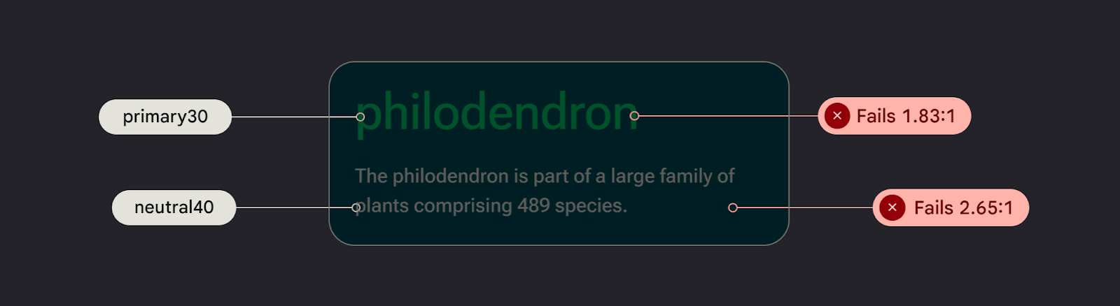
- Ensure the contrast between the background and text is at least 4.5:1. Learn how to check color contrast.
- Use a 3:1 ratio between surfaces and non-text elements. For example, the ratio of a background to an icon would be 3:1.
- Use more than one visual affordance for actions like links.
Use Material's Accessible color system . This color system is based on tonal palettes, and is central to making color schemes accessible by default.
Design for sound
TalkBack is a Google screen reader included on Android devices that gives users eyes-free control. You can manually test this by exploring your app with TalkBack or with the A11y scanner.
Follow these guidelines to ensure your app is prepared for screen readers:
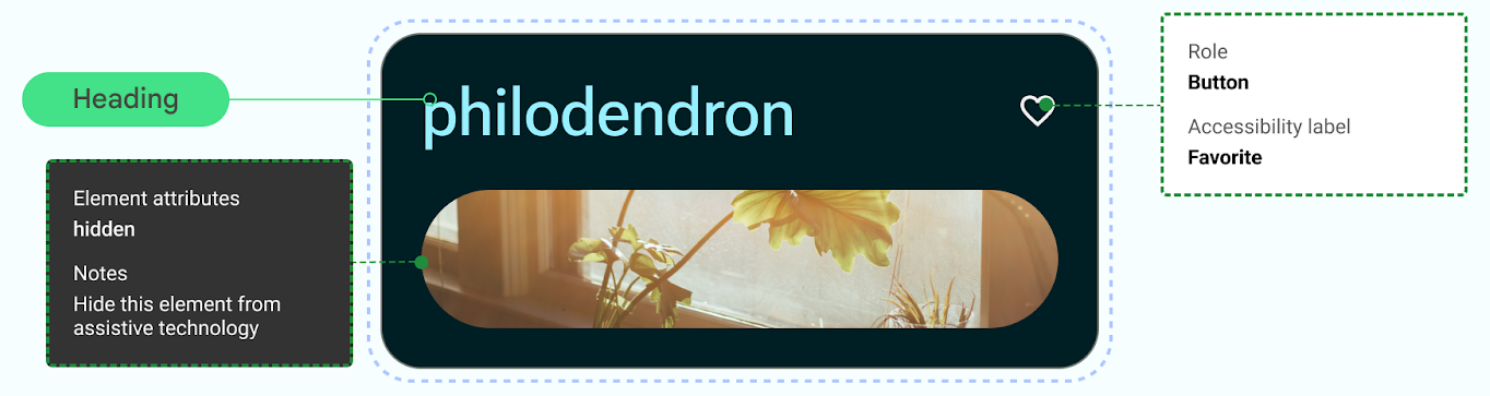
- Describe UI elements in your code. Compose uses Semantics properties to inform accessibility services about the information shown in UI elements.
- To satisfy Android framework requirements, provide additional textual description of icons and images.
- Set decorative item descriptions to null.
- To allow skipping between blocks of actions and content, consider UI granularity and group UI elements..
Check out Material's Design to Implementation Walk, which walks you through accessibility considerations and notation using Web Content Accessibility Guidelines (WCAG).
Design for audio
Android provides features to enable users to interact with their devices through a variety of voice commands and queries.
The Voice Access app for Android lets you control your device with spoken commands. Use your voice to open apps, navigate, and edit text hands-free.
Design for motor skill
Switch Access lets users interact with your Android device using one or more devices, which can be helpful for users with limited dexterity who have trouble interacting directly with a touch screen.
Manually test by exploring switch access.
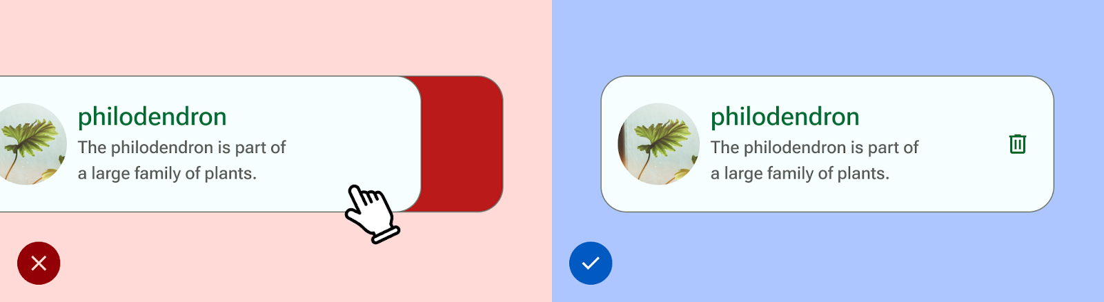
- Don't rely on gestures to complete all actions; create accessibility actions to support all user flows in your app.
- Ensure all touch targets are at least 48 dp, even if this extends past the UI element visual.
- Consider haptic feedback to help inform the user with additional, real-time sensory input.