Progress indicators are circular displays of the length of a process or an otherwise unspecified wait time.
Use progress indicators to show the proportion of a task that is complete. To show progress an indicator is animated along a circular track in a clockwise direction.
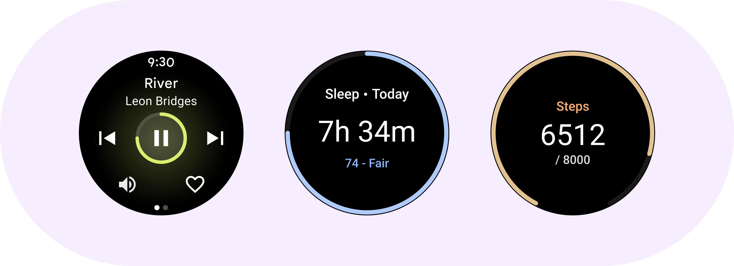
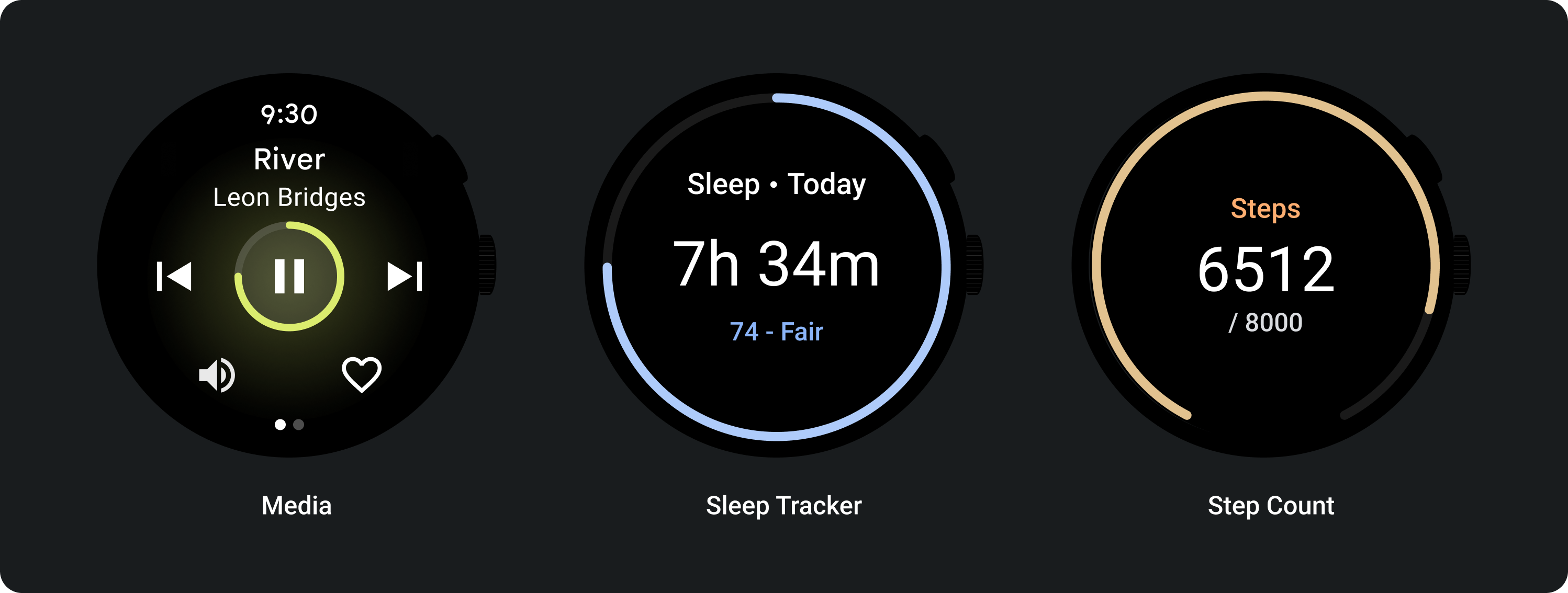
You can apply progress indicators to components such as a play button.
Anatomy
Use progress indicators to show the proportion of a task that is complete. To show progress an indicator is animated along a circular track in a clockwise direction.
You can apply progress indicators to components such as a play button.
Design recommendations
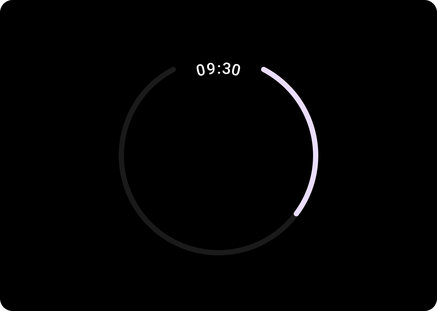
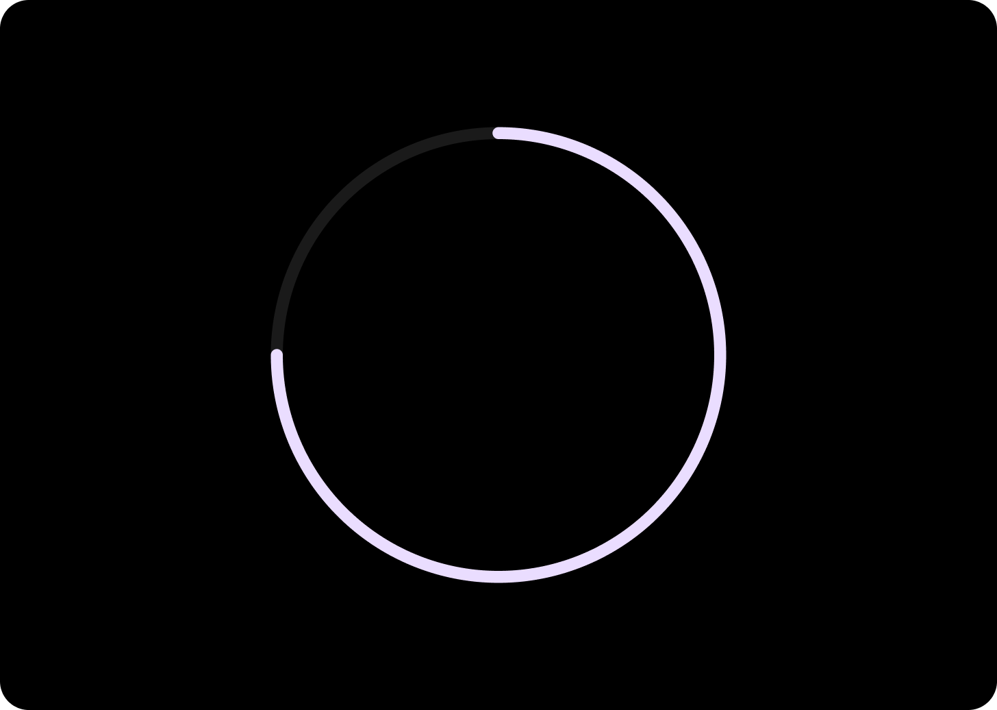
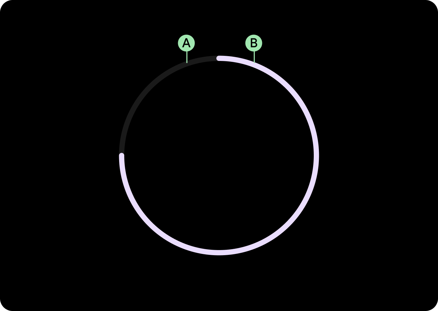
Progress indicator with gap
Create progress indicators with a gap to leave space for important information such as the time. To create a gap, change the progress indicator’s startAngle and endAngle.

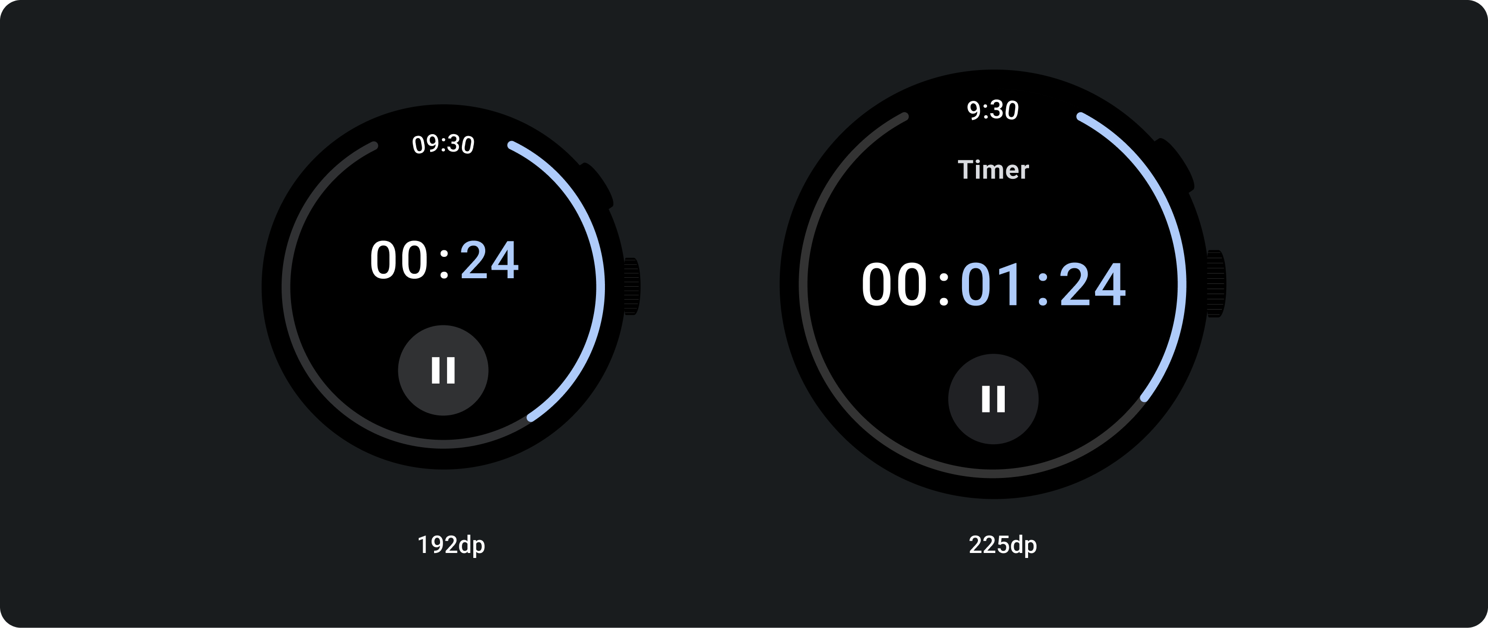
Small progress indicator
Create progress indicators with a gap to leave space for important information such as the time. Create a gap by changing the progress indicator’s start and end angle.
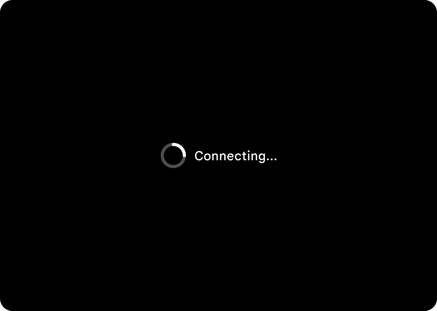
Indeterminate progress indicator
When using the progress indicator for situations where there is no set time, use a progress indicator with animated value. This can also be called a spinner. Use spinners sparingly as they can increase perceived wait time.
Usage
Adaptive layouts
Responsive behavior
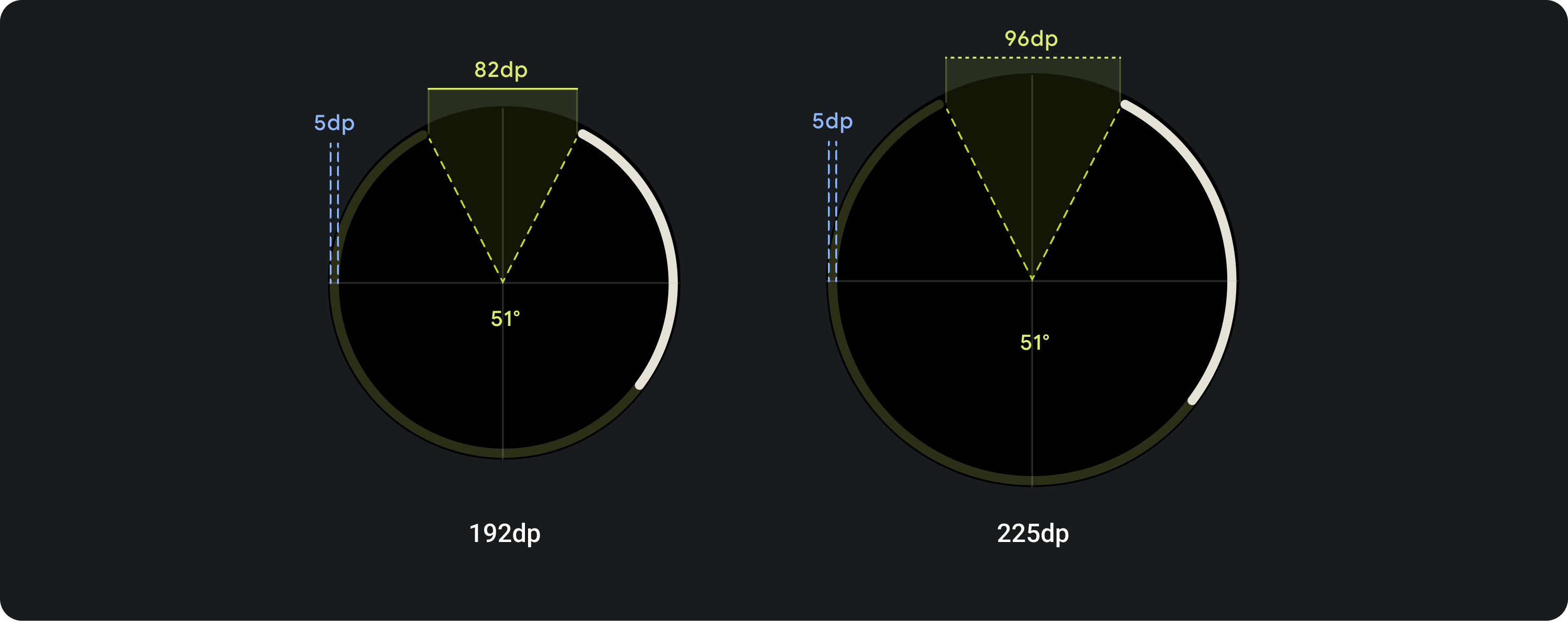
The circumference of the progress indicator fills the screen/element (for on button) width and height, proportionally, while the stroke width remains the same across all breakpoints.
The gap degree for full screen stays at 51°, but the sweep will increase in dp based on the screen size.
The ring width and starting and end points are customisable.