
Design for clarity, legibility, and minimal distraction.
Visual design principles emphasize clarity, legibility, and minimal distraction, adapted to the unique constraints of a small, near-eye display on AI glasses. Consider the limited display area and the user's primary focus on the real world. Visual elements should be designed to be crisp, high-contrast, and appear only when necessary, quickly fading when no longer relevant.

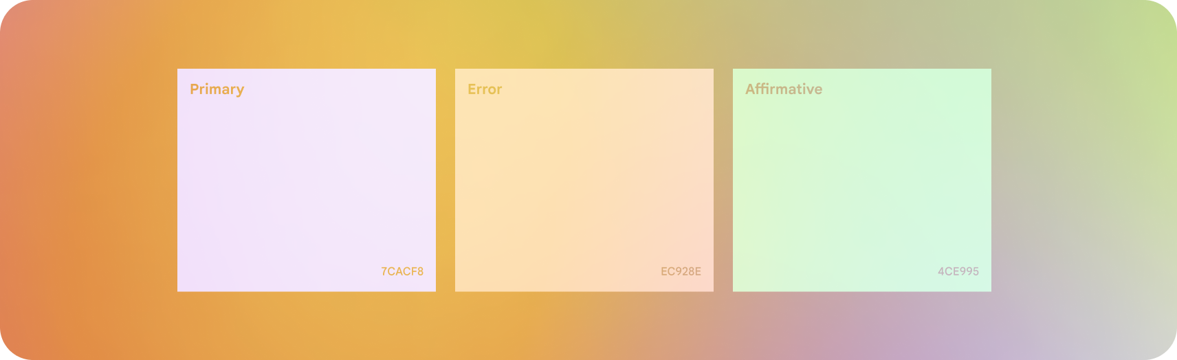
Jetpack Compose Glimmer's design language features a simplified theme for optimal visibility on glasses. Color and type can be customized for semantic expression and app cohesion.


Do
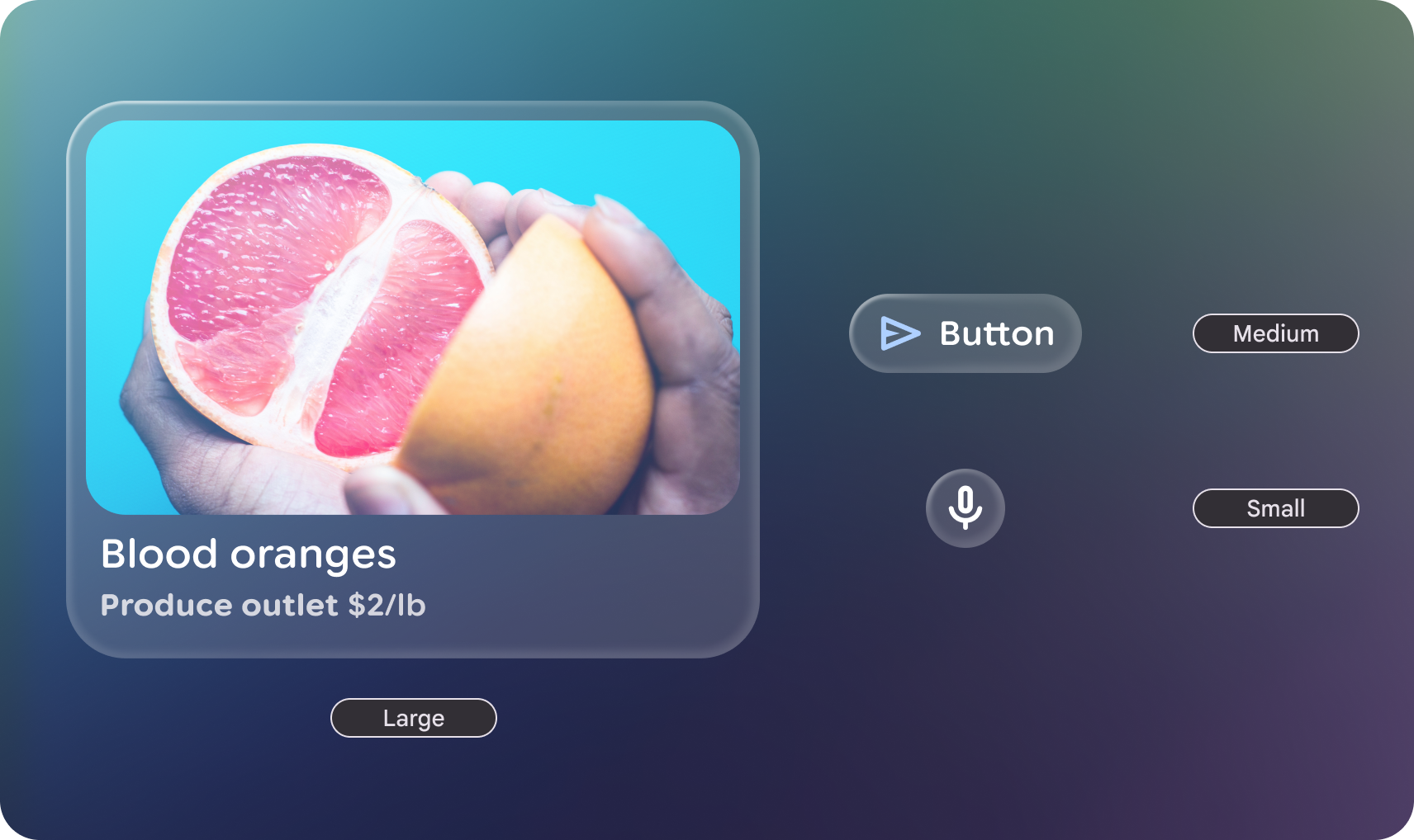
Embrace rounded corners to avoid drawing the user's attention into component corners.

Don't
Overly customize shape with sharp corners, they can create visual pockets that lead the user's eye into, which on immersive and augmented experiences have greater affect.