Applicable XR devices
This guidance helps you build experiences for these types of XR devices.
In Jetpack Compose Glimmer, the Button component is an interactive
component that's optimized for AI glasses input, offering clear visual feedback
for their unfocused, focused, and pressed states to guide user actions.

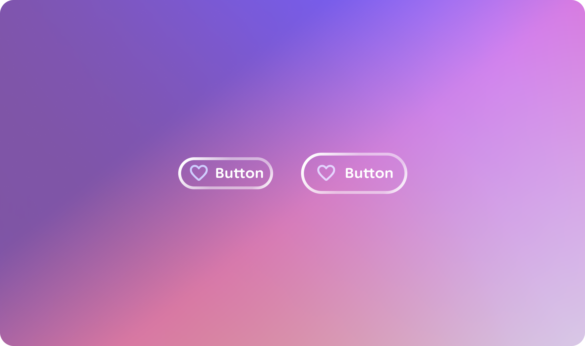
Example: Button variations
@Composable
fun GlimmerButtonExample() {
    Column(
        verticalArrangement = Arrangement.spacedBy(16.dp),
        horizontalAlignment = Alignment.CenterHorizontally,
        modifier = Modifier.fillMaxWidth()
    ) {
        // Basic Button
        Button(onClick = { /* Do something */ }) {
            Text("Test Button 1")
        }

        // Button with a leading icon
        Button(
            onClick = { /* Do something */ },
            leadingIcon = {
                Icon(
                    painter = painterResource(id = R.drawable.ic_favorite),
                    contentDescription = "Favorite icon"
                )
            }
        ) {
            Text("Test Button 2")
        }

        // Button with leading and trailing icons
        Button(
            onClick = { /* Do something */ },
            leadingIcon = {
                Icon(
                    painter = painterResource(id = R.drawable.ic_favorite),
                    contentDescription = "Favorite icon"
                )
            },
            trailingIcon = {
                Icon(
                    painter = painterResource(id = R.drawable.ic_favorite),
                    contentDescription = "Favorite icon"
                )
            }
        ) {
            Text("Test Button 3")
        }
    }
}
Key points about the code
- The button icons source local XML vector drawables
(
R.drawable.ic_favorite) usingpainterResource, replacing theIcons.Defaultlibrary dependency for optimized asset loading. - The
leadingIconandtrailingIconparameters are utilized to inject icon Composables into the button layout, demonstrating Jetpack Compose Glimmer's support for flexible icon positioning. - The buttons use the default sizing configuration, which automatically manages internal padding and text scaling to align with standard Jetpack Compose Glimmer design specifications without explicit size modifiers.

