
Overview
In order to maintain a consistent user experience and to help users make an informed choice, you are required to display an information screen and a separate billing choice screen if you offer an alternative in-app billing system to Google Play’s. The information screen only needs to be shown to each user the first time the user initiates a purchase, while the billing choice screen should be shown before every purchase. The user-facing messages and UI specifications for both screens should be implemented according to the following guidelines.
Information for users
The information screen helps users understand the context of the change and gives more information to help them make an informed choice.
When to display
The information screen should be shown to users at the start of their first purchase after you add an alternative in-app billing system. This message does not need to be displayed on subsequent purchases by the same user. Display the information screen immediately after a user has taken explicit action to initiate a purchase.
When to display price
The purchase price should be visible and obvious to users before they are shown either the information screen or the billing choice screen.
How to display
The information screen should be displayed in a modal bottom sheet. A modal bottom sheet is similar to a modal dialog that animates up from the bottom of the screen and stays pinned to the bottom. It is elevated above all UI elements on the underlying screen. The underlying screen is obscured behind a dark scrim to indicate that it will not respond to user interaction.
Refer to Google Material Design for more information on the design and implementation of modal bottom sheets.
User actions
The bottom sheet should be triggered when a user taps on a button or other UI element in your app that initiates a purchase. The user can take three possible actions from the information screen:
Continue
Tapping the “Continue” button dismisses the information screen and launches the billing choice screen.
Learn more
Tapping the “Learn more” button launches a Google Help Center article in a web browser.
Dismiss
If users want to dismiss the bottom sheet and return to the underlying screen, they can dismiss the bottom sheet by:
- Tapping outside of the bottom sheet container
- Tapping the Android system "Back" button
The information screen does not need to be displayed again after it has been dismissed or after the user has tapped “Continue”.
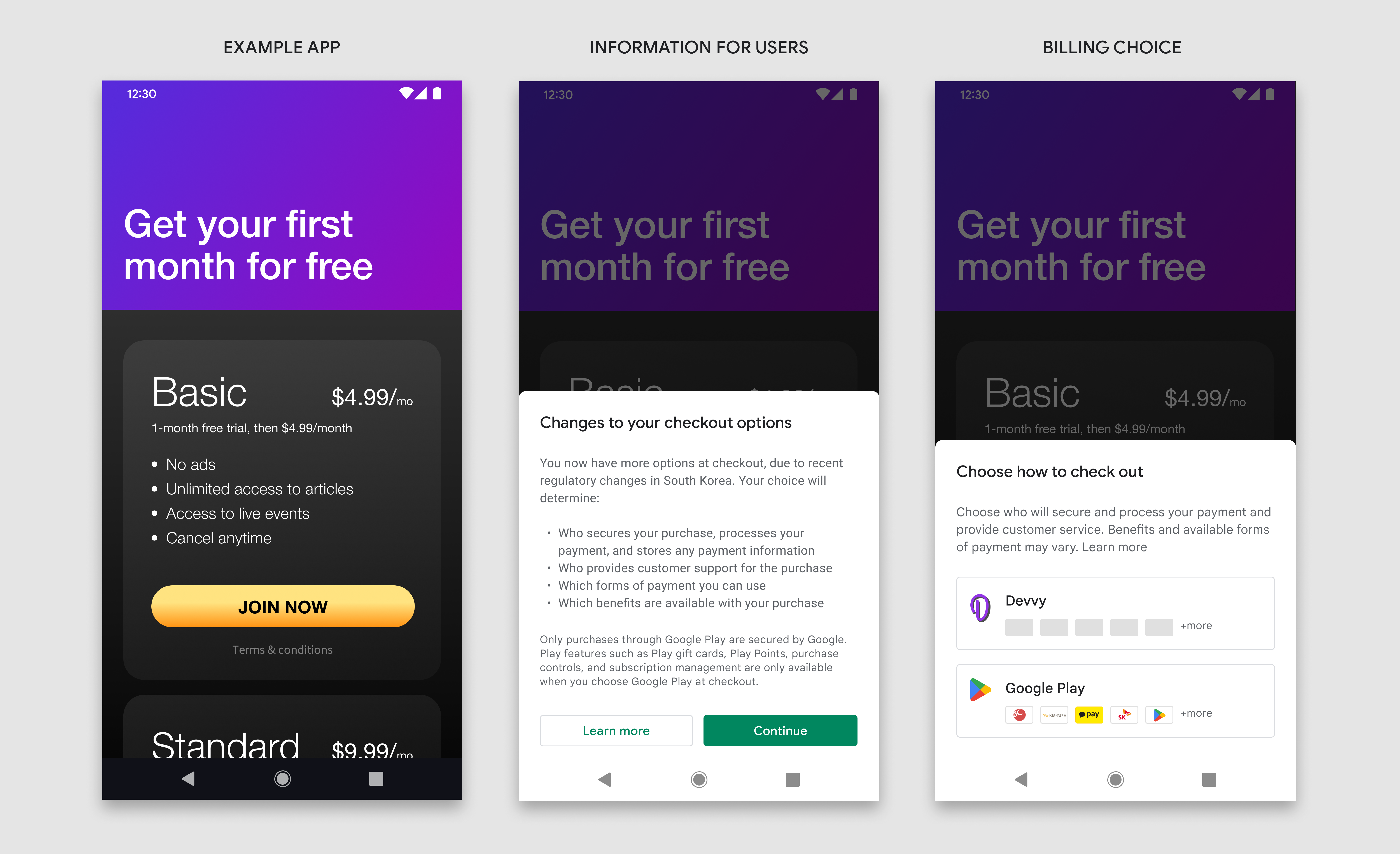
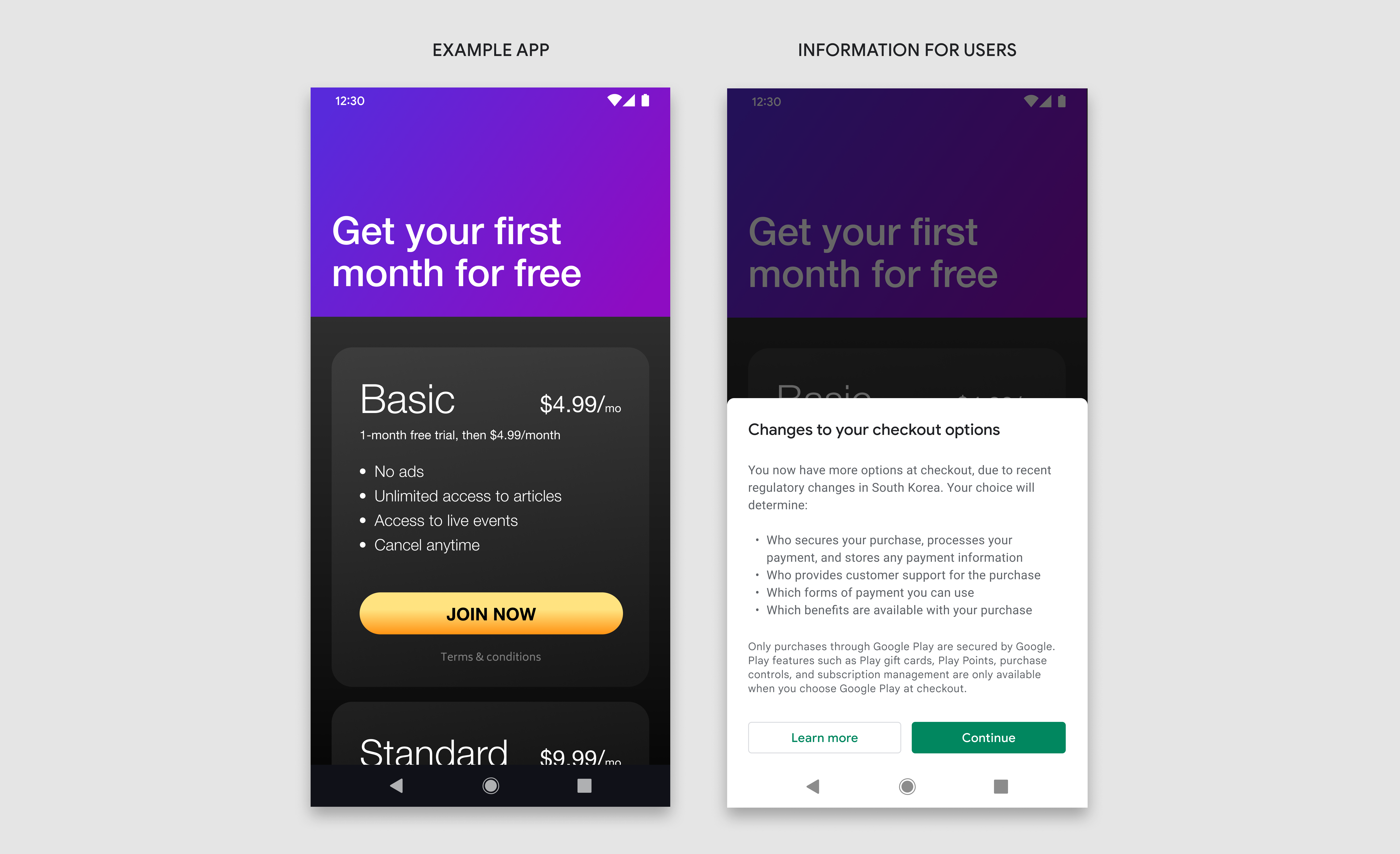
Example: The purchase price is clearly displayed before the user initiates the purchase. Tapping the “join now” button triggers the information screen.
Design specifications
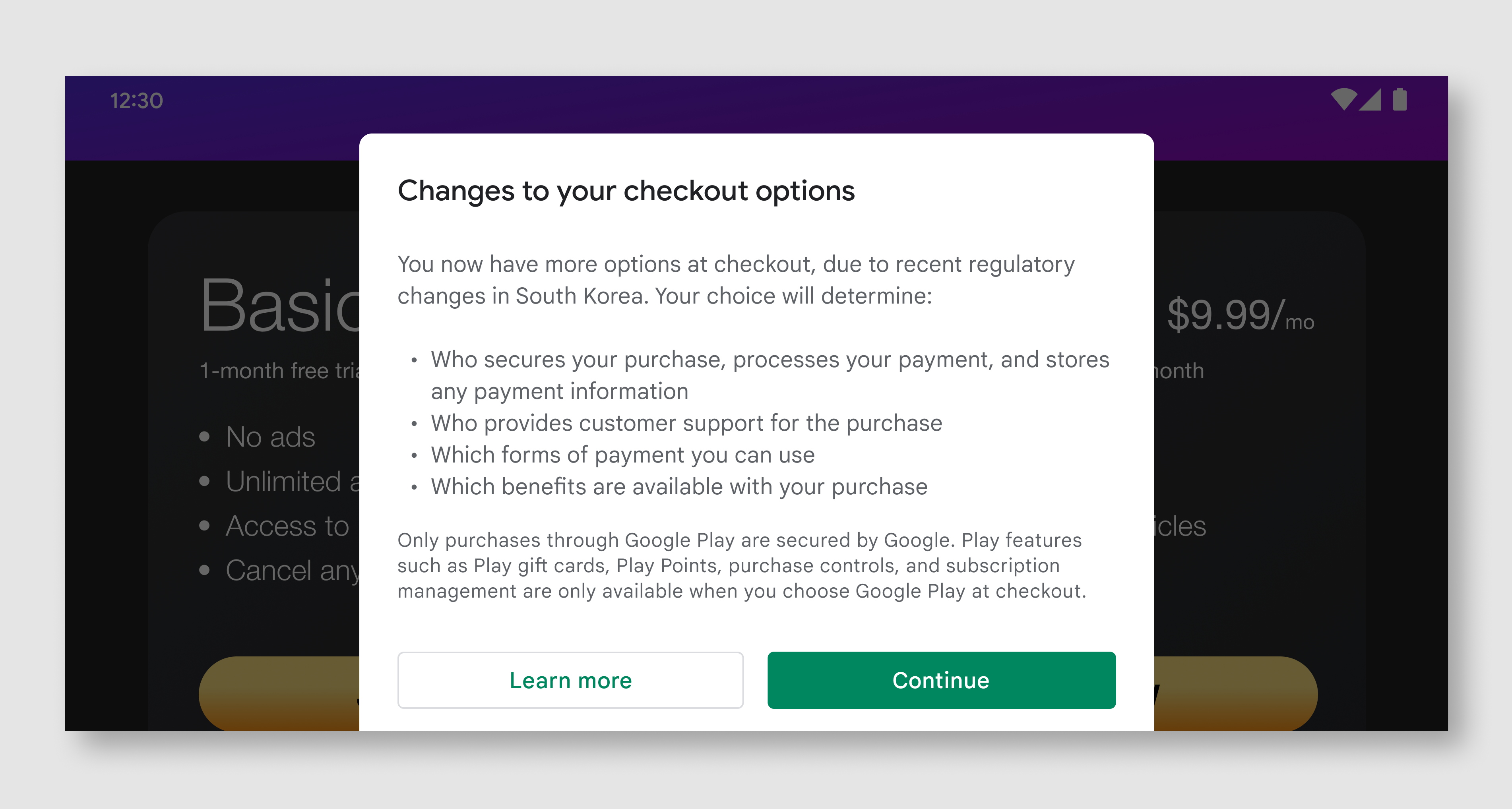
The information screen is divided into three components: title, message, and buttons. All three components are required and must contain the exact text and UI elements defined in these guidelines. Do not include any additional text or imagery on this screen, but you are free to include additional text and imagery on other screens.
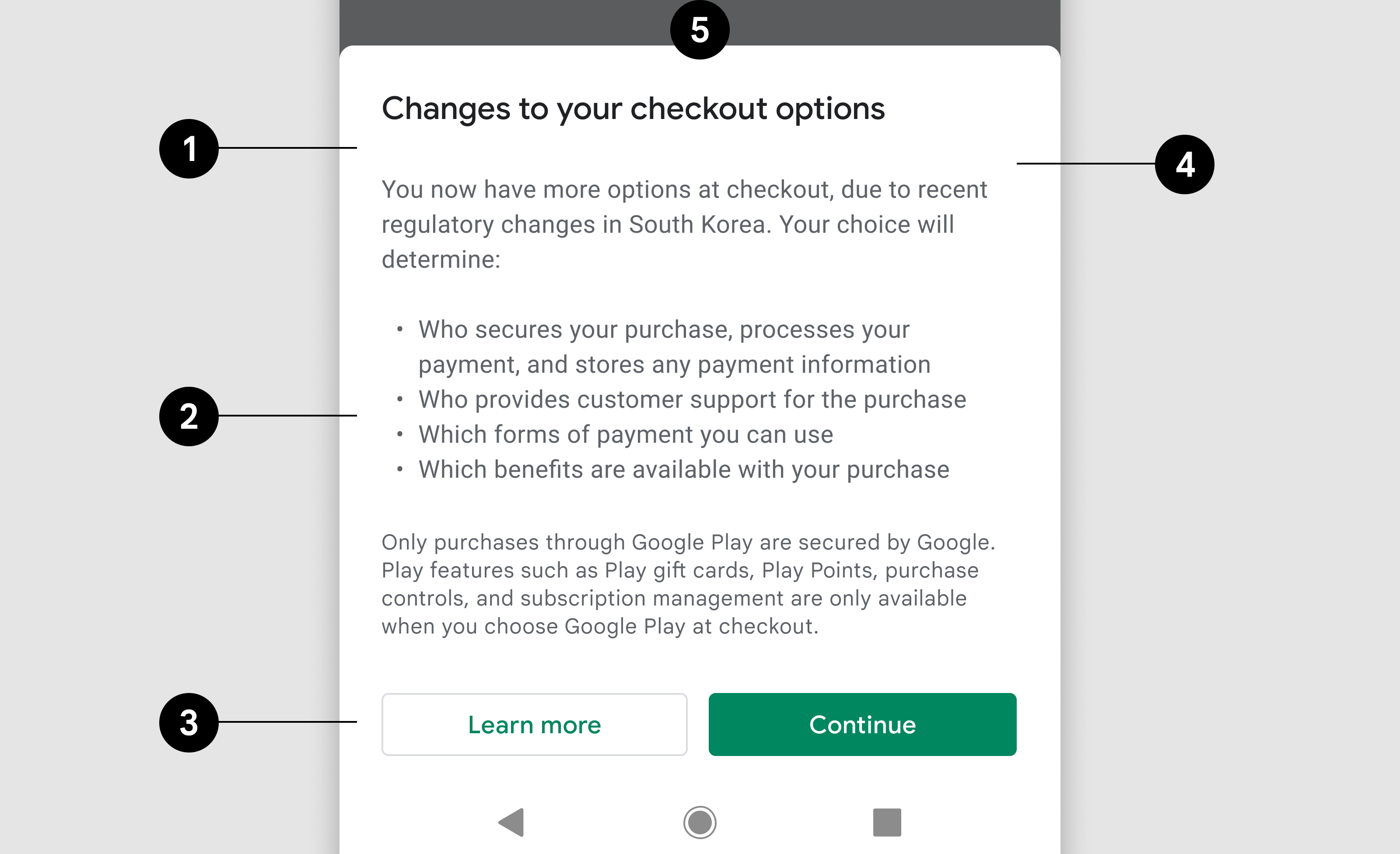
- Title
- Message
- Buttons
- Bottom sheet
- Background scrim
Title
| Text | Changes to your checkout options |
| Font | Roboto (apply to all fonts) |
| Font size | 18sp |
| Font color | #202124 |
Message
| Text 1 | You now have more options at checkout, due to recent
regulatory changes in South Korea. Your choice will determine:
|
| Font size | 14sp |
| Line height | 20 |
| Font color | #5F6368 |
| Text 2 | Only purchases through Google Play are secured by Google. Play features such as Play gift cards, Play Points, purchase controls, and subscription management are only available when you choose Google Play at checkout. |
| Font size | 12sp |
| Line height | 16 |
| Font color | #5F6368 |
Button 1
| Text | Learn more |
| Text alignment | Centered |
| Font size | 14sp |
| Font weight | Medium |
| Font color | #01875F |
| Background color | #FFFFFF |
| Dimensions | Height:36, Width: scale to container |
| Corner radius | 4dp |
| Outline | 1dp, #DADCE0 |
| Link | Links to Google Play help article |
Button 2
| Text | Continue |
| Text alignment | Centered |
| Font size | 14sp |
| Font weight | Medium |
| Font color | #FFFFFF |
| Background color | #01875F |
| Dimensions | Height:36, Width: scale to container |
| Corner radius | 4dp |
| Link | Links to Billing choice screen |
Bottom sheet
| Dimensions | Height: variable, Width: 100% |
| Corner radius | 8dp, 8dp, 0, 0 |
| Background | #FFFFFF |
| Inner padding | Left:24dp, Right:24dp, Top:32dp, Bottom: 24dp |
| Elevation | 8dp |
Landscape
In landscape view, the bottom sheet is wider than in portrait view, but otherwise follows the same design specifications and functionality.
| Bottom sheet | Width: 500dp maximum, Inner padding: 24dp |
| Title | Same as portrait view |
| Message | Same as portrait view |
| Buttons | Height:36, Width: scale to container |
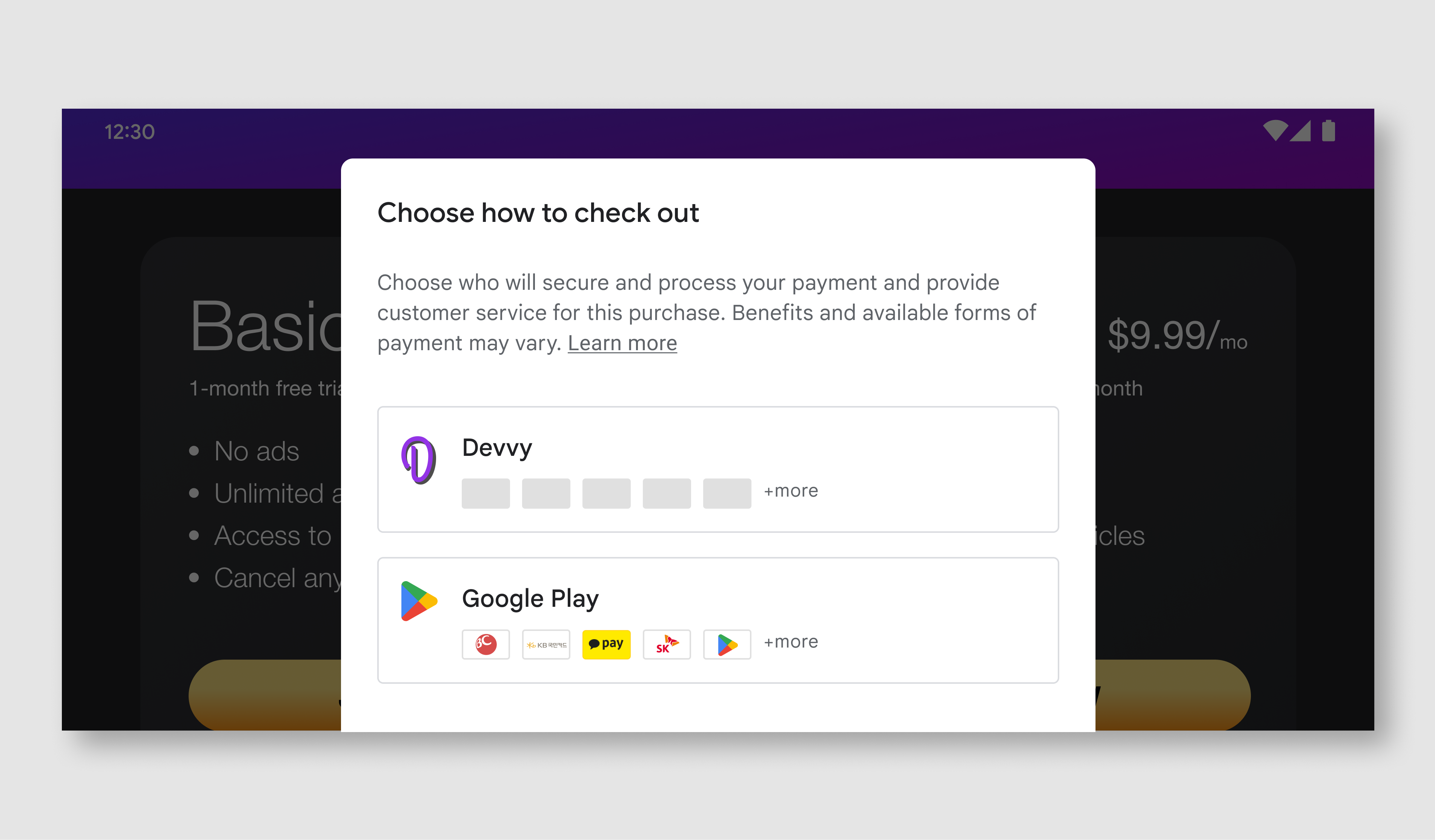
Billing choice screen
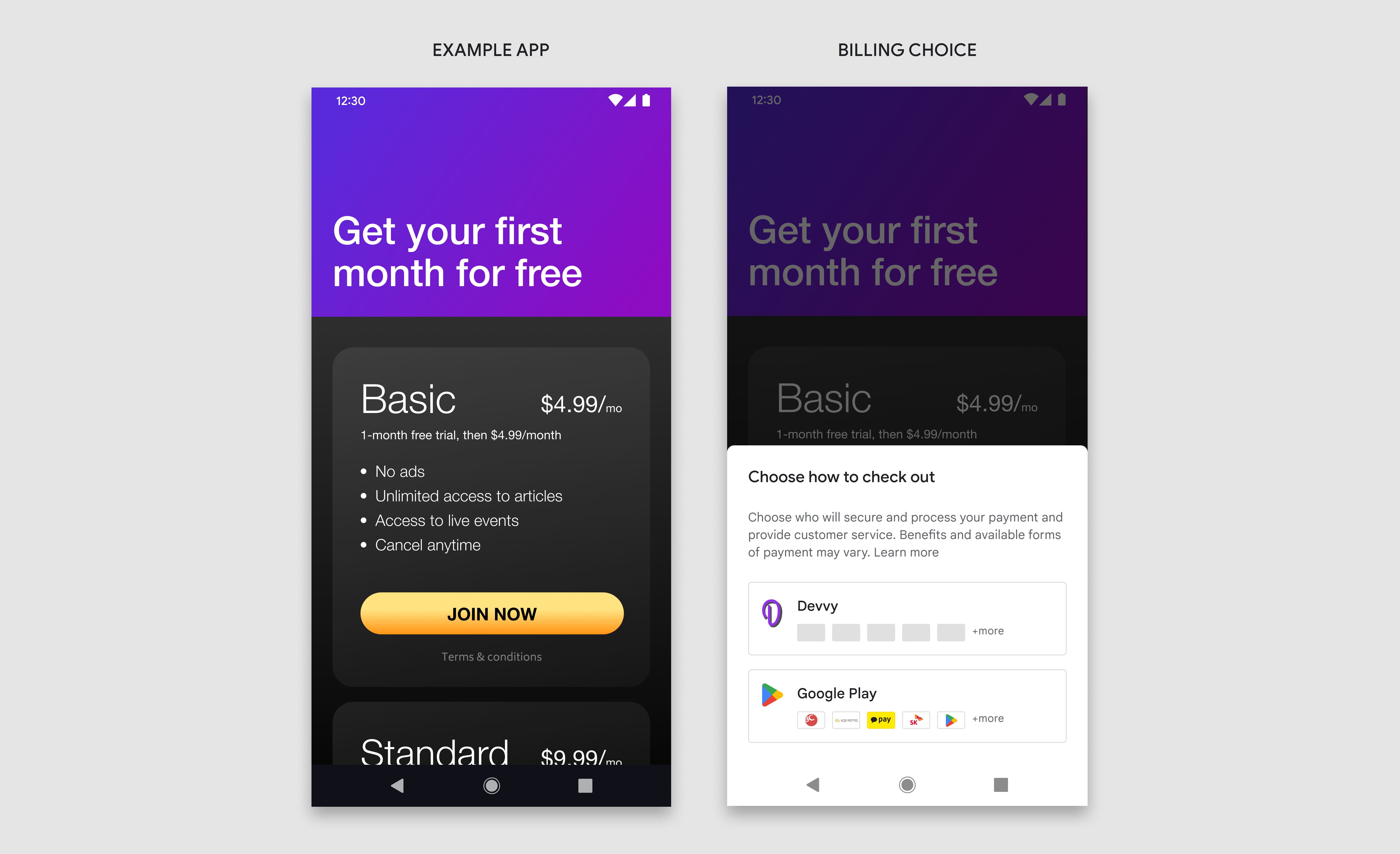
The billing choice screen presents users with two checkout options to complete their purchase. To help users make an informed decision, each billing service option also displays their available forms of payment. Once users make their choice, they will continue to complete their purchase through that billing service.
When to display
If the user has already seen the information screen, the billing choice screen should appear immediately after the user has taken explicit action to initiate a purchase.
How to display
The Billing choice screen should be displayed in a modal bottom sheet and follow the same specifications as the information screen.
Equal visual representation
The buttons for the additional in-app billing service and Google Play’s billing service should be represented in a fair and equal manner. This includes but is not limited to equal button sizes, text size/style, tap targets, and icon sizes. Please do not add any additional text, images, or style changes not defined in these guidelines.
Example: Tapping the “join now” button triggers the billing choice screen.
Design specifications
The billing choice screen has four distinct components: title, description, developer button, and the Google Play button. All components should be used, and should contain the exact text and UI elements defined in these guidelines. We ask you not to include any additional text or imagery on this screen, but you are free to include additional text and imagery on other screens owned by you.
Visual assets for Google Play and payment icons are available through the links provided below.
Example: In portrait view, the bottom sheet should span 100% of the total screen width.
- Title
- Description
- Developer button
- Google Play button
- Bottom sheet
- Background scrim
Title
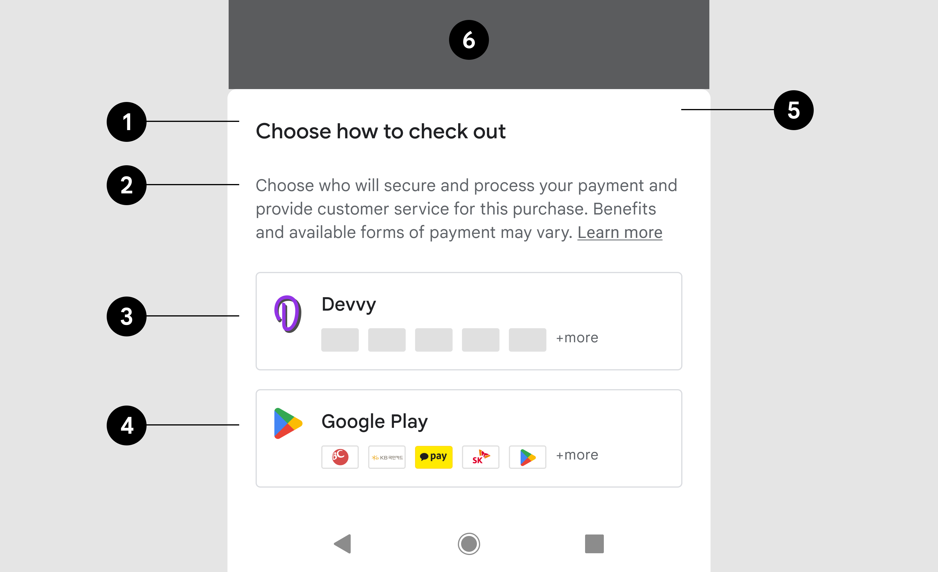
| Text | Choose how to check out |
| Font | Roboto (apply to all fonts) |
| Font size | 18sp |
| Font color | #202124 |
Description
| Text | Choose who will secure and process your payment and provide customer service. Benefits and available forms of payment may vary. |
| Font size | 14sp |
| Font color | #5F6368 |
| Text Link | Learn more |
| Link destination | Link |
| Font size | 14sp |
| Decoration | Underline |
| Font color | #5F6368 |
Developer button
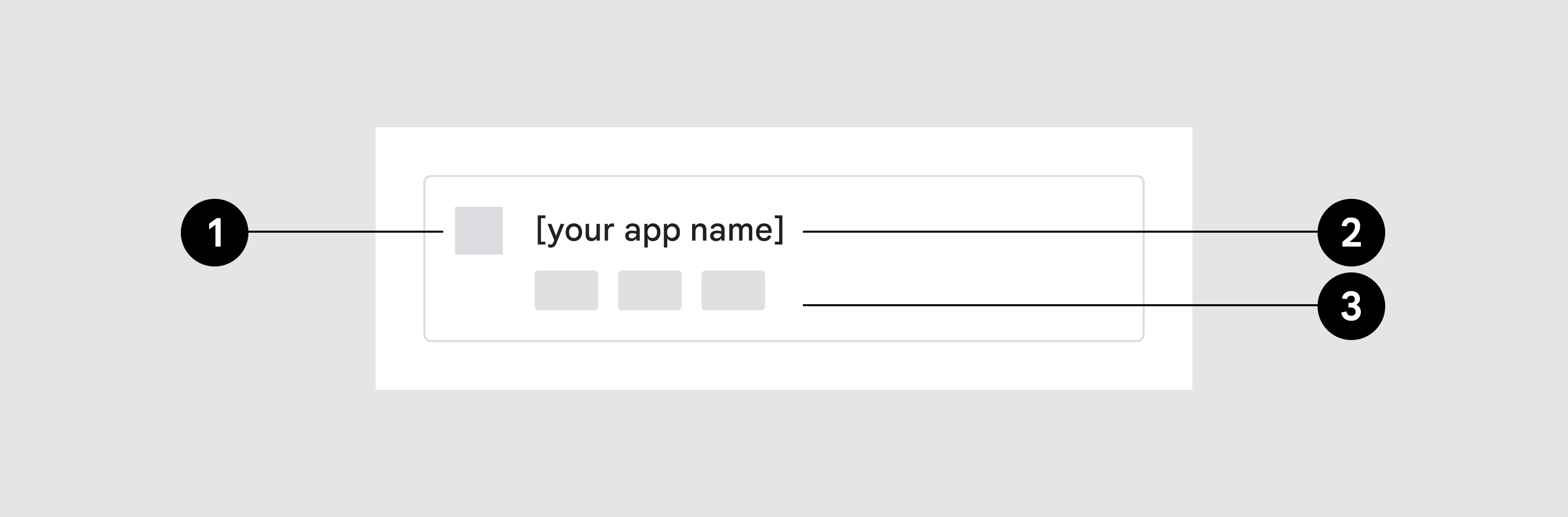
- App icon
- App name
- Payment method icons
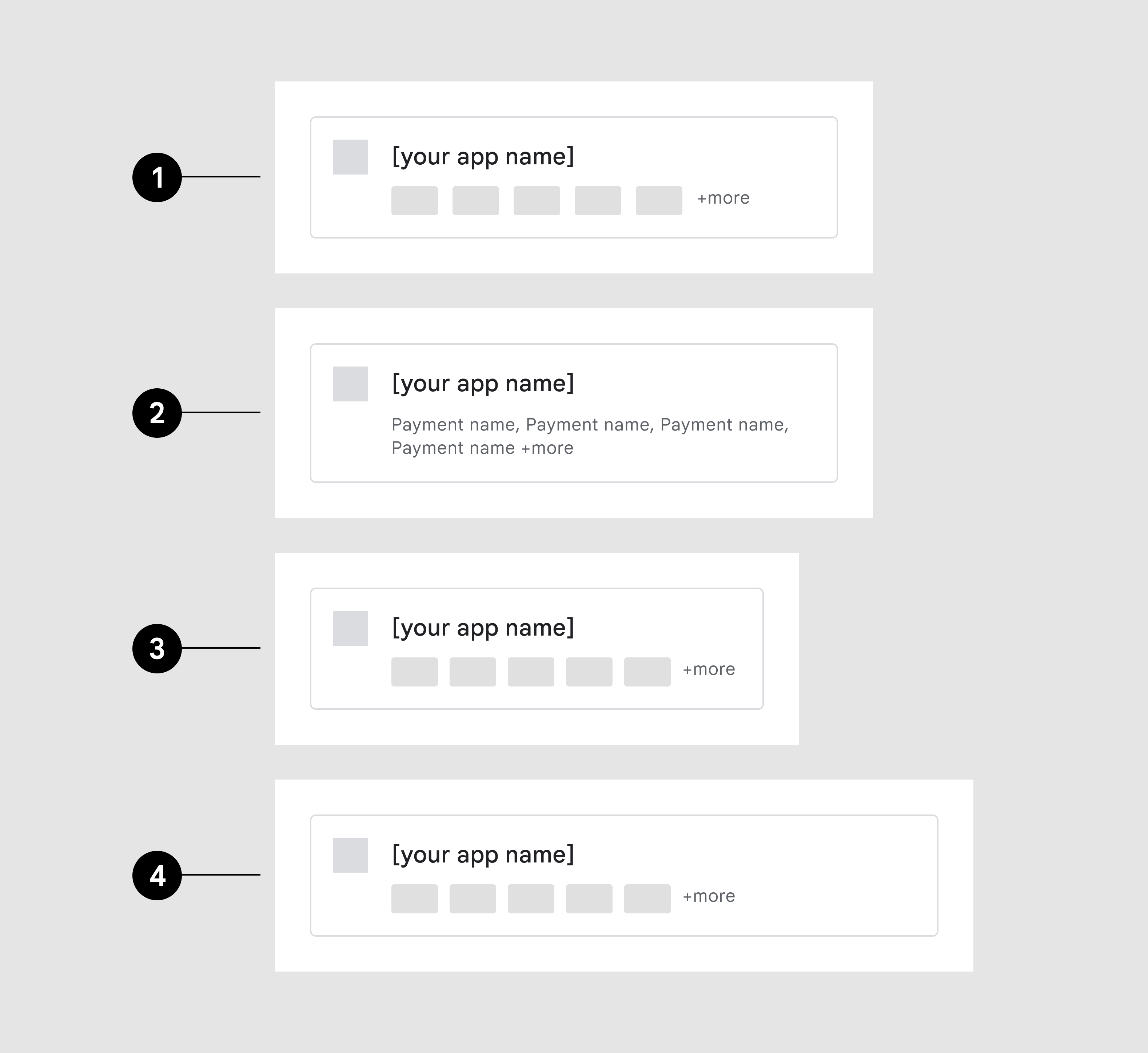
- Maximum number of payment method icons
- Payment method names instead of icons
- 360dp width
- 480dp width
Payment method icons
Scale to screen width
Button container
| Outline | 1pt, #DADCE0 |
| Corner radius | 4dp |
| Inner padding | 16dp, 16dp, 16dp, 16dp, |
App icon
| Dimensions | Height: 24dp, Width: variable |
Title
| Text | {App Name} |
| Font size | 14sp |
| Font color | #202124 |
Payment methods
| Dimensions | 32dp X 20dp |
| Corner radius | 2 |
| Quantity | 5 maximum, if >5 available display additional indicator |
| Additional indicator | + more (wraps to next line on narrow screens) |
| Font size | 12sp |
| Font color | #5F6368 |
Google Play button
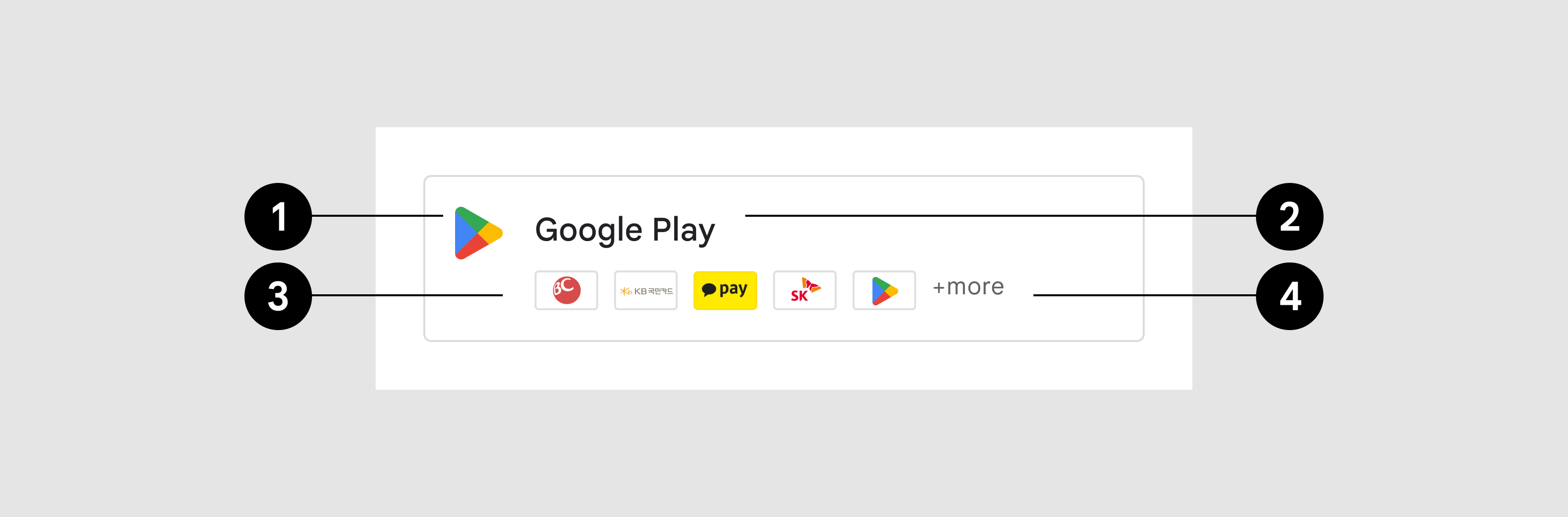
- Icon
- Title
- Accepted payment methods
- Additional indicator
Button container
| Outline | 1pt, #DADCE0 |
| Corner radius | 4dp |
| Inner padding | 16dp, 16dp, 16dp, 16dp, |
App icon
| Image asset | Google Play prism |
| Dimensions | 24dp X 24dp |
Title
| Text | Google Play |
| Font size | 14sp |
| Font color | #202124 |
Payment methods
| Image asset | Link |
| Additional indicator | +more |
| Font size | 12sp |
| Font color | #5F6368 |
Landscape
Example: In landscape view, the bottom sheet is wider than in portrait view, but otherwise follows the same design specifications and functionality.
| Bottom sheet | Width: 500dp maximum, Inner padding: 24dp |
| Title | Same as portrait view |
| Message | Same as portrait view |
| Buttons | Same as portrait view |