With new form factors like the Pixel 10 Pro Fold joining the Android ecosystem, adaptive app development is essential for creating high-quality user experiences across phones, tablets, and foldables. Users expect your app's UI to seamlessly adapt to these different sizes and postures.
To help you build these dynamic experiences more efficiently, we are announcing that the Compose Adaptive Layouts Library 1.2 is officially entering beta. This release provides powerful new tools to create polished, responsive UIs for this expanding device ecosystem.
Powerful new tools for a bigger canvas
The Compose Adaptive Layouts library is our foundational toolkit for building UIs that adapt across different window sizes. This new beta release is packed with powerful features to help you create sophisticated layouts with less code. Key additions include:
- Powerful new layout strategies: The beta introduces new layout strategies like reflow and levitate, designed to help you build dynamic layouts that look great on both the outer and inner displays of a device like the Pixel 10 Pro Fold, Galaxy Z Fold7 and Z Flip7.
- New Window Size Classes: The release adds built-in support for the new Large and Extra-Large window size classes. These new breakpoints are essential for designing and triggering rich, multi-pane UI changes on expansive screens like tablets and large foldables.
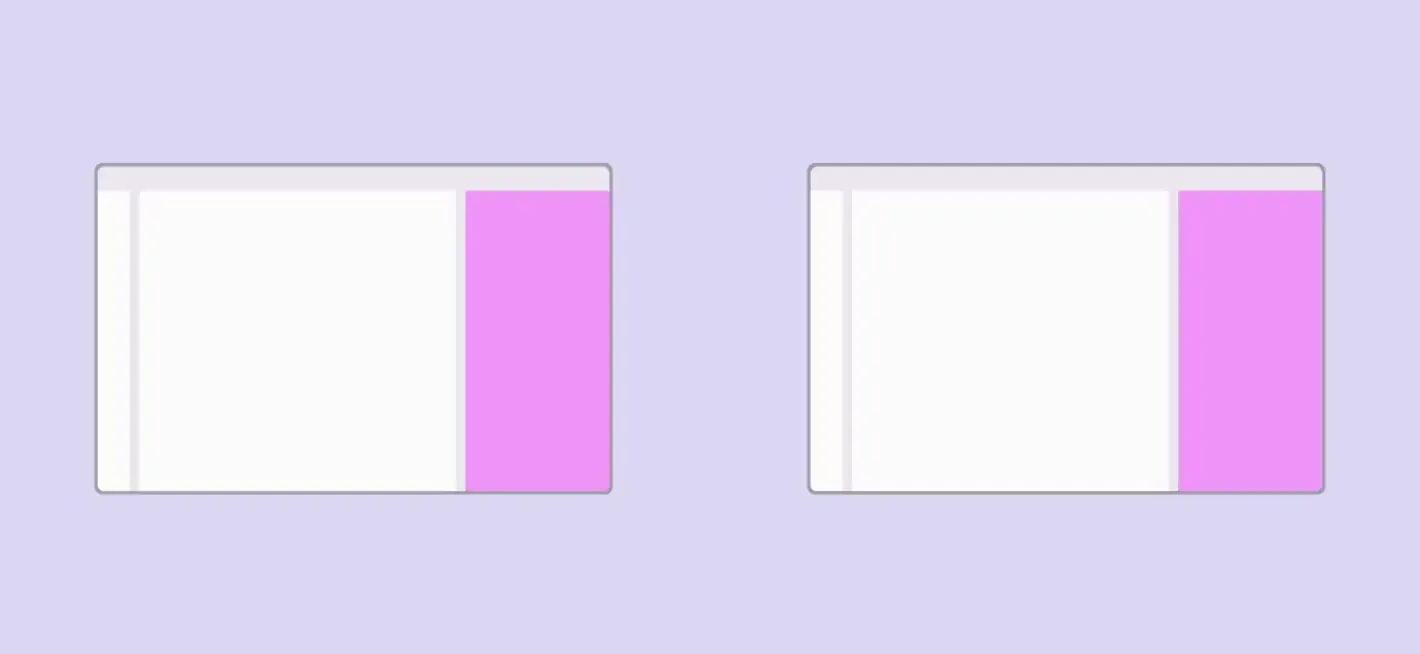
Two new pane adaptation strategies: reflow (left) and levitate (right)
For a full list of changes, check out the official release documentation. Explore our guides on canonical layouts and building a supporting pane layout.
Engage more users on every screen
Embracing an adaptive mindset is more than a best practice, it’s a strategy for growth. The goal isn't just to make your app work on a larger screen, but to make it shine by becoming more intuitive for users. Instead of simply stretching a single-column layout, think about how you can use the extra space to create more efficient and immersive experiences.
This is the core principle behind dynamic layout strategies like reflow, a powerful new feature in the Compose Adaptive Layouts 1.2 beta designed to help you build these UIs. For example, a great starting point is adopting a multi-pane layout. By showing a list and its corresponding detail view side-by-side, you reduce taps and allow users to accomplish tasks more quickly.
This kind of thoughtful adaptive development is what truly boosts engagement. And, as we highlighted during the latest episode of #TheAndroidShow, this is why we see that users who use an app on both their phone and a larger screen are almost three times more engaged. Building adaptively doesn't just make your current users happier; it creates a more valuable and compelling experience that builds lasting loyalty and helps you reach new users.
The expanding Android ecosystem, from foldables to desktops
This shift toward adaptive design extends across the entire Android ecosystem. From the new Pixel 10 Pro Fold to the latest Samsung Galaxy foldables, developers have the opportunity to engage a large and growing user base on over 500 million large-screen devices.
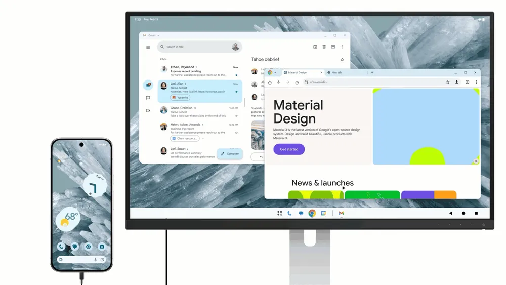
This is also why we’re continuing to invest in forward-looking experiences like Connected Displays, currently available to try in developer preview. This feature opens up new surfaces and interaction models for apps to run on, enabling true desktop-class features and multi-instance workflows. We've previously shared details on how you can get started with the Connected Displays developer preview and see how it's shaping the future of multi-device experiences.
Putting adaptive principles into practice
For developers who want to get their apps ready for this adaptive future, here are a few key best practices to keep in mind:
- Take inventory: The first step is to see where you are today. Test your app on a large screen device or with the resizable emulator in Android Studio to identify areas for improvement, like stretched UIs or usability issues.
- Support optimized layouts: Use libraries like Compose Adaptive Layouts to build UI that adapts to different window sizes and device postures. Your app should work well in both portrait and landscape, without restricting orientation.
- Think beyond touch: A great adaptive experience means supporting all input methods. This goes beyond basic functionality to include thoughtful details that users expect, like hover states for mouse cursors, context menus on right-click, and support for keyboard shortcuts.
Your app's potential is no longer confined to a single screen. Explore the large screen design gallery and app quality guidelines today to envision where your app can go. Get inspired and find design patterns, official guidance, and sample apps you need to build for every fold, flip, and screen at developer.android.com/adaptive-apps.
-

 Product News
With the release of Android 17, we are transitioning into an adaptive first development standard. Your users no longer rely on a single form factor; they transition between phones, foldables, tablets, laptops, automotive displays, and immersive XR environments throughout their day.
Fahd Imtiaz • 4 min read -

 Product News
With the release of Android 16 in 2025, we shared our vision for a device ecosystem where apps adapt seamlessly to any screen—whether it’s a phone, foldable, tablet, desktop, car display, or XR. Users expect their apps to work everywhere.
Miguel Montemayor • 6 min read -
 Product News
In 2025 the Android ecosystem has grown far beyond the phone. Today, developers have the opportunity to reach over 500 million active devices, including foldables, tablets, XR, Chromebooks, and compatible cars.
Fahd Imtiaz • 2 min read
Get the latest Android development insights delivered to your inbox weekly.