
Build up a flexible flow and rhythm with a structure and containment methods for your content. Start by designing layout containers, and then add content.
1. Base structure: layout grid to guide content
To begin creating a solid structure with consistent guardrails, add margins and columns to your layouts.
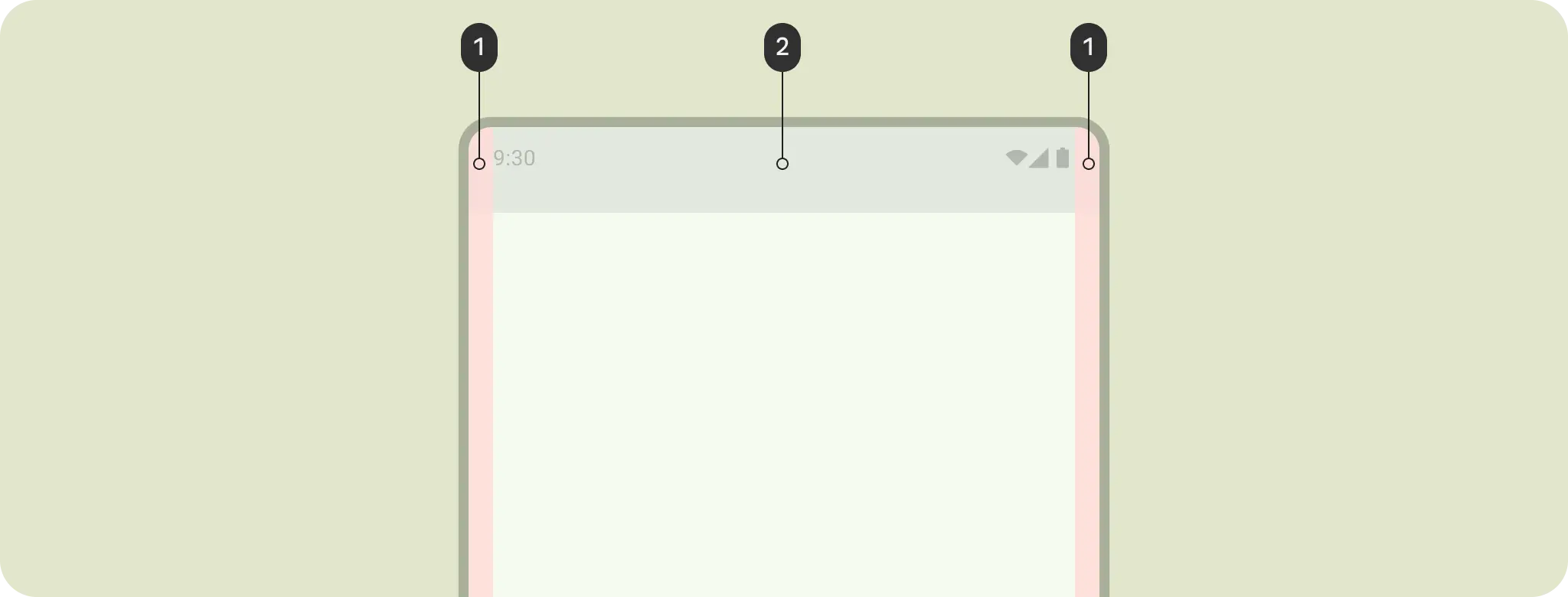
Margins provide spacing on the left and right edges of the screen and content. A standard margin value for compact sizing is 16 dp, but margins should adapt to accommodate larger screens. Your app's body content and actions must stay within and align with these margins.
You can also ensure inset safe zones or insets at this step. System bar insets prevent crucial actions from falling under system bars. You should draw your content behind the system bars.
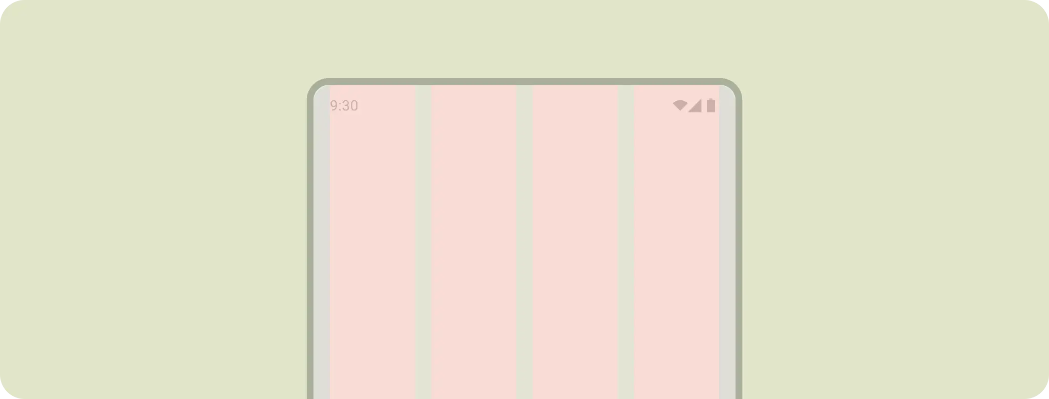
Use columns to build a flexible grid structure for consistent alignment, and to provide vertical definition to a layout by dividing content within the body area. Content goes in the areas of the screen containing columns. These columns lend structure to your layout, providing convenient structure to arrange elements.
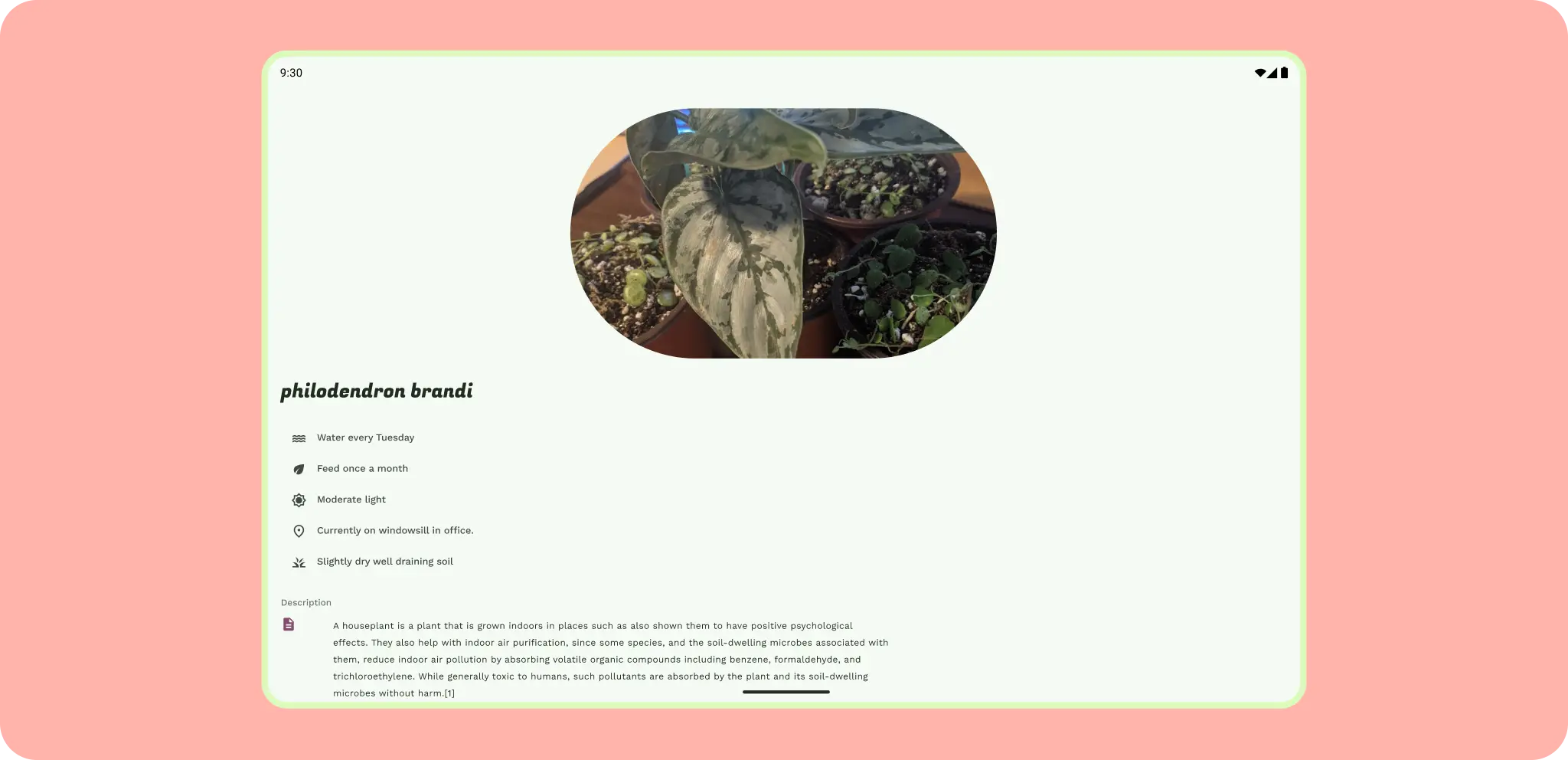
Content importance, or hierarchy, can help dictate the type of layout grid to bring more structure. If your content has a clear hierarchy, a hierarchical layout grid is appropriate; for example an editorial layout or detail screen with a large header and key art.
A modular grid works well for equally important but very structured content and layout, like a photo gallery.
Choose a column grid for consistently responsive, one-directional layouts, or when you need greater flexibility.
Regardless of which type, the layout grid should also adapt across sizes and form factors.
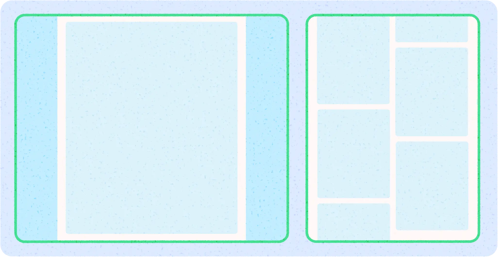
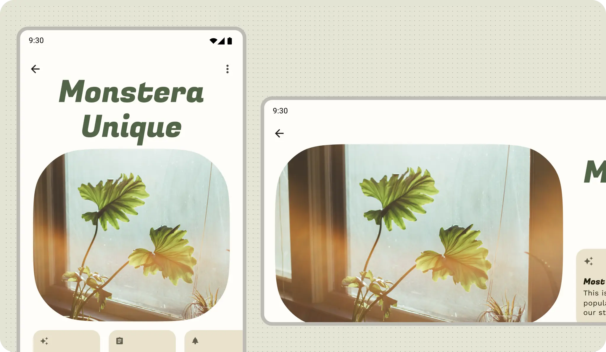
This example uses a column grid to align content with an underlying grid while retaining flexible sizing. To accommodate different form factors, the column grid changes the column size and the number of columns based on the screen size, which also lets the content scale. Avoid being too granular with the layout grid. Instead, use the baseline grid to provide consistent spacing units.
Starting to add copy to the layout structure. Margins protect content from the screen's edges. Columns provide a consistent spacing and alignment structure.
Alternatively, use a hierarchical layout grid to keep the detail screen in order.
Start with a consistent layout grid. If your content requires it, break the grid. Even then, you might find that another grid still aligns with your content's needs.
Learn more about layout containers, like pagers and flow layout.
Manuscript and masonry are other types of layout grids.
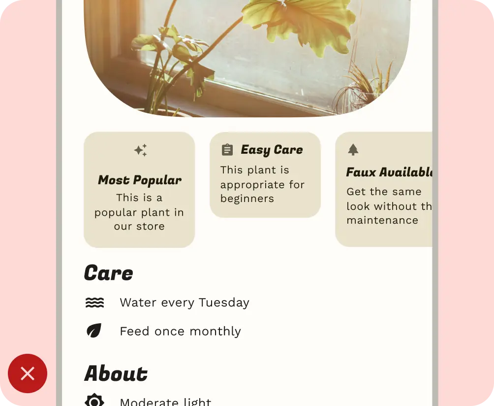
Whichever layout grid you choose can also use the containment concept of panes to group content for adaptive layouts. For example, the example used is a detail screen, one pane that could be shown in a list-detail layout.
2. Apply containment
Use containment to visually group elements.
Containment refers to using whitespace and visible elements together to create a visual grouping. A container is a shape that represents an enclosed area. In a single layout, you can group together elements that share similar content or functionality and separate them from other elements using open space, typography, and dividers.
Android uses rows, columns, and boxes as building blocks, so you can design containment in a similar way. Group similar items together with whitespace or visible division to help guide you through the content.
Implicit containment uses whitespace to visually group content to create container boundaries while explicit containment uses objects like divider lines and cards to group content together.
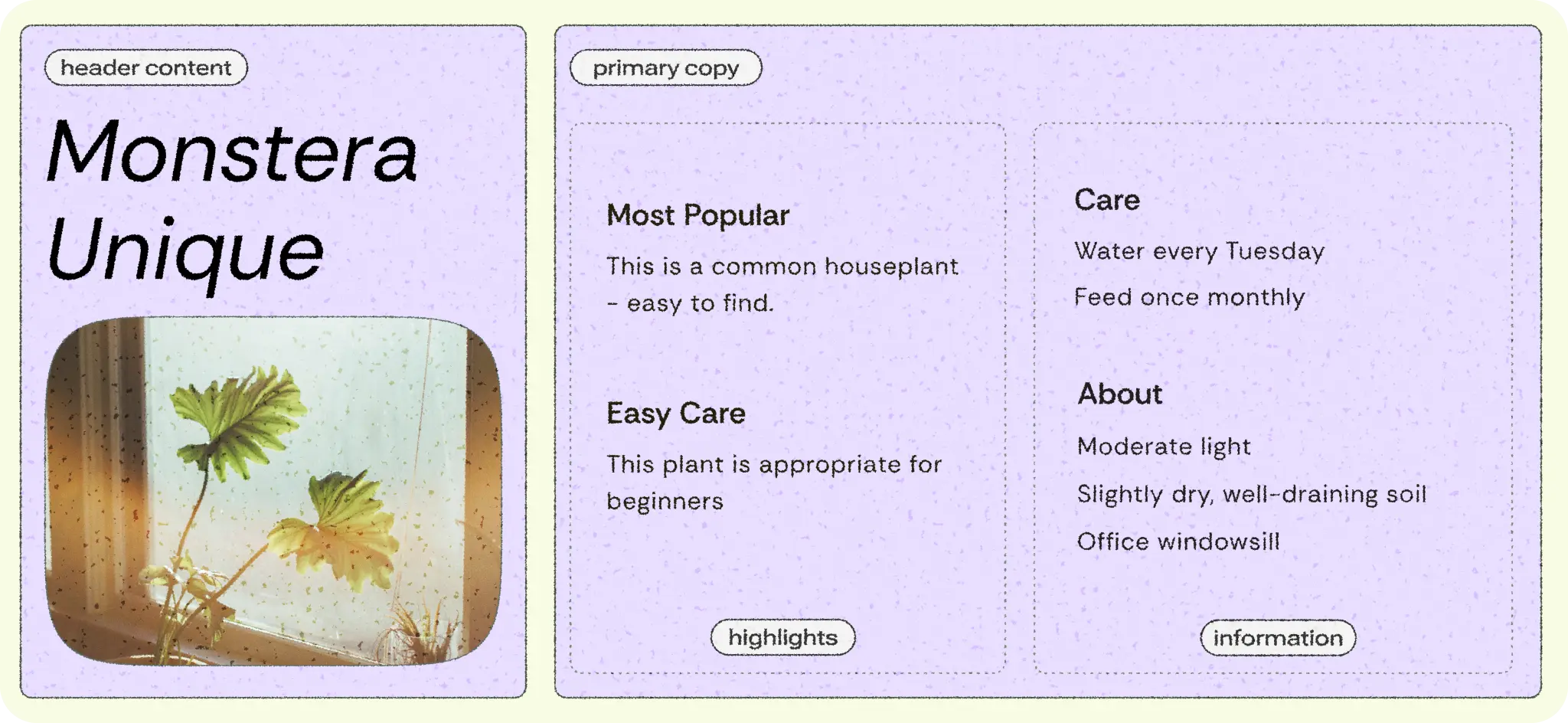
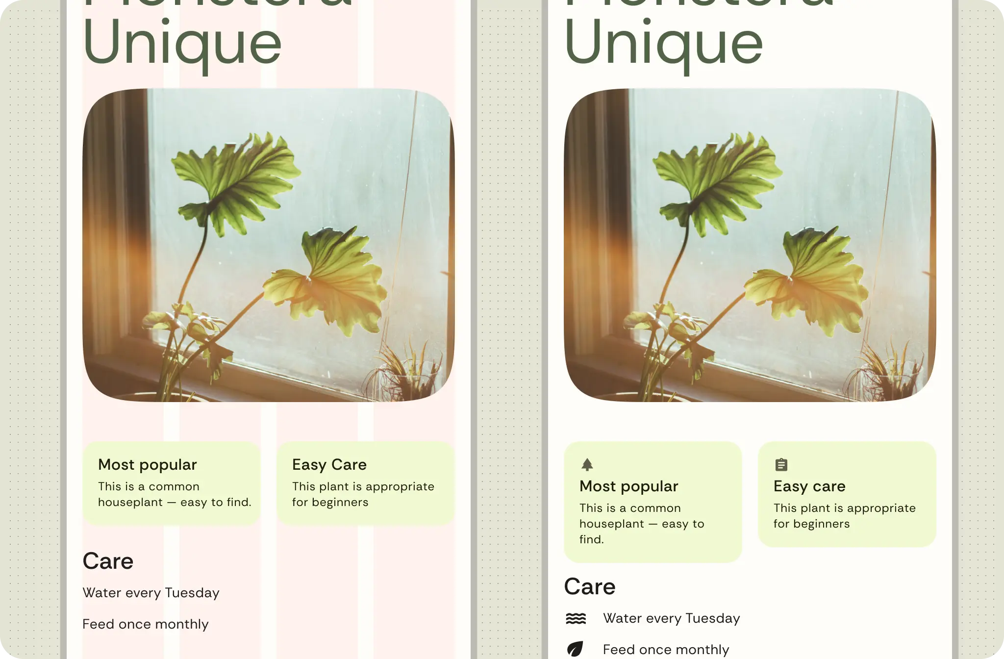
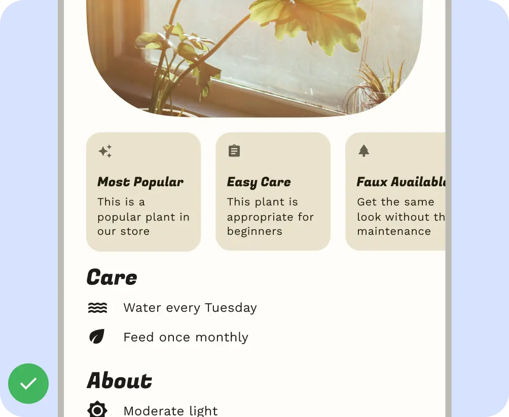
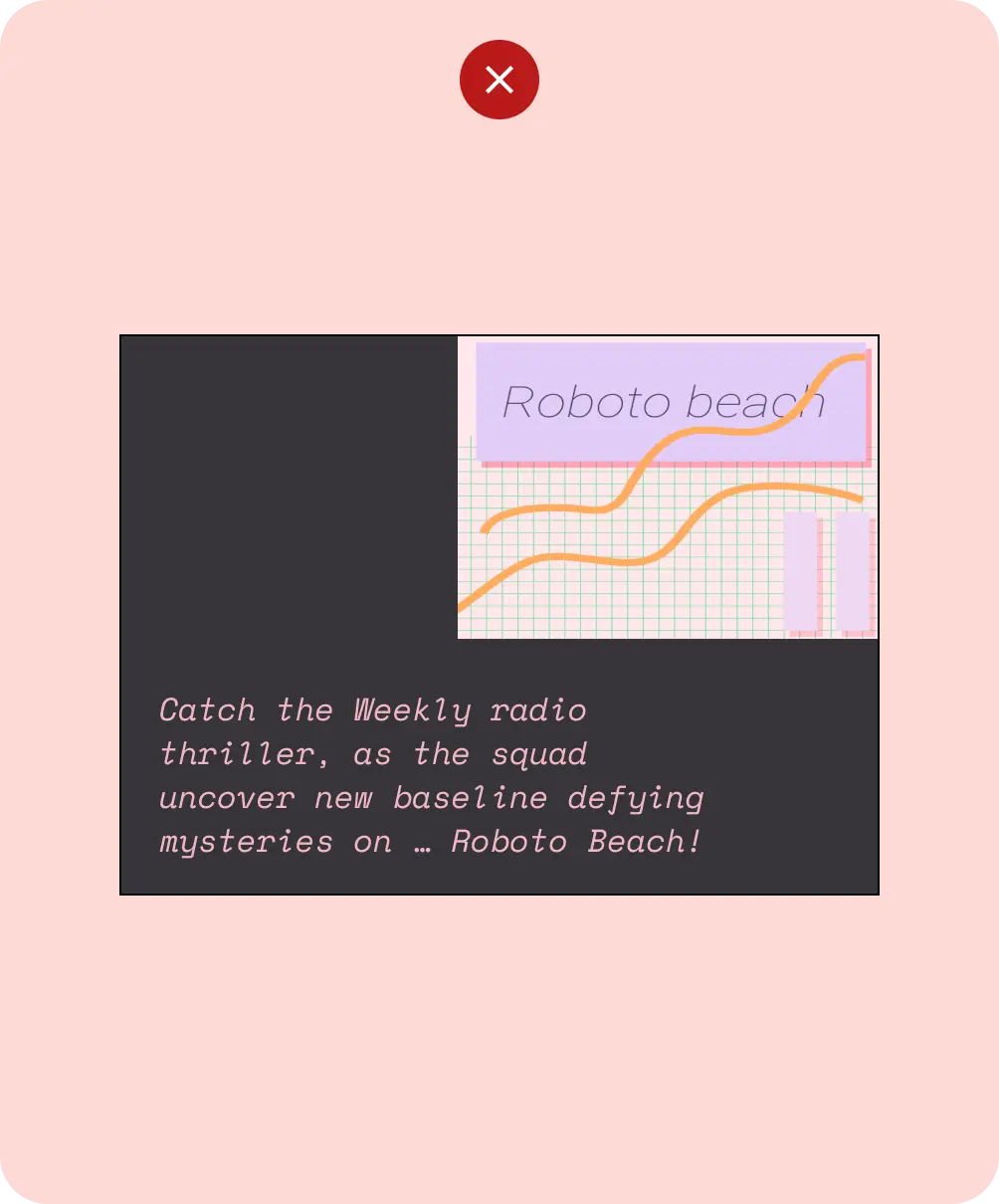
The following figure shows an example of using implicit containment to contain the header and primary copy. The column grid is used to align and create groupings. Highlights are explicitly contained within cards. Using iconography and type hierarchy for greater visual separation.
3. Position content
With a layout grid chosen and content in containers, Android has various ways to handle content elements and position them, with basic building blocks and modifiers or layout containers like grid and flexbox.
Consider whether your content is one-dimensional or two-dimensional. For example, content can flow horizontally, vertically, or in both directions.
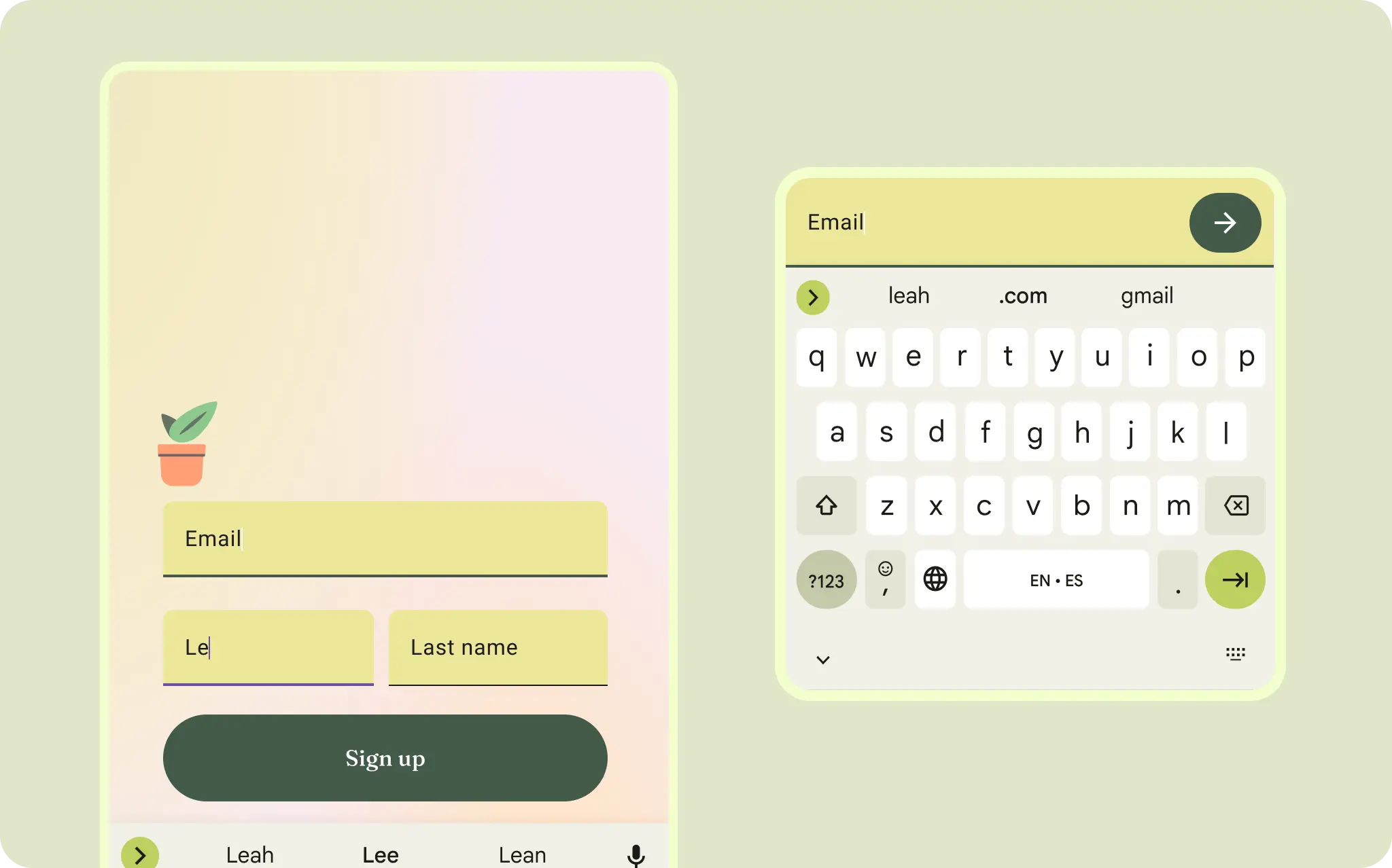
As shown in the following figure, an authentication layout can use a two-dimensional grid layout.
UI elements can also flex and flow in one dimension, like filters or content tags. Learn more about flexbox.
Layouts can also use a combination of layout types. For example, you might pair a carousel or horizontal scroll with vertical cards. Or, you could present a custom chart with vertical list data.
You can present content in scrolling rows or columns with lazy rows and lazy columns.
Alignment
Similar to auto layout flow and alignment, you can specify UI elements arrangement and alignment.
Use AlignmentLine to create custom alignment lines, which parent layouts
can use to align and position their children.
Do
Don't
4. Scale and crop content
Scaling is crucial for accommodating dynamic content, device orientation, and screen sizes. Elements can remain fixed or be scaled.
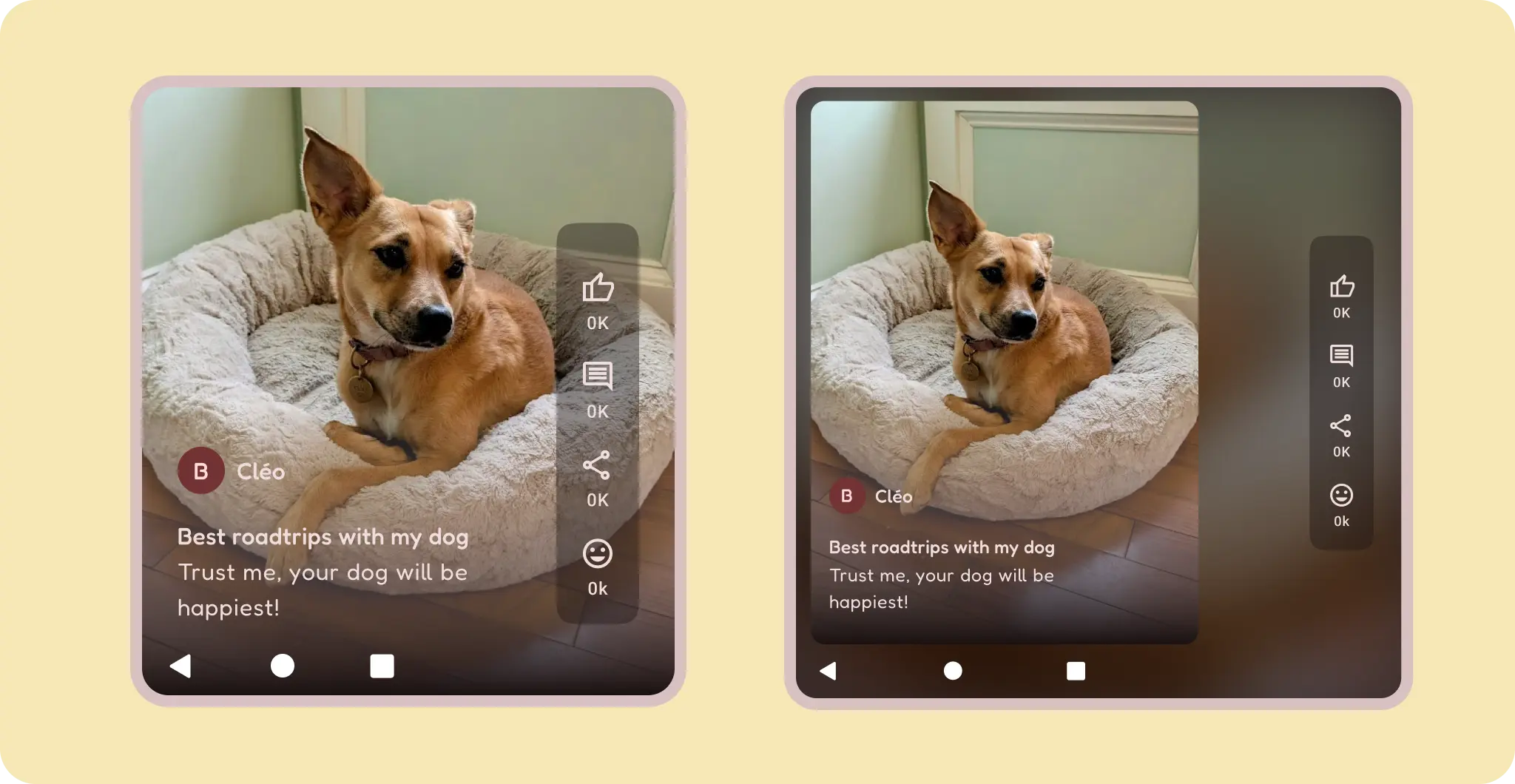
Specify how images scale and position within their containers to ensure they display correctly on any device. Otherwise, the primary focus of an image might be cut off, or the image might be too small or too large for the layout.
Accommodate different device aspect ratios and orientations with appropriate scaling and cropping. Because aspect ratios can vary significantly, specify how your content handles these scenarios.
For example, a full-width hero image takes up the entire screen on a phone in landscape orientation.
Do
Don't
If content must retain aspect ratio, like vertical only video, constrain aspect and balance empty space.
Don't
Pinned content
Many components have built-in interactions, scrolling, and positioning with slots or scaffolds, like app bars. Some elements can be modified to stay fixed instead of reacting to scrolling, for example floating action buttons (FABs) that house critical actions. Pin elements for better focus in certain use cases, for example, pin a text input to a keyboard to prevent hidden inputs.
For text input, like messaging and authentication, the input is attached to the keyboard and sole focus is given.
Components in layout
Material 3 components provide their own configurations and states for interaction and content.
Compose provides convenient layouts for combining Material Components into common screen patterns. Composables such as Scaffold provide slots for various components and other screen elements. Read more about Material Components and Layout.