
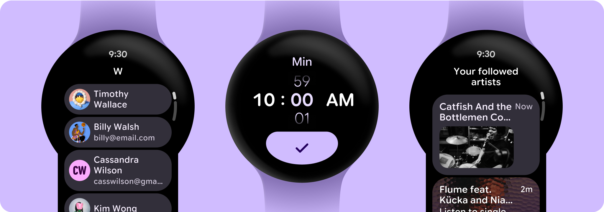
Understand the Compose layout templates and sample design layouts in order to design and build unique app screens.
Most apps use either a non-scrolling or scrolling layout, consisting of the following elements:
- Time text: Given that the device is a watch, we recommend showing the time text even when in an app journey (optional, but recommended).
- Page title: Wayfinding and reminders of where in the journey the user is (optional, but recommended).
- Scroll indicator: Only on scrolling-layouts; indicates that there's more below the screen fold.
- Action buttons: Recommended at the bottom; confirm, conclude, or continue the user-journey.
App layout sections
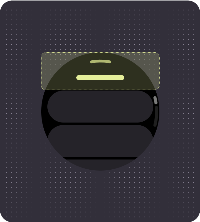 Top section
The top section has the option of Time Text, a compact button, and title serving as a way finder and clear navigation. All are optional.
A compact button can be used in special cases where the page is very long, and a search or action button will help the user navigate the list without having to scroll all the way to the bottom.
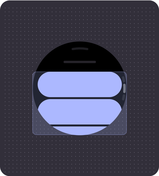 Middle section
The middle section can contain any of the available Compose (non-fullscreen), or custom components in a list. This section can contain additional headings to group content, and the scrollbar.
All components within the middle content section should be responsive, filling the available width up until the percentage margins. All scrolling layouts will have scaling-lazy-column behavior, showing the components scaling and fading off screen.
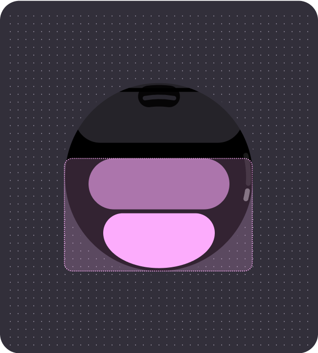 Bottom section
The bottom section provides space for primary and secondary action buttons, or can be left empty if this is the end of a journey.
It is recommended to use an end-of-list Edge-Hugging Button as it utilizes the limited space and complements the round screen.
More than one action can be needed, which can appear in a button stack, or two-icon button group.
Non-scrolling app views
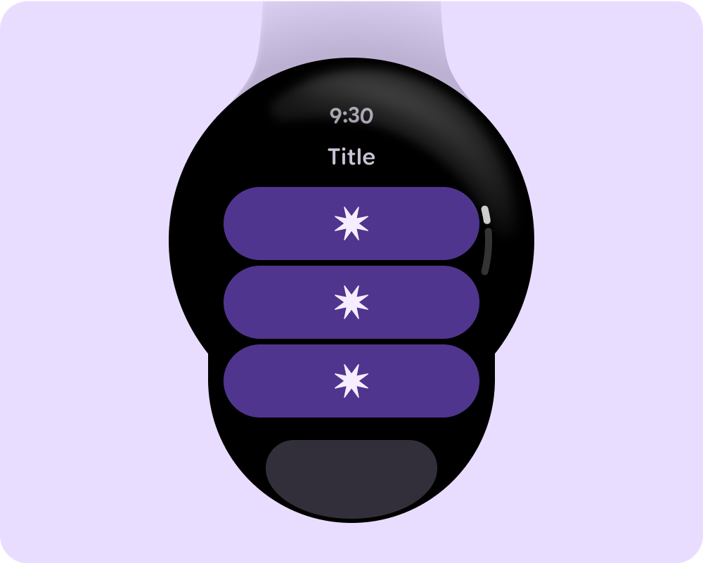
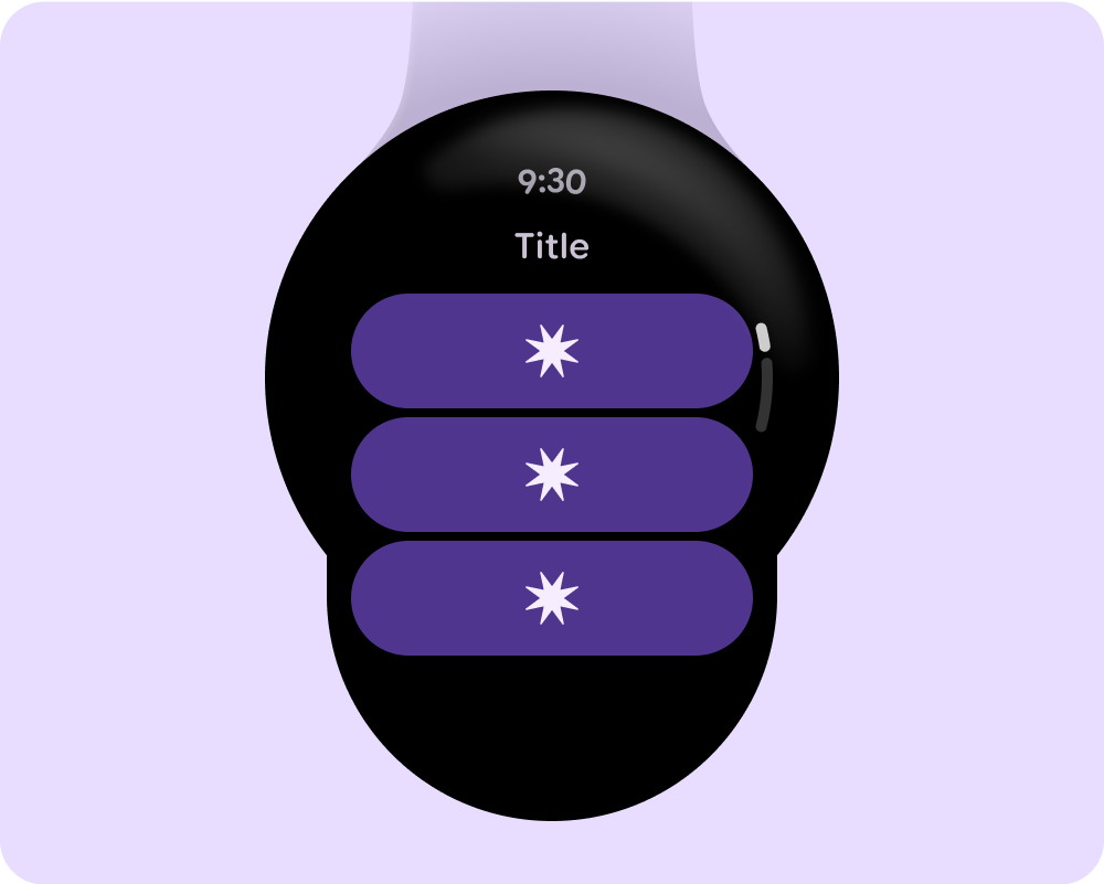
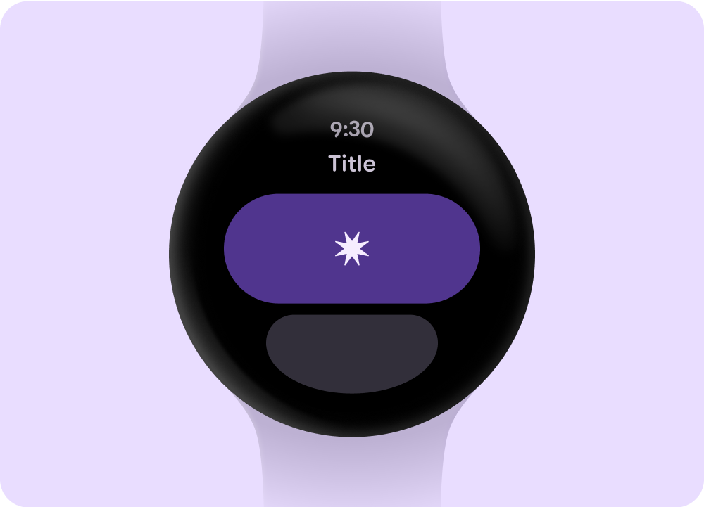 With title
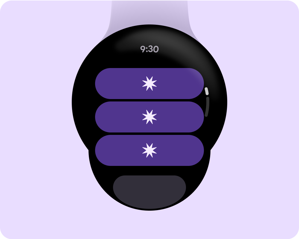
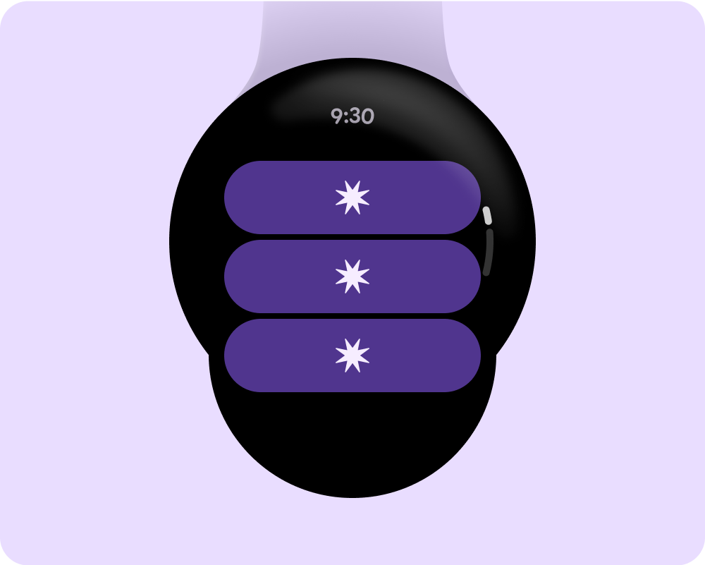
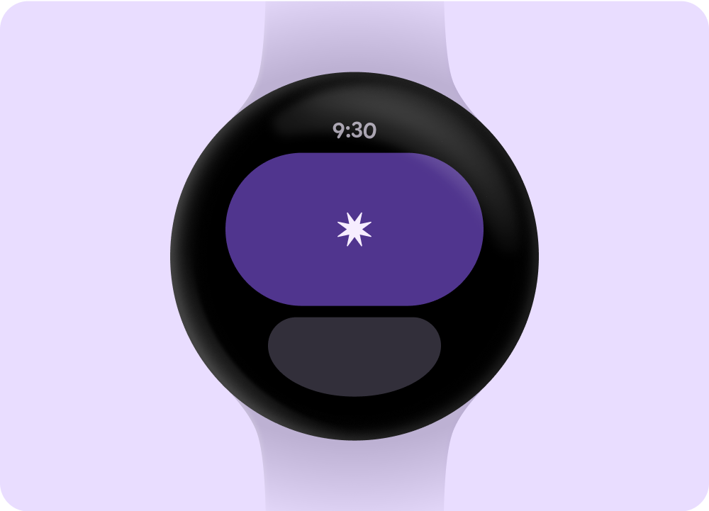 Without title
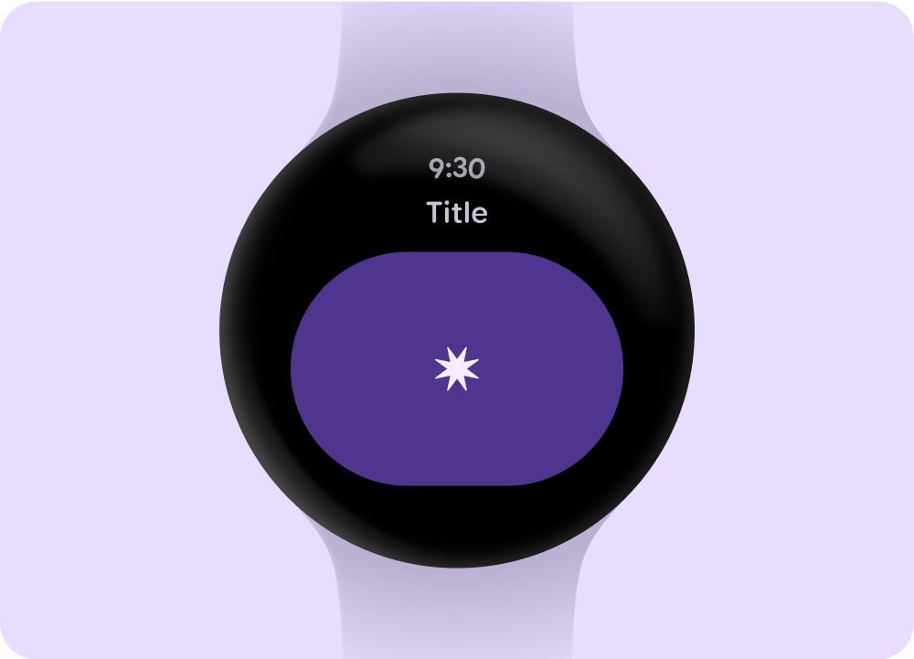 With title and no bottom section
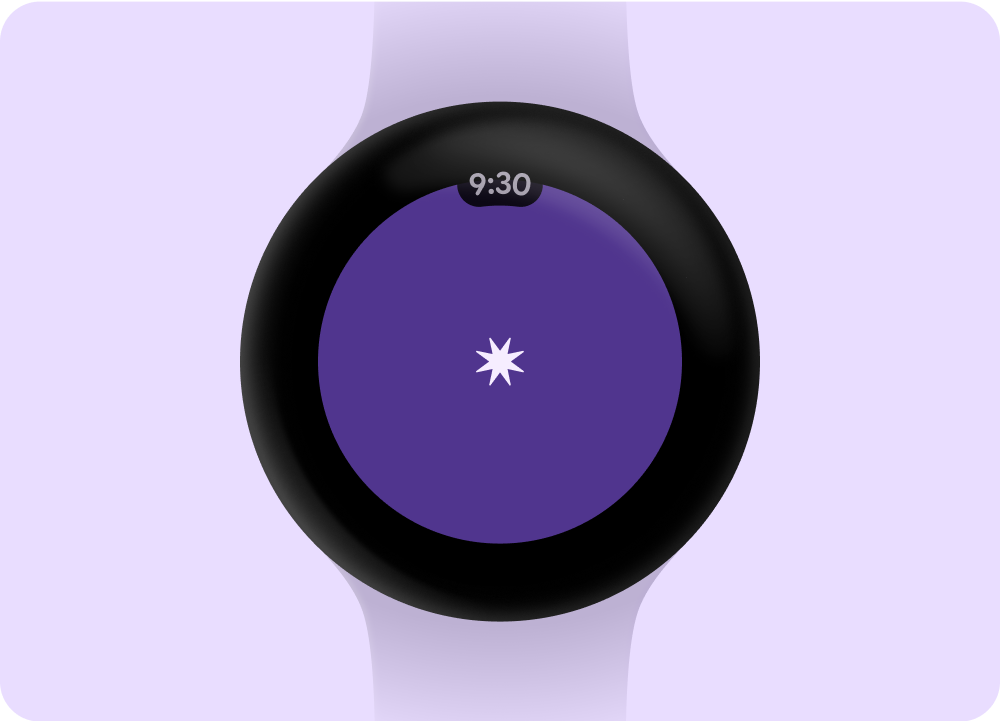 Without title or bottom section
Scrolling app views
 With title
 Without title
 With title and no bottom section
 Without title or bottom section