For pages that contain more information that extends beyond the height of the screen, or require longer and more immersive journeys, use a scroll view.
Preset scrolling layout components
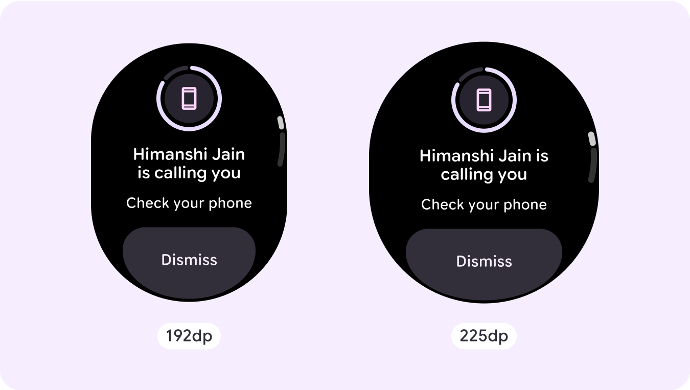
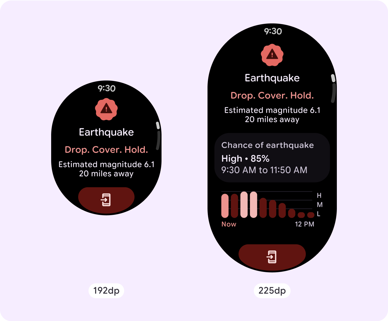
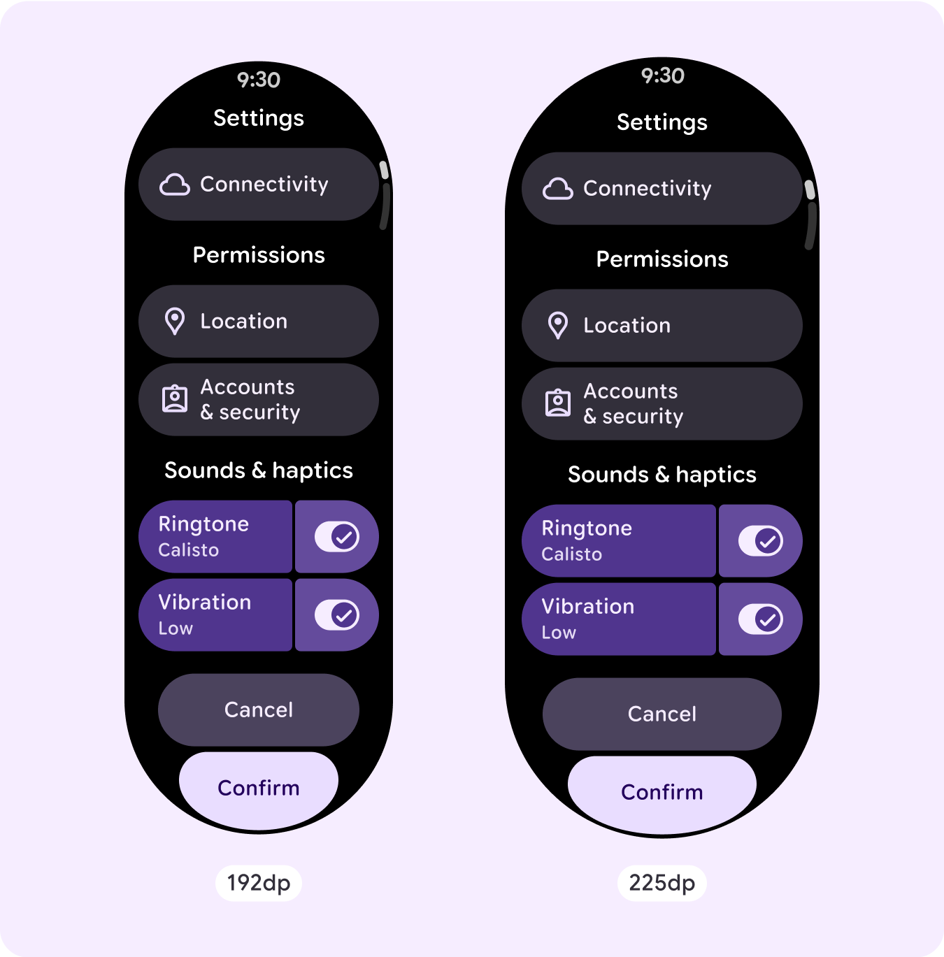
Dialog with bottom button stack
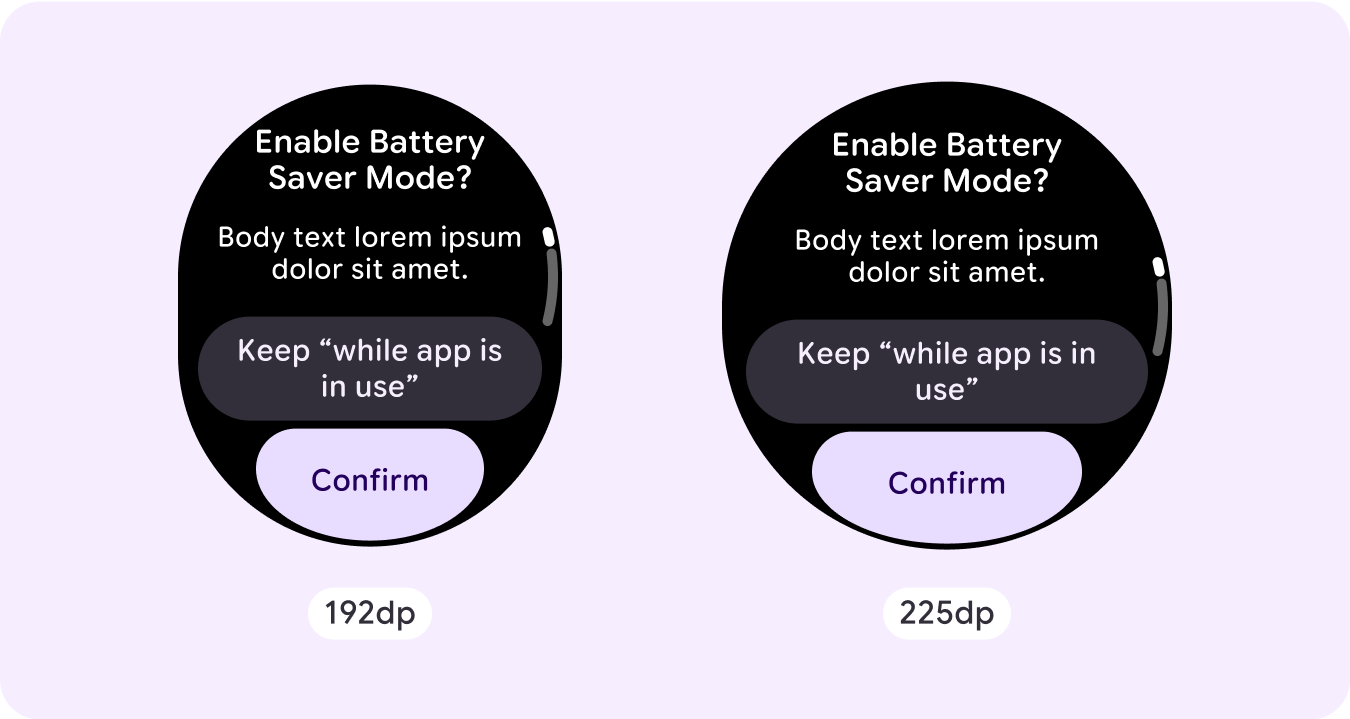
Dialog with bottom button stack
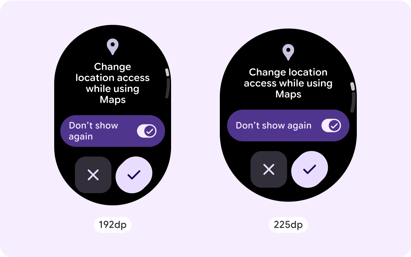
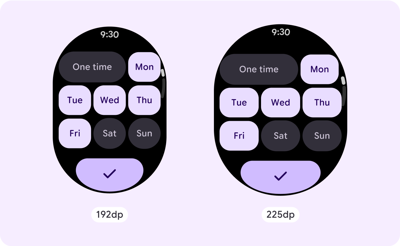
Dialog with bottom double buttons
Custom scrolling layout examples
Scrolling app screens are not limited to the set components, but can combine elements to create the layout you want. Be mindful of the length of a scrolling screen, and the use of responsive (percentage) margins and padding, to verify that components adapt to the available screen size.
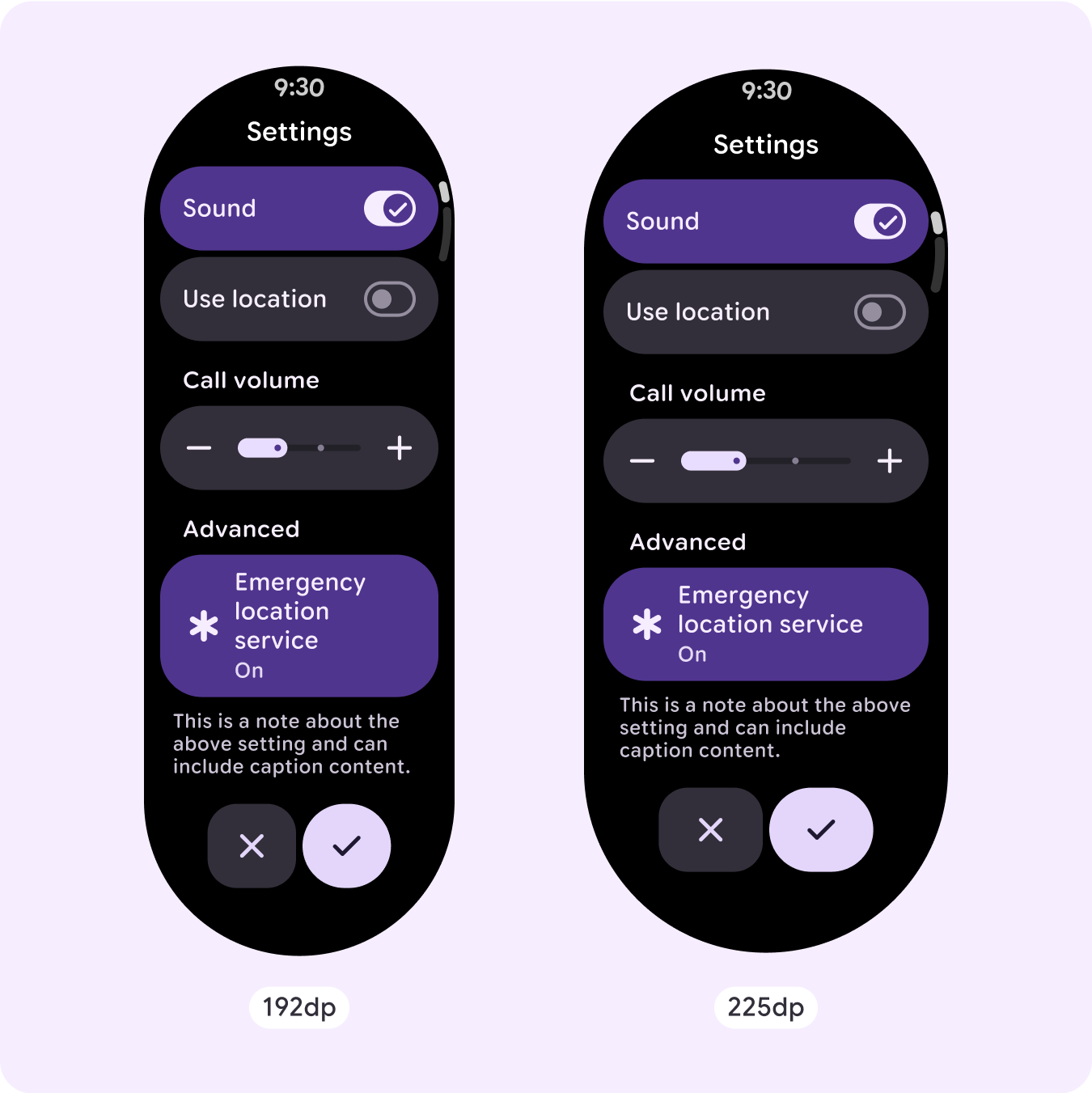
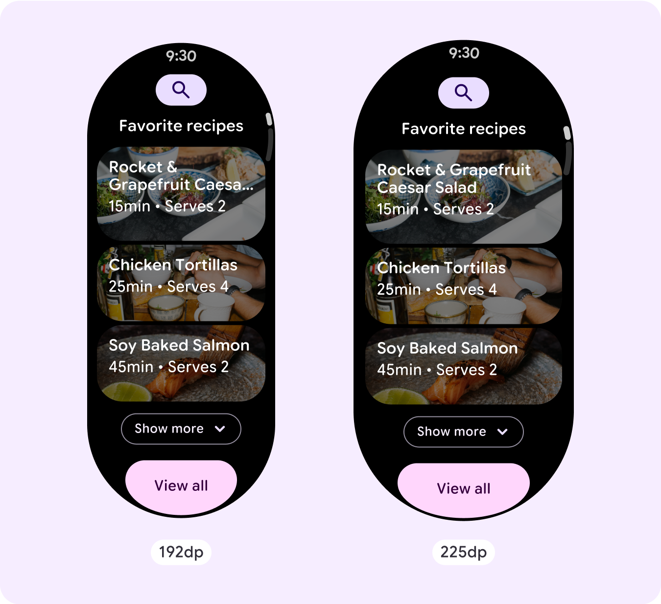
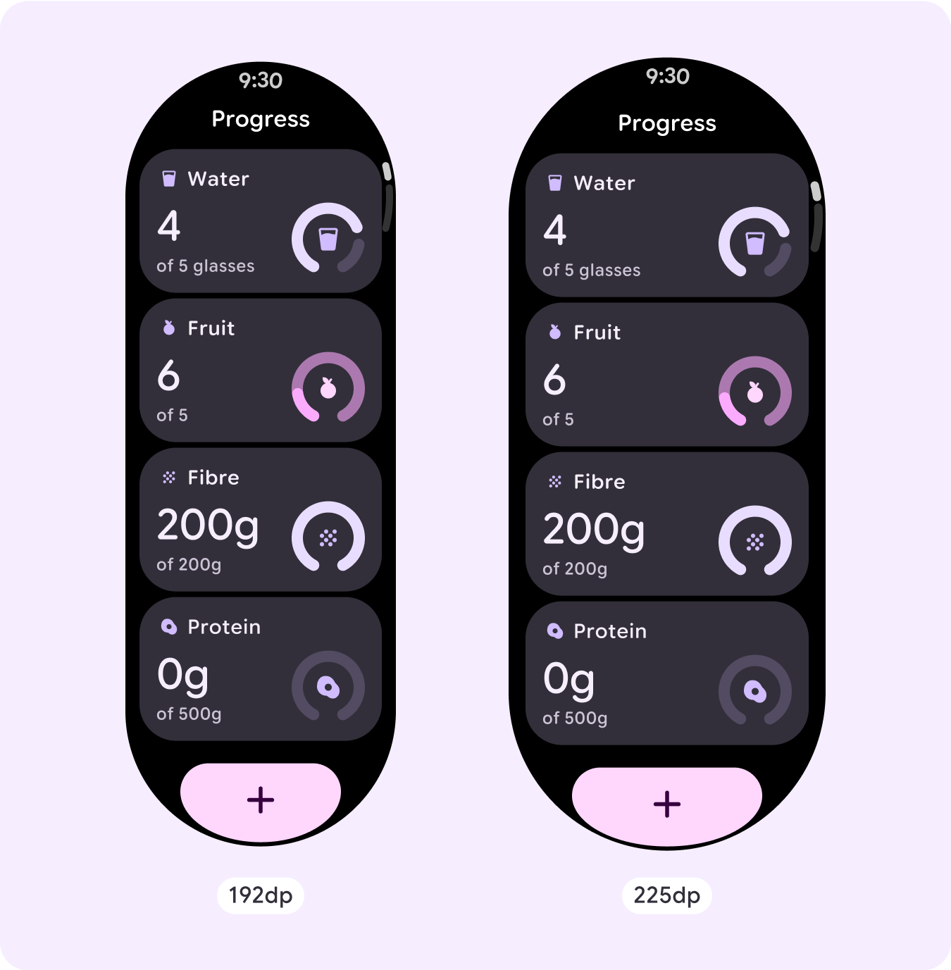
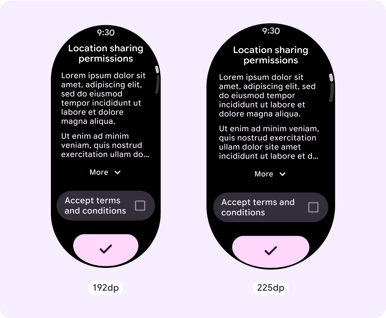
Additional content on larger screens
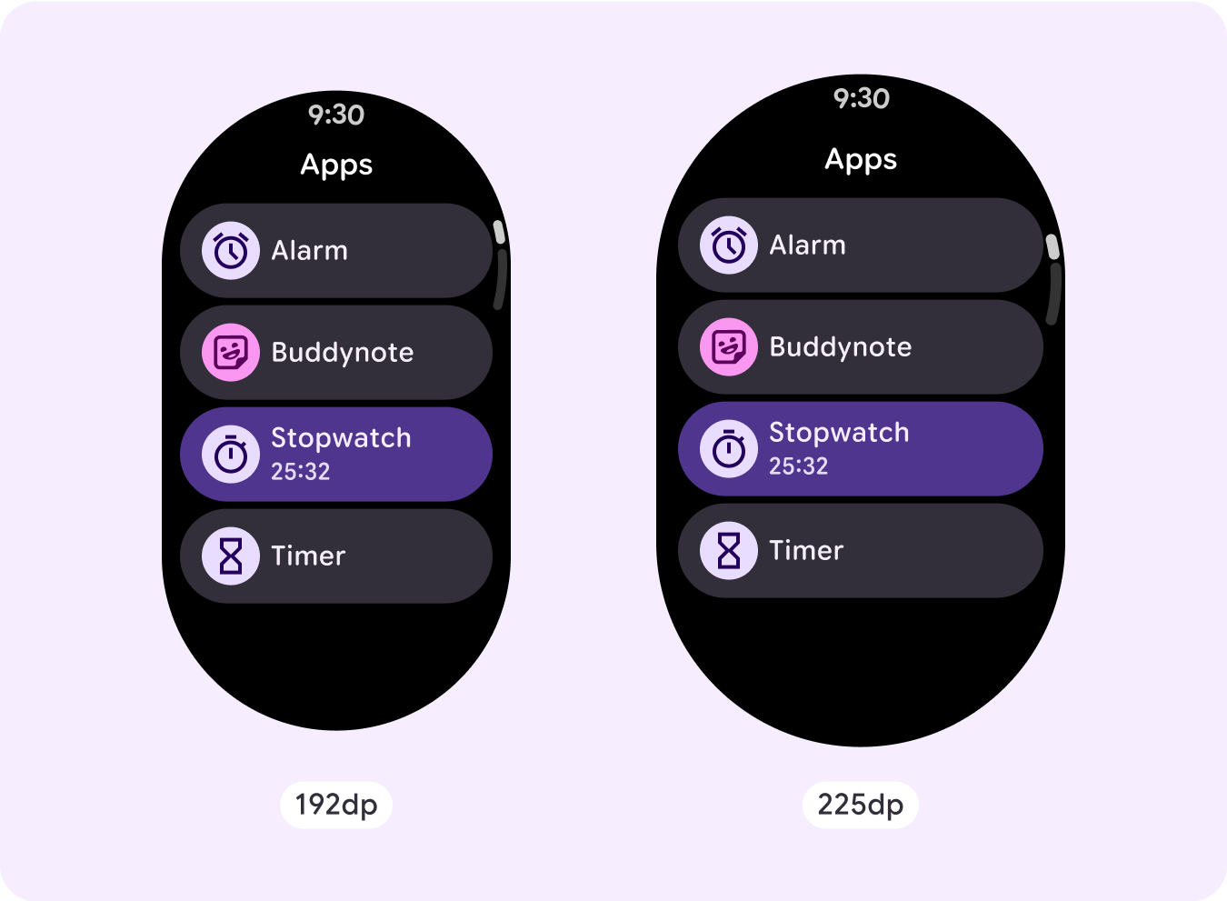
Button list: Icon buttons with icon size 26dp
Button list: App buttons with icon size 32dp
Button list: App buttons with icon size 36dp
Button list with toggle buttons
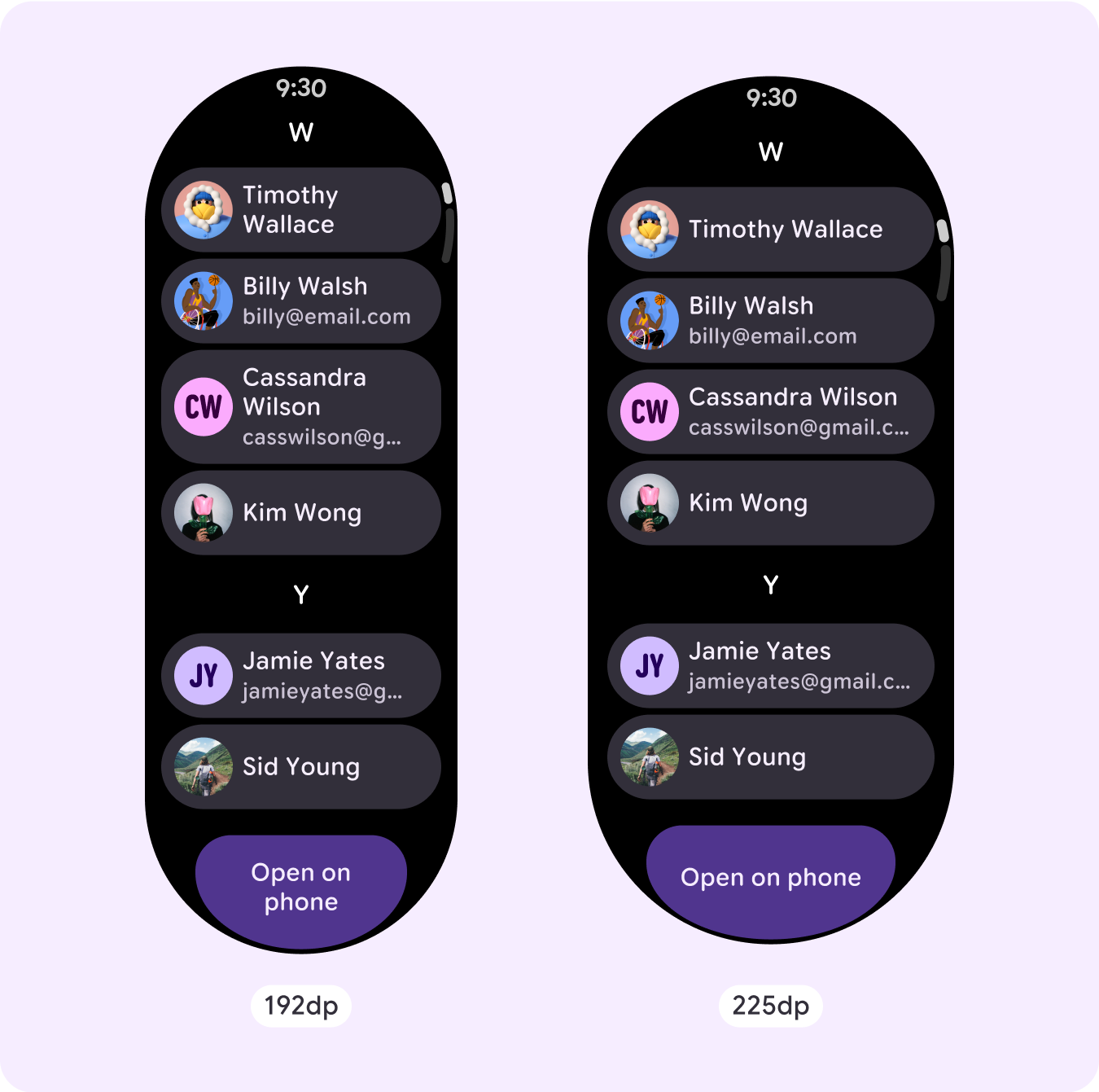
Mixed list with single-line elements
Mixed list with multi-line elements
Card list with app cards
Card list with title cards
Card list with custom cards
Text list
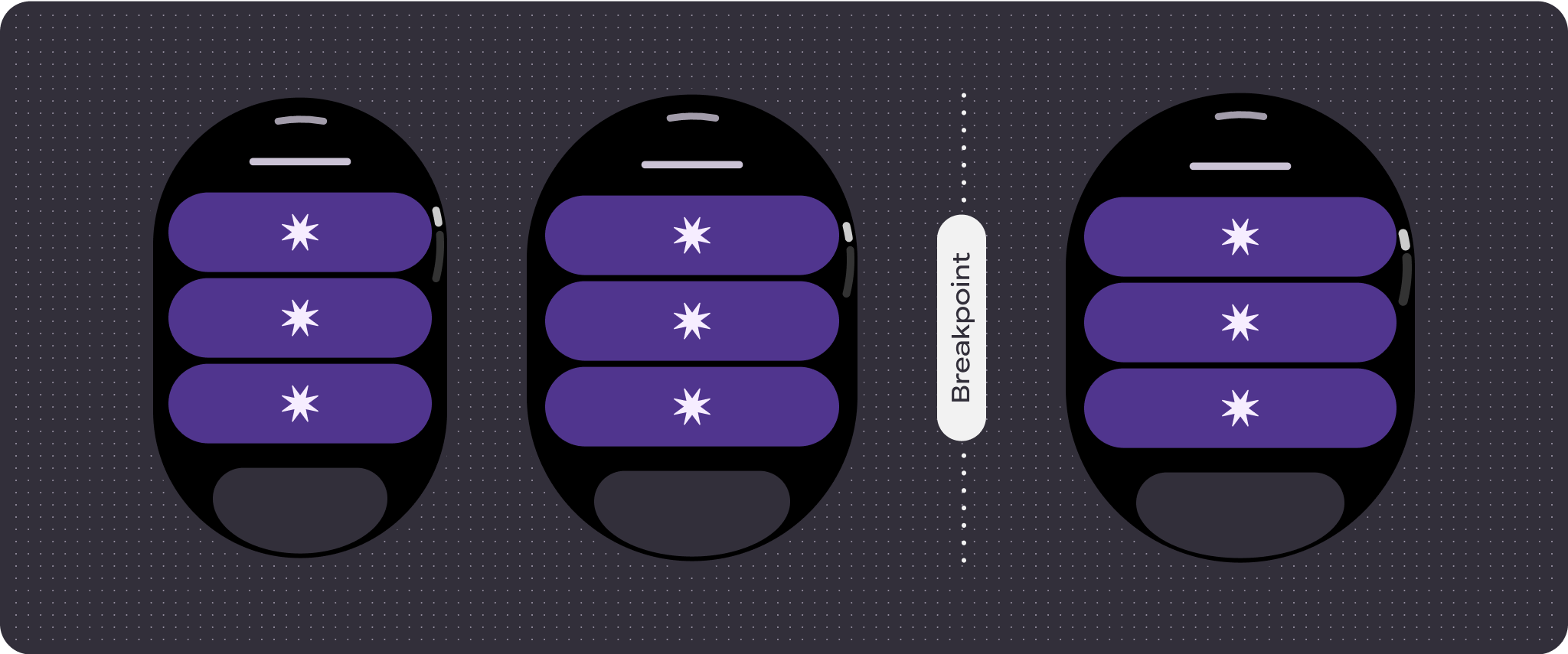
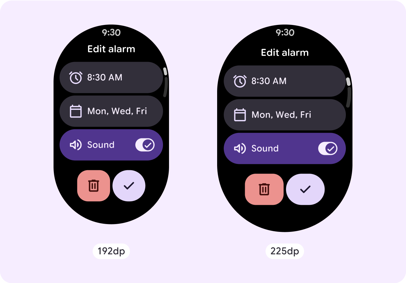
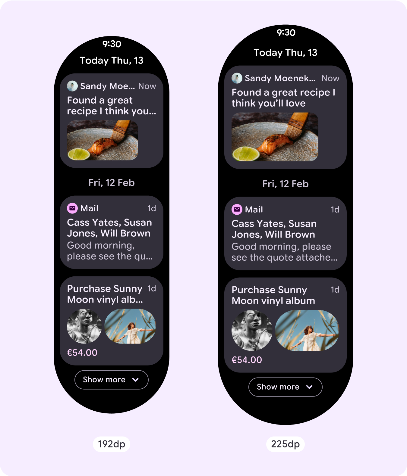
Responsive and adaptive behavior
All components in the Compose library automatically adapt to the wider screen size, and gain width and height. Scroll views that use responsive design practices usually adapt to a range of screen sizes. However, in some special cases, you can use a breakpoint to override dimensions and augment layouts which expand functionality, improve glanceability, or make content fit better on screen.
To verify that responsive parameters are properly defined, use the following checklist:
- Apply the recommended top, bottom, and side margins.
- Define outer margins in percentage values to prevent clipping at the beginning and end of the scrollable container.
- Apply margins in fixed DP values between UI elements.
- Consider applying a breakpoint at 225dp to introduce additional content or make existing content more glanceable when on bigger screen sizes.