Create more accessible, personal color schemes communicating your product's hierarchy, state, and brand. When designing for wearables, color plays a crucial role in enhancing legibility, usability, visual appeal, and expression, especially on smaller screens.
The following principles explain how to use color across themes.
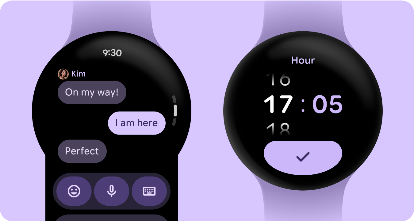
Build from black
Watches are designed with a black background, instead of the tinted background that phone devices use. While dark themes are meant for low-light environments and light themes for daylight, watch UIs need to function seamlessly both day and night. Therefore, color tokens for watches must be specifically tailored.
New color roles
The Material 3 color system retains the structure of three accent colors and two neutral surface colors, but introduces container colors within the accent roles. These new roles enable greater expressive potential without disrupting visual hierarchy, essentially providing surface color variations with increased chroma. Container roles are particularly useful for highlighting states, such as toggle buttons, or for providing complementary styling when the primary accent is already utilized.
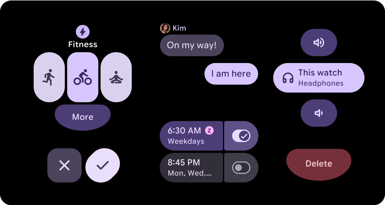
Semantic meaning
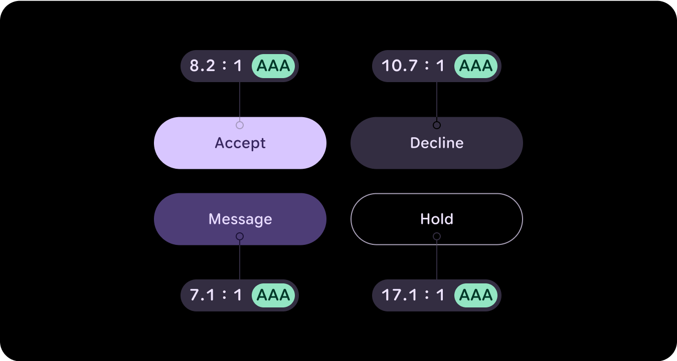
In watch UIs, colors need to communicate meaning clearly and intuitively. For example, red indicates errors and green signals success, helping users quickly understand actions or states without needing extra explanation. This semantic use of color helps users navigate your UI and take action with confidence.
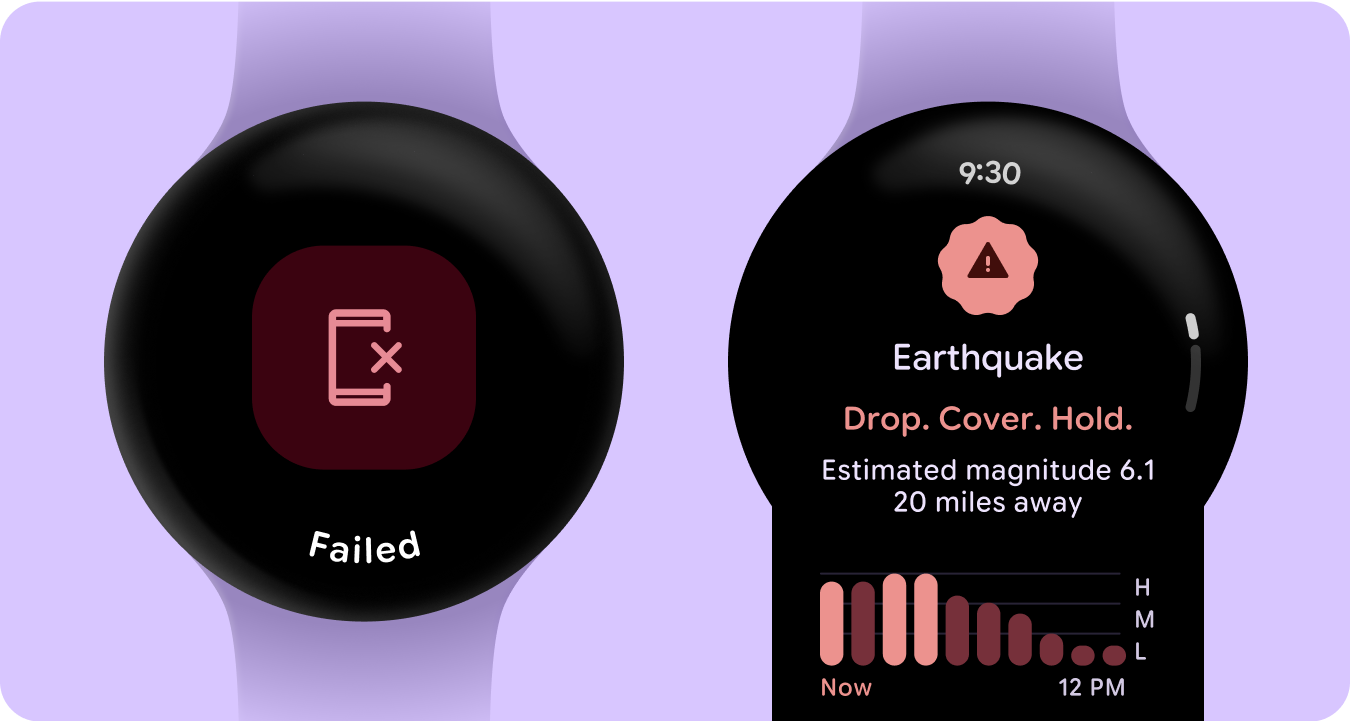
Color accessibility (contrast compliance)
In watch UIs, colors need to communicate meaning clearly and intuitively. For example, red indicates errors and green signals success, helping users quickly understand actions or states without needing extra explanation. This semantic use of color helps users navigate your UI and take action with confidence.
What's new
There are substantial updates to the visual design system and how we elevate expression throughout updates to our style foundations, components, and tiles design libraries.
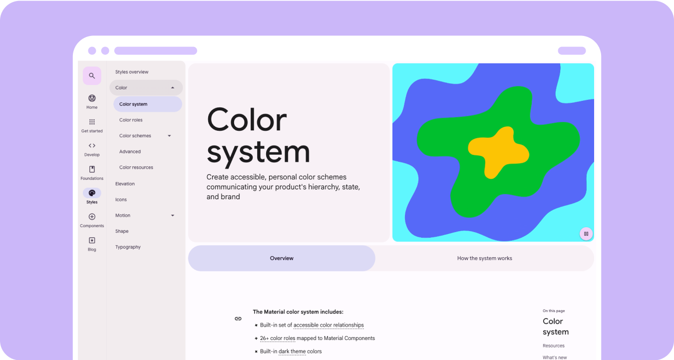
The Material 3 Expressive color system includes the following features:
- Built-in set of accessible color relationships
- 28+ color roles mapped to Material components
- Built-in dark theme colors for building from black
- Improved disabled color values
- Additional error colors
- Static baseline color with default colors assigned to each color role
- Dynamic color features, including System/Watch face, and image-based color themes
Resources
To learn more, view the following resources.
Material Design color guidelines
Learn about the latest best practices for color schemes using Material 3 Expressive.