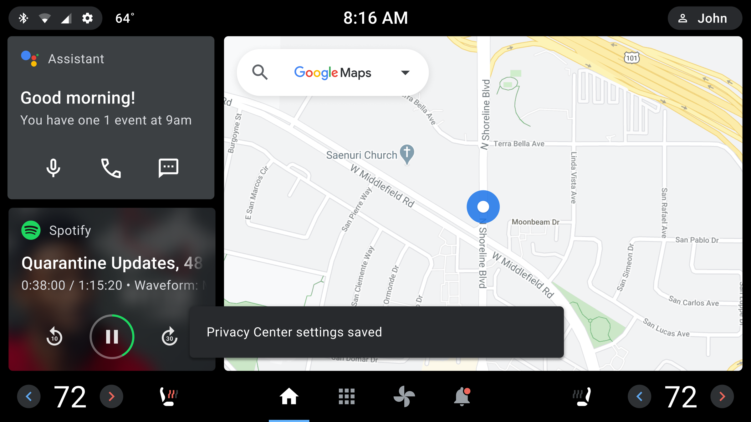
A toast is a short, informational message that an app displays briefly near the bottom of the screen.
Only one toast can be displayed at a time. The toast tells a user about an action the app has taken or will take. It does not require any user action or response. After 8 seconds, the toast disappears automatically.
Toasts are related to dialogs (and are in the Dialog family of components), but they differ in purpose and priority.
| Component | Purpose | Priority |
| Toast | Displays an informative message. Doesn't require user interaction. Disappears after 8 seconds. | Low |
| Dialog | Displays information and task options that require user interaction. A dialog retains focus until a user responds. | High |
Anatomy
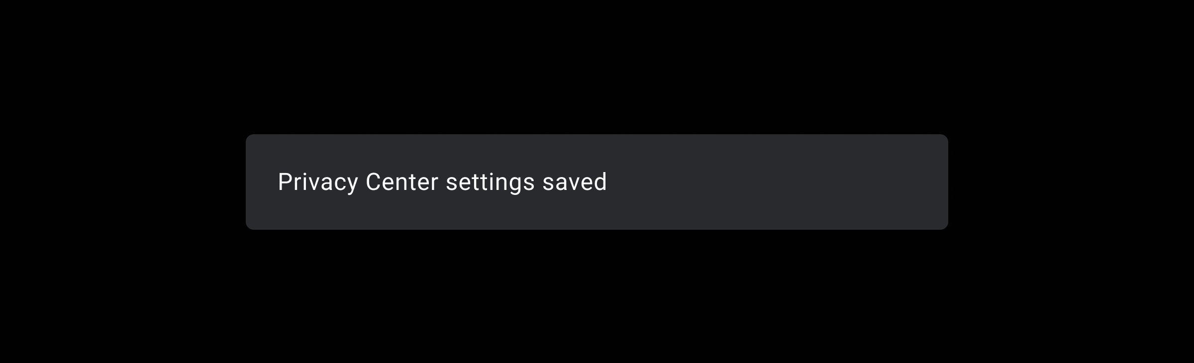
A toast appears briefly in front of other screen content. It consists of a background and a text message.
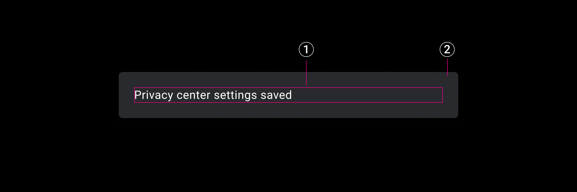
2. Toast message area
Specs
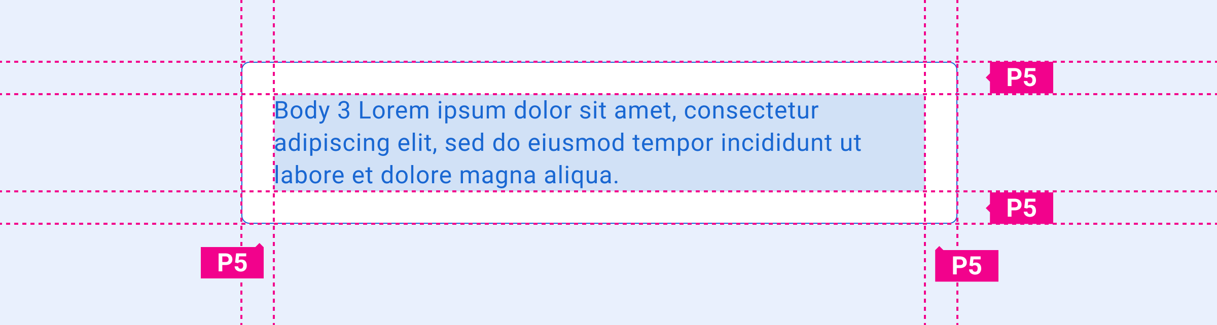
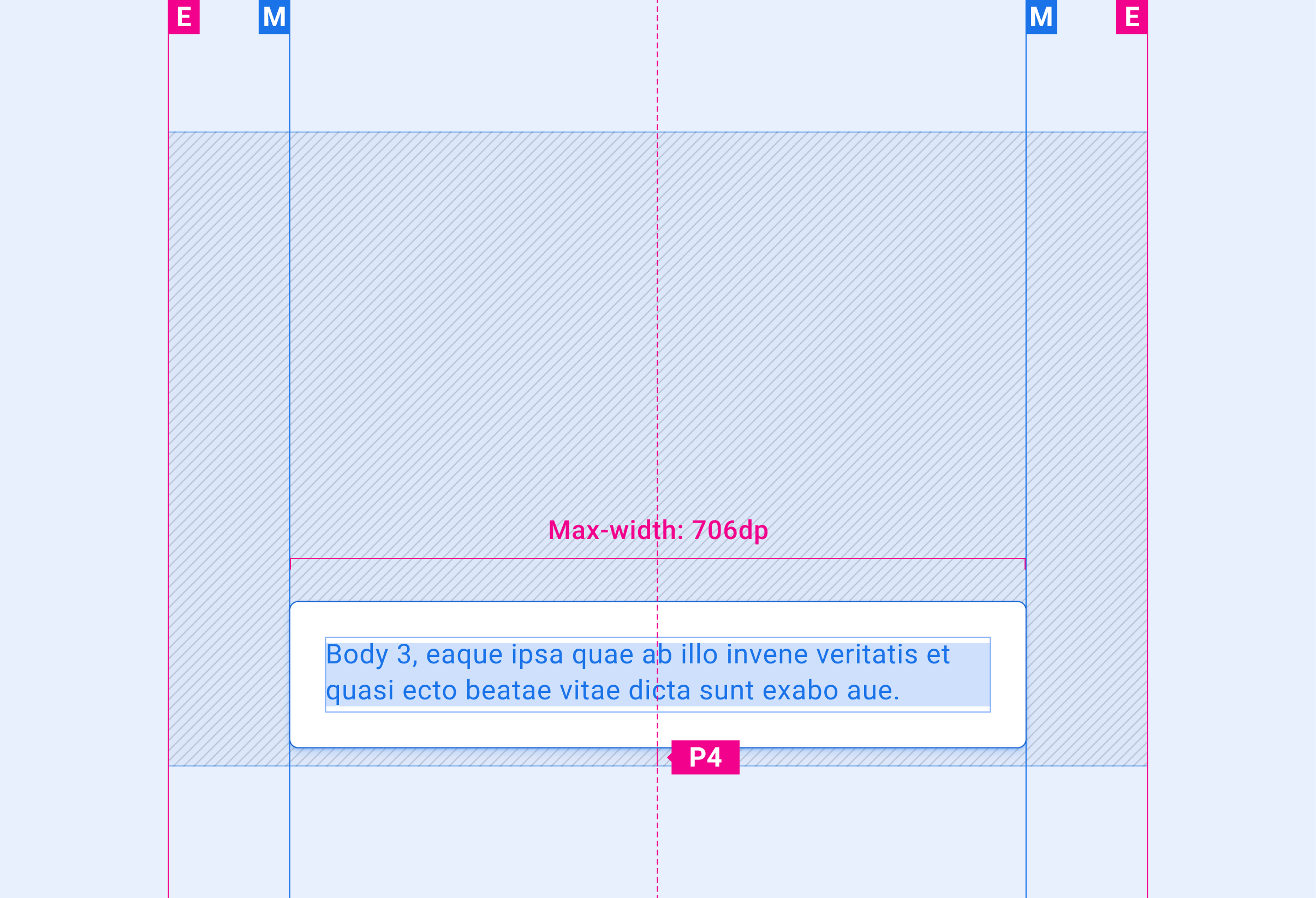
Here are the specifications for toasts:
Toast – padding around message text
Toast – bottom placement on screen
Customization
OEMs can modify the appearance of toasts to reflect their brand by:
- Providing custom fonts
- Changing toast dimensions and placement
Design system provides guidance for customizing components using layout, typography, and sizing.
Examples
Here are some examples of toasts:
Toast message format
Toast placement (near bottom of the screen)