
Buttons give users access to actions they may need to take in the car to provide access to actions that drivers may need to take — for example, confirming a choice or returning to the previous template.
Buttons can include the following:
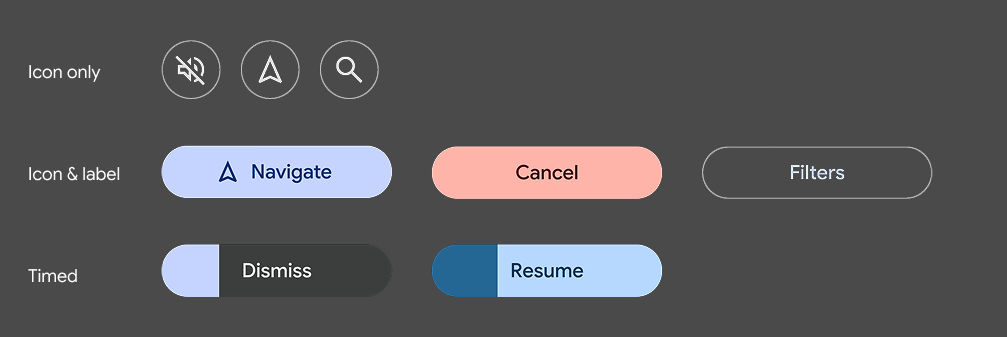
- Icon only
- Label only
- Icon + label
Template support
You can use buttons in the following places:
- Pane template
- Message template
- Long message template
- Sign-in templates
- In the action strip on any template
Guidance
Consider the following advice as you design buttons for your app.
You can supply foreground and background colors to replace default colors. However, vehicle OEMs can choose whether or not to use the colors you supply in AAOS versions of your app.
You can specify which button is the primary button.
Keep labels short to avoid truncation – especially on the Navigation template, where space is limited.
Primary buttons
In the Message, Long Message, and Pane templates, which feature up to 2 buttons, you can optionally tag one button as primary to represent the primary action.
The primary button will be highlighted with the app accent color for visibility and ease-of-use.
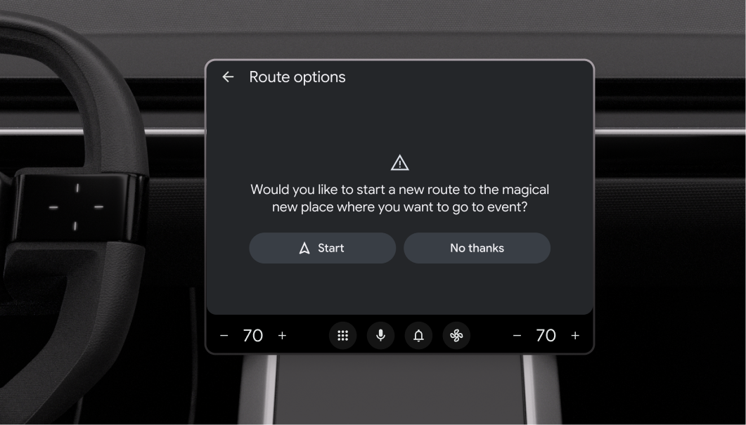
Timed buttons
You can create buttons associated with default actions that are taken automatically if the user doesn't act within a specified amount of time (customizable by the app). For a sample flow using this strategy, see Respond to a timed alert.
To convey the countdown to the user, the button becomes a timer with a built-in progress indicator. The timer countdown is indicated by shading that moves horizontally across the button.
The Car App Library determines the timer color based on the button's background color, adjusting it as needed to ensure sufficient contrast.
To create a timed button, assign a default flag to it.
In these examples, the Navigate or Accept action will automatically be taken if the user doesn't choose the other action before the shaded progress indicator moves all the way across the button.