
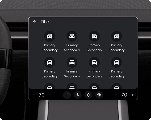
The Grid template presents items in a grid layout and is useful when users rely primarily on images to make their selections.
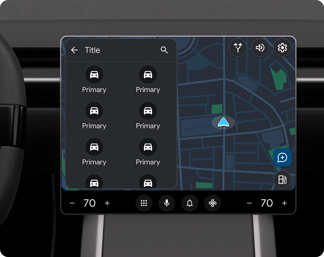
This template can be embedded in the Tab template to provide tabbed navigation or included in the Map + Content template to provide a grid on a map.
The grid template includes the following:
- Optional header (header is replaced with tabs when this template is embedded in the Tab template)
- Grid items (see the note below), each containing an icon or a
large-size image
- Primary text for each grid item (optional)
- Secondary text for each grid item (optional)
- An image or icon (optional)
- A badge
- Optional floating action buttons
For more flexibility and to take advantage of the latest features, use the Sectioned Item template instead of the Grid template. With the Sectioned Item template, you can mix and match lists and grids to create a custom browsing structure.
Grid template UX requirements
| SHOULD | Limit length of primary and secondary text strings to avoid truncation. |
| SHOULD | Have an action associated with each grid item (information-only items are not recommended). |
| SHOULD | Clearly indicate item state (for grid items that have multiple states, such as selected and unselected) by variations in image, icon, or text. |
| SHOULD | Include a header with an optional title and primary and secondary actions. |
| SHOULD NOT | Include both an action strip and a floating action button at the same time. |
| MAY | Show a loading spinner instead of the icon or image for a grid item when an action associated with the item is in progress. |
Resources
| Type | Link |
| API reference |
GridTemplate, GridTemplate.Builder
|