
Rows are customizable components used to build various list types, like lists with data or images. They are supported by templates and can display a small amount of text along with other elements.
Row variants
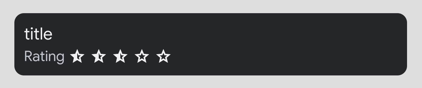
You can customize rows by adding images, icons, buttons, and more to unlock more functionality for drivers. These examples show each of the available options.
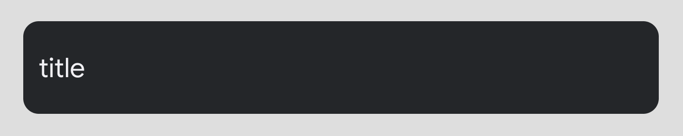
Title: Mandatory. Up to 2 lines, where the second line either wraps or comes after line break.
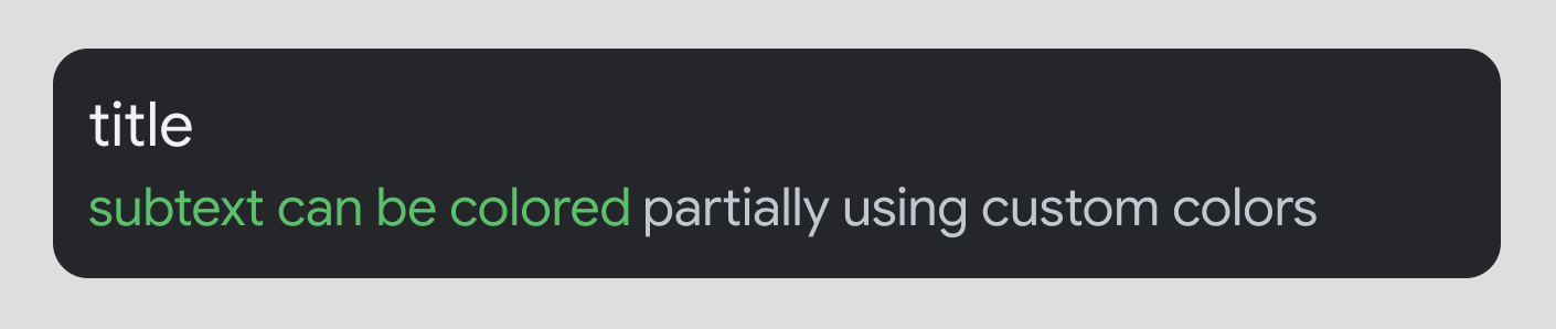
Secondary text: Optional. Up to 2 lines with customizable text color.
Inline icon: Optional. In either primary or secondary text.
Numeric decoration: Optional. Typically used to indicate a quantity of unseen content, such as unread messages.
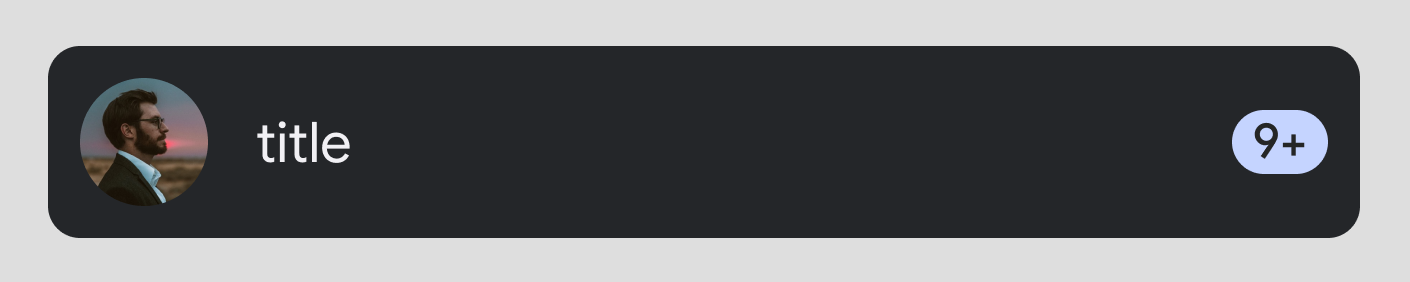
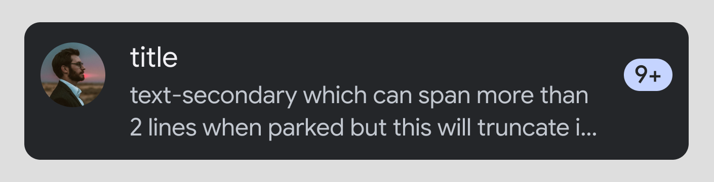
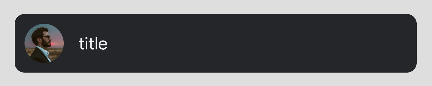
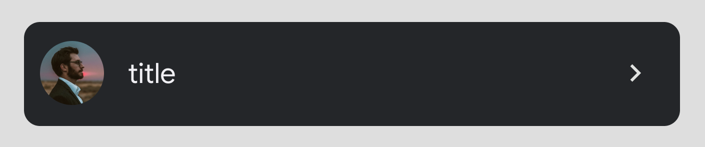
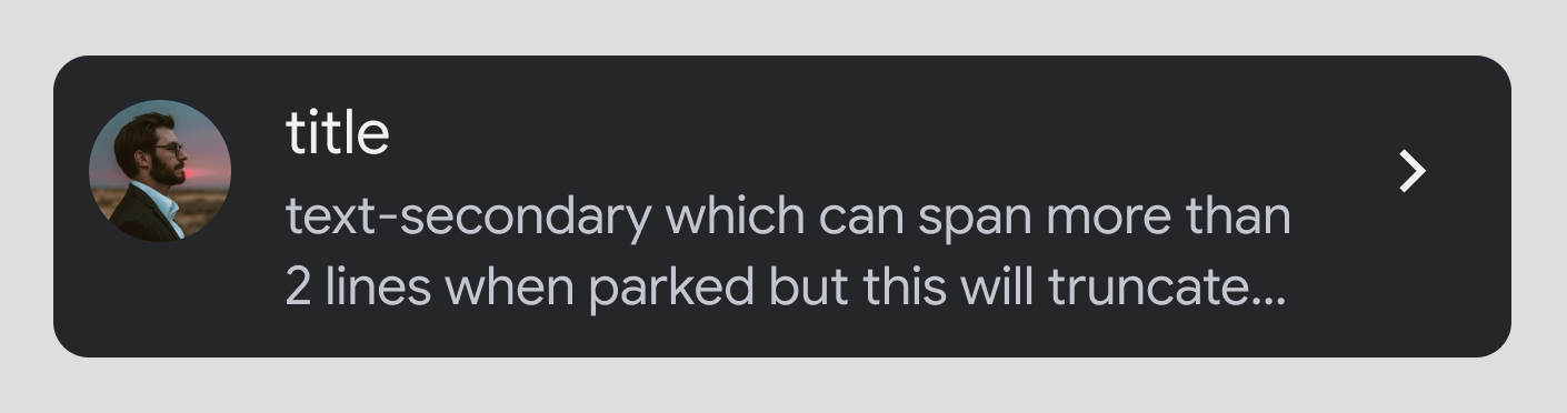
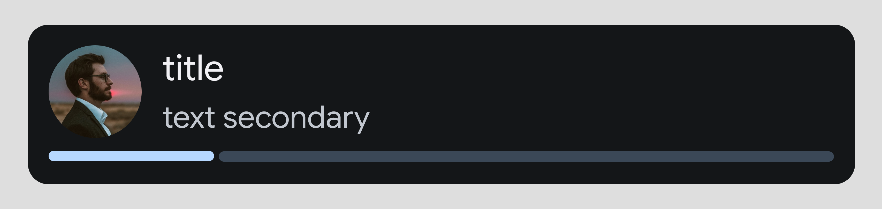
Image: Optional
Actions: When used in certain templates, rows can have up to two action buttons.
Browsable: When a row is marked as browsable, the system will provide an icon that indicates this. Browsable rows must also be clickable (see below) and cannot contain actions.
Progress bar
How rows behave
- Clickable: Optional. The row can be marked
- Enabled: By default, all rows are treated as enabled. You can mark a row as disabled to make it unavailable and
- Indexable: By default, all rows are indexed by their title text for alphabetical sorting when used in a template that supports that functionality. You can mark a row
Template support
The following templates support rows:
- Sectioned Item template
- List
- Place List (map)
- Search
- Pane template with no line dividers in the Pane template because its rows are not actionable
Row items
In addition to primary and secondary text, and an image or icon, rows on the List template can also include any of the following:
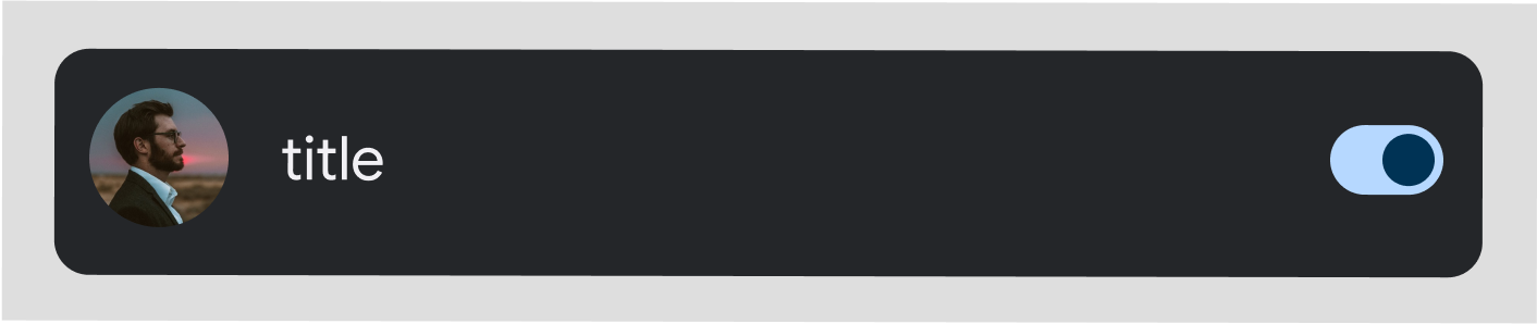
Toggle switch: Optional
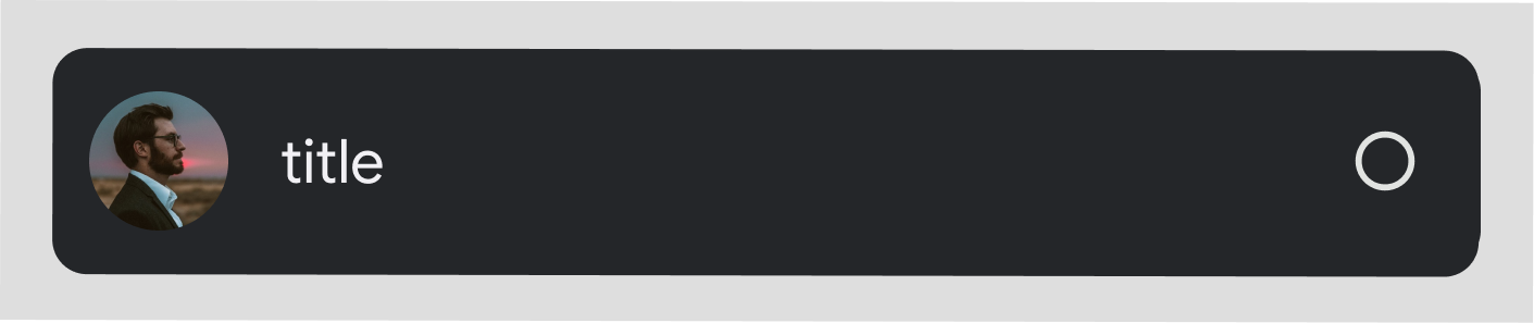
Radio button: Optional. Used only in selectable lists, which must have radio buttons on all rows.
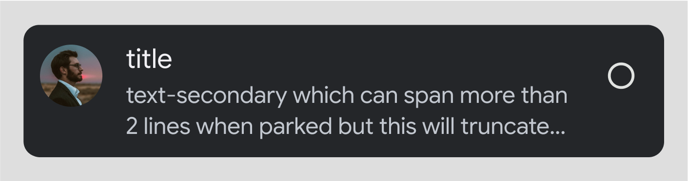


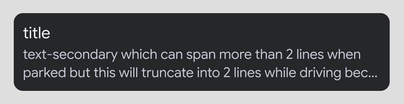
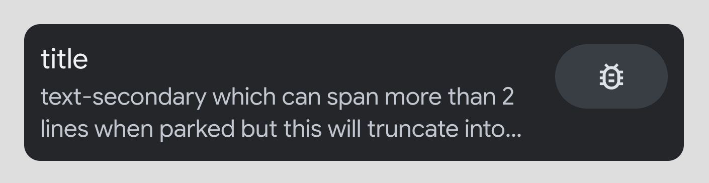
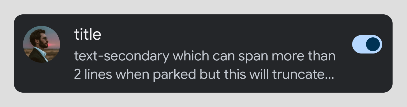
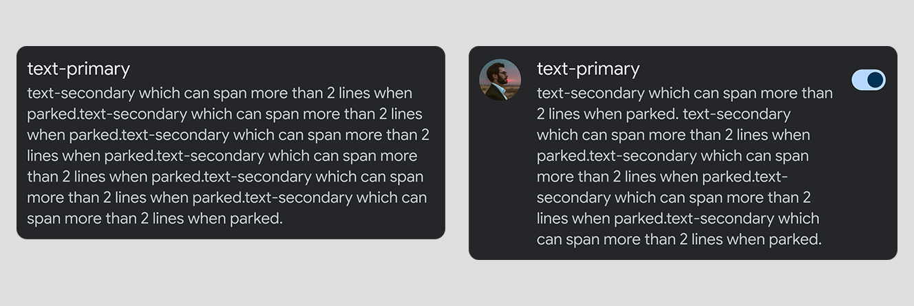
Longer secondary text: If secondary text is longer than 2 lines, it will be truncated while driving. The full text will be visible only when parked.
Guidance
A row with a toggle switch can't contain a radio button, and the other way round. Also, carats are not used on lists with either toggle switches or radio buttons. However, a row with either of these options can also contain an image or icon and wrapping text.
Rows when parked
When parked, you can include longer text in rows, as shown in the following examples.
Resources
| Type | Link |
| API reference |
Row,
Row.Builder
|