
Smartwatches are ideal for on-the-go use, but operating them becomes difficult when users have their hands full. To address this, Wear OS 7 introduces a new one-handed gestures framework for OEMs and a Gesture API for developers who use Jetpack Compose on Wear OS. While adopted exclusively by Pixel Watch devices (Pixel Watch 3 and newer), this underlying framework is available to all manufacturers. By supporting this API, your app's gesture support can automatically scale across the ecosystem as other OEMs opt in.
To build seamless, touch-free experiences, follow these guidelines to determine if one-handed gestures are right for your app experience.
Supported gestures and actions
The Wear OS gestures framework supports two gesture types: primary action and dismiss action. On Pixel Watch, the primary action is mapped to the double pinch gesture, and the dismiss action is mapped to the wrist turn gesture.
Primary action
The primary action should map to the main task, such as answering a phone call or toggling play or pause in media controls, that a user can complete on a screen or page. If the page is scrollable, your app can map only one UI element at a time to the primary action.
Double pinch is most useful when the user can navigate to that UI element either using gestures, voice, or when the element opens automatically (like a notification or media controls). If the only way to navigate to the UI element is by touch or buttons, the action isn't a good use case for the primary action gesture.
Dismiss action
By default, the dismiss action maps to system back and navigates back to the previous screen. Your app can override wrist turn for specific use cases, but these exceptions should still align with the concept of dismiss, silence, or minimize. Example overrides include silencing a call rather than dismissing it, and closing notifications rather than dismissing or deleting them. This action should never be mapped to arbitrary actions in your app, no matter how tempting that may be, because it breaks the user model of using the dismiss action as a consistent indicator for a back or dismiss command.
Dismiss action can also be disabled for a screen when it poses a risk due to accidental triggers, such as on an active workout screen or in an emergency call. To disable wrist turn for a given screen, subscribe to the dismiss action but do nothing with the dispatched gesture event; that is, provide an empty subscription.
Quick gesture guidelines
The Wear OS gestures framework is designed to handle interruptions and controls. It isn't designed to enable full watch navigation. Follow these guidelines to adopt one-handed gestures in your app:
- Minimize navigation: Use gestures for one-and-done interactions, such as dismissing a notification or pausing and resuming media.
- Use scroll sparingly: The primary gesture (double pinch) can be used
to scroll, but this shouldn't be the default experience for all scrollable
content. Only enable gesture scrolling if the following conditions can be
met:
- The user is able to get into the scroll view with one hand or in a hands-free way, such as using a gesture, voice command, or on a screen that auto-launches, like media control and maps navigation.
- The content provides value at a glance, such as a workout summary, and doesn't require further interaction other than an optional single button that can also take the primary gesture action once it's scrolled into view (such as a done edge button).
- Avoid dead ends: Ensure gesture actions don't result in dead ends where a user can't proceed further in their journey without using the touchscreen or a physical button.
- Avoid hidden actions: Never hide a gesture-only action. If a user can perform an action with a double pinch, a visible, tappable button that performs the same task must be present. The exception to this is universal actions like a wrist turn to go back, where user intent is hard to predict.
Gesture interaction flow and feedback
When a gesture is available and performed by the user, the following sequence of events occurs:
- Gesture hint: When a primary action gesture is available, an animated illustration of a hand performing the gesture is shown on screen, informing the user which gesture is available and which UI element the gesture will act on. Typically, hints don't appear for the dismiss action unless it maps to a UI element on the screen.
- Haptic feedback: A short, crisp haptic is played when the gesture action is successfully handled.
Sound and visual feedback: Any sound or visual feedback associated with a UI element that occurs with a touch interaction should also be triggered with gesture actions. You must hook your app's existing touch audio and visual callbacks into gesture events to offer a consistent experience.
Example: Camera has an associated shutter sound and button interaction that must be triggered with gestures.
Gesture hints, education, and settings
To make gesture actions discoverable, Pixel Watch provides an on-watch interactive tutorial and a hints framework within the Gesture API. Gesture settings are also provided in system settings—on Pixel Watch, in Settings > Gestures > Hand gestures.
Tutorial onboarding
On Pixel Watch, users are introduced to hand gestures through an interactive tutorial and Pixel Tips. There's no need to create a unique gesture tutorial within your app. Instead, leverage the in-context hints provided by Jetpack Compose on Wear OS to inform users where gestures are available within your app.
In-context hints
To help users discover gestures within your app, provide hints that associate the gesture action with the physical affordance. Subtle hints are clearer and more legible, causing minimal obstruction of other UI elements.
In-context hint types include:
- Button hint
- Appears as an animated icon within a UI element, such as a button, temporarily hiding the typical content in that element, such as a button label or icon.
- Floating hint
- An animated icon contained within a small bubble overlay that points to the UI element that the gesture affects. Floating hints are typically used when the UI element they point to is too small to contain the hint. The primary example is scrolling, where the hint bubble points to the scroll bar to indicate that the primary gesture will scroll.
- The hint can point to any of the cardinal directions (up, down, left, right).
Button hint

Swaps with an existing icon or text momentarily.
Floating hint

Points to an element on screen that is too small to hold a button hint.
Color guidance:
- Button hint
- By default, the animated vector drawable (AVD) color is tinted to match
the button icon or text color (
LocalContentColor). - The AVD can be tinted to a custom color if necessary. Generally, however, the color should be the same as the content it temporarily replaces to provide proper contrast.
- By default, the animated vector drawable (AVD) color is tinted to match
the button icon or text color (
- Floating hint
Tertiarycolor is applied to the hint container.- The AVD color is tinted to
onTertiary. - You can customize both the hint color and background shape color.
Button hint color guidance
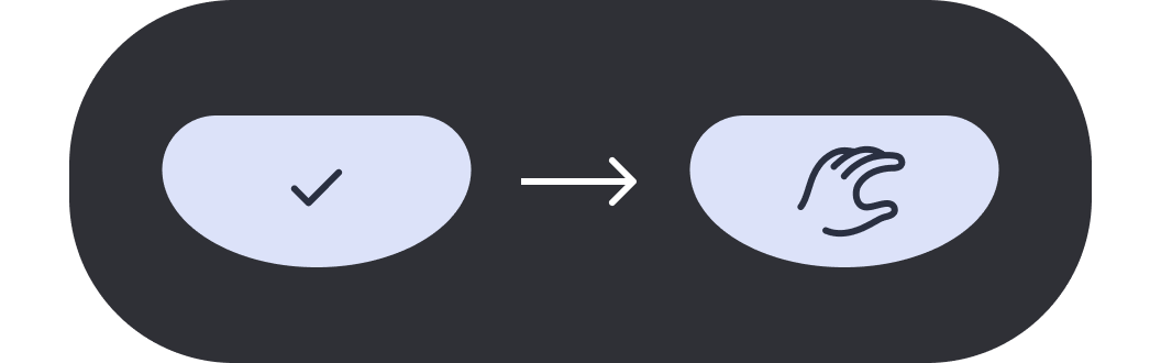
AVD color matches the button icon or text color.
Floating hint color guidance
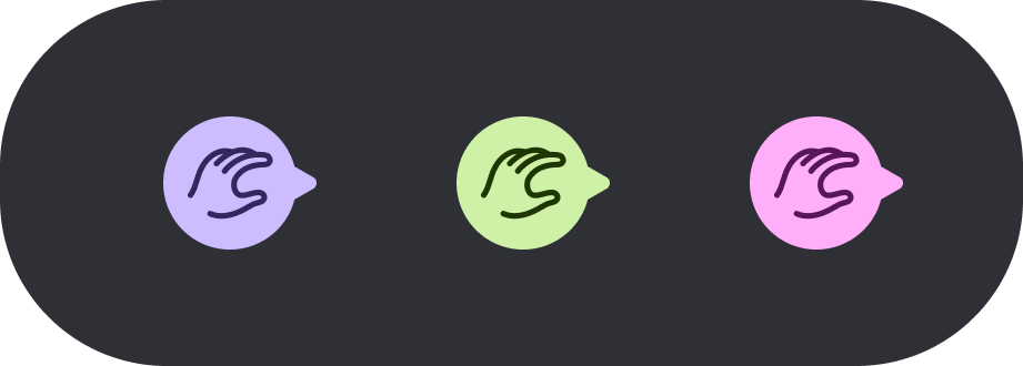
Hint container uses Tertiary and AVD uses onTertiary.
Hint cadence rules:
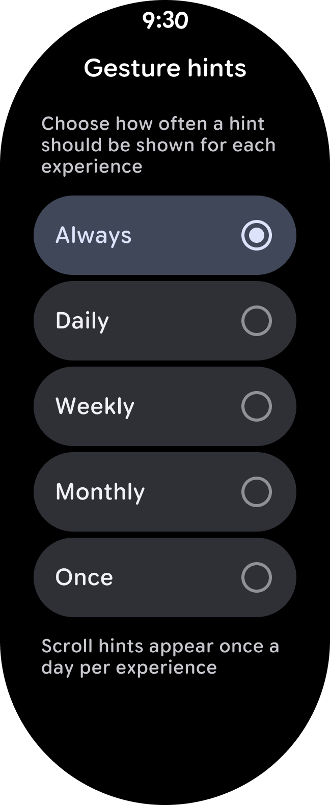
To help users discover gestures, the platform provides a configurable frequency for how often a hint should be shown for an experience. The hint cadence logic is global rather than per experience. The Wear OS Gestures framework controls the cadence and exposes a setting (on Pixel Watch, Gestures > Hand gestures > Gesture hints) for users to adjust the cadence.
- Button hints
- Upon the first launch of an app with a gesture action, or upon updating an app that introduces a gesture action, a hint initially appears for that action at least once. The hint is only shown again based on the user-defined cadence (such as Always, Daily, and Monthly). Hints are set to Always by default.
- Floating hints
- Because they cover up adjacent content, floating hints appear at most once per day per experience. If the global hint cadence is set to a value that's less frequent than once a day (Daily), then the system uses that less frequent cadence.
Additional resources
For developer guidance on how to implement one-handed gestures in your app, see One-handed gestures with Compose.