
All Jetpack Compose Glimmer components are designed to work with standard input methods, such as a tap or swipe on the glasses' touchpad, while also being receptive to lower-level input commands that are specific to the hardware on display glasses. Jetpack Compose Glimmer components automatically handle the necessary input events.
For standard actions like scroll and drag, use the Jetpack Compose Glimmer
components to promote a consistent experience. However, for custom components or
bespoke interaction behaviors, you can use existing Compose APIs like
Modifier.draggable or Modifier.scrollable.
Pointer input and focus
On display glasses, pointer input can affect focus:
- Tap: Direct interaction for activating element. Focus moves to an element when a user interacts with it.
- Swipe: Used for navigation and scrolling. Unhandled swipe gestures automatically translate into focus movements, enabling seamless UI navigation without direct pointer input.
Using a feature of Jetpack Compose, the system can automatically set the initial focus to the very-first focusable element when the screen loads, which is often the top-left item on the screen.
This feature is still in development and isn't enabled by default. To activate
this feature, set the isInitialFocusOnFocusableAvailable flag to true in
your activity's onCreate() method.
import androidx.compose.ui.ExperimentalComposeUiApi
import androidx.compose.ui.ComposeUiFlags

class GlassesActivityExample : ComponentActivity() {
    override fun onCreate(savedInstanceState: Bundle?) {
        @OptIn(ExperimentalComposeUiApi::class)
        ComposeUiFlags.isInitialFocusOnFocusableAvailable = true
        super.onCreate(savedInstanceState)
    }
}
Navigation behavior and order
Focus movement and order change as a user navigates your app.
Focus movement
On a scrollable container, focus moves continuously with a swipe on the touchpad. For discrete elements like a row of buttons, each swipe moves the focus one element at a time.
Focus order
Just like in Jetpack Compose, Jetpack Compose Glimmer uses one-dimensional focus search. To learn more about the order of focus traversal, see Change focus traversal order.
To change the initially-focused item, you can add a top-level
Modifier.focusGroup() and specify a custom onEnter
focusProperty:
Modifier.focusProperties {
    onEnter = {
        initialFocus.requestFocus()
        // Prevent focus from exiting the group
        cancelFocusChange()
    }
}
.focusGroup()
Scrolling containers
For an optimal user experience, scrolling containers like lists should be the only major component on a screen. Avoid placing a scrollable list directly above or below other interactive elements, such as buttons, to prevent navigation confusion and promote smooth, predictable focus movement.
Default focus states
Jetpack Compose Glimmer implements default focus states across its interactable components, including surfaces, cards, and list items, promoting consistent and clear visual feedback during user interaction.
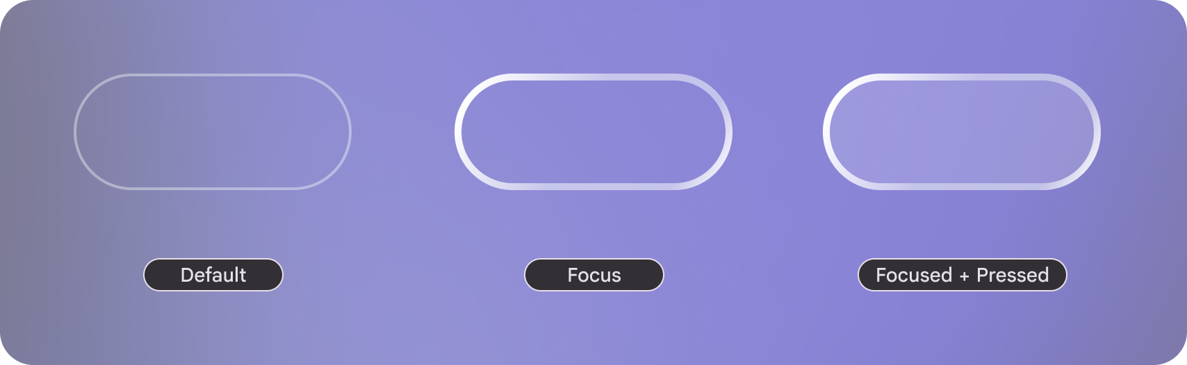
Default: The button's background color is derived from
GlimmerTheme.colors.surface, its main content calculates the content color of that surface.Focused: The border width is increased to communicate focus.
Focused + Pressed: The background is set to
GlimmerTheme.colors.surfaceat increased opacity to communicate its selected state.