
Applicable XR devices
This guidance helps you build experiences for these types of XR devices.
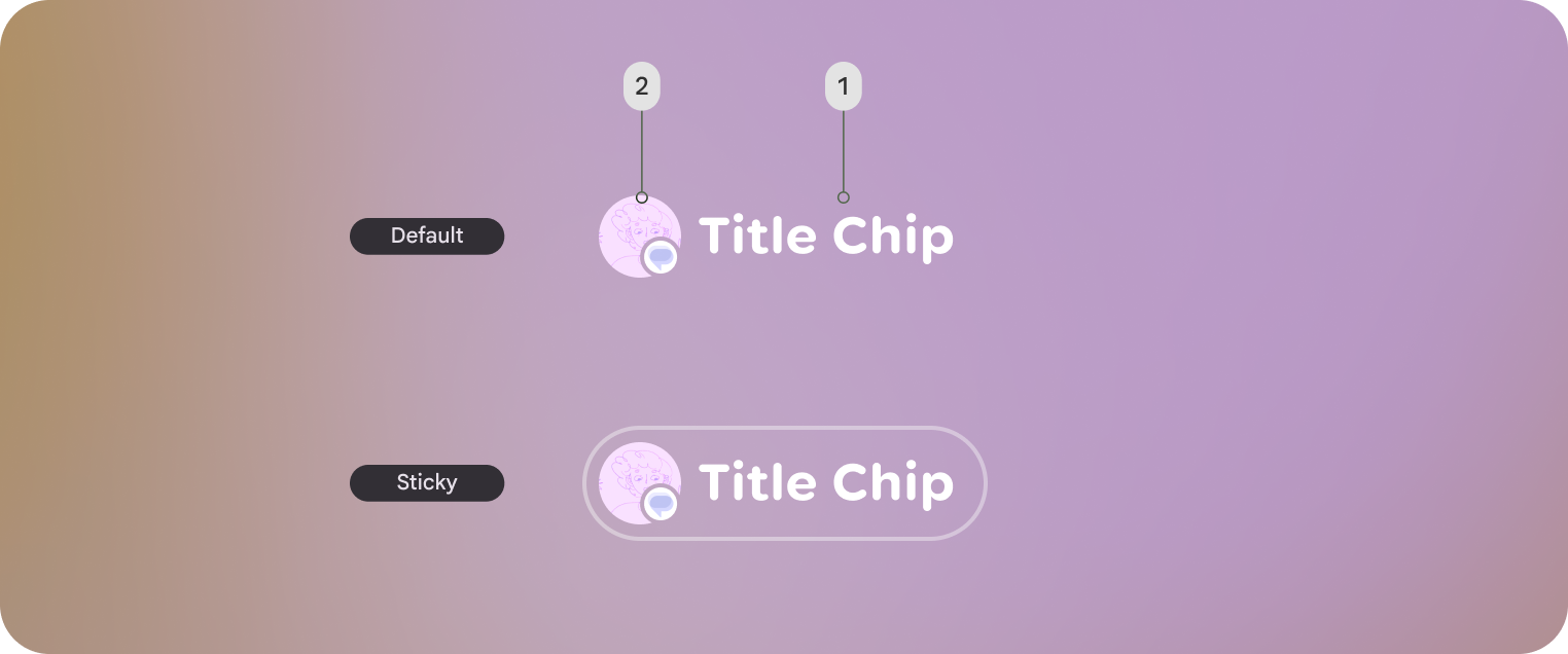
In Jetpack Compose Glimmer, the TitleChip component is a non-interactive
component that provides brief context or labeling for associated content, such
as a Card or a VerticalList.
Use title chips for concise information like a short title, a category name, or a status indicator. Normally, you should place title chips above the content they describe to establish a clear structural relationship.
Basic example: Create a short title chip
The following code creates a basic title chip:
@Composable fun TitleChipSample() { TitleChip { Text("Messages") } }
Example: Create a title chip with a card
To use a title chip with another component, place the title chip
TitleChipDefaults.associatedContentSpacing above the other component in
the composable. The following code creates a title chip with a card:
@Composable fun TitleChipWithCardSample() { Column(horizontalAlignment = Alignment.CenterHorizontally) { TitleChip { Text("Title Chip") } Spacer(Modifier.height(TitleChipDefaults.associatedContentSpacing)) Card( title = { Text("Title") }, subtitle = { Text("Subtitle") }, leadingIcon = { Icon(FavoriteIcon, "Localized description") }, ) { Text("Card Content") } } }
Key points about the code
- The title chip is centered horizontally, which is the usual alignment for a title chip placed above a card.
- The
Spacerhas a fixed height to provide the right amount of vertical spacing between the two components. This is defined usingTitleChipDefaults.associatedContentSpacing. - Uses an optional
leadingIconto add additional visual context before the text content. - The title chip automatically uses the
captionstyle for its text. - The title chip isn't interactive. If you need a clickable label, use a
Buttonor another interactive component.