
An adaptive icon, or AdaptiveIconDrawable, can display differently
depending on individual device capabilities and user theming. Adaptive icons are
primarily used by the launcher on the home screen, but they can also be used in
shortcuts, the Settings app, sharing dialogs, and the overview screen. Adaptive
icons are used across all Android form factors.
In contrast to bitmap images, adaptive icons can adapt to different use cases:
Different shapes: an adaptive icon can display a variety of shapes across different device models. For example, it can display a circular shape on one OEM device, and display a squircle (a shape between a square and a circle) on another device. Each device OEM must provide a mask, which the system uses to render all adaptive icons with the same shape.

Figure 1. Adaptive icons support a variety of masks, which vary from one device to another. Visual effects: an adaptive icon supports a variety of engaging visual effects, which display when users place or move the icon around the home screen.

Figure 2. Examples of visual effects displayed by an adaptive icon. User theming: starting with Android 13 (API level 33), users can theme their adaptive icons. If a user enables themed app icons in their system settings, and the launcher supports this feature, the system uses the coloring of the user's chosen wallpaper and theme to determine the tint color of the app icons for apps that have a
monochromelayer in their adaptive icon. Starting with Android 16 QPR 2, Android automatically themes app icons for apps that don't provide their own.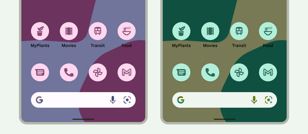
Figure 3. Adaptive icons inheriting from the user's wallpaper and themes. In the following scenarios, the home screen doesn't display the themed app icon, and instead displays the adaptive or standard app icon:
- If the user doesn't enable themed app icons.
- If your app doesn't provide a monochromatic app icon and the users device runs on an earlier version of Android than Android 16 QPR 2.
- If the launcher doesn't support themed app icons.
Design adaptive icons
To ensure that your adaptive icon supports different shapes, visual effects, and user theming, the design must meet the following requirements:
You must provide two layers for the color version of the icon: one for the foreground, and one for the background. The layers can be either vectors or bitmaps, though vectors are preferred.
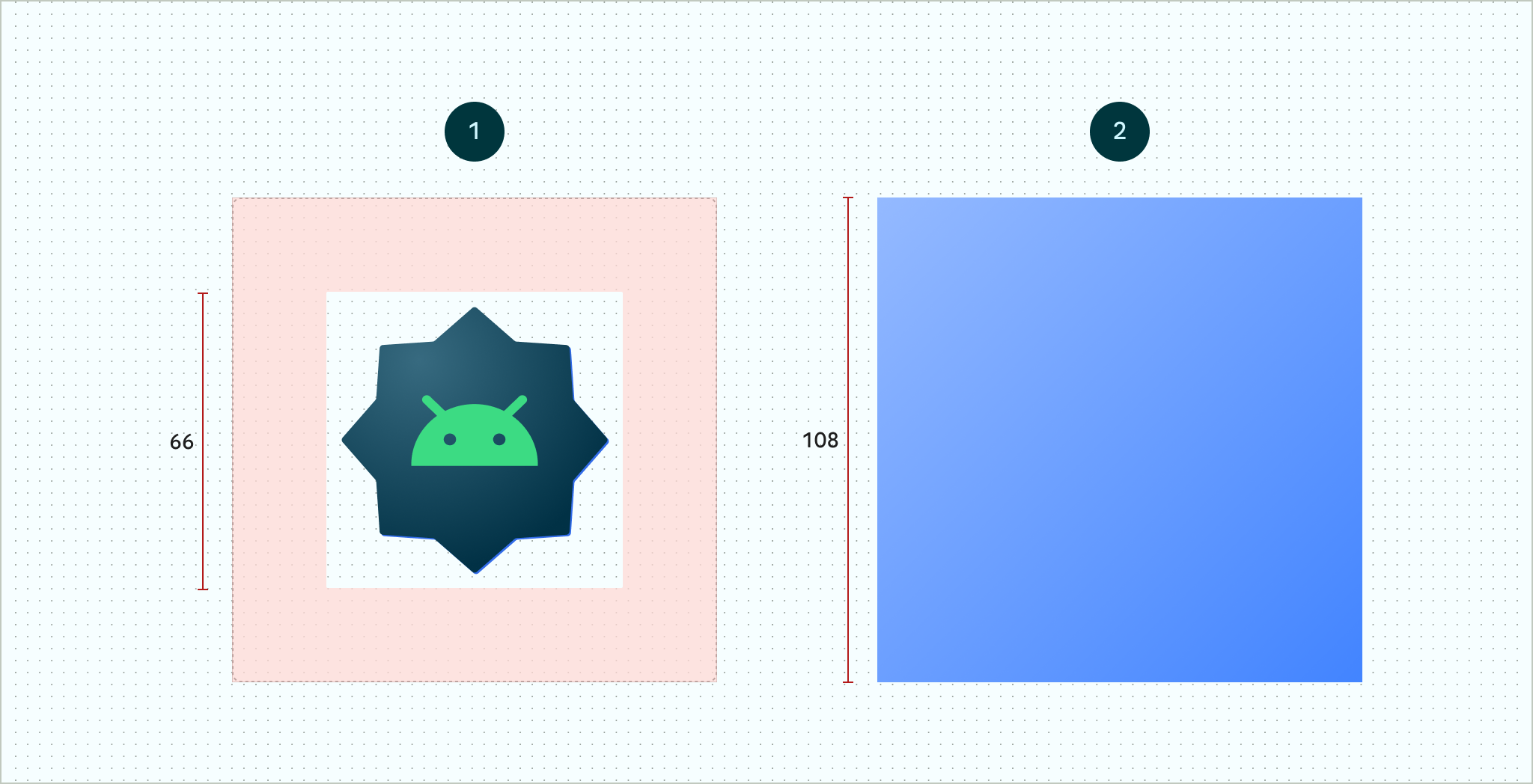
Figure 4. Adaptive icons defined using foreground and background layers. The 66x66 safe zone depicted is the area that is never clipped by a shaped mask defined by an OEM. 
Figure 5. An example of how foreground and background layers look together with a circular mask applied. If you want to support user theming of app icons, provide a single layer for the monochrome version of the icon.
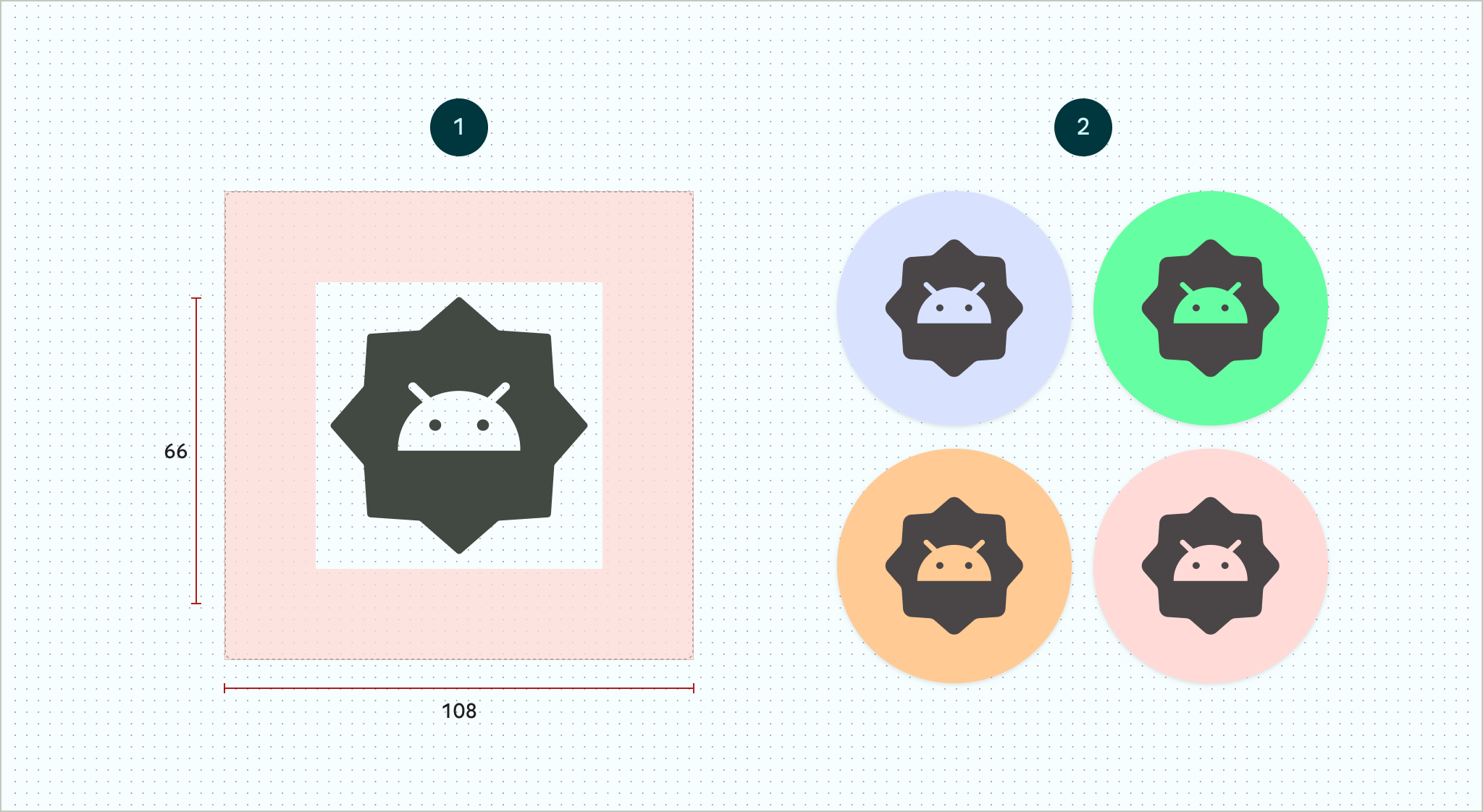
Figure 6. A monochromatic icon layer (left) with examples of color previews (right). Size all layers to 108x108 dp.
Use icons with clean edges. The layers must not have masks or background shadows around the outline of the icon.
Use a logo that's at least 48x48 dp. It must not exceed 66x66 dp, because the inner 66x66 dp of the icon appears within the masked viewport.
The outer 18 dp on each of the four sides of the layers is reserved for masking and to create visual effects such as parallax or pulsing.
To learn how to create adaptive icons using Android Studio, see the Android App icon Figma template or Android Studio documentation for creating launcher icons. Also, read the blog post Designing Adaptive Icons.
Add your adaptive icon to your app
Adaptive icons, just like non-adaptive icons, are specified using the
android:icon attribute in the app
manifest.
An optional attribute, android:roundIcon, is used by launchers that represent
apps with circular icons, and may be useful if your app's icon includes a
circular background as a core part of its design. Such launchers are required to
generate app icons by applying a circular mask to android:roundIcon, and this
guarantee may enable you to optimize the appearance of your app icon by, for
example, slightly enlarging the logo and ensuring that when cropped, the
circular background is full bleed.
The following code snippet illustrates both of these attributes, but most apps
only specify android:icon:
<application
    ...
    android:icon="@mipmap/ic_launcher"
    android:roundIcon="@mipmap/ic_launcher_round"
    ...>
</application>
Next, save your adaptive icon to res/mipmap-anydpi-v26/ic_launcher.xml. Use
the <adaptive-icon> element to define the foreground, background, and
monochromatic layer resources for your icons. The <foreground>,
<background>, and <monochrome> inner elements support both
vector and bitmap images.
The following example shows how to define <foreground>, <background>, and
<monochrome> elements inside <adaptive-icon>:
<?xml version="1.0" encoding="utf-8"?>
...
<adaptive-icon xmlns:android="http://schemas.android.com/apk/res/android">
    <background android:drawable="@drawable/ic_launcher_background" />
    <foreground android:drawable="@drawable/ic_launcher_foreground" />
    <monochrome android:drawable="@drawable/ic_launcher_foreground" />
</adaptive-icon>
...
The foreground and monochrome layers are using the same drawable. However, you can create separate drawables for each layer if needed.
You can also define drawables as elements by inlining them into the
<foreground>, <background>, and <monochrome> elements. The following
snippet shows an example of doing this with the foreground drawable.
<?xml version="1.0" encoding="utf-8"?>
...
<foreground>
   <inset
       android:insetBottom="18dp"
       android:insetLeft="18dp"
       android:insetRight="18dp"
       android:insetTop="18dp">
       <shape android:shape="oval">
           <solid android:color="#0000FF" />
       </shape>
   </inset>
</foreground>
...
If you want to apply the same mask and visual effect to your shortcuts as regular adaptive icons, use one of the following techniques:
- For static shortcuts, use the
<adaptive-icon>element. - For dynamic shortcuts, call the
createWithAdaptiveBitmap()method when you create them.
For more information about implementing adaptive icons, see Implementing Adaptive Icons. For more information about shortcuts, see App shortcuts overview.
Additional resources
See the following resources for additional information about designing and implementing adaptive icons.
- Figma community page template
- Understanding Android Adaptive Icons
- Designing Adaptive Icons
- Implementing Adaptive Icons
- Create app icons in Android Studio
- Google Play icon design specifications