
This page includes details for optional widget enhancements that are available starting in Android 12 (API level 31). These features are optional, but they're straightforward to implement and improve your users' widget experience.
For additional ways to see how to enhance your widget, see the Compose guide Enhance your Widget.
Use dynamic colors
Starting in Android 12, a widget can use the device theme colors for buttons, backgrounds, and other components. This provides smoother transitions and consistency across different widgets.
There are two ways to achieve dynamic colors:
Use the system's default theme (
@android:style/Theme.DeviceDefault.DayNight) in the root layout.Use the Material 3 theme (
Theme.Material3.DynamicColors.DayNight) from the Material Components for Android library, available starting in Material Components for Android v1.6.0.
Once the theme is set in the root layout, you can use common color attributes in the root or any of its children to pick up the dynamic colors.
Some examples of color attributes you can use are the following:
?attr/primary?attr/primaryContainer?attr/onPrimary?attr/onPrimaryContainer
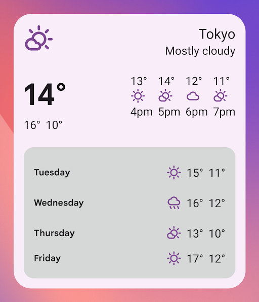
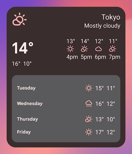
In the following example using the Material 3 theme, the device's theme color is "purplish." The accent color and widget background adapt for light and dark modes, as shown in figures 1 and 2.
<LinearLayout xmlns:android="http://schemas.android.com/apk/res/android"
  xmlns:app="http://schemas.android.com/apk/res-auto"
  android:layout_width="match_parent"
  android:layout_height="match_parent"
  android:background="?attr/colorPrimaryContainer"
  android:theme="@style/Theme.Material3.DynamicColors.DayNight">

  <ImageView
    ...
    app:tint="?attr/colorPrimaryContainer"
    android:src="@drawable/ic_partly_cloudy" />

    <!-- Other widget content. -->

</LinearLayout>
Backward compatibility for dynamic colors
Dynamic colors are only available in devices running Android 12
or higher. To provide a custom theme for lower versions, create a default theme
with your custom colors and a new qualifier (values-v31) using the default
theme attributes.
Here is an example using the Material 3 theme:
/values/styles.xml
<resources>
  <style name="MyWidgetTheme" parent="Theme.Material3.DynamicColors.DayNight">
    <!-- Override default colorBackground attribute with custom color. -->
    <item name="android:colorBackground">@color/my_background_color</item>

    <!-- Add other colors/attributes. -->

  </style>
</resources>
/values-v31/styles.xml
<resources>
  <!-- Do not override any color attribute. -->
  <style name="MyWidgetTheme" parent="Theme.Material3.DynamicColors.DayNight" />
</resources>
/layout/my_widget_layout.xml
<resources>
  <LinearLayout xmlns:android="http://schemas.android.com/apk/res/android"
    ...
    android:background="?android:attr/colorBackground"
    android:theme="@style/MyWidgetTheme" />
</resources>
Enable voice support
App Actions let Google Assistant display widgets in response to relevant user voice commands. By configuring your widget to respond to built-in intents (BIIs), your app can proactively display widgets on Assistant surfaces such as Android and Android Auto. Users have the option to pin widgets displayed by Assistant to their launcher, encouraging future engagement.
For example, you can configure the workout summary widget for your exercise app
to fulfill the user voice commands that trigger the
GET_EXERCISE_OBSERVATION
BII. Assistant proactively displays your widget when users trigger this BII by
making requests like, "Hey Google, how many miles did I run this week on
ExampleApp?"
There are dozens of BIIs covering several categories of user interaction, letting almost any Android app enhance their widgets for voice. To get started, see Integrate App Actions with Android widgets.
Enable smoother transitions
Starting in Android 12, launchers provide a smoother transition when a user launches your app from a widget.
To enable this improved transition, use @android:id/background or
android.R.id.background to identify your background element:
// Top-level layout of the widget.
<LinearLayout
    android:id="@android:id/background">
</LinearLayout>
Your app can use @android:id/background on previous versions of Android
without breaking, but it is ignored.
Use runtime modification of RemoteViews
Starting in Android 12, you can take advantage of several
RemoteViews methods that provide for runtime modification of RemoteViews
attributes. See the RemoteViews API
reference for the full list of added methods.
The following code example shows how to use a few of these methods.
Kotlin
// Set the colors of a progress bar at runtime.
remoteView.setColorStateList(R.id.progress, "setProgressTintList", createProgressColorStateList())

// Specify exact sizes for margins.
remoteView.setViewLayoutMargin(R.id.text, RemoteViews.MARGIN_END, 8f, TypedValue.COMPLEX_UNIT_DP)
Java
// Set the colors of a progress bar at runtime.
remoteView.setColorStateList(R.id.progress, "setProgressTintList", createProgressColorStateList());

// Specify exact sizes for margins.
remoteView.setViewLayoutMargin(R.id.text, RemoteViews.MARGIN_END, 8f, TypedValue.COMPLEX_UNIT_DP);