
This page describes refinements for widget sizing and greater flexibility introduced in Android 12 (API level 31). It also details how to determine a size for your widget.
Use improved APIs for widget sizes and layouts
Starting with Android 12 (API level 31), you can provide more refined size attributes and flexible layouts by doing the following, as described in the sections that follow:
In previous versions of Android, it is possible to get the size ranges of a
widget using the
OPTION_APPWIDGET_MIN_WIDTH,
OPTION_APPWIDGET_MIN_HEIGHT,
OPTION_APPWIDGET_MAX_WIDTH,
and OPTION_APPWIDGET_MAX_HEIGHT
extras and then estimate the widget's size, but that logic doesn't work in all
situations. For widgets targeting Android 12 or higher, we recommend
providing responsive or exact
layouts.
Specify additional widget sizing constraints
Android 12 adds APIs letting you ensure your widget is sized more reliably across different devices with varying screen sizes.
In addition to the existing minWidth,
minHeight,
minResizeWidth,
and minResizeHeight
attributes, use the following new appwidget-provider attributes:
targetCellWidthandtargetCellHeight: define the target size of the widget in terms of launcher grid cells. If defined, these attributes are used instead ofminWidthorminHeight.maxResizeWidthandmaxResizeHeight: define the maximum size that the launcher allows the user to resize the widget to.
The following XML shows how to use the sizing attributes.
<appwidget-provider
  ...
  android:targetCellWidth="3"
  android:targetCellHeight="2"
  android:maxResizeWidth="250dp"
  android:maxResizeHeight="110dp">
</appwidget-provider>
Provide responsive layouts
If the layout needs to change depending on the size of the widget, we recommend creating a small set of layouts, each valid for a range of sizes. If this isn’t possible, another option is to provide layouts based on the exact widget size at runtime, as described in this page.
This feature allows for smoother scaling and overall better system health, because the system doesn't have to wake up the app every time it displays the widget in a different size.
The following code example shows how to provide a list of layouts.
Kotlin
override fun onUpdate(...) {
    val smallView = ...
    val tallView = ...
    val wideView = ...

    val viewMapping: Map<SizeF, RemoteViews> = mapOf(
            SizeF(150f, 100f) to smallView,
            SizeF(150f, 200f) to tallView,
            SizeF(215f, 100f) to wideView
    )
    val remoteViews = RemoteViews(viewMapping)

    appWidgetManager.updateAppWidget(id, remoteViews)
}
Java
@Override
public void onUpdate(...) {
    RemoteViews smallView = ...;
    RemoteViews tallView = ...;
    RemoteViews wideView = ...;

    Map<SizeF, RemoteViews> viewMapping = new ArrayMap<>();
    viewMapping.put(new SizeF(150f, 100f), smallView);
    viewMapping.put(new SizeF(150f, 200f), tallView);
    viewMapping.put(new SizeF(215f, 100f), wideView);
    RemoteViews remoteViews = new RemoteViews(viewMapping);

    appWidgetManager.updateAppWidget(id, remoteViews);
}
Assume the widget has the following attributes:
<appwidget-provider
    android:minResizeWidth="160dp"
    android:minResizeHeight="110dp"
    android:maxResizeWidth="250dp"
    android:maxResizeHeight="200dp">
</appwidget-provider>
The preceding code snippet means the following:
smallViewsupports from 160dp (minResizeWidth) × 110dp (minResizeHeight) to 160dp × 199dp (next cutoff point - 1dp).tallViewsupports from 160dp × 200dp to 214dp (next cutoff point - 1) × 200dp.wideViewsupports from 215dp × 110dp (minResizeHeight) to 250dp (maxResizeWidth) × 200dp (maxResizeHeight).
Your widget must support the size range from minResizeWidth ×
minResizeHeight to maxResizeWidth × maxResizeHeight. Within that range,
you can decide the cutoff point to switch layouts.
Provide exact layouts
If a small set of responsive layouts isn't feasible, you can instead provide different layouts tailored to the sizes at which the widget is shown. This is typically two sizes for phones (portrait and landscape mode) and four sizes for foldables.
To implement this solution, your app needs to perform the following steps:
Overload
AppWidgetProvider.onAppWidgetOptionsChanged(), which is called when the set of sizes changes.Call
AppWidgetManager.getAppWidgetOptions(), which returns aBundlecontaining the sizes.Access the
AppWidgetManager.OPTION_APPWIDGET_SIZESkey from theBundle.
The following code example shows how to provide exact layouts.
Kotlin
override fun onAppWidgetOptionsChanged(
        context: Context,
        appWidgetManager: AppWidgetManager,
        id: Int,
        newOptions: Bundle?
) {
    super.onAppWidgetOptionsChanged(context, appWidgetManager, id, newOptions)
    // Get the new sizes.
    val sizes = newOptions?.getParcelableArrayList<SizeF>(
            AppWidgetManager.OPTION_APPWIDGET_SIZES
    )
    // Check that the list of sizes is provided by the launcher.
    if (sizes.isNullOrEmpty()) {
        return
    }
    // Map the sizes to the RemoteViews that you want.
    val remoteViews = RemoteViews(sizes.associateWith(::createRemoteViews))
    appWidgetManager.updateAppWidget(id, remoteViews)
}

// Create the RemoteViews for the given size.
private fun createRemoteViews(size: SizeF): RemoteViews { }
Java
@Override
public void onAppWidgetOptionsChanged(
    Context context, AppWidgetManager appWidgetManager, int appWidgetId, Bundle newOptions) {
    super.onAppWidgetOptionsChanged(context, appWidgetManager, appWidgetId, newOptions);
    // Get the new sizes.
    ArrayList<SizeF> sizes =
        newOptions.getParcelableArrayList(AppWidgetManager.OPTION_APPWIDGET_SIZES);
    // Check that the list of sizes is provided by the launcher.
    if (sizes == null || sizes.isEmpty()) {
      return;
    }
    // Map the sizes to the RemoteViews that you want.
    Map<SizeF, RemoteViews> viewMapping = new ArrayMap<>();
    for (SizeF size : sizes) {
        viewMapping.put(size, createRemoteViews(size));
    }
    RemoteViews remoteViews = new RemoteViews(viewMapping);
    appWidgetManager.updateAppWidget(id, remoteViews);
}

// Create the RemoteViews for the given size.
private RemoteViews createRemoteViews(SizeF size) { }
Determine a size for your widget
Each widget must define a targetCellWidth and targetCellHeight for devices
running Android 12 or higher—or minWidth and minHeight for all
versions of Android—indicating the minimum amount of space it consumes
by default. However, when users add a widget to their home screen, it generally
occupies more than the minimum width and height you specify.
Android home screens offer users a grid of available spaces onto which they can
place widgets and icons. This grid can vary by device; for example, many
handsets offer a 5x4 grid, and tablets can offer a larger grid. When your widget
is added, it is stretched to occupy the minimum number of cells,
horizontally and vertically, required to satisfy constraints for its
targetCellWidth and targetCellHeight on devices running
Android 12 or higher, or minWidth and minHeight constraints on
devices running Android 11 (API level 30) or lower.
Both the width and height of a cell and the size of the automatic margins applied to widgets can vary across devices. Use the following table to roughly estimate your widget's minimum dimensions in a typical 5x4 grid handset, given the number of occupied grid cells you want:
| Number of cells (width x height) | Available size in portrait mode (dp) | Available size in landscape mode (dp) |
|---|---|---|
| 1x1 | 57x102dp | 127x51dp |
| 2x1 | 130x102dp | 269x51dp |
| 3x1 | 203x102dp | 412x51dp |
| 4x1 | 276x102dp | 554x51dp |
| 5x1 | 349x102dp | 697x51dp |
| 5x2 | 349x220dp | 697x117dp |
| 5x3 | 349x337dp | 697x184dp |
| 5x4 | 349x455dp | 697x250dp |
| ... | ... | ... |
| n x m | (73n - 16) x (118m - 16) | (142n - 15) x (66m - 15) |
Use the portrait mode cell sizes to inform the values you provide for
the minWidth, minResizeWidth, and maxResizeWidth attributes. Similarly,
use the landscape mode cell sizes to inform the values you provide
for the minHeight, minResizeHeight, and maxResizeHeight attributes.
The reason for this is that the cell width is typically smaller in portrait mode than in landscape mode—and, similarly, the cell height is typically smaller in landscape mode than in portrait mode.
For example, if you want your widget width to be resizable down to one cell on
a Google Pixel 4, you need to set your minResizeWidth to at most 56dp
to make sure the value for the minResizeWidth attribute is smaller
than 57dp—because a cell is at least 57dp wide in portrait.
Similarly, if you want your widget height to be resizable in one cell on the
same device, you need to set your minResizeHeight to at most 50dp to make sure
the value for the minResizeHeight attribute is smaller than
51dp—because one cell is at least 51dp high in landscape mode.
Each widget is resizable within the size ranges between the
minResizeWidth/minResizeHeight and maxResizeWidth/maxResizeHeight
attributes, which means it needs to adapt to any size ranges between them.
For example, to set the default size of the widget on placement, you can set the following attributes:
<appwidget-provider
    android:targetCellWidth="3"
    android:targetCellHeight="2"
    android:minWidth="180dp"
    android:minHeight="110dp">
</appwidget-provider>
This means the widget's default size is 3x2 cells, as specified by the
targetCellWidth and targetCellHeight attributes—or 180×110dp, as
specified by minWidth and minHeight for devices running
Android 11 or lower. In the latter case, the size in cells can
vary depending on the device.
Also, to set the supported size ranges of your widget, you can set the following attributes:
<appwidget-provider
    android:minResizeWidth="180dp"
    android:minResizeHeight="110dp"
    android:maxResizeWidth="530dp"
    android:maxResizeHeight="450dp">
</appwidget-provider>
As specified by the preceding attributes, the width of the widget is resizable from 180dp to 530dp, and its height is resizable from 110dp to 450dp. The widget is then resizable from 3x2 to 5x2 cells, as long as the following conditions are present:
- The device has the 5x4 grid.
- The mapping between the number of cells and the available size in dps follows the table showing estimation of minimum dimensions in this page.
- The widget adapts to that size range.
Kotlin
val smallView = RemoteViews(context.packageName, R.layout.widget_weather_forecast_small)
val mediumView = RemoteViews(context.packageName, R.layout.widget_weather_forecast_medium)
val largeView = RemoteViews(context.packageName, R.layout.widget_weather_forecast_large)

val viewMapping: Map<SizeF, RemoteViews> = mapOf(
        SizeF(180f, 110f) to smallView,
        SizeF(270f, 110f) to mediumView,
        SizeF(270f, 280f) to largeView
)

appWidgetManager.updateAppWidget(appWidgetId, RemoteViews(viewMapping))
Java
RemoteViews smallView =
    new RemoteViews(context.getPackageName(), R.layout.widget_weather_forecast_small);
RemoteViews mediumView =
    new RemoteViews(context.getPackageName(), R.layout.widget_weather_forecast_medium);
RemoteViews largeView =
    new RemoteViews(context.getPackageName(), R.layout.widget_weather_forecast_large);

Map<SizeF, RemoteViews> viewMapping = new ArrayMap<>();
viewMapping.put(new SizeF(180f, 110f), smallView);
viewMapping.put(new SizeF(270f, 110f), mediumView);
viewMapping.put(new SizeF(270f, 280f), largeView);
RemoteViews remoteViews = new RemoteViews(viewMapping);

appWidgetManager.updateAppWidget(id, remoteViews);
Assume the widget uses the responsive layouts defined in the preceding
code snippets. This means the layout specified as
R.layout.widget_weather_forecast_small is used from 180dp (minResizeWidth) x
110dp (minResizeHeight) to 269x279dp (next cutoff points - 1). Similarly,
R.layout.widget_weather_forecast_medium is used from 270x110dp to 270x279dp,
and R.layout.widget_weather_forecast_large is used from 270x280dp to
530dp (maxResizeWidth) x 450dp (maxResizeHeight).
As the user resizes the widget, its appearance changes to adapt to each size in cells, as shown in the following examples.
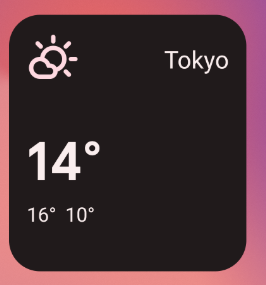
R.layout.widget_weather_forecast_small.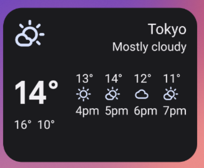
R.layout.widget_weather_forecast_medium.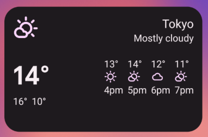
R.layout.widget_weather_forecast_medium.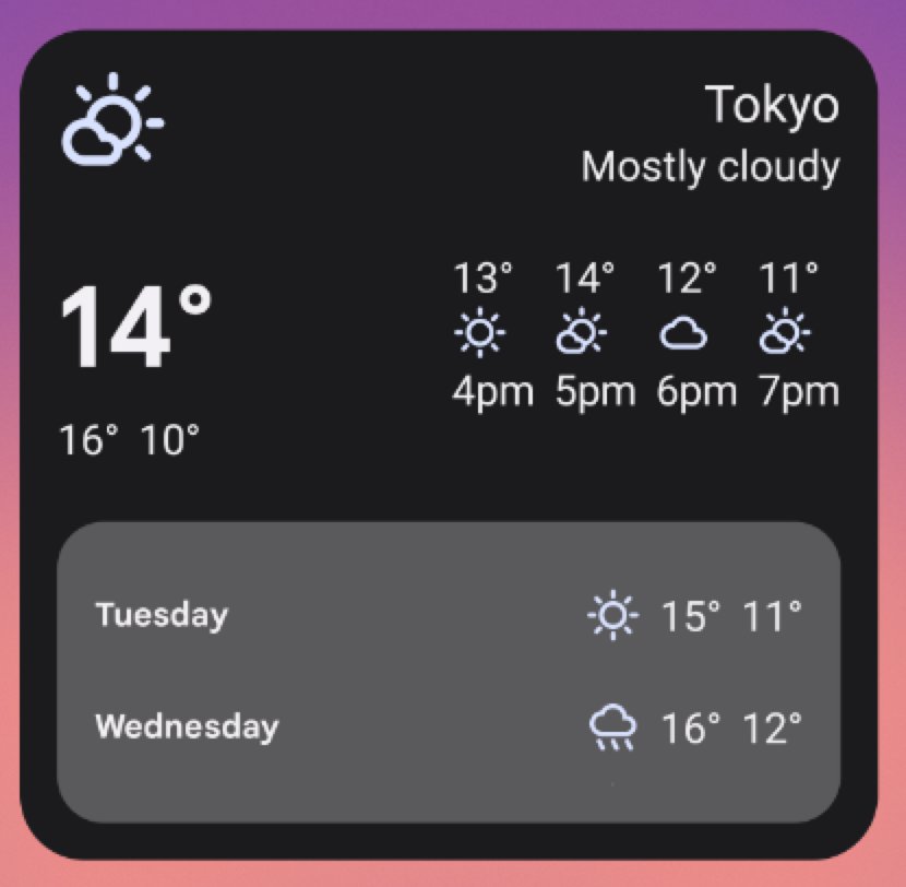
R.layout.widget_weather_forecast_large.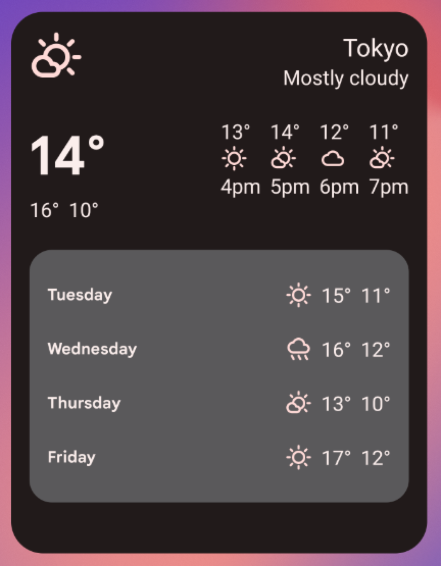
R.layout.widget_weather_forecast_large.