
FlowRow and FlowColumn
are composables that are similar to Row and Column, but differ in that items
flow into the next line when the container runs out of space. This creates
multiple rows or columns. The number of items in a line can also be controlled
by setting maxItemsInEachRow or maxItemsInEachColumn. You can often use
FlowRow and FlowColumn to build responsive layouts— content will not be cut
off if items are too large for one dimension, and using a combination of
maxItemsInEach* with Modifier.weight(weight) can help build layouts that
fill/expand the width of a row or column when needed.
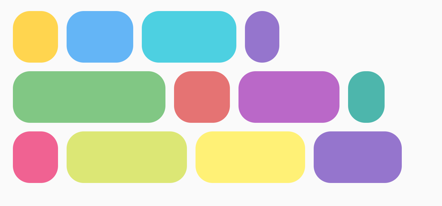
The typical example is for a chip or filtering UI:
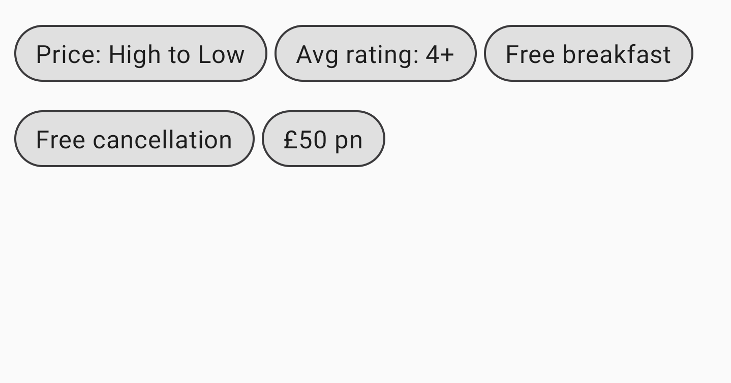
FlowRowBasic usage
To use FlowRow or FlowColumn, create these composables and place the items
inside it that should follow the standard flow:
@Composable
private fun FlowRowSimpleUsageExample() {
FlowRow(modifier = Modifier.padding(8.dp)) {
ChipItem("Price: High to Low")
ChipItem("Avg rating: 4+")
ChipItem("Free breakfast")
ChipItem("Free cancellation")
ChipItem("£50 pn")
}
}
This snippet results in the UI shown above, with items automatically flowing to the next row when there is no more space in the first row.
Features of flow layout
Flow layouts have the following features and properties that you can use to create different layouts in your app.
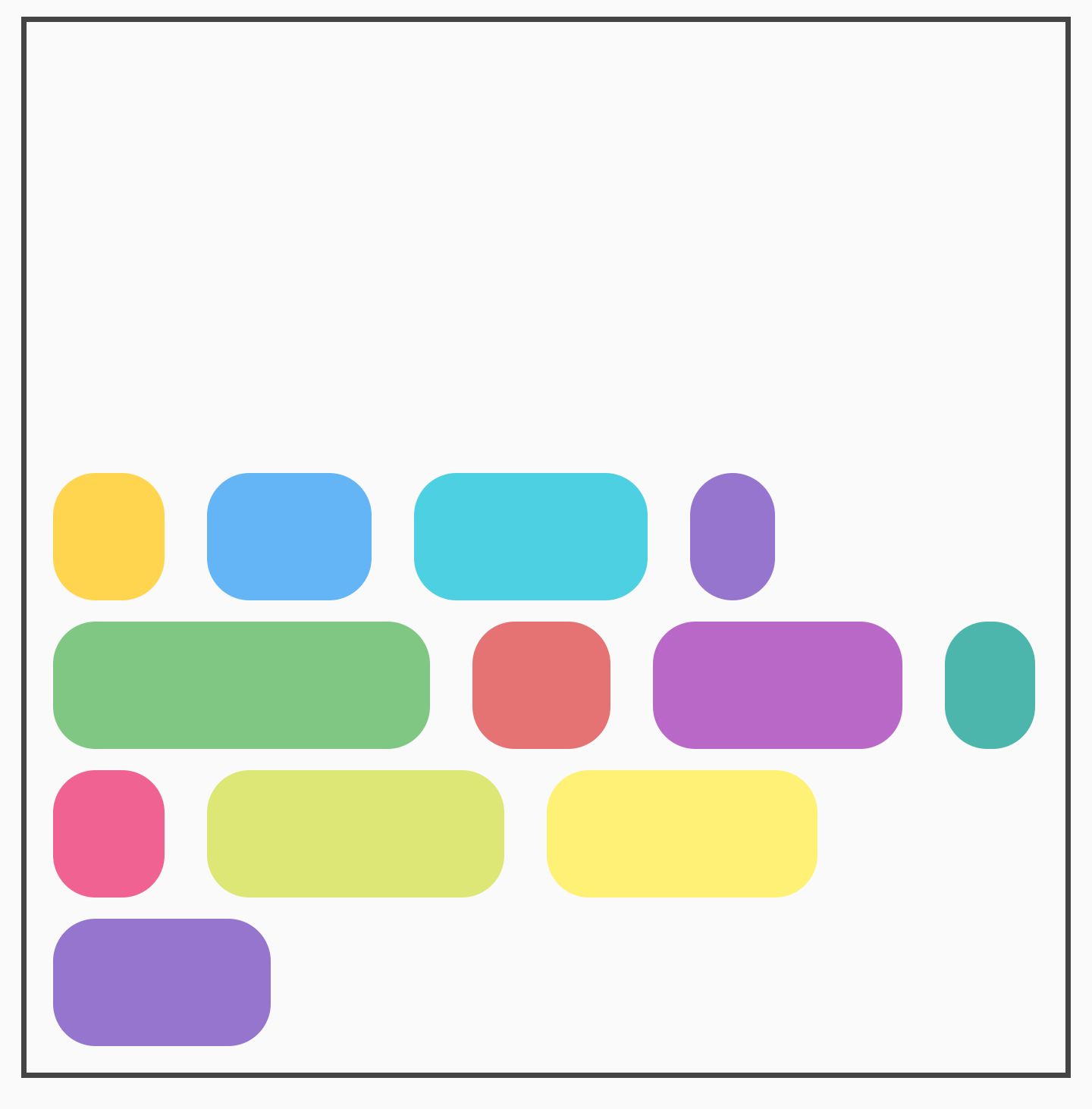
Main axis arrangement: horizontal or vertical arrangement
The main axis is the axis on which items are laid out (for example, in
FlowRow, items are arranged horizontally). The horizontalArrangement
parameter in FlowRow controls the way free space is distributed between items.
The following table shows examples of setting horizontalArrangement on items
for FlowRow:
Horizontal arrangement set on |
Result |
|
|
|
|
|
|
|
|
|
|
|
For FlowColumn, similar options are available with verticalArrangement, with
the default of Arrangement.Top.
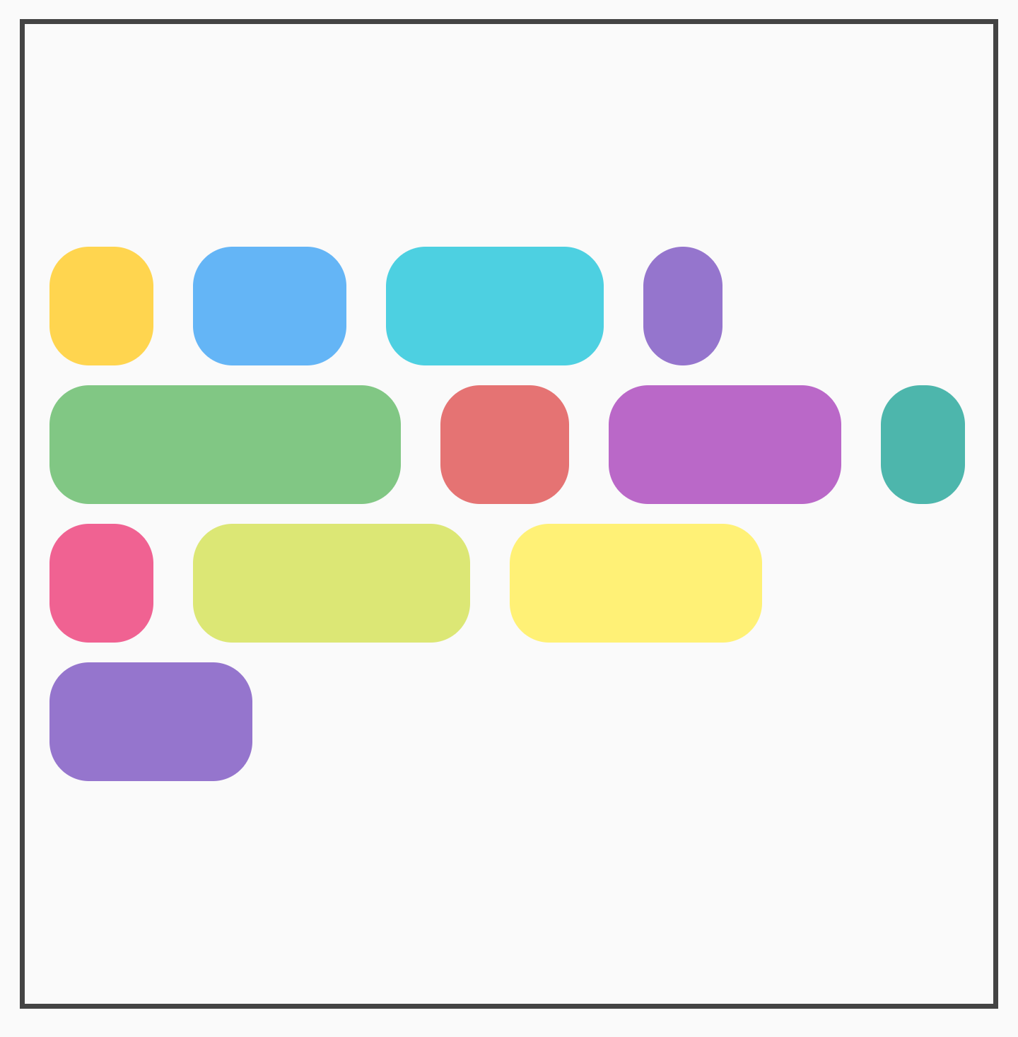
Cross axis arrangement
The cross axis is the axis in the opposite direction to the main axis. For
example, in FlowRow, this is the vertical axis. To change how the overall
contents inside the container are arranged in the cross axis, use
verticalArrangement for FlowRow, and horizontalArrangement for
FlowColumn.
For FlowRow, the following table shows examples of setting different
verticalArrangement on the items:
Vertical arrangement set on |
Result |
|
|
|
|
|
For FlowColumn, similar options are available with horizontalArrangement.
The default cross axis arrangement is Arrangement.Start.
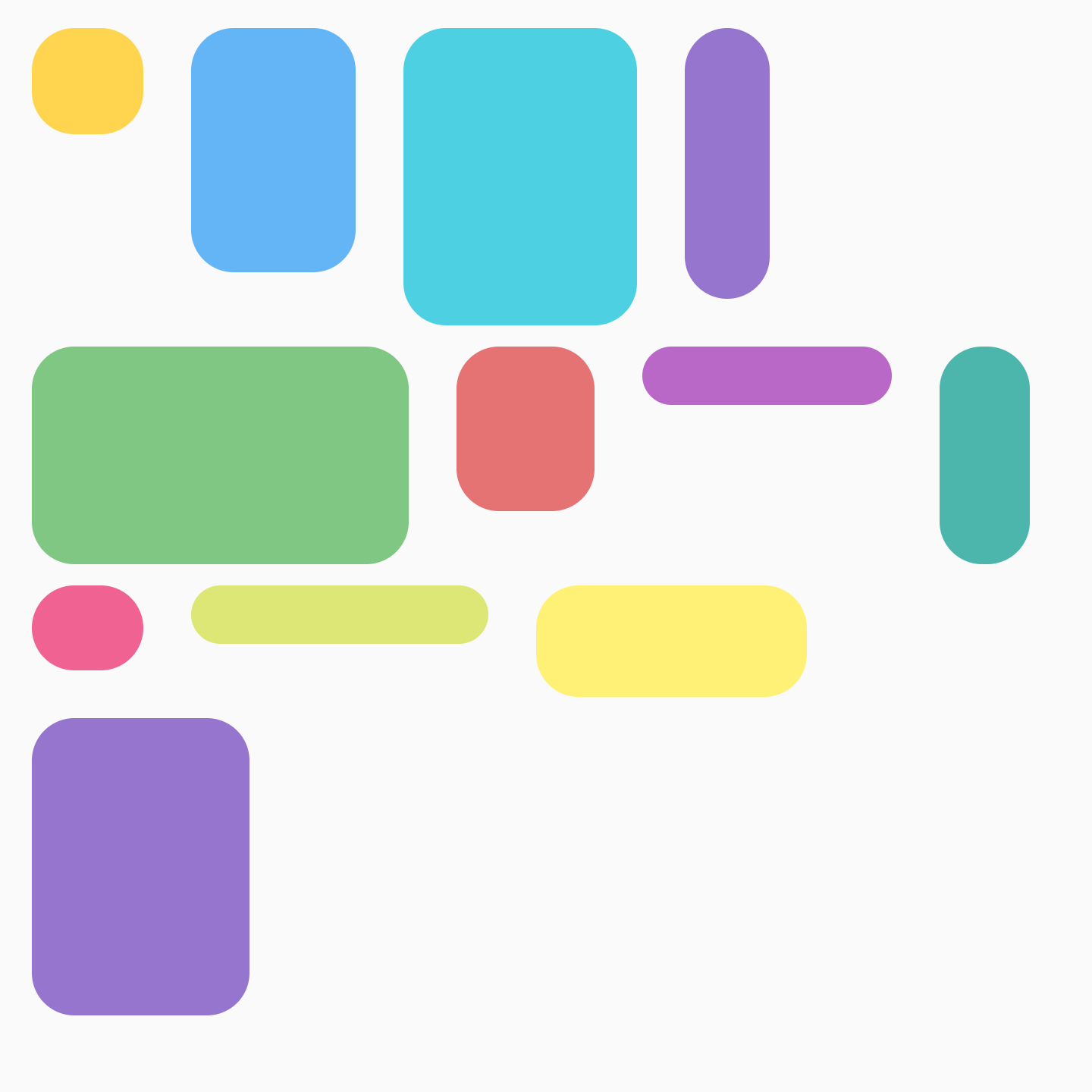
Individual item alignment
You may want to position individual items within the row with different
alignments. This is different from verticalArrangement and
horizontalArrangement as it aligns items within the current line. You can
apply this with Modifier.align().
For example, when items in a FlowRow are different heights, the row takes the
height of the biggest item and applies Modifier.align(alignmentOption) to the
items:
Vertical alignment set on |
Result |
|
|

|
|
|
For FlowColumn, similar options are available. The default alignment is
Alignment.Start.
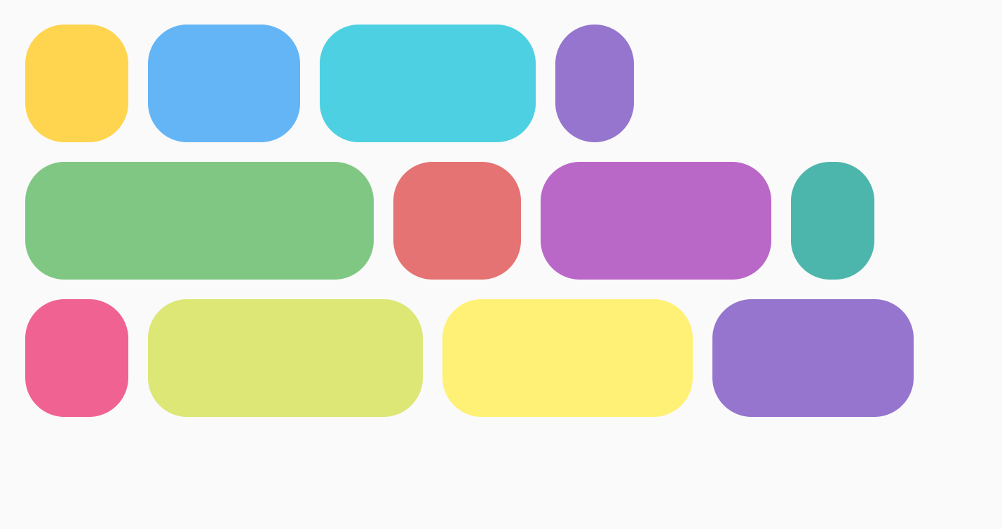
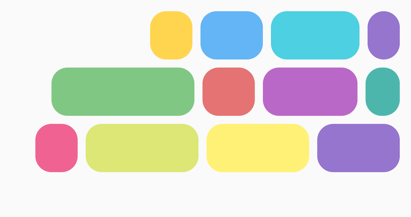
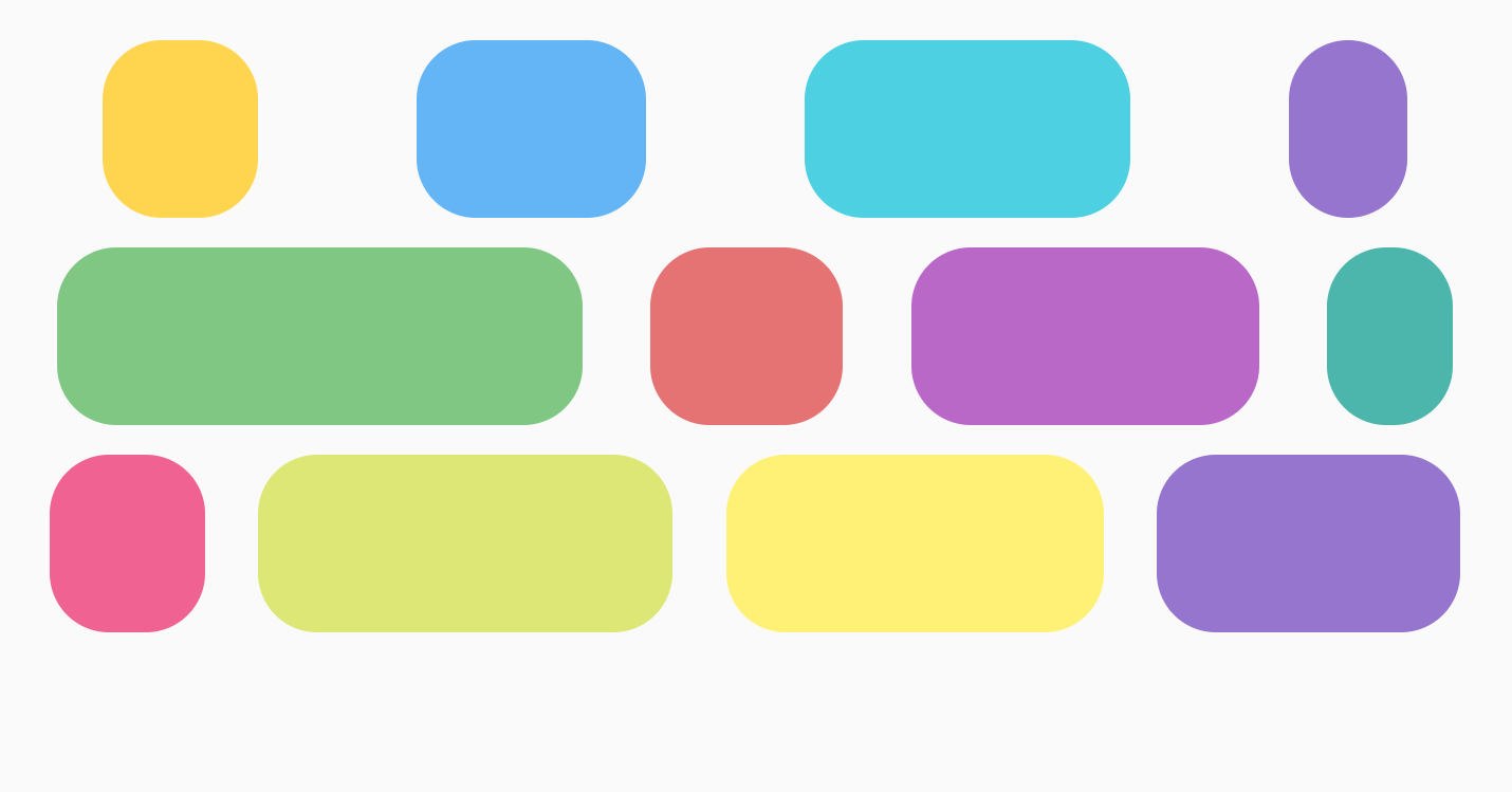
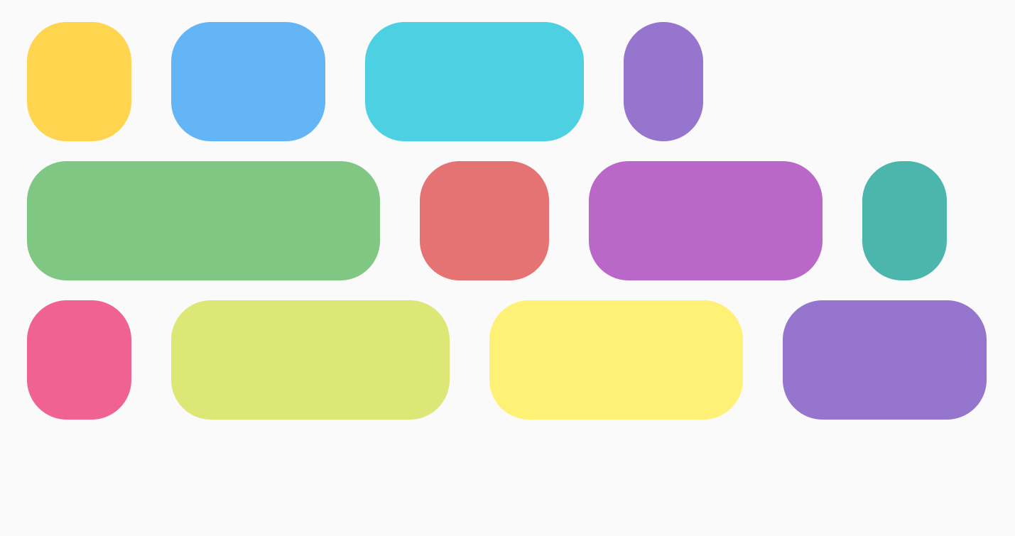
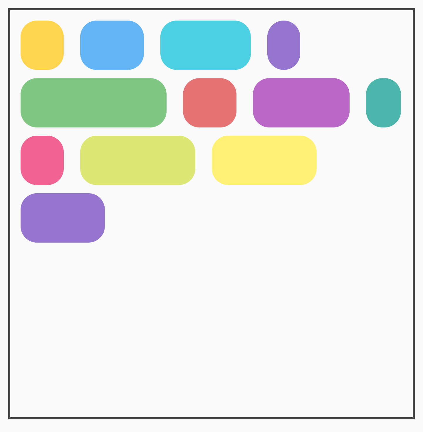
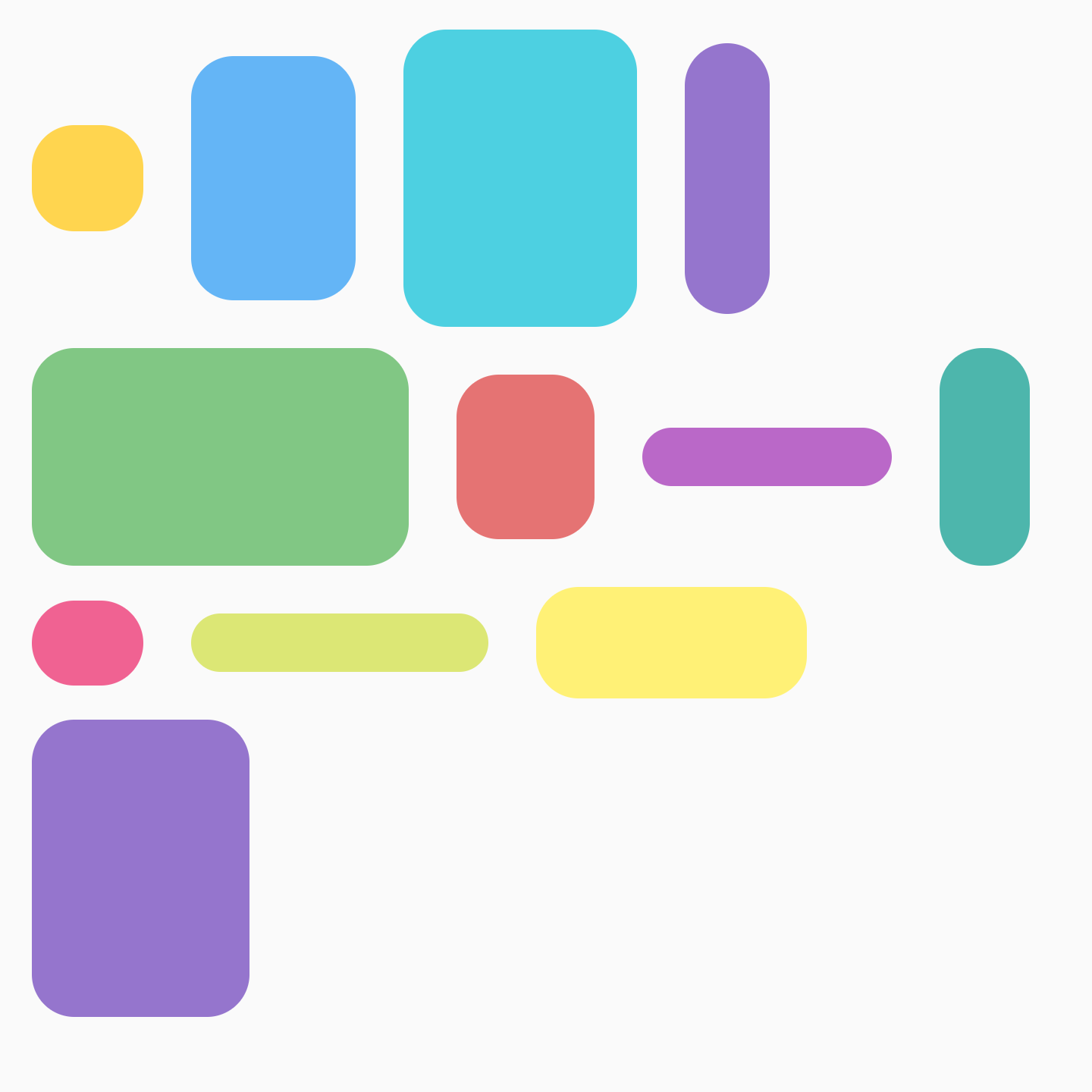
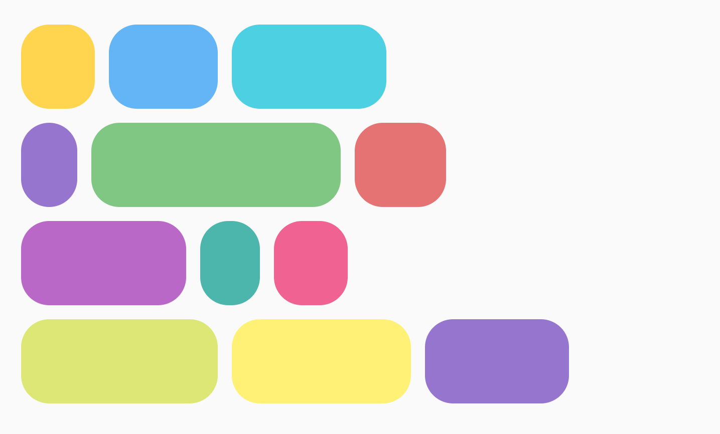
Max items in row or column
The parameters maxItemsInEachRow or maxItemsInEachColumn define the maximum
items in the main axis to allow in one line before wrapping to the next. The
default is Int.MAX_INT, which allows as many items as possible, as long as
their sizes allow them to fit into the line.
For example, setting a maxItemsInEachRow forces the initial layout to only
have 3 items:
No max set |
|
|
|
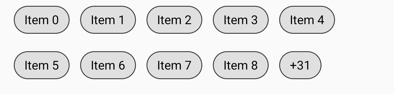
Lazy loading flow items
ContextualFlowRow and ContextualFlowColumn are a specialized
version of FlowRow and FlowColumn that allow you to lazy load the contents
of your flow row or column. They also provide information around the items position
(index, row number and available size), such as if the item is in the first
row. This is useful for large data-sets and if you need contextual information
about an item.
The maxLines parameter limits the number of rows displayed, and the overflow
parameter specifies what should be displayed when an overflow of items is
reached, allowing you to specify a custom expandIndicator or
collapseIndicator.
For example, to show a "+ (number of items remaining)" or "Show Less" button:
val totalCount = 40
var maxLines by remember {
mutableStateOf(2)
}
val moreOrCollapseIndicator = @Composable { scope: ContextualFlowRowOverflowScope ->
val remainingItems = totalCount - scope.shownItemCount
ChipItem(if (remainingItems == 0) "Less" else "+$remainingItems", onClick = {
if (remainingItems == 0) {
maxLines = 2
} else {
maxLines += 5
}
})
}
ContextualFlowRow(
modifier = Modifier
.safeDrawingPadding()
.fillMaxWidth(1f)
.padding(16.dp)
.wrapContentHeight(align = Alignment.Top)
.verticalScroll(rememberScrollState()),
verticalArrangement = Arrangement.spacedBy(4.dp),
horizontalArrangement = Arrangement.spacedBy(8.dp),
maxLines = maxLines,
overflow = ContextualFlowRowOverflow.expandOrCollapseIndicator(
minRowsToShowCollapse = 4,
expandIndicator = moreOrCollapseIndicator,
collapseIndicator = moreOrCollapseIndicator
),
itemCount = totalCount
) { index ->
ChipItem("Item $index")
}
ContextualFlowRowItem weights
Weight grows an item based on its factor and the available space on the line it
was placed in. Importantly, there is a difference between FlowRow and Row
with how weights are used to calculate the width of an item. For Rows, weight
is based on all items in the Row. With FlowRow, weight is based on the
items in the line that an item is placed in, not all the items in the
FlowRow container.
For example, if you have 4 items that all fall on a line, each with different
weights of 1f, 2f, 1f, and 3f, the total weight is 7f. The remaining space
in a row or column will be divided by 7f. Then, each item width will be
calculated using: weight * (remainingSpace / totalWeight).
You can use a combination of Modifier.weight and max items with FlowRow or
FlowColumn to create a grid-like layout. This approach is useful for creating
responsive layouts that adjust to the sizing of your device.
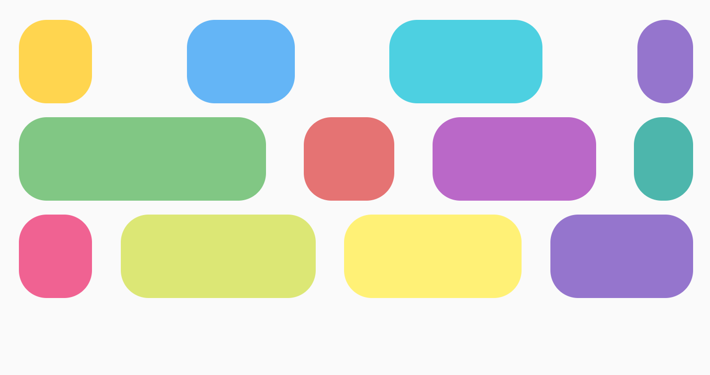
There are a few different examples of what you can achieve using weights. One
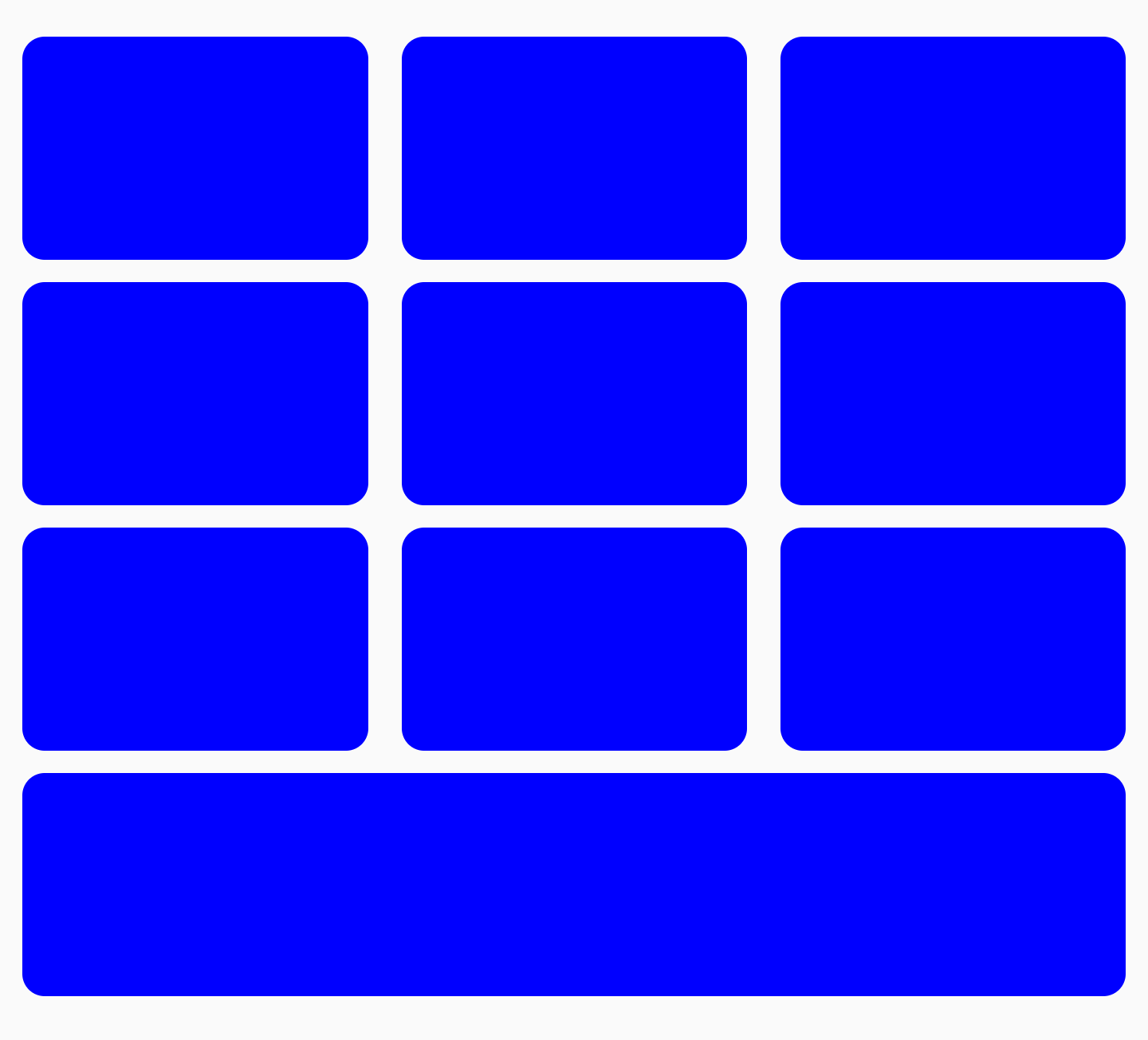
example is a grid where items are equally sized, as shown below:
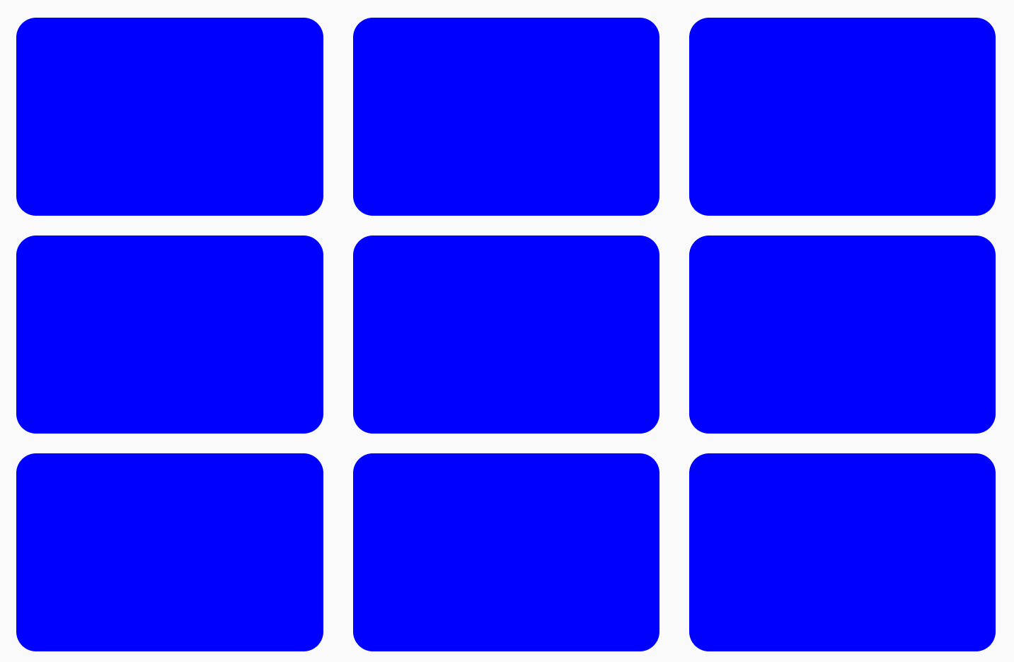
FlowRow to create a grid
To create a grid of equal item sizes, you can do the following:
val rows = 3
val columns = 3
FlowRow(
modifier = Modifier.padding(4.dp),
horizontalArrangement = Arrangement.spacedBy(4.dp),
maxItemsInEachRow = rows
) {
val itemModifier = Modifier
.padding(4.dp)
.height(80.dp)
.weight(1f)
.clip(RoundedCornerShape(8.dp))
.background(MaterialColors.Blue200)
repeat(rows * columns) {
Spacer(modifier = itemModifier)
}
}
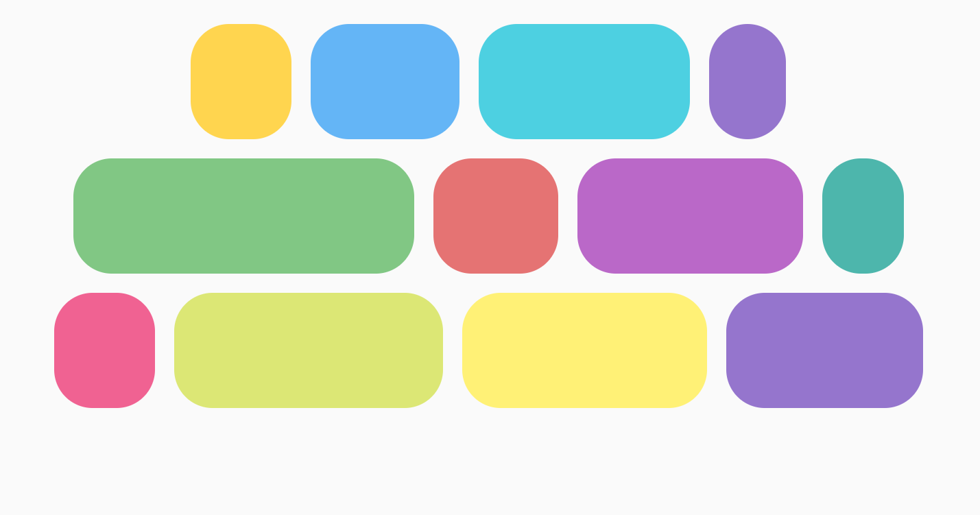
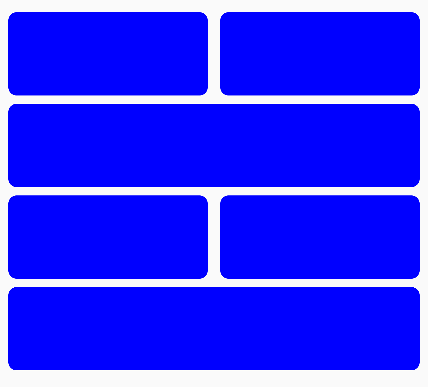
Importantly, if you add another item and repeat it 10 times instead of 9, the
last item takes up the entire last column, as the total weight for the whole row
is 1f:
FlowRow to create a grid with the last item taking up full widthYou can combine weights with other Modifiers such as
Modifier.width(exactDpAmount), Modifier.aspectRatio(aspectRatio), or
Modifier.fillMaxWidth(fraction). These modifiers all work in conjunction to
allow for responsive sizing of items within a FlowRow (or FlowColumn).
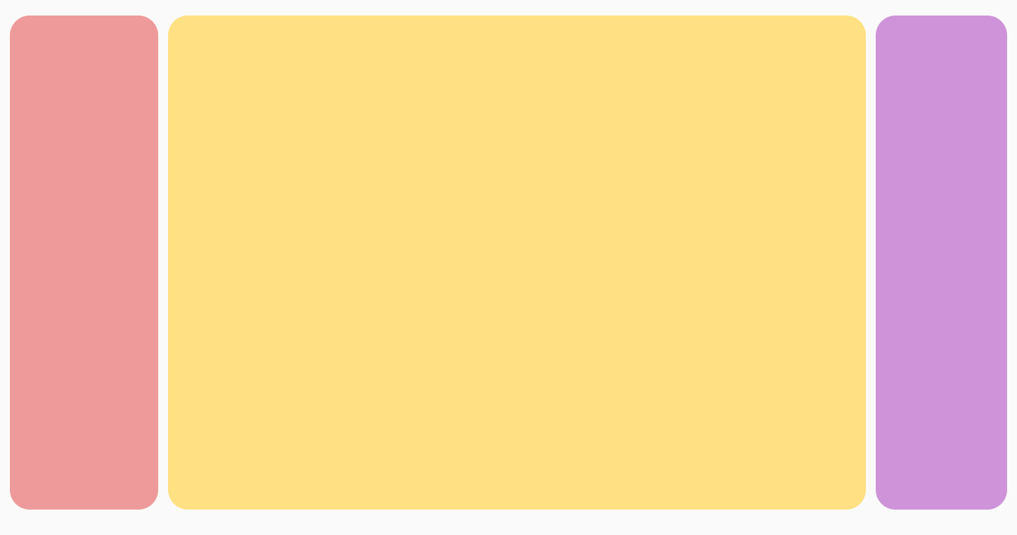
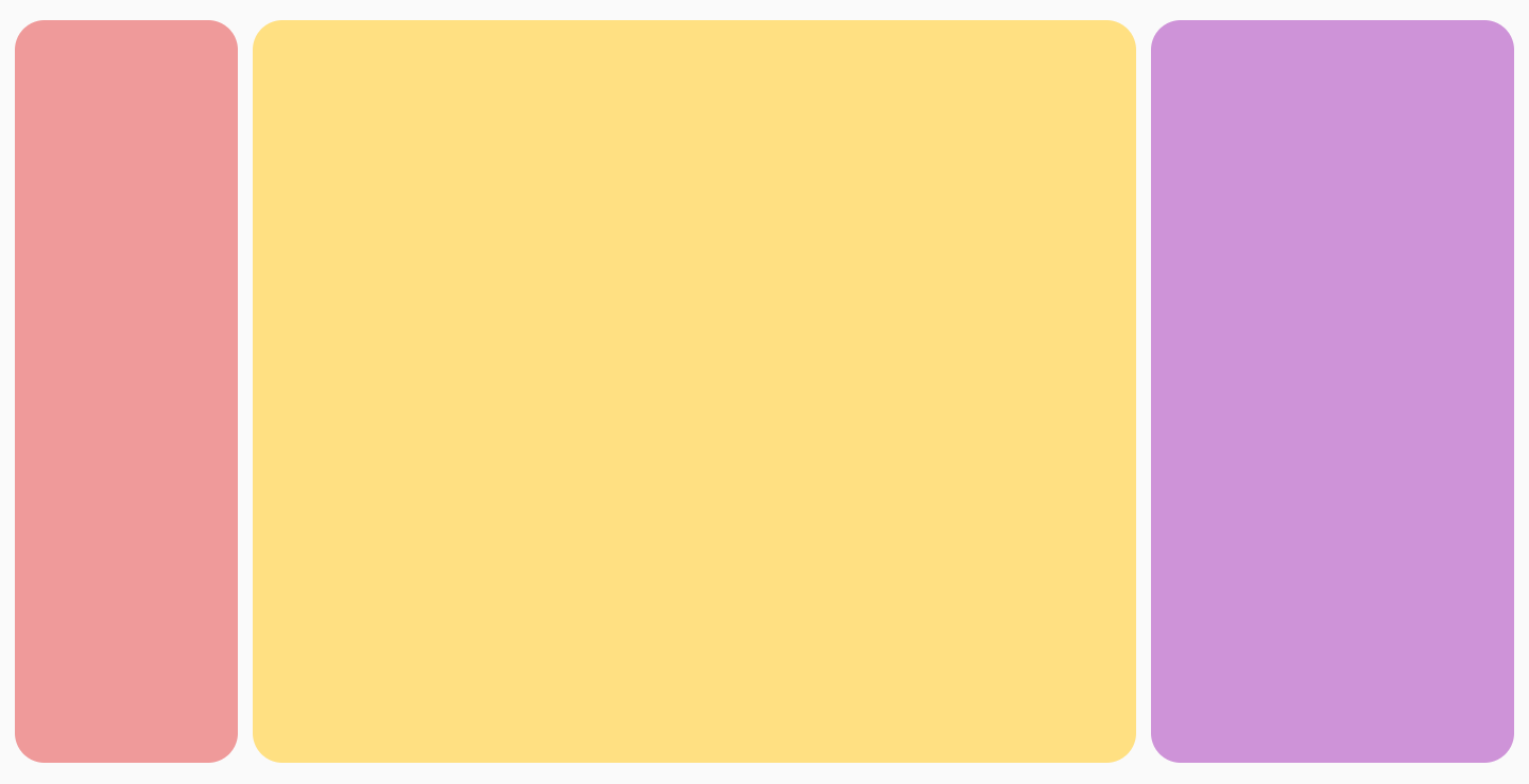
You can also create an alternating grid of different item sizes, where two items take up half the width each, and one item takes up the full width of the next column:
FlowRow with alternating sizes of rowsYou can achieve this with the following code:
FlowRow(
modifier = Modifier.padding(4.dp),
horizontalArrangement = Arrangement.spacedBy(4.dp),
maxItemsInEachRow = 2
) {
val itemModifier = Modifier
.padding(4.dp)
.height(80.dp)
.clip(RoundedCornerShape(8.dp))
.background(Color.Blue)
repeat(6) { item ->
// if the item is the third item, don't use weight modifier, but rather fillMaxWidth
if ((item + 1) % 3 == 0) {
Spacer(modifier = itemModifier.fillMaxWidth())
} else {
Spacer(modifier = itemModifier.weight(0.5f))
}
}
}
Fractional sizing
Using Modifier.fillMaxWidth(fraction), you can specify the size of the
container that an item should take up. This is different from how
Modifier.fillMaxWidth(fraction) works when applied to Row or Column, in
that Row/Column items take up a percentage of the remaining width, rather than
the whole container's width.
For example, the following code produces different results when using FlowRow
vs Row:
FlowRow(
modifier = Modifier.padding(4.dp),
horizontalArrangement = Arrangement.spacedBy(4.dp),
maxItemsInEachRow = 3
) {
val itemModifier = Modifier
.clip(RoundedCornerShape(8.dp))
Box(modifier = itemModifier.height(200.dp).width(60.dp).background(Color.Red))
Box(modifier = itemModifier.height(200.dp).fillMaxWidth(0.7f).background(Color.Blue))
Box(modifier = itemModifier.height(200.dp).weight(1f).background(Color.Magenta))
}
|
|
|
|
fillMaxColumnWidth() and fillMaxRowHeight()
Applying either Modifier.fillMaxColumnWidth() or
Modifier.fillMaxRowHeight() to an item inside a FlowColumn or FlowRow
ensures that items in the same column or row take up the same width or height as
the biggest item in the column/row.
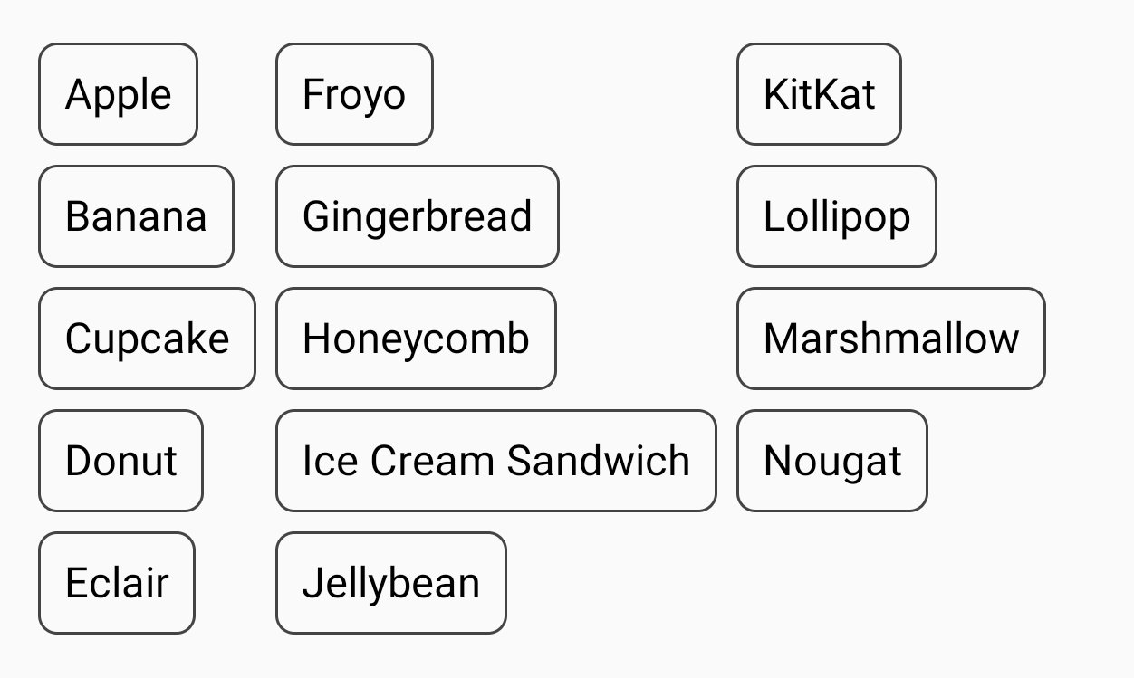
For example, this example uses FlowColumn to display the list of Android
desserts. You can see the difference in each items widths when
Modifier.fillMaxColumnWidth() is applied to the items versus when its not and
the items wrap.
FlowColumn(
Modifier
.padding(20.dp)
.fillMaxHeight()
.fillMaxWidth(),
horizontalArrangement = Arrangement.spacedBy(8.dp),
verticalArrangement = Arrangement.spacedBy(8.dp),
maxItemsInEachColumn = 5,
) {
repeat(listDesserts.size) {
Box(
Modifier
.fillMaxColumnWidth()
.border(1.dp, Color.DarkGray, RoundedCornerShape(8.dp))
.padding(8.dp)
) {
Text(
text = listDesserts[it],
fontSize = 18.sp,
modifier = Modifier.padding(3.dp)
)
}
}
}
|
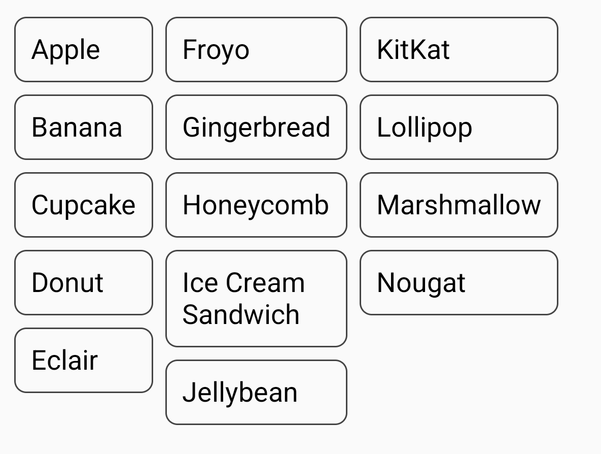
|
No width changes set (wrapping items) |
|
Recommended for you
- Note: link text is displayed when JavaScript is off
- Compose layout basics
- ConstraintLayout in Compose
- Editor actions {:#editor-actions}