
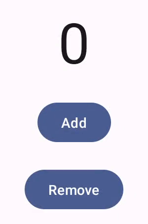
User interface components give feedback to the device user by the way they respond to user interactions. Every component has its own way of responding to interactions, which helps the user know what their interactions are doing. For example, if a user touches a button on a device's touchscreen, the button is likely to change in some way, perhaps by adding a highlight color. This change lets the user know that they touched the button. If the user didn't want to do that, they'll know to drag their finger away from the button before releasing--otherwise, the button will activate.
The Compose Gestures documentation covers how Compose components handle low-level pointer event, such as pointer moves and clicks. Out of the box, Compose abstracts those low-level events into higher-level interactions–for example, a series of pointer events might add up to a button press-and-release. Understanding those higher-level abstractions can help you customize how your UI responds to the user. For example, you might want to customize how a component's appearance changes when the user interacts with it, or maybe you just want to maintain a log of those user actions. This document gives you the information you need to modify the standard UI elements, or design your own.
Interactions
In many cases, you don't need to know just how your Compose component is
interpreting user interactions. For example, Button relies on
Modifier.clickable
to figure out whether the user clicked the button. If you're adding a typical
button to your app, you can define the button's onClick code, and
Modifier.clickable runs that code when appropriate. That means you don't need
to know whether the user tapped the screen or selected the button with a
keyboard; Modifier.clickable figures out that the user performed a click, and
responds by running your onClick code.
However, if you want to customize your UI component's response to user behavior, you may need to know more of what's going on under the hood. This section gives you some of that information.
When a user interacts with a UI component, the system represents their behavior
by generating a number of
Interaction
events. For example, if a user touches a button, the button generates
PressInteraction.Press.
If the user lifts their finger inside the button, it generates a
PressInteraction.Release,
letting the button know that the click was finished. On the other hand, if the
user drags their finger outside the button, then lifts their finger, the button
generates
PressInteraction.Cancel,
to indicate that the press on the button was canceled, not completed.
These interactions are unopinionated. That is, these low-level interaction events don't intend to interpret the meaning of the user actions, or their sequence. They also don't interpret which user actions might take priority over other actions.
These interactions generally come in pairs, with a start and an end. The second
interaction contains a reference to the first one. For example, if a user
touches a button then lifts their finger, the touch generates a
PressInteraction.Press
interaction, and the release generates a
PressInteraction.Release;
the Release has a press property identifying the initial
PressInteraction.Press.
You can see the interactions for a particular component by observing its
InteractionSource. InteractionSource is built on top of Kotlin
flows, so you can collect the interactions from it the same way
you'd work with any other flow. For more information about this design decision,
see the Illuminating Interactions blog post.
Interaction state
You might want to extend the built-in functionality of your components by also
tracking the interactions yourself. For example, perhaps you want a button to
change color when it's pressed. The simplest way to track the interactions is to
observe the appropriate interaction state. InteractionSource offers a number
of methods that reveal various interaction statuses as state. For example, if
you want to see whether a particular button is pressed, you can call its
InteractionSource.collectIsPressedAsState()
method:
val interactionSource = remember { MutableInteractionSource() } val isPressed by interactionSource.collectIsPressedAsState() Button( onClick = { /* do something */ }, interactionSource = interactionSource ) { Text(if (isPressed) "Pressed!" else "Not pressed") }
Besides collectIsPressedAsState(), Compose also provides
collectIsFocusedAsState(), collectIsDraggedAsState(), and
collectIsHoveredAsState(). These methods are actually convenience methods
built on top of lower-level InteractionSource APIs. In some cases, you may
want to use those lower-level functions directly.
For example, suppose you need to know whether a button is being pressed, and
also whether it's being dragged. If you use both collectIsPressedAsState()
and collectIsDraggedAsState(), Compose does a lot of duplicate work, and
there's no guarantee you'll get all the interactions in the right order. For
situations like this, you might want to work directly with the
InteractionSource. For more information about tracking the interactions
yourself with InteractionSource, see Work with InteractionSource.
The following section describes how to consume and emit interactions with
InteractionSource and MutableInteractionSource, respectively.
Consume and emit Interaction
InteractionSource represents a read-only stream of Interactions — it is not
possible to emit an Interaction to an InteractionSource. To emit
Interactions, you need to use a MutableInteractionSource, which extends from
InteractionSource.
Modifiers and components can consume, emit, or consume and emit Interactions.
The following sections describe how to consume and emit interactions from both
modifiers and components.
Consuming modifier example
For a modifier that draws a border for focused state, you only need to observe
Interactions, so you can accept an InteractionSource:
fun Modifier.focusBorder(interactionSource: InteractionSource): Modifier { // ... }
It is clear from the function signature that this modifier is a consumer — it
can consume Interactions, but cannot emit them.
Producing modifier example
For a modifier that handles hover events like Modifier.hoverable, you
need to emit Interactions, and accept a MutableInteractionSource as a
parameter instead:
fun Modifier.hover(interactionSource: MutableInteractionSource, enabled: Boolean): Modifier { // ... }
This modifier is a producer — it can use the provided
MutableInteractionSource to emit HoverInteractions when it is hovered or
unhovered.
Build components that consume and produce
High-level components such as a Material Button act as both producers and
consumers. They handle input and focus events, and also change their appearance
in response to these events, such as showing a ripple or animating their
elevation. As a result, they directly expose MutableInteractionSource as a
parameter, so that you can provide your own remembered instance:
@Composable fun Button( onClick: () -> Unit, modifier: Modifier = Modifier, enabled: Boolean = true, // exposes MutableInteractionSource as a parameter interactionSource: MutableInteractionSource? = null, elevation: ButtonElevation? = ButtonDefaults.elevatedButtonElevation(), shape: Shape = MaterialTheme.shapes.small, border: BorderStroke? = null, colors: ButtonColors = ButtonDefaults.buttonColors(), contentPadding: PaddingValues = ButtonDefaults.ContentPadding, content: @Composable RowScope.() -> Unit ) { /* content() */ }
This allows hoisting the
MutableInteractionSource out of the component and observing all the
Interactions produced by the component. You can use this to control the
appearance of that component, or any other component in your UI.
If you are building your own interactive high level components, we recommend
that you expose MutableInteractionSource as a parameter in this way. Besides
following state hoisting best practices, this also makes it easy to read and
control the visual state of a component in the same way that any other sort of
state (such as enabled state) can be read and controlled.
Compose follows a layered architectural approach,
so high-level Material components are built on top of foundational building
blocks that produce the Interactions they need to control ripples and other
visual effects. The foundation library provides high-level interaction modifiers
such as Modifier.hoverable, Modifier.focusable, and
Modifier.draggable.
To build a component that responds to hover events, you can simply use
Modifier.hoverable and pass a MutableInteractionSource as a parameter.
Whenever the component is hovered, it emits HoverInteractions, and you can use
this to change how the component appears.
// This InteractionSource will emit hover interactions val interactionSource = remember { MutableInteractionSource() } Box( Modifier .size(100.dp) .hoverable(interactionSource = interactionSource), contentAlignment = Alignment.Center ) { Text("Hello!") }
To also make this component focusable, you can add Modifier.focusable and pass
the same MutableInteractionSource as a parameter. Now, both
HoverInteraction.Enter/Exit and FocusInteraction.Focus/Unfocus are emitted
through the same MutableInteractionSource, and you can customize the
appearance for both types of interaction in the same place:
// This InteractionSource will emit hover and focus interactions val interactionSource = remember { MutableInteractionSource() } Box( Modifier .size(100.dp) .hoverable(interactionSource = interactionSource) .focusable(interactionSource = interactionSource), contentAlignment = Alignment.Center ) { Text("Hello!") }
Modifier.clickable is an even higher
level abstraction than hoverable and focusable — for a component to be
clickable, it is implicitly hoverable, and components that can be clicked should
also be focusable. You can use Modifier.clickable to create a component that
handles hover, focus, and press interactions, without needing to combine lower
level APIs. If you want to make your component clickable as well, you can
replace hoverable and focusable with a clickable:
// This InteractionSource will emit hover, focus, and press interactions val interactionSource = remember { MutableInteractionSource() } Box( Modifier .size(100.dp) .clickable( onClick = {}, interactionSource = interactionSource, // Also show a ripple effect indication = ripple() ), contentAlignment = Alignment.Center ) { Text("Hello!") }
Work with InteractionSource
If you need low-level information about interactions with a component, you can
use standard flow APIs for that component's InteractionSource.
For example, suppose you want to maintain a list of the press and drag
interactions for an InteractionSource. This code does half the job, adding
the new presses to the list as they come in:
val interactionSource = remember { MutableInteractionSource() } val interactions = remember { mutableStateListOf<Interaction>() } LaunchedEffect(interactionSource) { interactionSource.interactions.collect { interaction -> when (interaction) { is PressInteraction.Press -> { interactions.add(interaction) } is DragInteraction.Start -> { interactions.add(interaction) } } } }
But besides adding the new interactions, you also have to remove interactions when they end (for example, when the user lifts their finger back off the component). That's easy to do, since the end interactions always carry a reference to the associated start interaction. This code shows how you'd remove the interactions that have ended:
val interactionSource = remember { MutableInteractionSource() } val interactions = remember { mutableStateListOf<Interaction>() } LaunchedEffect(interactionSource) { interactionSource.interactions.collect { interaction -> when (interaction) { is PressInteraction.Press -> { interactions.add(interaction) } is PressInteraction.Release -> { interactions.remove(interaction.press) } is PressInteraction.Cancel -> { interactions.remove(interaction.press) } is DragInteraction.Start -> { interactions.add(interaction) } is DragInteraction.Stop -> { interactions.remove(interaction.start) } is DragInteraction.Cancel -> { interactions.remove(interaction.start) } } } }
Now, if you want to know if the component is currently being pressed or dragged,
all you have to do is check whether interactions is empty:
val isPressedOrDragged = interactions.isNotEmpty()
If you want to know what the most recent interaction was, just look at the last item in the list. For example, this is how the Compose ripple implementation figures out the appropriate state overlay to use for the most recent interaction:
val lastInteraction = when (interactions.lastOrNull()) { is DragInteraction.Start -> "Dragged" is PressInteraction.Press -> "Pressed" else -> "No state" }
Because all Interactions follow the same structure, there is not much of a
difference in code when working with different types of user interactions — the
overall pattern is the same.
Note that the previous examples in this section represent the Flow of
interactions using State
— this makes it easy to observe updated values,
as reading the state value will automatically cause recompositions. However,
composition is batched pre-frame. This means that if the state changes, and
then changes back within the same frame, components observing the state won't
see the change.
This is important for interactions, as interactions can regularly start and end
within the same frame. For example, using the previous example with Button:
val interactionSource = remember { MutableInteractionSource() } val isPressed by interactionSource.collectIsPressedAsState() Button(onClick = { /* do something */ }, interactionSource = interactionSource) { Text(if (isPressed) "Pressed!" else "Not pressed") }
If a press starts and ends within the same frame, the text will never display as
"Pressed!". In most cases, this is not an issue — showing a visual effect for
such a small amount of time will result in flickering, and won't be very
noticeable to the user. For some cases, such as showing a ripple effect or a
similar animation, you may want to show the effect for at least a minimum amount
of time, instead of immediately stopping if the button is no longer pressed. To
do this, you can directly start and stop animations from inside the collect
lambda, instead of writing to a state. There is an example of this pattern in
the Build an advanced Indication with animated border section.
Example: Build component with custom interaction handling
To see how you can build components with a custom response to input, here's an example of a modified button. In this case, suppose you want a button that responds to presses by changing its appearance:
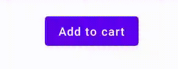
To do this, build a custom composable based on Button, and have it take an
additional icon parameter to draw the icon (in this case, a shopping cart). You
call collectIsPressedAsState() to track whether the user is hovering over the
button; when they are, you add the icon. Here's what the code looks like:
@Composable fun PressIconButton( onClick: () -> Unit, icon: @Composable () -> Unit, text: @Composable () -> Unit, modifier: Modifier = Modifier, interactionSource: MutableInteractionSource? = null ) { val isPressed = interactionSource?.collectIsPressedAsState()?.value ?: false Button( onClick = onClick, modifier = modifier, interactionSource = interactionSource ) { AnimatedVisibility(visible = isPressed) { if (isPressed) { Row { icon() Spacer(Modifier.size(ButtonDefaults.IconSpacing)) } } } text() } }
And here's what it looks like to use that new composable:
PressIconButton( onClick = {}, icon = { Icon(Icons.Filled.ShoppingCart, contentDescription = null) }, text = { Text("Add to cart") } )
Because this new PressIconButton is built on top of the existing Material
Button, it reacts to user interactions in all the usual ways. When the user
presses the button, it changes its opacity slightly, just like an ordinary
Material Button.
Create and apply a reusable custom effect with Indication
In previous sections, you learned how to change part of a component in response
to different Interactions, such as showing an icon when pressed. This same
approach can be used for changing the value of parameters you provide to a
component, or changing the content displayed inside a component, but this is
only applicable on a per-component basis. Often, an application or design system
will have a generic system for stateful visual effects — an effect that should
be applied to all components in a consistent manner.
If you are building this kind of design system, customizing one component and reusing this customization for other components can be difficult for the following reasons:
- Every component in the design system needs the same boilerplate
- It's easy to forget to apply this effect to newly built components and custom clickable components
- It may be difficult to combine the custom effect with other effects
To avoid these issues and easily scale a custom component across your system,
you can use Indication.
Indication represents a reusable visual effect that can be applied across
components in an application or design system. Indication is split into two
parts:
IndicationNodeFactory: A factory that createsModifier.Nodeinstances that render visual effects for a component. For simpler implementations that do not change across components, this can be a singleton (object) and reused across the entire application.These instances can be stateful or stateless. Since they are created per component, they can retrieve values from a
CompositionLocalto change how they appear or behave inside a particular component, as with any otherModifier.Node.Modifier.indication: A modifier that drawsIndicationfor a component.Modifier.clickableand other high level interaction modifiers accept an indication parameter directly, so they not only emitInteractions, but can also draw visual effects for theInteractions they emit. So, for simple cases, you can just useModifier.clickablewithout needingModifier.indication.
Replace effect with an Indication
This section describes how to replace a manual scale effect applied to one specific button with an indication equivalent that can be reused across multiple components.
The following code creates a button that scales downwards on press:
val interactionSource = remember { MutableInteractionSource() } val isPressed by interactionSource.collectIsPressedAsState() val scale by animateFloatAsState(targetValue = if (isPressed) 0.9f else 1f, label = "scale") Button( modifier = Modifier.scale(scale), onClick = { }, interactionSource = interactionSource ) { Text(if (isPressed) "Pressed!" else "Not pressed") }
To convert the scale effect in the snippet above to an Indication, follow
these steps:
Create the
Modifier.Noderesponsible for applying the scale effect. When attached, the node observes the interaction source, similar to previous examples. The only difference here is that it directly launches animations instead of converting the incoming Interactions to state.The node needs to implement
DrawModifierNodeso it can overrideContentDrawScope#draw(), and render a scale effect using the same drawing commands as with any other graphics API in Compose.Calling
drawContent()available from theContentDrawScopereceiver will draw the actual component that theIndicationshould be applied to, so you just need to call this function within a scale transformation. Make sure yourIndicationimplementations always calldrawContent()at some point; otherwise, the component you are applying theIndicationto will not be drawn.private class ScaleNode(private val interactionSource: InteractionSource) : Modifier.Node(), DrawModifierNode { var currentPressPosition: Offset = Offset.Zero val animatedScalePercent = Animatable(1f) private suspend fun animateToPressed(pressPosition: Offset) { currentPressPosition = pressPosition animatedScalePercent.animateTo(0.9f, spring()) } private suspend fun animateToResting() { animatedScalePercent.animateTo(1f, spring()) } override fun onAttach() { coroutineScope.launch { interactionSource.interactions.collectLatest { interaction -> when (interaction) { is PressInteraction.Press -> animateToPressed(interaction.pressPosition) is PressInteraction.Release -> animateToResting() is PressInteraction.Cancel -> animateToResting() } } } } override fun ContentDrawScope.draw() { scale( scale = animatedScalePercent.value, pivot = currentPressPosition ) { this@draw.drawContent() } } }
Create the
IndicationNodeFactory. Its only responsibility is to create a new node instance for a provided interaction source. As there are no parameters to configure the indication, the factory can be an object:object ScaleIndication : IndicationNodeFactory { override fun create(interactionSource: InteractionSource): DelegatableNode { return ScaleNode(interactionSource) } override fun equals(other: Any?): Boolean = other === ScaleIndication override fun hashCode() = 100 }
Modifier.clickableusesModifier.indicationinternally, so to make a clickable component withScaleIndication, all you need to do is provide theIndicationas a parameter toclickable:Box( modifier = Modifier .size(100.dp) .clickable( onClick = {}, indication = ScaleIndication, interactionSource = null ) .background(Color.Blue), contentAlignment = Alignment.Center ) { Text("Hello!", color = Color.White) }
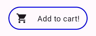
This also makes it easy to build high level, reusable components using a custom
Indication— a button could look like:@Composable fun ScaleButton( onClick: () -> Unit, modifier: Modifier = Modifier, enabled: Boolean = true, interactionSource: MutableInteractionSource? = null, shape: Shape = CircleShape, content: @Composable RowScope.() -> Unit ) { Row( modifier = modifier .defaultMinSize(minWidth = 76.dp, minHeight = 48.dp) .clickable( enabled = enabled, indication = ScaleIndication, interactionSource = interactionSource, onClick = onClick ) .border(width = 2.dp, color = Color.Blue, shape = shape) .padding(horizontal = 16.dp, vertical = 8.dp), horizontalArrangement = Arrangement.Center, verticalAlignment = Alignment.CenterVertically, content = content ) }
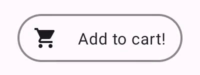
You can then use the button in the following way:
ScaleButton(onClick = {}) { Icon(Icons.Filled.ShoppingCart, "") Spacer(Modifier.padding(10.dp)) Text(text = "Add to cart!") }
Indication.Build an advanced Indication with animated border
Indication is not just limited to transformation effects, such as scaling a
component. Because IndicationNodeFactory returns a Modifier.Node, you can draw
any kind of effect above or below the content as with other drawing APIs. For
example, you can draw an animated border around the component and an overlay on
top of the component when it is pressed:
Indication.The Indication implementation here is very similar to the previous example —
it just creates a node with some parameters. Since the animated border depends
on the shape and the border of the component the Indication is used for, the
Indication implementation also requires shape and border width to be provided
as parameters:
data class NeonIndication(private val shape: Shape, private val borderWidth: Dp) : IndicationNodeFactory { override fun create(interactionSource: InteractionSource): DelegatableNode { return NeonNode( shape, // Double the border size for a stronger press effect borderWidth * 2, interactionSource ) } }
The Modifier.Node implementation is also conceptually the same, even if the
drawing code is more complicated. As before, it observes InteractionSource
when attached, launches animations, and implements DrawModifierNode to draw
the effect on top of the content:
private class NeonNode( private val shape: Shape, private val borderWidth: Dp, private val interactionSource: InteractionSource ) : Modifier.Node(), DrawModifierNode { var currentPressPosition: Offset = Offset.Zero val animatedProgress = Animatable(0f) val animatedPressAlpha = Animatable(1f) var pressedAnimation: Job? = null var restingAnimation: Job? = null private suspend fun animateToPressed(pressPosition: Offset) { // Finish any existing animations, in case of a new press while we are still showing // an animation for a previous one restingAnimation?.cancel() pressedAnimation?.cancel() pressedAnimation = coroutineScope.launch { currentPressPosition = pressPosition animatedPressAlpha.snapTo(1f) animatedProgress.snapTo(0f) animatedProgress.animateTo(1f, tween(450)) } } private fun animateToResting() { restingAnimation = coroutineScope.launch { // Wait for the existing press animation to finish if it is still ongoing pressedAnimation?.join() animatedPressAlpha.animateTo(0f, tween(250)) animatedProgress.snapTo(0f) } } override fun onAttach() { coroutineScope.launch { interactionSource.interactions.collect { interaction -> when (interaction) { is PressInteraction.Press -> animateToPressed(interaction.pressPosition) is PressInteraction.Release -> animateToResting() is PressInteraction.Cancel -> animateToResting() } } } } override fun ContentDrawScope.draw() { val (startPosition, endPosition) = calculateGradientStartAndEndFromPressPosition( currentPressPosition, size ) val brush = animateBrush( startPosition = startPosition, endPosition = endPosition, progress = animatedProgress.value ) val alpha = animatedPressAlpha.value drawContent() val outline = shape.createOutline(size, layoutDirection, this) // Draw overlay on top of content drawOutline( outline = outline, brush = brush, alpha = alpha * 0.1f ) // Draw border on top of overlay drawOutline( outline = outline, brush = brush, alpha = alpha, style = Stroke(width = borderWidth.toPx()) ) } /** * Calculates a gradient start / end where start is the point on the bounding rectangle of * size [size] that intercepts with the line drawn from the center to [pressPosition], * and end is the intercept on the opposite end of that line. */ private fun calculateGradientStartAndEndFromPressPosition( pressPosition: Offset, size: Size ): Pair<Offset, Offset> { // Convert to offset from the center val offset = pressPosition - size.center // y = mx + c, c is 0, so just test for x and y to see where the intercept is val gradient = offset.y / offset.x // We are starting from the center, so halve the width and height - convert the sign // to match the offset val width = (size.width / 2f) * sign(offset.x) val height = (size.height / 2f) * sign(offset.y) val x = height / gradient val y = gradient * width // Figure out which intercept lies within bounds val intercept = if (abs(y) <= abs(height)) { Offset(width, y) } else { Offset(x, height) } // Convert back to offsets from 0,0 val start = intercept + size.center val end = Offset(size.width - start.x, size.height - start.y) return start to end } private fun animateBrush( startPosition: Offset, endPosition: Offset, progress: Float ): Brush { if (progress == 0f) return TransparentBrush // This is *expensive* - we are doing a lot of allocations on each animation frame. To // recreate a similar effect in a performant way, it would be better to create one large // gradient and translate it on each frame, instead of creating a whole new gradient // and shader. The current approach will be janky! val colorStops = buildList { when { progress < 1 / 6f -> { val adjustedProgress = progress * 6f add(0f to Blue) add(adjustedProgress to Color.Transparent) } progress < 2 / 6f -> { val adjustedProgress = (progress - 1 / 6f) * 6f add(0f to Purple) add(adjustedProgress * MaxBlueStop to Blue) add(adjustedProgress to Blue) add(1f to Color.Transparent) } progress < 3 / 6f -> { val adjustedProgress = (progress - 2 / 6f) * 6f add(0f to Pink) add(adjustedProgress * MaxPurpleStop to Purple) add(MaxBlueStop to Blue) add(1f to Blue) } progress < 4 / 6f -> { val adjustedProgress = (progress - 3 / 6f) * 6f add(0f to Orange) add(adjustedProgress * MaxPinkStop to Pink) add(MaxPurpleStop to Purple) add(MaxBlueStop to Blue) add(1f to Blue) } progress < 5 / 6f -> { val adjustedProgress = (progress - 4 / 6f) * 6f add(0f to Yellow) add(adjustedProgress * MaxOrangeStop to Orange) add(MaxPinkStop to Pink) add(MaxPurpleStop to Purple) add(MaxBlueStop to Blue) add(1f to Blue) } else -> { val adjustedProgress = (progress - 5 / 6f) * 6f add(0f to Yellow) add(adjustedProgress * MaxYellowStop to Yellow) add(MaxOrangeStop to Orange) add(MaxPinkStop to Pink) add(MaxPurpleStop to Purple) add(MaxBlueStop to Blue) add(1f to Blue) } } } return linearGradient( colorStops = colorStops.toTypedArray(), start = startPosition, end = endPosition ) } companion object { val TransparentBrush = SolidColor(Color.Transparent) val Blue = Color(0xFF30C0D8) val Purple = Color(0xFF7848A8) val Pink = Color(0xFFF03078) val Orange = Color(0xFFF07800) val Yellow = Color(0xFFF0D800) const val MaxYellowStop = 0.16f const val MaxOrangeStop = 0.33f const val MaxPinkStop = 0.5f const val MaxPurpleStop = 0.67f const val MaxBlueStop = 0.83f } }
The main difference here is that there is now a minimum duration for the
animation with the animateToResting() function, so even if the press is
immediately released, the press animation will continue. There is also handling
for multiple quick presses at the start of animateToPressed — if a press
happens during an existing press or resting animation, the previous animation is
canceled, and the press animation starts from the beginning. To support multiple
concurrent effects (such as with ripples, where a new ripple animation will draw
on top of other ripples), you can track the animations in a list, instead of
canceling existing animations and starting new ones.
Recommended for you
- Note: link text is displayed when JavaScript is off
- Understand gestures
- Kotlin for Jetpack Compose
- Material Components and layouts