The Switch component allows users to toggle between two states: checked
and unchecked. In your app you may use a switch to let the user do one of the
following:
- Toggle a setting on or off.
- Enable or disable a feature.
- Select an option.
The component has two parts: the thumb and the track. The thumb is the draggable part of the switch, and the track is the background. The user can drag the thumb to the left or right to change the state of the switch. They can also tap the switch to check and clear it.

Basic implementation
See the Switch reference for a full API definition. The following are
some of the key parameters you might need to use:
checked: The initial state of the switch.onCheckedChange: A callback that is called when the state of the switch changes.enabled: Whether the switch is enabled or disabled.colors: The colors used for the switch.
The following example is a minimal implementation of the Switch composable.
@Composable fun SwitchMinimalExample() { var checked by remember { mutableStateOf(true) } Switch( checked = checked, onCheckedChange = { checked = it } ) }
This implementation appears as follows when unchecked:
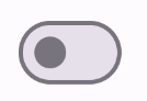
This is the appearance when checked:

Advanced implementation
The primary parameters you might want to use when implementing a more advanced switch are the following:
thumbContent: Use this to customize the appearance of the thumb when it is checked.colors: Use this to customize the color of the track and thumb.
Custom thumb
You can pass any composable for the thumbContent parameter to create a custom
thumb. The following is an example of a switch that uses a custom icon for its
thumb:
@Composable fun SwitchWithIconExample() { var checked by remember { mutableStateOf(true) } Switch( checked = checked, onCheckedChange = { checked = it }, thumbContent = if (checked) { { Icon( imageVector = Icons.Filled.Check, contentDescription = null, modifier = Modifier.size(SwitchDefaults.IconSize), ) } } else { null } ) }
In this implementation, the unchecked appearance is the same as the example in the preceding section. However, when checked, this implementation appears as follows:
Custom colors
The following example demonstrates how you can use the colors parameter to change the color of a switch's thumb and track, taking into account whether the switch is checked.
@Composable fun SwitchWithCustomColors() { var checked by remember { mutableStateOf(true) } Switch( checked = checked, onCheckedChange = { checked = it }, colors = SwitchDefaults.colors( checkedThumbColor = MaterialTheme.colorScheme.primary, checkedTrackColor = MaterialTheme.colorScheme.primaryContainer, uncheckedThumbColor = MaterialTheme.colorScheme.secondary, uncheckedTrackColor = MaterialTheme.colorScheme.secondaryContainer, ) ) }
This implementation appears as follows: