
The Card composable acts as a Material Design container for your UI.
Cards typically present a single coherent piece of content. The following
examples show where you might use a card:
- A product in a shopping app.
- A news story in a news app.
- A message in a communications app.
It is the focus on portraying a single piece of content that distinguishes
Card from other containers. For example, Scaffold provides general structure
to a whole screen. Card is generally a smaller UI element inside a larger
layout, whereas a layout component such as Column or Row provides a simpler
and more generic API.

Basic implementation
Card behaves much like other containers in Compose. You declare its content by
calling other composables within it. For example, consider how Card contains a
call to Text in the following minimal example:
@Composable
fun CardMinimalExample() {
    Card() {
        Text(text = "Hello, world!")
    }
}
Advanced implementations
See the reference for the API definition of Card. It defines several
parameters that allow you to customize the appearance and behavior of the
component.
Some key parameters to note are the following:
elevation: Adds a shadow to the component that makes it appear elevated above the background.colors: Uses theCardColorstype to set the default color of both the container and any children.enabled: If you passfalsefor this parameter, the card appears as disabled and does not respond to user input.onClick: Ordinarily, aCarddoes not accept click events. As such, the primary overload you would like to note is that which defines anonClickparameter. You should use this overload if you would like your implementation ofCardto respond to presses from the user.
The following example demonstrates how you might use these parameters, as well
as other common parameters such as shape and modifier.
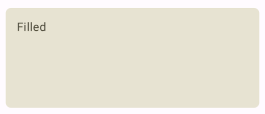
Filled card
The following is an example of how you can implement a filled card.
The key here is the use of the colors property to change the filled
color.
@Composable fun FilledCardExample() { Card( colors = CardDefaults.cardColors( containerColor = MaterialTheme.colorScheme.surfaceVariant, ), modifier = Modifier .size(width = 240.dp, height = 100.dp) ) { Text( text = "Filled", modifier = Modifier .padding(16.dp), textAlign = TextAlign.Center, ) } }
This implementation appears as follows:
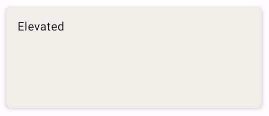
Elevated Card
The following snippet demonstrates how to implement an elevated card. Use the
dedicated ElevatedCard composable.
You can use the elevation property to control the appearance of elevation and
the resulting shadow.
@Composable fun ElevatedCardExample() { ElevatedCard( elevation = CardDefaults.cardElevation( defaultElevation = 6.dp ), modifier = Modifier .size(width = 240.dp, height = 100.dp) ) { Text( text = "Elevated", modifier = Modifier .padding(16.dp), textAlign = TextAlign.Center, ) } }
This implementation appears as follows:
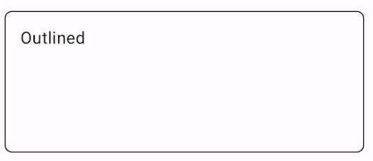
Outlined Card
The following is an example of an outlined card. Use the dedicated
OutlinedCard composable.
@Composable fun OutlinedCardExample() { OutlinedCard( colors = CardDefaults.cardColors( containerColor = MaterialTheme.colorScheme.surface, ), border = BorderStroke(1.dp, Color.Black), modifier = Modifier .size(width = 240.dp, height = 100.dp) ) { Text( text = "Outlined", modifier = Modifier .padding(16.dp), textAlign = TextAlign.Center, ) } }
This implementation appears as follows:
Limitations
Cards don't come with inherent scroll or dismiss actions, but can integrate into
composables offering these features. For example, to implement swipe to dismiss
on a card, integrate it with the SwipeToDismiss composable. To integrate
with scroll, use scroll modifiers such as verticalScroll. See the Scroll
documentation for more information.