App bars are containers that provide the user access to key features and navigation items. There are two types of app bars, top app bars and bottom app bars. Their respective appearance and purpose are as follows:
Type |
Appearance |
Purpose |
|---|---|---|
Top app bar |
Across the top of the screen. |
Provides access to key tasks and information. Generally hosts a title, core action items, and certain navigation items. |
Bottom app bar |
Across the bottom of the screen. |
Typically includes core navigation items. May also provide access to other key actions, such as through a contained floating action button. |

To implement a top app bar and bottom app bar, use the TopAppBar and
BottomAppBar composables, respectively. They let you create consistent
interfaces that encapsulate navigation and action controls, and which are
aligned with Material Design principles.
Top app bars
The following table outlines the four types of top app bars:
Type |
Example |
|---|---|
Small: For screens that don't require a lot of navigation or actions. |

|
Center aligned: For screens that have a single, primary action. |

|
Medium: For screens that require a moderate amount of navigation and actions. |

|
Large: For screens that require a lot of navigation and actions. |

|
API surface
The various composables that allow you to implement the four different top app bars are quite similar. They share several key parameters:
title: The text that appears across the app bar.navigationIcon: The primary icon for navigation. Appears on the left of the app bar.actions: Icons that provide the user access to key actions. They appear on the right of the app bar.scrollBehavior: Determines how the top app bar responds to scrolling of the scaffold's inner content.colors: Determines how the app bar appears.
Scroll behavior
You can control how the app bar responds when the user scrolls the given
scaffold's inner content. To do so, create an instance of
TopAppBarScrollBehavior and pass it to your top app bar for the
scrollBehavior parameter.
There are three types of TopAppBarScrollBehavior. They are as follows:
enterAlwaysScrollBehavior: When the user pulls up the scaffold's inner content, the top app bar collapses. The app bar expands when the user starts pulling down the inner content.exitUntilCollapsedScrollBehavior: Similar toenterAlwaysScrollBehavior, though the app bar only expands when the user pulls the content all the way down.pinnedScrollBehavior: The app bar remains in place and does not react to scrolling.
The following examples implement several of these options.
Examples
The following sections provide implementations for the four different types of top app bars, including varying examples of how you can control scroll behavior.
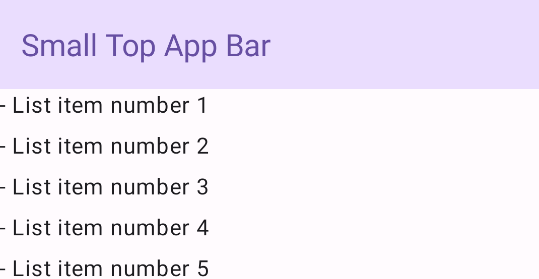
Small
To create a small top app bar, use the TopAppBar composable. The
following example implements a basic top app bar that contains only a title.
The following example does not pass TopAppBar a value for
scrollBehavior and it therefore does not react to scrolling of the inner
content.
@Composable fun SmallTopAppBarExample() { Scaffold( topBar = { TopAppBar( colors = TopAppBarDefaults.topAppBarColors( containerColor = MaterialTheme.colorScheme.primaryContainer, titleContentColor = MaterialTheme.colorScheme.primary, ), title = { Text("Small Top App Bar") } ) }, ) { innerPadding -> ScrollContent(innerPadding) } }
This implementation appears as follows:
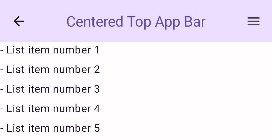
Center aligned
The center aligned top app bar is essentially the same as the small app bar,
though the title is centered within the component. To implement it, use the
dedicated CenterAlignedTopAppBar composable.
This example uses enterAlwaysScrollBehavior() to get the value that it passes
for scrollBehavior. As such, the bar collapses when the user scrolls the
scaffold's inner content.
@Composable fun CenterAlignedTopAppBarExample() { val scrollBehavior = TopAppBarDefaults.pinnedScrollBehavior(rememberTopAppBarState()) Scaffold( modifier = Modifier.nestedScroll(scrollBehavior.nestedScrollConnection), topBar = { CenterAlignedTopAppBar( colors = TopAppBarDefaults.topAppBarColors( containerColor = MaterialTheme.colorScheme.primaryContainer, titleContentColor = MaterialTheme.colorScheme.primary, ), title = { Text( "Centered Top App Bar", maxLines = 1, overflow = TextOverflow.Ellipsis ) }, navigationIcon = { IconButton(onClick = { /* do something */ }) { Icon( imageVector = Icons.AutoMirrored.Filled.ArrowBack, contentDescription = "Localized description" ) } }, actions = { IconButton(onClick = { /* do something */ }) { Icon( imageVector = Icons.Filled.Menu, contentDescription = "Localized description" ) } }, scrollBehavior = scrollBehavior, ) }, ) { innerPadding -> ScrollContent(innerPadding) } }
This implementation appears as follows:
Medium
The medium top app bar places the title beneath any additional icons. To create
one, use the MediumTopAppBar composable.
Like the previous snippet, this example uses enterAlwaysScrollBehavior() to
get the value that it passes for scrollBehavior.
@Composable fun MediumTopAppBarExample() { val scrollBehavior = TopAppBarDefaults.enterAlwaysScrollBehavior(rememberTopAppBarState()) Scaffold( modifier = Modifier.nestedScroll(scrollBehavior.nestedScrollConnection), topBar = { MediumTopAppBar( colors = TopAppBarDefaults.topAppBarColors( containerColor = MaterialTheme.colorScheme.primaryContainer, titleContentColor = MaterialTheme.colorScheme.primary, ), title = { Text( "Medium Top App Bar", maxLines = 1, overflow = TextOverflow.Ellipsis ) }, navigationIcon = { IconButton(onClick = { /* do something */ }) { Icon( imageVector = Icons.AutoMirrored.Filled.ArrowBack, contentDescription = "Localized description" ) } }, actions = { IconButton(onClick = { /* do something */ }) { Icon( imageVector = Icons.Filled.Menu, contentDescription = "Localized description" ) } }, scrollBehavior = scrollBehavior ) }, ) { innerPadding -> ScrollContent(innerPadding) } }
This implementation appears as follows, with a demonstration of how the scroll
behavior from enterAlwaysScrollBehavior() appears:
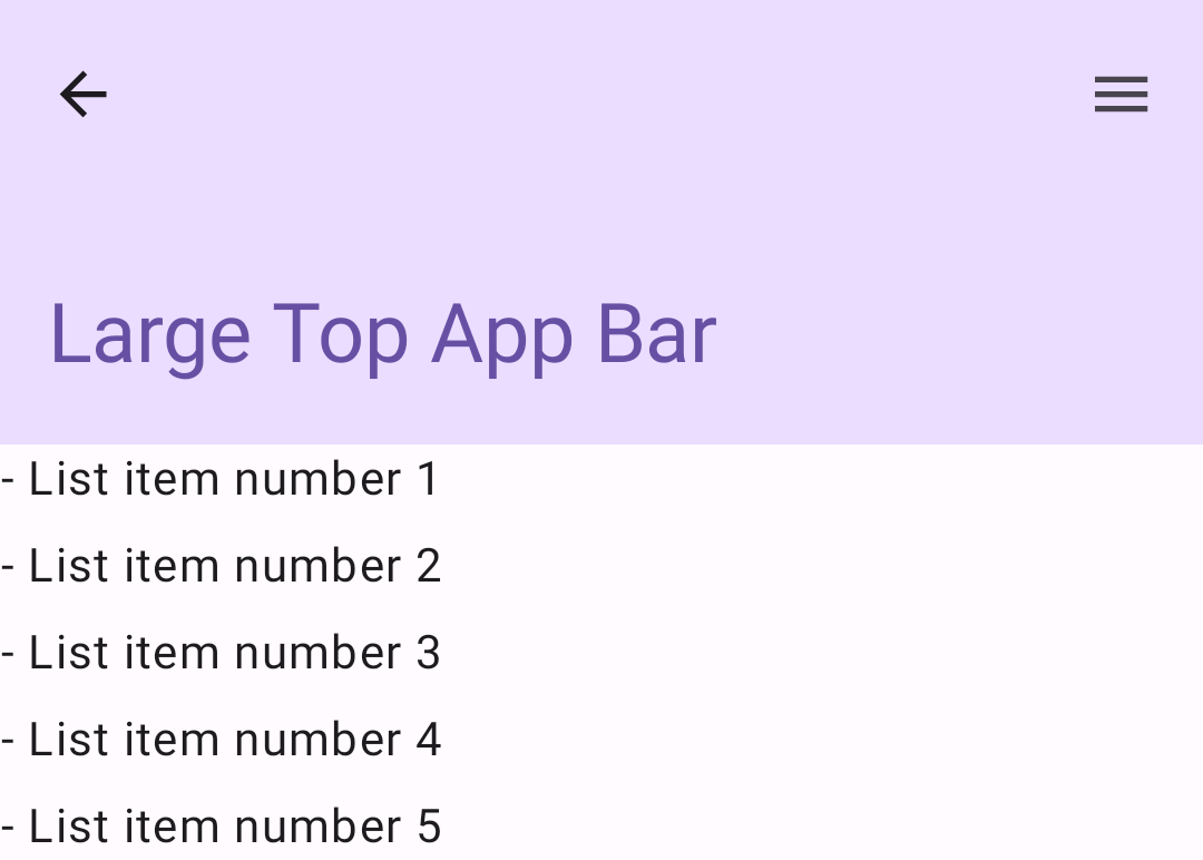
Large
A large top app bar is similar to the medium, though the padding between the
title and the icons is greater and it occupies more space on screen overall. To
create one, use the LargeTopAppBar composable.
Unlike the preceding snippets, this example uses
exitUntilCollapsedScrollBehavior() to get the value that it passes for
scrollBehavior. As such, the bar collapses when the user scrolls the
scaffold's inner content, but then expands when the user scrolls to the end of
the inner content.
@Composable fun LargeTopAppBarExample() { val scrollBehavior = TopAppBarDefaults.exitUntilCollapsedScrollBehavior(rememberTopAppBarState()) Scaffold( modifier = Modifier.nestedScroll(scrollBehavior.nestedScrollConnection), topBar = { LargeTopAppBar( colors = TopAppBarDefaults.topAppBarColors( containerColor = MaterialTheme.colorScheme.primaryContainer, titleContentColor = MaterialTheme.colorScheme.primary, ), title = { Text( "Large Top App Bar", maxLines = 1, overflow = TextOverflow.Ellipsis ) }, navigationIcon = { IconButton(onClick = { /* do something */ }) { Icon( imageVector = Icons.AutoMirrored.Filled.ArrowBack, contentDescription = "Localized description" ) } }, actions = { IconButton(onClick = { /* do something */ }) { Icon( imageVector = Icons.Filled.Menu, contentDescription = "Localized description" ) } }, scrollBehavior = scrollBehavior ) }, ) { innerPadding -> ScrollContent(innerPadding) } }
This implementation appears as follows:
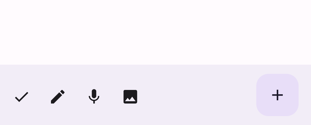
Bottom app bar
To create a bottom app bar, use the BottomAppBar composable. Using this
composable is quite similar to the top app bar composables described in the
preceding sections of this page. You pass composables for the following key
parameters:
actions: A series of icons that appear on the left side of the bar. These are commonly either key actions for the given screen, or navigation items.floatingActionButton: The floating action button that appears on the right side of the bar.
@Composable fun BottomAppBarExample() { Scaffold( bottomBar = { BottomAppBar( actions = { IconButton(onClick = { /* do something */ }) { Icon(Icons.Filled.Check, contentDescription = "Localized description") } IconButton(onClick = { /* do something */ }) { Icon( Icons.Filled.Edit, contentDescription = "Localized description", ) } IconButton(onClick = { /* do something */ }) { Icon( Icons.Filled.Mic, contentDescription = "Localized description", ) } IconButton(onClick = { /* do something */ }) { Icon( Icons.Filled.Image, contentDescription = "Localized description", ) } }, floatingActionButton = { FloatingActionButton( onClick = { /* do something */ }, containerColor = BottomAppBarDefaults.bottomAppBarFabColor, elevation = FloatingActionButtonDefaults.bottomAppBarFabElevation() ) { Icon(Icons.Filled.Add, "Localized description") } } ) }, ) { innerPadding -> Text( modifier = Modifier.padding(innerPadding), text = "Example of a scaffold with a bottom app bar." ) } }
This implementation appears as follows: