Window size classes are a set of opinionated viewport breakpoints that help you design, develop, and test responsive/adaptive layouts. The breakpoints balance layout simplicity with the flexibility of optimizing your app for unique cases.
Window size classes categorize the display area available to your app as compact, medium, expanded, large, or extra large. Available width and height are classified separately, so at any point in time, your app has two window size classes—one for width, one for height. Available width is usually more important than available height due to the ubiquity of vertical scrolling, so the width window size class is likely more relevant to your app's UI.


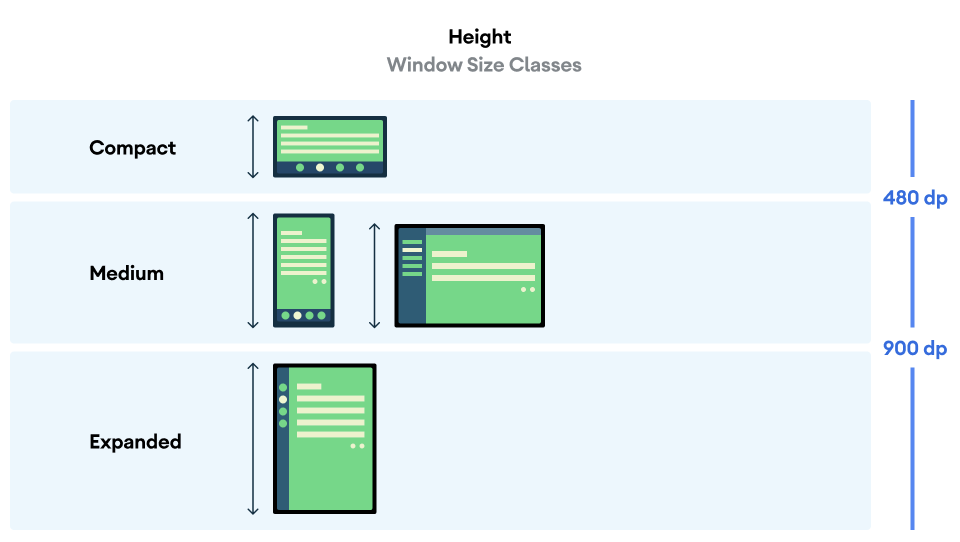
As visualized in the figures, the breakpoints allow you to continue thinking about layouts in terms of devices and configurations. Each size class breakpoint represents a majority case for typical device scenarios, which can be a helpful frame of reference as you think about the design of your breakpoint-based layouts.
| Size class | Breakpoint | Device representation |
|---|---|---|
| Compact width | width < 600dp | 99.96% of phones in portrait |
| Medium width | 600dp ≤ width < 840dp | 93.73% of tablets in portrait,
most large unfolded inner displays in portrait |
| Expanded width | 840dp ≤ width < 1200dp | 97.22% of tablets in landscape,
most large unfolded inner displays in landscape are at least expanded width |
| Large width | 1200dp ≤ width < 1600dp | Large tablet displays |
| Extra-large width | width ≥ 1600dp | Desktop displays |
| Compact height | height < 480dp | 99.78% of phones in landscape |
| Medium height | 480dp ≤ height < 900dp | 96.56% of tablets in landscape,
97.59% of phones in portrait |
| Expanded height | height ≥ 900dp | 94.25% of tablets in portrait |
Although visualizing size classes as physical devices can be useful, window size classes are explicitly not determined by the size of the device screen. Window size classes are not intended for isTablet‑type logic. Rather, window size classes are determined by the window size available to your application regardless of the type of device the app is running on, which has two important implications:
Physical devices do not guarantee a specific window size class. The screen space available to your app can differ from the screen size of the device for many reasons. On mobile devices, split‑screen mode can partition the screen between two applications. On ChromeOS, Android apps can be presented in desktop‑type windows that are arbitrarily resizable. Foldables can have two different‑sized screens individually accessed by folding or unfolding the device.
The window size class can change throughout the lifetime of your app. While your app is running, device orientation changes, multitasking, and folding/unfolding can change the amount of screen space available. As a result, the window size class is dynamic, and your app's UI should adapt accordingly.
Window size classes map to the compact, medium, and expanded breakpoints in the Material Design layout guidance. Additionally, large and extra-large breakpoints have been added to better target desktop and connected displays.
Use window size classes to make high‑level application layout decisions, such as deciding whether to use a specific canonical layout to take advantage of additional screen space.
Compute the current WindowSizeClass using the
currentWindowAdaptiveInfo() top‑level function of the
androidx.compose.material3.adaptive library. The function returns an
instance of WindowAdaptiveInfo, which contains windowSizeClass. To
support large and extra-large breakpoints, add the supportLargeAndXLargeWidth
parameter set to true to the function call. The
following example shows how to calculate the window size class and receive
updates whenever the window size class changes:
val windowSizeClass = currentWindowAdaptiveInfo().windowSizeClass
Manage layouts with window size classes
Window size classes enable you to change your app layout as the display space available to your app changes, for example, when a device folds or unfolds, the device orientation changes, or the app window is resized in multi‑window mode.
Localize the logic for handling display size changes by passing window size classes down as state to nested composables just like any other app state:
@Composable fun MyApp( windowSizeClass: WindowSizeClass = currentWindowAdaptiveInfo(supportLargeAndXLargeWidth = true).windowSizeClass ) { // Decide whether to show the top app bar based on window size class. val showTopAppBar = windowSizeClass.isHeightAtLeastBreakpoint(WindowSizeClass.HEIGHT_DP_MEDIUM_LOWER_BOUND) // MyScreen logic is based on the showTopAppBar boolean flag. MyScreen( showTopAppBar = showTopAppBar, /* ... */ ) }
Test window size classes
As you make layout changes, test the layout behavior across all window sizes, especially at the compact, medium, and expanded breakpoint widths.
If you have an existing layout for compact screens, first optimize your layout for the expanded width size class, since this size class provides the most space for additional content and UI changes. Then decide what layout makes sense for the medium width size class; consider adding a specialized layout.
Next steps
To learn more about how to use window size classes to create responsive/adaptive layouts, see the following:
For Compose-based layouts: Support different display sizes
For view-based layouts: Responsive/adaptive design with views
To learn more about what makes an app great on all devices and screen sizes, see:
