
TextField allows users to enter and modify text. This page describes how you
can implement TextField, style TextField input, and configure
other TextField options, like keyboard options and visually transforming
user input.
Choose TextField implementation
There are two levels of TextField implementation:
TextFieldis the Material Design implementation. We recommend you choose this implementation as it follows Material Design guidelines:BasicTextFieldenables users to edit text via hardware or software keyboard, but provides no decorations like hint or placeholder.
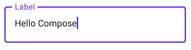
@Composable fun SimpleFilledTextFieldSample() { var text by remember { mutableStateOf("Hello") } TextField( value = text, onValueChange = { text = it }, label = { Text("Label") } ) }

@Composable fun SimpleOutlinedTextFieldSample() { var text by remember { mutableStateOf("") } OutlinedTextField( value = text, onValueChange = { text = it }, label = { Text("Label") } ) }
Style TextField
TextField and BasicTextField share a lot of common parameters to customize
them. The complete list for TextField is available in the TextField source
code.
This is a non-exhaustive list of some of the useful parameters:
singleLinemaxLinestextStyle
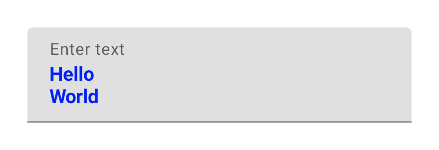
@Composable fun StyledTextField() { var value by remember { mutableStateOf("Hello\nWorld\nInvisible") } TextField( value = value, onValueChange = { value = it }, label = { Text("Enter text") }, maxLines = 2, textStyle = TextStyle(color = Color.Blue, fontWeight = FontWeight.Bold), modifier = Modifier.padding(20.dp) ) }
We recommend TextField over BasicTextField when your design calls for a
Material TextField or OutlinedTextField. However, BasicTextField should be used
when building designs that don't need the decorations from the Material spec.
Style input with Brush API
You can use the Brush API for more advanced styling in your TextField. The
following section describes how you can use a Brush to add a colored gradient
to TextField input.
For more information about using the Brush API to style text, see Enable advanced styling with Brush API.
Implement colored gradients using TextStyle
To implement a colored gradient as you type within a TextField, set your brush
of choice as a TextStyle for your TextField. In this example, we use a
built-in brush with a linearGradient to view the rainbow gradient effect as
text is typed into the TextField.
var text by remember { mutableStateOf("") } val brush = remember { Brush.linearGradient( colors = rainbowColors ) } TextField( value = text, onValueChange = { text = it }, textStyle = TextStyle(brush = brush) )

buildAnnotatedString and SpanStyle, along with linearGradient, to customize only a piece of text.Set keyboard options
TextField lets you set keyboard configurations options, such as the keyboard
layout, or enable the autocorrect if it’s supported by the keyboard. Some
options may not be guaranteed if the software keyboard doesn't comply with the
options provided here. Here is the list of the supported keyboard
options:
capitalizationautoCorrectkeyboardTypeimeAction
Format input
TextField allows you to set a VisualTransformation
on the input value, like replacing characters with * for passwords, or
inserting hyphens every 4 digits for a credit card number:
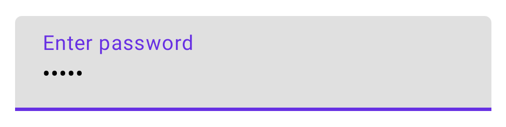
@Composable fun PasswordTextField() { var password by rememberSaveable { mutableStateOf("") } TextField( value = password, onValueChange = { password = it }, label = { Text("Enter password") }, visualTransformation = PasswordVisualTransformation(), keyboardOptions = KeyboardOptions(keyboardType = KeyboardType.Password) ) }
More examples are available in the VisualTransformationSamples source code.
Clean input
A common task when editing text is to strip leading characters, or otherwise transform the input string each time it changes.
As a model, you should assume that the keyboard may make arbitrary and large
edits each onValueChange. This may happen, for example, if the user uses
autocorrect, replaces a word with an emoji, or other smart editing features. To
correctly handle this, write any transformation logic with the assumption that
the current text passed to onValueChange is unrelated to the previous or next
values that will be passed to onValueChange.
To implement a text field that disallows leading zeros, you can do this by stripping all leading zeroes on every value change.
@Composable fun NoLeadingZeroes() { var input by rememberSaveable { mutableStateOf("") } TextField( value = input, onValueChange = { newText -> input = newText.trimStart { it == '0' } } ) }
To control the cursor position while cleaning text, use the TextFieldValue
overload of TextField
as part of the state.
Best practices with state
The following is a series of best practices to define and update TextField
state to prevent input issues in your app.
- Use
MutableStateto representTextFieldstate: Avoid using reactive streams likeStateFlowto representTextFieldstate, as these structures might introduce asynchronous delays.
class SignUpViewModel : ViewModel() { var username by mutableStateOf("") private set /* ... */ }
- Avoid delays to update the state: When you call
onValueChange, update yourTextFieldsynchronously and immediately:
// SignUpViewModel.kt class SignUpViewModel(private val userRepository: UserRepository) : ViewModel() { var username by mutableStateOf("") private set fun updateUsername(input: String) { username = input } } // SignUpScreen.kt @Composable fun SignUpScreen(/*...*/) { OutlinedTextField( value = viewModel.username, onValueChange = { username -> viewModel.updateUsername(username) } /*...*/ ) }
- Where to define the state: If your
TextFieldstate requires business logic validations as you type, it is correct to hoist the state to yourViewModel. If it doesn’t, you can use composables or a state holder class as the source of truth. To learn more about where to hoist your state, see the state hoisting documentation.
Additional resources
- Auto-format a phone number in a text field
- Show or hide password based on a user toggle
- Validate input as the user types
Recommended for you
- Note: link text is displayed when JavaScript is off
- Architecting your Compose UI
- State and Jetpack Compose
- Save UI state in Compose