
When a user interacts with your app, they often do so by touching elements on their screen. However, this is not the only form of interaction. Other forms of interaction could include the following:
- A ChromeOS user might use the arrow keys on their physical keyboard to navigate the screen.
- Someone playing a game could use their attached game controller to navigate through the game's menu.
- A mobile app user might cycle through elements using the on-screen keyboard.
In these cases, it is important to track which component is active at any given point in time, which is what we call focus. Elements on the screen should be focused in a logical order. Jetpack Compose has a default way of handling focus that is correct in most cases. However, in some cases, you might need to modify this default behavior.
The following pages describe how to use focus in your app:
- Change focus traversal order: Explains how to change the default focus order, add focus groups, and disable focus of a composable.
- Change focus behavior: Describes how to request, capture, and release focus, and how to redirect focus upon entering a screen.
- React to focus: Explains how to react to focus changes, add visual cues to elements, and understand the focus state of an element.
Default focus traversal order
Before we dive into the default behavior of the focus search, it's important to
understand the concept of level in the hierarchy: generally speaking, we can
say that two Composables are at the same level when they are siblings, meaning
that they have the same parents. For instance, elements inside a Column are at
the same level. Getting up a level means going from a child to its Composable
parent, or, keeping the same example, going back from an item to a Column that
contains it. Going down a level is the other way around, from the Column
parent to the contained items. This concept can be applied to every Composable
that can contain other Composables.
UI navigation can happen in multiple ways, some of which most users will already know:
- TABs: one-dimensional navigation, going forward or backward. TAB
navigation advances focus to the next or previous element in the hierarchy. By
default, Compose follows the declaration of the
Composables. One-directional navigation can be achieved through thetabkey on a keyboard, or the Rotary Bezel on a watch, and this kind of focus search will visit each element on the screen. - Arrow keys: two-dimensional navigation, going left, right, up, or down. Two-dimensional navigation can be achieved through a D-Pad on a TV or arrow keys on a keyboard, and its traversal order only visits elements at a given level. You can use the D-Pad center and Back button to go down and back up to a different level.
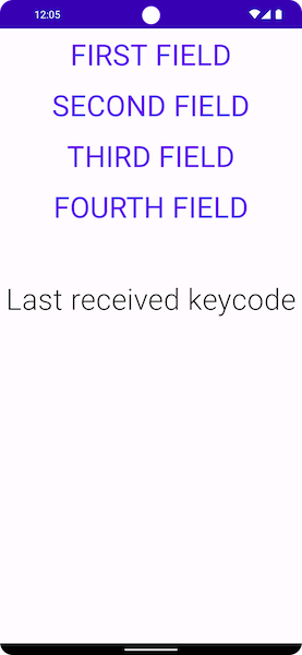
Take as an example the screenshot below, where you have four buttons, one below
the other, and you want to cycle through them all in order of appearance.
Jetpack Compose delivers this behavior out of the box: the toolkit lets you
cycle through each composable in vertical order from top to bottom using the
tab key, or move focus by pressing the up or down arrow.
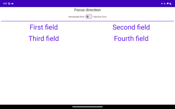
When you switch to a different kind of layout, things change a bit. If your
layout has more than one column, like the layout below, Jetpack Compose lets you
navigate through them without having to add any code. If you press the tab
key, Jetpack Compose automatically highlights the items in order of declaration,
from First to Fourth. Using arrow keys on your keyboard makes the selection
follow the desired direction in 2D space.
Column { Row { TextButton({ }) { Text("First field") } TextButton({ }) { Text("Second field") } } Row { TextButton({ }) { Text("Third field") } TextButton({ }) { Text("Fourth field") } } }
The Composables are declared in two Rows, and the focus elements are
declared in order, from first to fourth. When you press the tab key, this
produces the following focus order:
In the snippet below, you declare the items in Columns rather than in Rows:
Row { Column { TextButton({ }) { Text("First field") } TextButton({ }) { Text("Second field") } } Column { TextButton({ }) { Text("Third field") } TextButton({ }) { Text("Fourth field") } } }
This layout traverses the items vertically, from top to bottom, from the start of the screen towards the end:
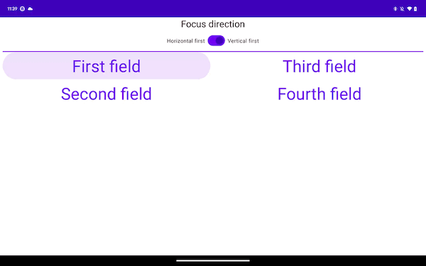
The previous two samples, while differing in one-directional navigation, provide
the same experience when it comes to two-dimensional navigation. This is usually
because the items on the screen have the same geographic placement in both
examples. Navigating right from the first Column moves the focus to the
second, and navigating down from the first Row moves the focus to the one
below it.
Recommended for you
- Note: link text is displayed when JavaScript is off
- Change focus behavior
- ConstraintLayout in Compose
- Flow layouts in Compose