A layout defines the visual structure for a user to interface with your app, such as in a composable. Android provides a range of libraries, canonical starting points, and techniques to display and position content.
Get Started
Start designing Android layouts by learning app anatomy then how to structure your app's content.
Takeaways
Consider different aspect ratios, size classes, and resolutions that users might encounter. Verify that your app provides a good user experience on both landscape and portrait orientation as well as different screen sizes and form factors.
For more information, see the guidance on adapting your layout and canonical layouts.
Honor device safe areas, which includes parts of the UI such as display cutouts, edge-to-edge insets, edge displays, software keyboards, and system bars. Provide a flexible layout for users to interact with the keyboard.
Do
Don't
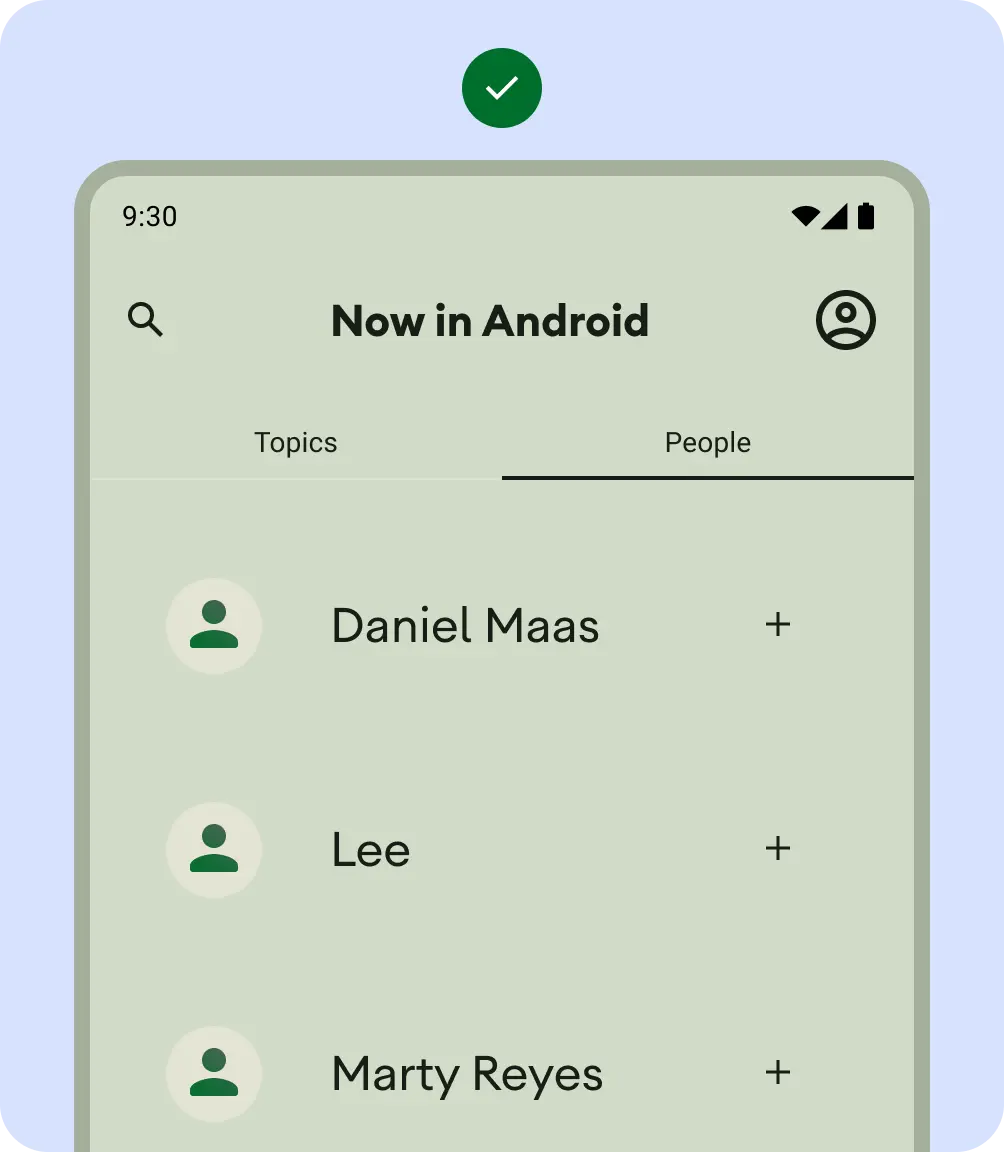
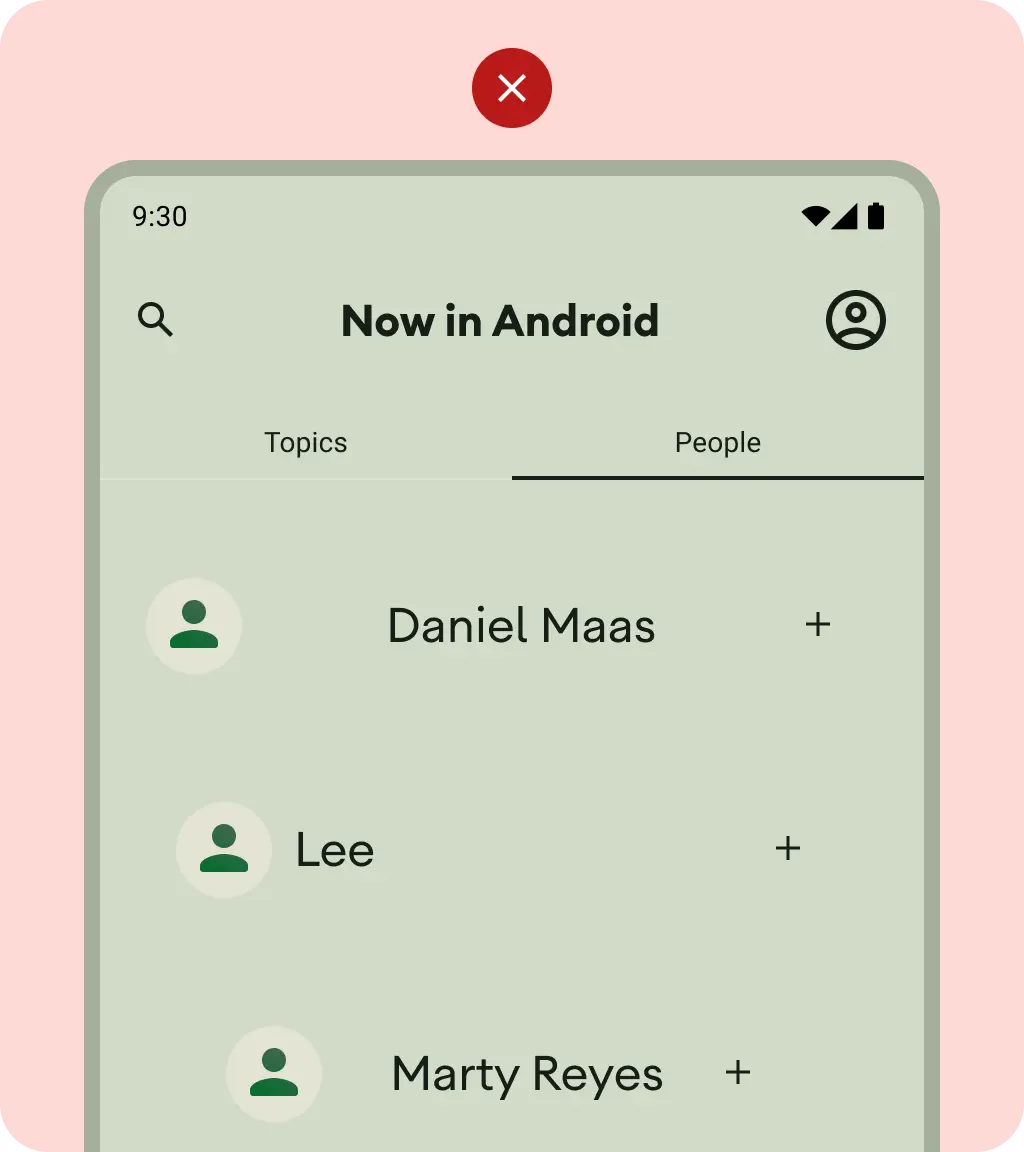
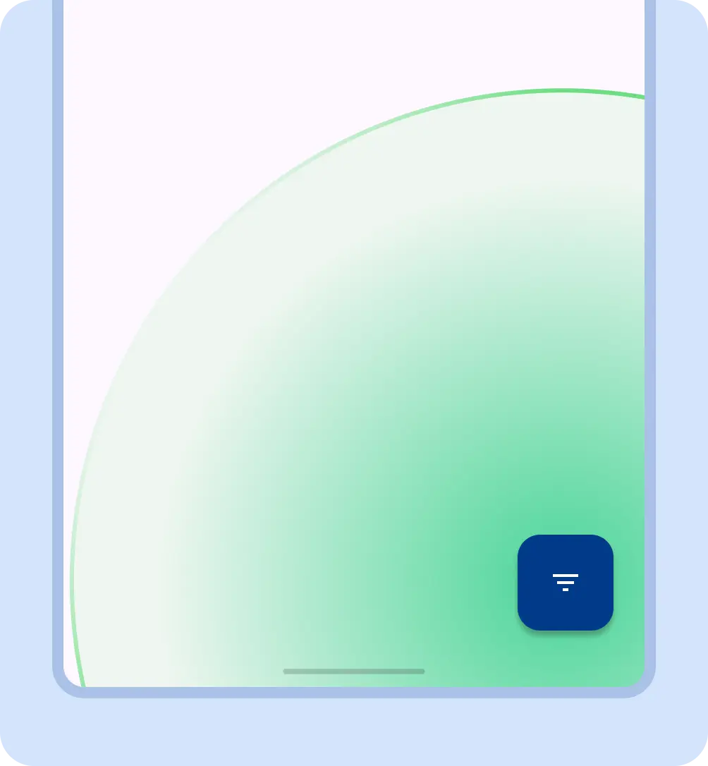
Keep essential interactions, like primary navigation, in a reachable screen area. Floating action buttons (FABs) provide a prominent and reachable interaction point
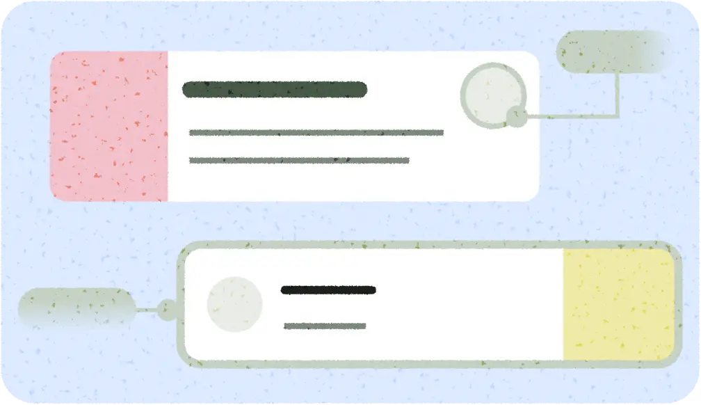
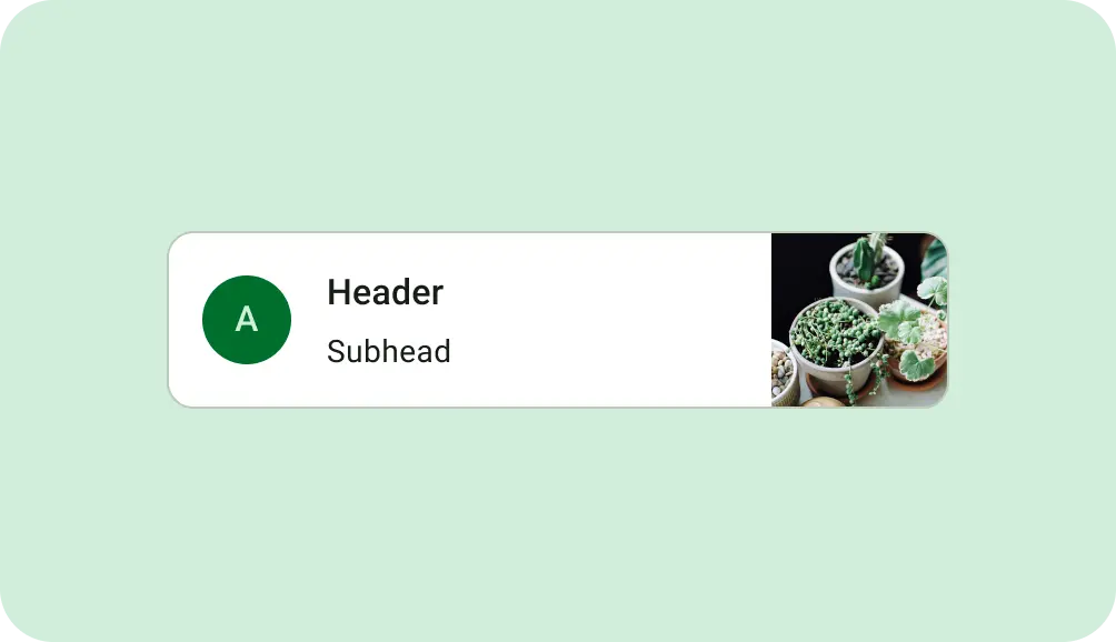
Use containment to group related content to guide the user through content and actions. Cards using explicit containment to group content with related actions.
Alignment
Provide consistent alignment between similar content and UI elements.
Do
Don't
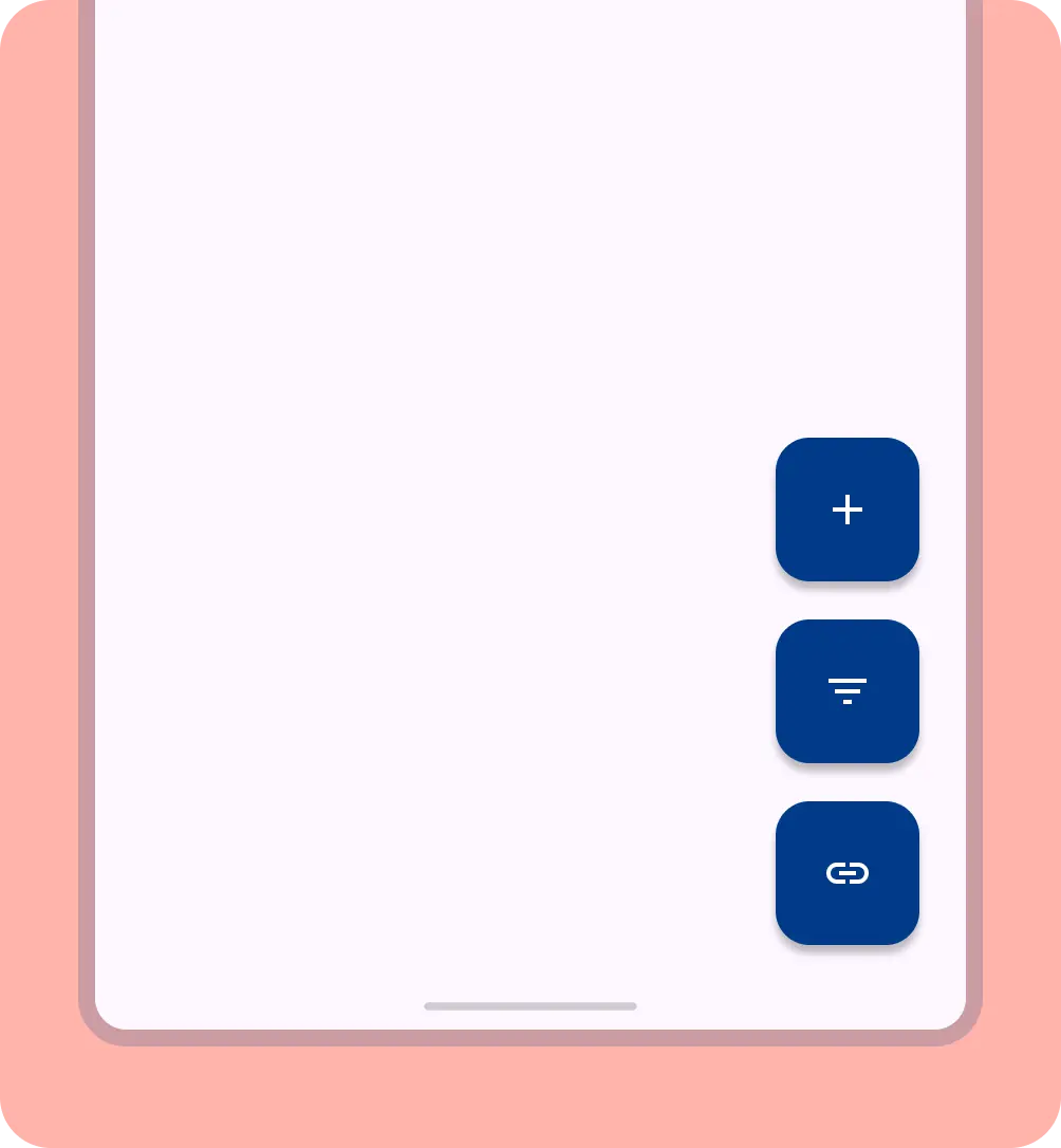
Don't overwhelm your user with too many actions per view.
When building custom layouts, notate how content should sit within the layout using alignment, constraints, or gravity terms. Include how images should respond to their container to display properly.