Android devices enable a desktop experience where apps open in free-form windows and users primarily interact with the UI with a pointer device like a mouse and a physical keyboard. Learn more about desktop experience across form factors.
Designing for a desktop experience differs significantly from mobile design because of the increased screen space, the precision of mouse and keyboard input, and the expectation of high productivity.
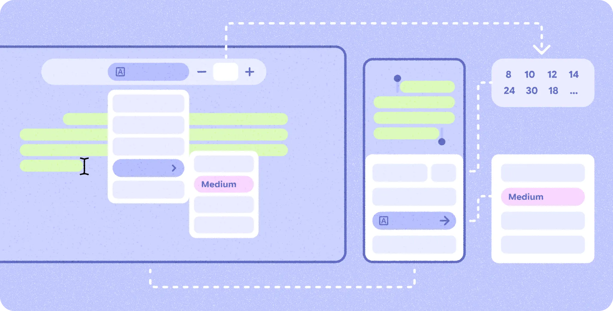
Adaptive from the start
Adapting your app to the desktop experience is not an afterthought. When you design your mobile app's layout and information hierarchy, design it in a flexible and modular way so that it adapts to a larger screen.
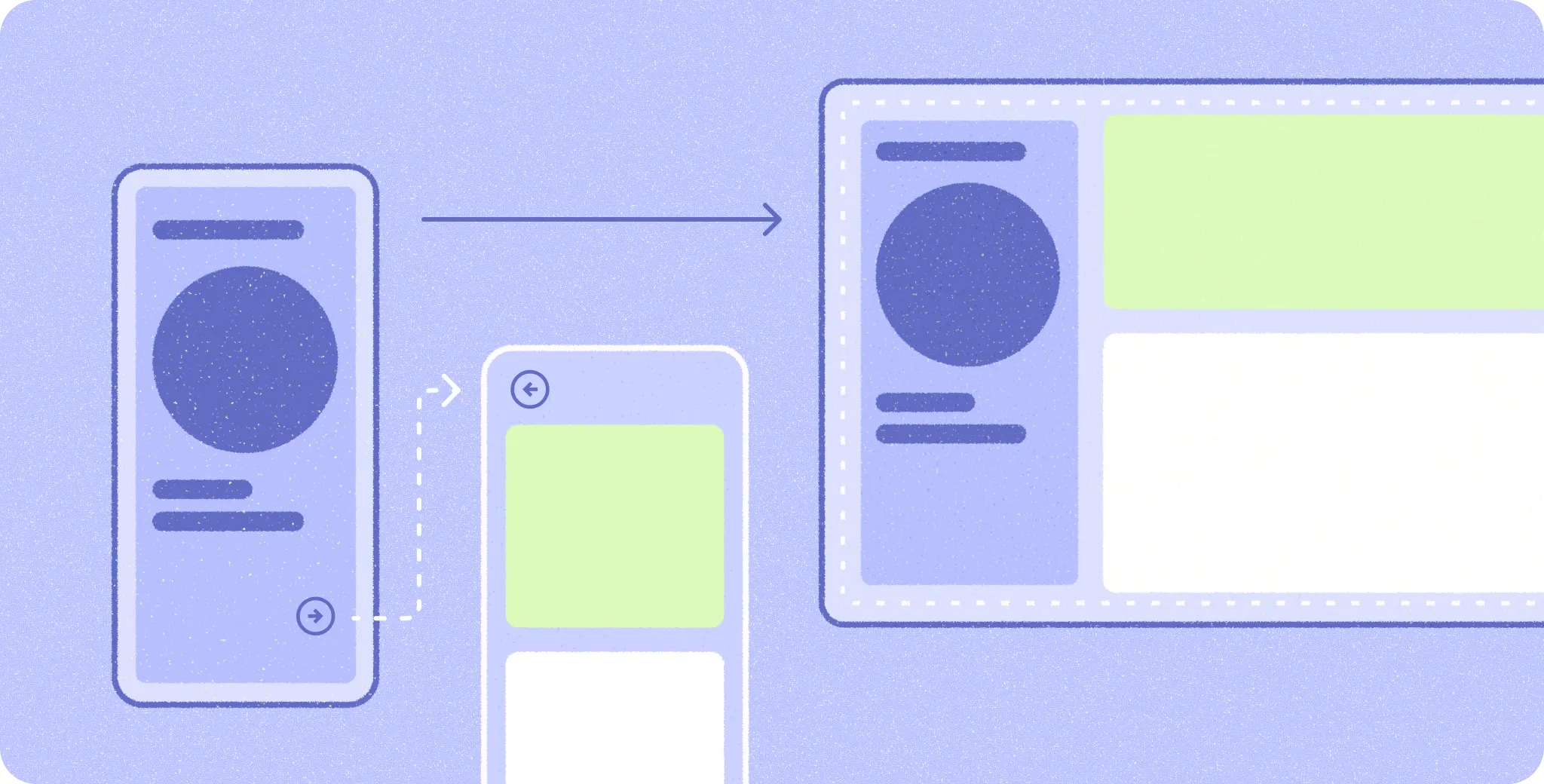
More screen, more done
Meaningfully use the increased screen space by showing more information in a denser layout instead of only scaling up elements to fill the space.
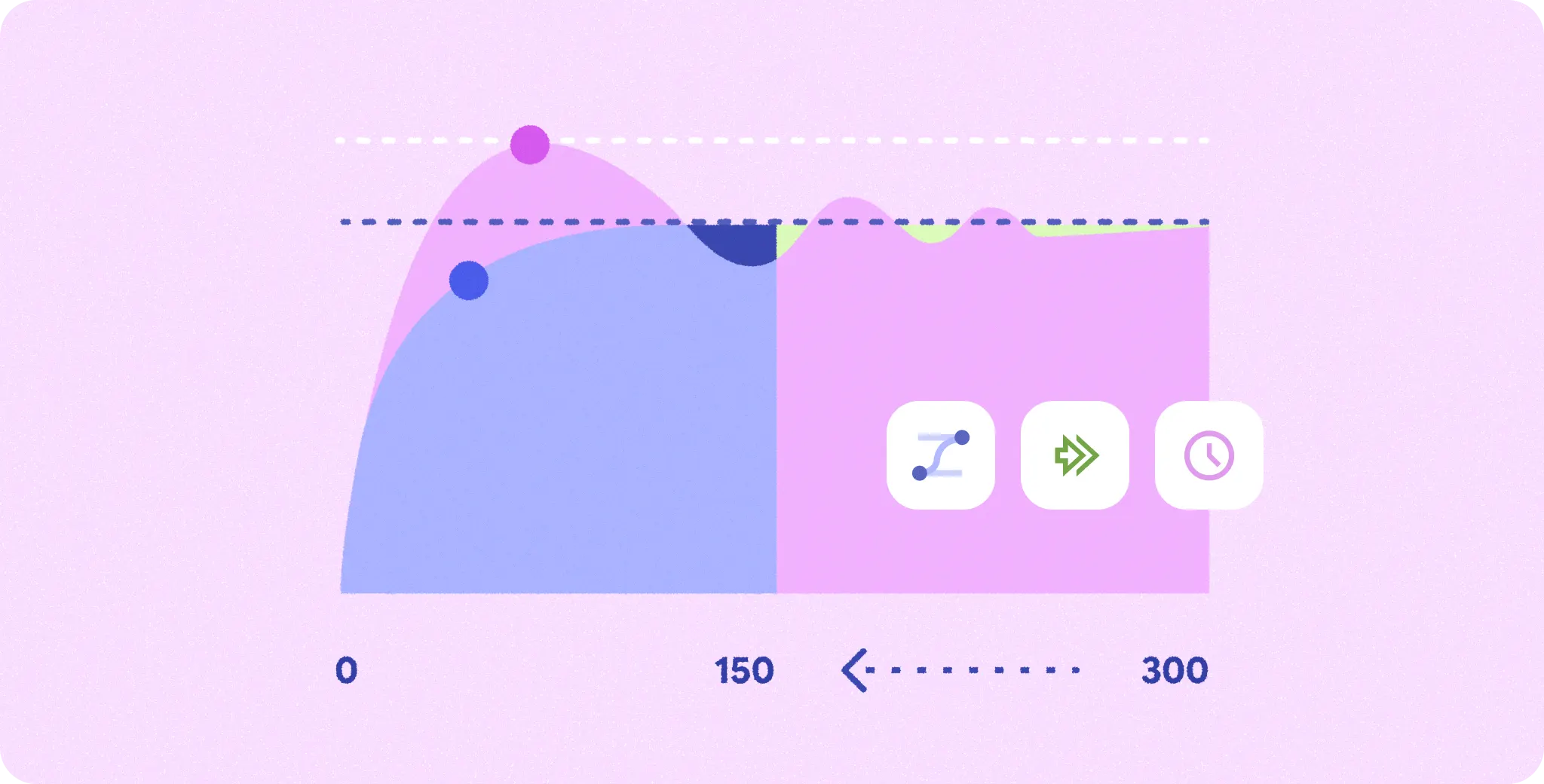
Refine the motion
Transitions where small UI elements move short distances are often faster than on mobile because the user's fingers don't obstruct the screen after an interaction. Transitions where large UI elements move long distances often need to be slower, or simplified, compared to mobile so the user isn't visually overwhelmed.
Multitasking at the core
Users expect to perform different types of tasks simultaneously in a desktop experience. The multi-window OS environment supports this, but you should also let users multitask within your app.

Balance efficiency with simplicity
While mobile design focuses more on simplicity and streamlined task flows, in a desktop environment users expect to accomplish more in a shorter flow. Finding the right balance for your app between accomplishing tasks with fewer steps and not overwhelming users with information is critical.
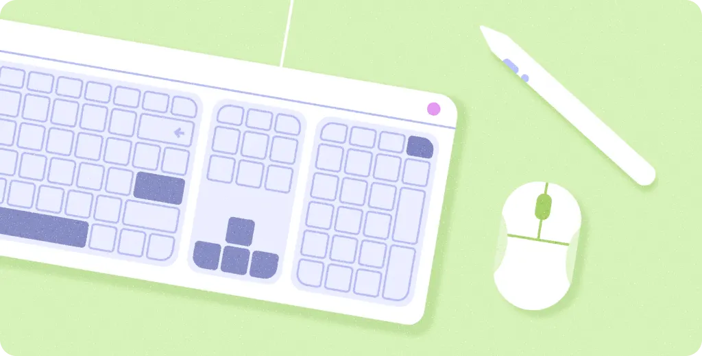
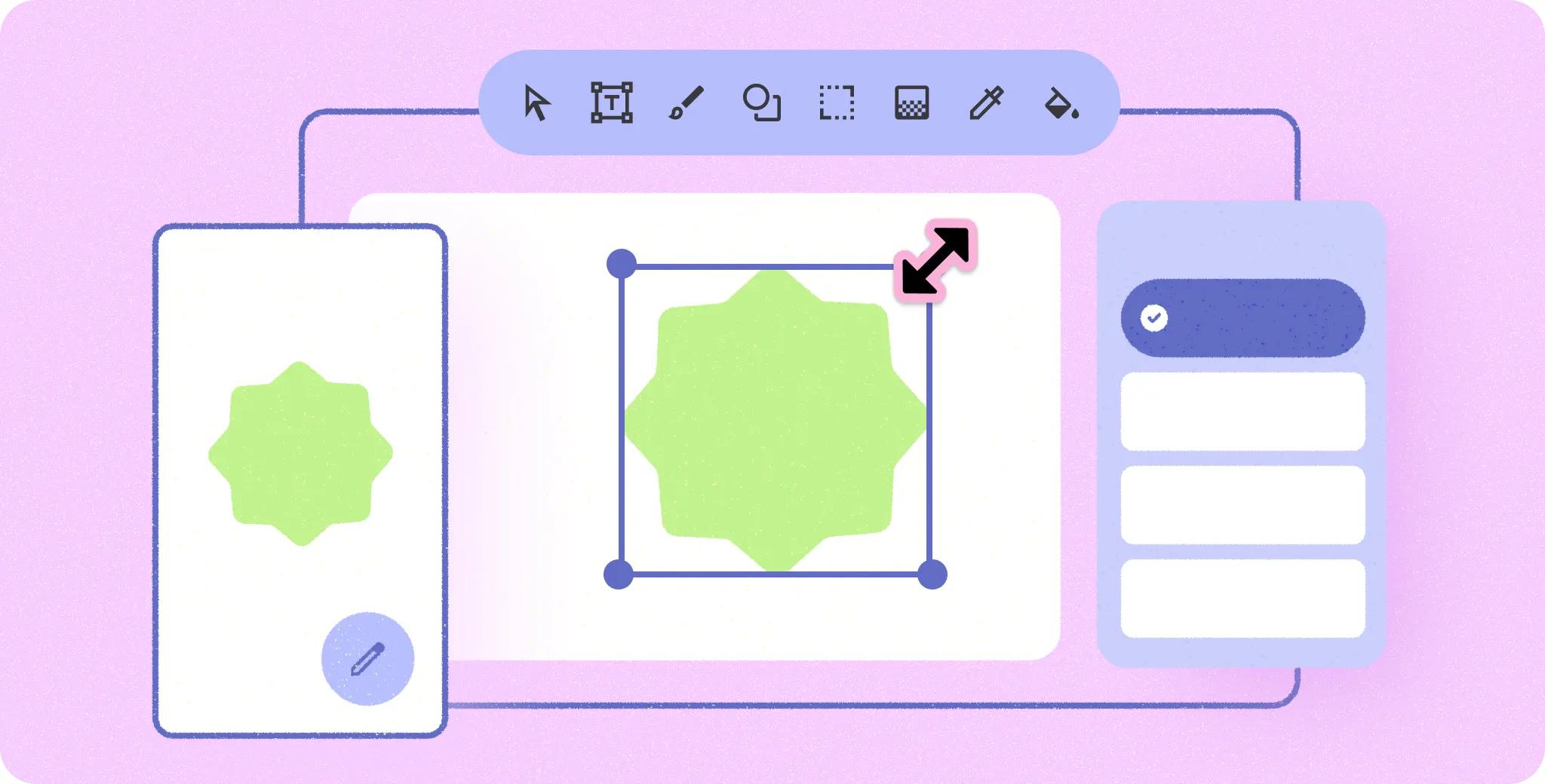
All input types are equally important
Touch, pointer, and physical keyboard are equally important in a desktop environment because users switch between them frequently. Follow best practices for pointer and keyboard interactions so that users can use your app efficiently with each input type.